lightning-input、lightning-comboboxなど標準の入力コンポーネントでは要件を満たせず、入力コンポーネントの作成を依頼されることが度々あったので、押さえとくべきポイントをまとめました。
低コストで作成できるように簡略的な書き方になります。より高度な例はsalesforce/base-components-recipesが参考になります。
コード例
テンプレート(HTML)
<template>
    <div class={formElementClass}>
        <!-- ラベル -->
        <label class={labelClass}>
            <template lwc:if={_required}>
                <abbr class="slds-required" title="必須">*</abbr>
            </template>
            {label}
        </label>

        <!-- ヘルプテキスト -->
        <lightning-helptext lwc:if={fieldLevelHelp} content={fieldLevelHelp}></lightning-helptext>

        <!-- フォーム -->
        <div class="slds-form-element__control">
        <!-- ★ここにフォームを実装する -->
        </div>

        <!-- エラーメッセージ -->
        <div lwc:if={_errorMessage} class="slds-form-element__help">{_errorMessage}</div>
    </div>
</template>
テンプレート(JavaScript)
import { LightningElement, api } from "lwc";

const VARIANT = {
    STANDARD: "standard",
    LABEL_HIDDEN: "label-hidden",
    LABEL_STACKED: "label-stacked",
    LABEL_INLINE: "label-inline"
};

export default class SampleInput extends LightningElement {
    @api label;
    @api variant = VARIANT.STANDARD;
    @api fieldLevelHelp;
    @api messageWhenValueMissing = "この項目を入力してください。";
    @api placeholder;
    // @api disabled; フォームによって実装が異なる
    // @api readonly; フォームによって実装が異なる

    _value;
    _required = false;
    _errorMessage;
    _customValidityMessage;

    @api
    get value() {
        return this._value;
    }

    set value(value) {
        this._value = value;
    }

    @api
    get required() {
        return this._required;
    }

    set required(value) {
        this._required = this.normalizeBoolean(value);
    }

    @api
    checkValidity() {
        // required以外の制限(minなど)を実装するは処理を追加します。
        const checkRequired = !(!this.disabled && this._required && !this._value);
        const checkCustomValidate = !this._customValidityMessage;
        return checkRequired && checkCustomValidate;
    }

    @api
    reportValidity() {
        this.classList.toggle("slds-form-element");
        if (this.checkValidity()) {
            this._errorMessage = "";
            return false;
        }
        // required以外の制限(minなど)を実装するは処理を追加します。
        this._errorMessage = this._customValidityMessage || this.messageWhenValueMissing;
        return true;
    }

    @api
    setCustomValidity(message) {
        this._customValidityMessage = message;
    }

    @api
    showHelpMessageIfInvalid() {
        this.reportValidity();
    }

    get formElementClass() {
        let style = "slds-form-element";
        if (this.variant === VARIANT.LABEL_STACKED) {
            style += " slds-form-element_stacked";
        }
        if (this.variant === VARIANT.LABEL_INLINE) {
            style += " slds-form-element_horizontal";
        }
        if (this._errorMessage) {
            style += " slds-has-error";
        }
        if (this.readOnly) {
            style += " slds-form-element_readonly";
        }
        return style;
    }

    get labelClass() {
        const style = "slds-form-element__label";
        return this.variant === VARIANT.LABEL_HIDDEN ? style + " slds-assistive-text" : style;
    }

    // 値が変更されたときに下記のメソッドを呼び出し、changeイベントを発火させる
    dispatchChangeEvent(value) {
        this.dispatchEvent(
            new CustomEvent("change", {
                detail: {
                    value
                }
            })
        );
    }

    normalizeBoolean(value) {
        return typeof value === "string" || !!value;
    }

    // フォームによって実装が異なる
    // handleBlur() {
    //     this.reportValidity();
    // }
}
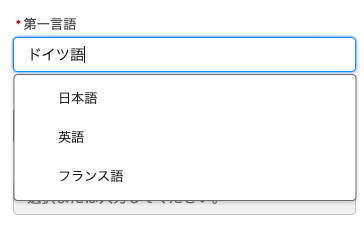
下記のコード例は入力コンポーネントの作成例です。フリーテキスト入力、プルダウン選択に対応した入力フォームです。
コード例(HTML)
<template>
    <div class={formElementClass}>
        <!-- ラベル -->
        <label class={labelClass}>
            <template lwc:if={_required}>
                <abbr class="slds-required" title="必須">*</abbr>
            </template>
            {label}
        </label>

        <!-- ヘルプテキスト -->
        <lightning-helptext lwc:if={fieldLevelHelp} content={fieldLevelHelp}></lightning-helptext>

        <!-- フォーム -->
        <div class="slds-form-element__control">
            <!-- この記事の本筋から逸れるため、下記のコンポーネントには触れません。発展の項で紹介しているsalesforce/base-components-recipesを参考にしてください。 -->
            <c-multi-select-combobox-base
                value={_value}
                placeholder={placeholder}
                options={options}
                onchange={handleChange}
                onselect={handleSelect}
                onblur={handleBlur}
                disabled={disabled}
            ></c-multi-select-combobox-base>
        </div>

        <!-- エラーメッセージ -->
        <div lwc:if={_errorMessage} class="slds-form-element__help">{_errorMessage}</div>
    </div>
</template>
コード例(JavaScript)
import { LightningElement, api } from "lwc";

const VARIANT = {
    STANDARD: "standard",
    LABEL_HIDDEN: "label-hidden",
    LABEL_STACKED: "label-stacked",
    LABEL_INLINE: "label-inline"
};

/**
 * @typedef {Object} ComboboxOption
 * @property {string} label
 * @property {string} value
 */

export default class SelectableInputText extends LightningElement {
    @api label;
    @api variant = VARIANT.STANDARD;
    @api fieldLevelHelp;
    @api messageWhenValueMissing = "この項目を入力してください。";
    @api placeholder;

    /**
     * @description サジェストの選択肢リストの全量。
     * @type {ComboboxOption[]}
     */
    @api options = [];

    _value;
    _required = false;
    _disabled = false;
    _readonly = false;
    _errorMessage;
    _customValidityMessage;

    @api
    get value() {
        return this._value;
    }

    set value(value) {
        this._value = value;
    }

    @api
    get required() {
        return this._required;
    }

    set required(value) {
        this._required = this.normalizeBoolean(value);
    }

    @api
    get disabled() {
        return this._disabled || this._readonly || false;
    }

    set disabled(value) {
        this._disabled = this.normalizeBoolean(value);
    }

    @api
    get readonly() {
        return this._disabled;
    }

    set readonly(value) {
        this._readonly = this.normalizeBoolean(value);
    }

    @api
    checkValidity() {
        // required以外の制限(minなど)を実装するは処理を追加します。
        const checkRequired = !(!this.disabled && this._required && !this._value);
        const checkCustomValidate = !this._customValidityMessage;
        return checkRequired && checkCustomValidate;
    }

    @api
    reportValidity() {
        this.classList.toggle("slds-form-element");
        if (this.checkValidity()) {
            this._errorMessage = "";
            return false;
        }
        // required以外の制限(minなど)を実装するは処理を追加します。
        this._errorMessage = this._customValidityMessage || this.messageWhenValueMissing;
        return true;
    }

    @api
    setCustomValidity(message) {
        this._customValidityMessage = message;
    }

    @api
    showHelpMessageIfInvalid() {
        this.reportValidity();
    }

    get formElementClass() {
        let style = "slds-form-element";
        if (this.variant === VARIANT.LABEL_STACKED) {
            style += " slds-form-element_stacked";
        }
        if (this.variant === VARIANT.LABEL_INLINE) {
            style += " slds-form-element_horizontal";
        }
        if (this._errorMessage) {
            style += " slds-has-error";
        }
        if (this.readOnly) {
            style += " slds-form-element_readonly";
        }
        return style;
    }

    get labelClass() {
        const style = "slds-form-element__label";
        return this.variant === VARIANT.LABEL_HIDDEN ? style + " slds-assistive-text" : style;
    }

    dispatchChangeEvent(value) {
        this.dispatchEvent(
            new CustomEvent("change", {
                detail: {
                    value
                }
            })
        );
    }

    normalizeBoolean(value) {
        return typeof value === "string" || !!value;
    }

    handleChange(event) {
        event.stopPropagation();
        if (event.detail.value === this._value) {
            return;
        }
        this._value = event.detail.value;
        this.dispatchChangeEvent(this._value);
    }

    handleSelect(event) {
        event.stopPropagation();
        if (event.detail.value === this._value) {
            return;
        }
        this._value = event.detail.value;
        this.dispatchChangeEvent(this._value);
    }

    handleBlur() {
        this.reportValidity();
    }
}
ラベル
lightning-inputなどの標準コンポーネントと一貫性を持たせるようにします。
標準の入力コンポーネントでは、ラベルの表示形式をvariant属性で変更できます。自作する場合も同じ使い方ができるように作成します。
variant属性の値は下記の値を取れるように作成します。
- ① standard
- ラベルとコンボボックスを垂直に配置します。デフォルトの値です。マージンが追加されないため、連続すると窮屈な印象を与えます。
- ② label-inline
- ラベルと入力欄を水平に配置します。
-
slds-form-element_stackedに、slds-form-element_horizontalクラスを追加します。
- ③ label-stacked
- ラベルとコンボボックスを垂直に配置し、ボトムマージンを追加します。
-
slds-form-element_stackedに、slds-form-element_stackedを追加します。
- ④ label-hidden
- ラベルが非表示になります。
- labelに
slds-assistive-textクラスを追加します。

上記の内容を実装すると下記のようになります。
<c-sample-input label="氏名" variant="label-inline"></c-sample-input>
<template>
    <div class={formElementClass}>
        <!-- ラベル -->
        <label class={labelClass}> {label} </label>
    </div>
</template>
チェックボックスグループなど複合した入力コンポーネントの場合、divの代わりにfieldset、labelの代わりにlegendを使用します。さらにslds-form-element__labelにslds-form-element__legendを追加します。
import { LightningElement, api } from "lwc";

const VARIANT = {
    STANDARD: "standard",
    LABEL_HIDDEN: "label-hidden",
    LABEL_STACKED: "label-stacked",
    LABEL_INLINE: "label-inline"
};

export default class SampleInput extends LightningElement {
    /**
     * @description 入力項目のラベル
     * @type {string}
     */
    @api label;

    /**
     * @description コンボボックスの外観を変える
     *              standard:ラベルとコンボボックスを垂直に配置する
     *              label-hidden:ラベルが非表示になる
     *              label-inline:ラベルとコンボボックスを水平に配置する
     *              label-stacked:ラベルとコンボボックスを垂直に配置し、ボトムマージンが追加される
     * @type {"standard"|"label-hidden"|"label-inline"|"label-stacked"}
     */
    @api variant = VARIANT.STANDARD;

    get formElementClass() {
        let style = "slds-form-element";
        if (this.variant === VARIANT.LABEL_STACKED) {
            style += " slds-form-element_stacked";
        }
        if (this.variant === VARIANT.LABEL_INLINE) {
            style += " slds-form-element_horizontal";
        }
        if (this._errorMessage) {
            style += " slds-has-error";
        }
        if (this.readOnly) {
            style += " slds-form-element_readonly";
        }
        return style;
    }

    get labelClass() {
        const style = "slds-form-element__label";
        return this.variant === VARIANT.LABEL_HIDDEN ? style + " slds-assistive-text" : style;
    }
}
sldsで始まるスタイルクラスはSLDS(Salesforce Lightning Design System)で提供されています。SLDSを使用することで、一貫性のあるデザインを簡単に実現できます。
必須
標準の入力コンポーネント同様に、必須時に「*」をラベルに表示し、送信時にバリデーションチェックされるようにします。
<c-sample-input label="" required></c-sample-input>
<template>
    <div class={formElementClass}>
        <!-- ラベル -->
        <label class={labelClass}>
            <!-- 必須 -->
            <template lwc:if={_required}>
                <abbr class="slds-required" title="必須">*</abbr>
            </template>
            {label}
        </label>
    </div>
</template>
_required = false;

@api get required() {
    return this._required;
}

set required(value) {
    this._required = this.normalizeBoolean(value);
}

/**
 * @description 属性のためのブール正規化ユーティリティ。
 * @param {any} value - 正規化する値。
 * @return {boolean} - 正規化された値。
 */
normalizeBoolean(value) {
    return typeof value === "string" || !!value;
}
バリデーションに使用する公開メソッドはバリデーションのところで説明します。
abbrのtitleに日本語を使用していますが、多言語対応するにはカスタム表示ラベルを使用します。
import labelRequired from "@salesforce/label/c.CMN_Required";
ヘルプテキスト
ヘルプテキストには標準コンポーネントのlightning-helptextが使えます。

<c-sample-input label="テスト" field-level-help="ヘルプテキスト"></c-sample-input>
<template>
    <div class={formElementClass}>
        <!-- ラベル -->
        <label class={labelClass}>
            <template lwc:if={_required}>
                <abbr class="slds-required" title="必須">*</abbr>
            </template>
            {label}
        </label>

        <!-- ヘルプテキスト -->
        <lightning-helptext lwc:if={fieldLevelHelp} content={fieldLevelHelp}></lightning-helptext>
    </div>
</template>
/**
 * @description 入力の目的と機能を詳しく説明したヘルプテキスト。
 * @type {string?}
 */
@api fieldLevelHelp;
カスタムイベント
値が変更された時にchangeイベントを発生するようにします。発火させるタイミングはフォームの実装によって異なります。
<c-sample-input label="サンプル" onchange={handleChange}></c-sample-input>
dispatchChangeEvent(value) {
    this.dispatchEvent(
        new CustomEvent("change", {
            detail: {
                value
            }
        })
    );
}
changeイベントと同様にして、必要に応じてinputイベント、blurイベントなどのカスタムイベントの発火処理を実装します。
カスタムイベントは子コンポーネントから親コンポーネントに情報を伝えるために使用されます。Lightning Web Component 間の通信の基礎 - Qiita
バリデーション用の公開メソッド
lightning-inputなど他の入力項目とのため、下記のメソッドを実装します。
| メソッド | 備考 |
|---|---|
| checkValidity | 入力が有効かどうかを確認します。 |
| reportValidity | 入力が不正な場合は、エラーメッセージを表示し、falseを返します。入力が有効な場合は、表示されたエラーメッセージをクリアし、trueを返します。 |
| setCustomValidity | フォームの送信時に表示されるカスタムエラーメッセージを設定します。 |
| showHelpMessageIfInvalid | 入力が不正な場合は、エラーメッセージを表示し、有効な場合はエラーメッセージがクリアされます。 |
// 標準入力コンポーネントとカスタム入力コンポーネントをまとめてバリデーションする方法
// <c-sample-input label="サンプル" data-type="input"></c-sample-input>
// <lightning-input label="サンプル" data-type="input"></lightning-input>

handleClick(event) {
    const allValid = [
        ...this.template.querySelectorAll('[data-type="input"]')
    ].reduce((validSoFar, inputCmp) => {
        inputCmp.reportValidity(); // バリデーションがNGのとき、エラー内容を表示する
        return inputCmp.checkValidity() && validSoFar; // バリデーションNGの入力項目があった場合、falseを返す
    }, true);

    if (allValid) {
        // クライアントサイドのバリデーションがOKのときの処理
    } else {
        // バリデーションがNGのときの処理
    }
}
// カスタムのバリデーションを設定する方法

validateCustom() {
    const cmp = this.template.querySelector('[data-field="AvailableDays__c"]');
    const str = this.form.AvailableDays__c
    if (str || == str.split(";").length <= 1) {
        cmp.setCustomValidity("2つ以上選択してください"); // エラーをセットする
    } else {
        cmp.setCustomValidity(""); // エラーをリセットする
    }
    return cmp.reportValidity(); // エラーを表示する
}
下記は実装例です。
<template>
    <div class={formElementClass}>
        <!-- ラベル -->
        <label class={labelClass}>
            <template lwc:if={_required}>
                <abbr class="slds-required" title="必須">*</abbr>
            </template>
            {label}
        </label>

        <!-- ヘルプテキスト -->
        <lightning-helptext lwc:if={fieldLevelHelp} content={fieldLevelHelp}></lightning-helptext>

        <!-- フォーム -->
        <div class="slds-form-element__control">
            <!-- ★ここにフォームを実装する -->
        </div>

        <!-- エラーメッセージ -->
        <div lwc:if={_errorMessage} class="slds-form-element__help">{_errorMessage}</div>
    </div>
</template>
@api
messageWhenValueMissing = "この項目を入力してください。";

_errorMessage;
_customValidityMessage;

@api
checkValidity() {
    // required以外の制限(minなど)を実装するは処理を追加します。
    const checkRequired = !(this._required && !this._value);
    const checkCustomValidate = !this._customValidityMessage;
    return checkRequired && checkCustomValidate;
}

@api
reportValidity() {
    if (this.checkValidity()) {
        this._errorMessage = "";
        return false;
    }
    // required以外の制限(minなど)を実装するは処理を追加します。
    this._errorMessage = this._customValidityMessage || this.messageWhenValueMissing;
    return true;
}

@api
setCustomValidity(message) {
    this._customValidityMessage = message;
}

@api
showHelpMessageIfInvalid() {
    this.reportValidity();
}
公開メソッドは親コンポーネントから子コンポーネントに情報を渡したり、操作するために使用します。- Lightning Web Component 間の通信の基礎 - Qiita
その他公開メソッド
blur、focusなどその他必要なメソッドを実装します。
画面フローでの使用
画面フローで使用する場合、validateメソッドを定義します。
また、.js-meta.xmlファイルに<target>lightning__FlowScreen</target>を追加する必要があります。
発展
より汎用的に作成する場合は、下記のソースコードが参考になります。