はじめに
Rユーザーのグラフ作成や可視化といえばggplot2が鉄板中の鉄板です。
レイヤー機能という、データに関する要素をプロットに重ねていく仕組みは簡潔なコードを可能にし、設定されているスタイルは野暮ったさのないグラフ作成を可能にしています。
Pythonを学び始めたユーザー(私)がPythonだとどうコード書くんだっけ、というときに使えるよう辞書的にまとめています。
Rユーザーのグラフ作成は?
ggplot
Rのggplot2がそのまま使用できる(2が取れているのが特徴です)
しかし完成度が甘く、Rのggplot2ほど自由に操作できません。例えば、
- boxplotでcolorが作動しない
- 「ggplot()」の関数内で変数を指定する必要がある
等々の不便さはあります。
plotly
Rでもお世話になりましたplotly。特徴はインタラクティブなグラフが作れることです。
しかしggplot2ほど簡単な操作ではないです。これから利用が伸びてきそう。
seaborn
pythonで主にグラフ作成に使われてきたmatplotlibを改良したモノで以下のような特徴があります。
- 適切なプロットスタイルや配色
- シンプルな関数
- pandasデータフレーム対応
個人的にはseabornがお勧めです。Rユーザーはggplot2自体は使い慣れていると思いますので、ggplot2 ⇄ seaborn表記をまとめます。
実例:ggplot2 ⇄ seaborn
seabornライブラリにはR同様データセット付属しておりRではみんな大好き定番のirisもあります。
いくつか読み込んで使用します。
事前準備
import matplotlib.pyplot as plt
import seaborn as sns; sns.set() #seabornライブラリを読み込み、スタイルをセットする
iris = sns.load_dataset('iris') #irisデータセット読み込み
fmri = sns.load_dataset('fmri') #fmriデータセット読み込み(Rにはありません)
tips = sns.load_dataset("tips") #tipsデータセット読み込み(Rにはありません)
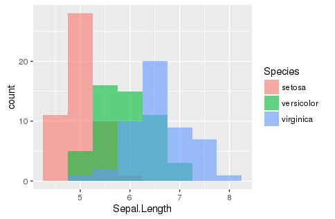
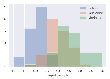
ヒストグラム histogram
ggplot(aes(x=Sepal.Length, fill=Species), data=iris) +
  geom_histogram(position = "identity", alpha = 0.6, bins=9, binwidth = 0.5)
# seabornでは各変数ごとにヒストグラムを重ねます。
sns.distplot(iris.query('species=="setosa"').sepal_length, kde=False, bins=np.linspace(4,8,9), label="setosa")
sns.distplot(iris.query('species=="versicolor"').sepal_length, kde=False, bins=np.linspace(4,8,9), label="versicolor")
sns.distplot(iris.query('species=="virginica"').sepal_length, kde=False, bins=np.linspace(4,8,9), label="virginica")
plt.legend()
 #kde = カーネル密度曲線の有無
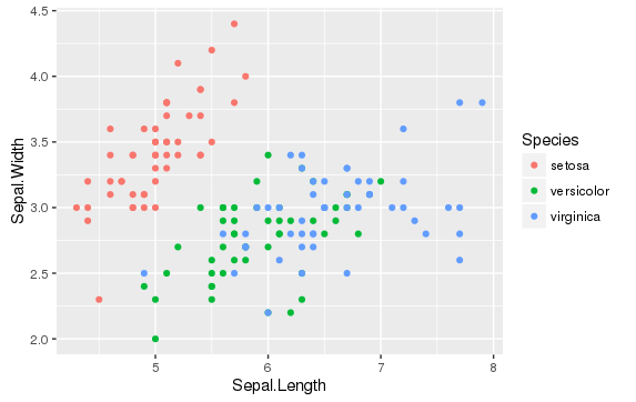
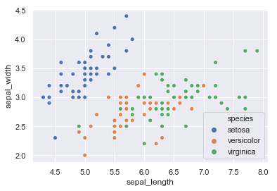
散布図 scatter
ggplot(aes(y=Sepal.Length, x=Sepal.Width, color=Species), data=iris) + geom_point()
sns.scatterplot(x='sepal_length', y='sepal_width', hue='species', data=iris)
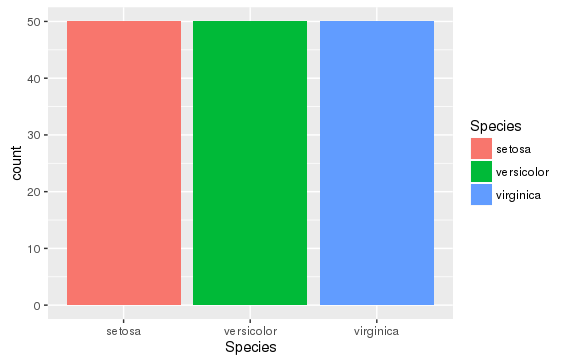
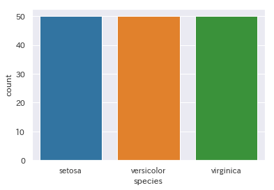
棒グラフ(count)
nカウントをする棒グラフ
ggplot(aes(x=Species, fill=Species), data=iris) + geom_bar(stat="count")
sns.countplot(x='species', data=iris)
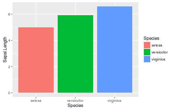
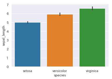
棒グラフ(bar)
棒グラフにするにはxに対するy値を事前に計算してグラフ化しますが、プロット化の際にも計算は可能です。ggplot2では計算式を指定できます。一方seabornではyに指定した変数の平均値とエラーバーが自動で計算されるようです。
# 平均値の棒グラフ
ggplot(aes(x=Species, y=Sepal.Length, fill=Species), data=iris) +
  stat_summary(fun.y=mean,geom="bar")
# 平均値の棒グラフ
sns.barplot(x='species', y='sepal_length', data=iris)
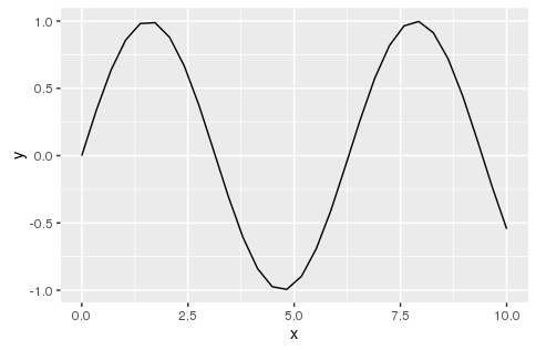
折れ線グラフ line
# 正弦波のデータを作成
x <- seq(0, 10, len=30)
y <- sin(x)
data.frame(x,y)-> dataframe
ggplot(aes(x=x, y=y), data=dataframe) + geom_line()
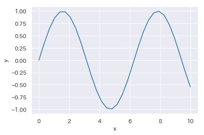
import numpy as np
import pandas as pd
x = list(np.linspace(0,10,30))
y = list(np.sin(x))
dataframe = pd.DataFrame(list(zip(x,y)), columns=['x','y'])
sns.lineplot(x="x", y="y", data=dataframe)
ちなみに、xの値に対してyの値が複数存在するデータを使用した場合、ggplot2ですと…
# fmriデータセットを使用(Pythonから持ってきた)
ggplot(aes(x=timepoint, y=signal, color=event), data=fmri) + geom_line()
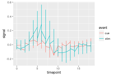
このようにわけのわからないグラフになってしまいますが、
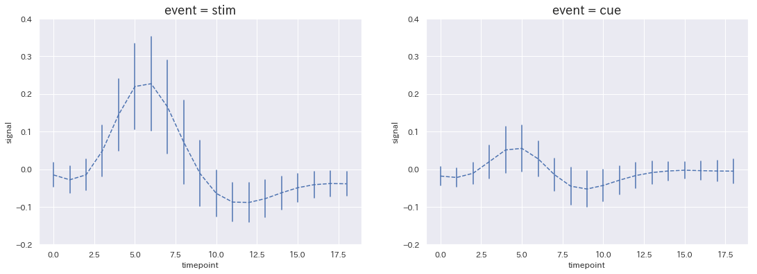
seabornでは...
sns.lineplot(x='timepoint', y='signal', hue='event',
             style="event", data=fmri, markers=True, dashes=False) #エラー変更はci ='sd'
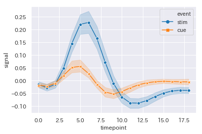
ライン(マーカー)を平均値、エラーバンド(sdの帯)を計算して表示してくれます。
エラーバンドは信頼区間(各マーカー間の回帰直線の信頼区間)ですね。
標準偏差に変更する場合はオプションでci='sd'と記述する必要があります。
(普通、折れ線グラフのエラーってSDじゃないのか?)
これ結構便利な気がします。
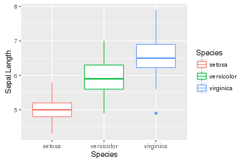
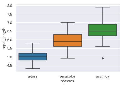
箱ひげ図 box
ggplot(aes(x=Species, y=Sepal.Length, color=Species), data=iris) + geom_boxplot()
sns.boxplot(x='species', y='sepal_length', data=iris)
subplots
複数の図を並べるsubplot表示
degree <-levels(factor(fmri$event))

p1 = ggplot(data=fmri%>%filter(event==degree[2]),aes(x=timepoint, y=signal)) +
  stat_summary(fun.y=mean,geom="line",linetype = 2) +
  stat_summary(fun.ymin = function(x) mean(x) - sd(x),
               fun.ymax = function(x) mean(x) + sd(x),
               geom = "errorbar") +
  ggtitle(paste0('event = ',degree[2]))

p2 = ggplot(data=fmri%>%filter(event==degree[1]),aes(x=timepoint, y=signal)) +
  stat_summary(fun.y=mean, geom="line",linetype = 2) +
  stat_summary(fun.ymin = function(x) mean(x) - sd(x),
               fun.ymax = function(x) mean(x) + sd(x),
               geom = "errorbar") +
  ggtitle(paste0('event = ',degree[1]))

gridExtra::grid.arrange(p1, p2, nrow = 1)
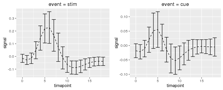
※y軸の幅をylimで設定してしまうとその範囲に含まれないデータはstat_summaryでの計算に含まれなくなるので注意が必要です(上記のmean, sd)。
RではgridExtraライブラリを使用して図を並べるのが多いようです。
patchwork関数も便利みたいです(解説されている記事はこちら)。
fig, ax = plt.subplots(1, 2, figsize=(16, 6))
fig.subplots_adjust(left=0.0625, right=0.95, wspace=0.2)

for i, degree in enumerate(fmri['event'].unique()):
    tmp = fmri[fmri['event'] == degree]
    sns.lineplot(x='timepoint', y='signal', data=tmp,
                 ax=ax[i], err_style='bars', ci='sd') #axで図番号の指定
    ax[i].set_ylim(-0.1, 0.25)
    ax[i].lines[0].set_linestyle("--")
    ax[i].set_title('event = {0}'.format(degree), size=18)
plot設定
seaborn plotの細かな設定
ラベルやタイトル、凡例は頻繁に変更しますよね。
.set_xxxx()で図の設定を追加できます。
変更できるパラメーターはmatplotlibのこちらの項目ですね。
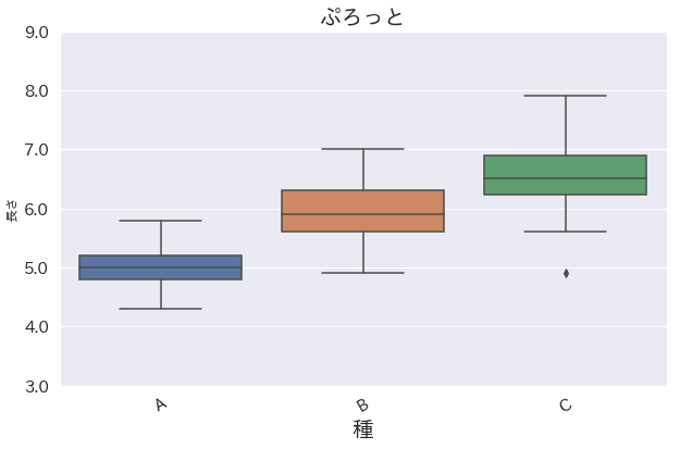
plt.figure(figsize=(10, 6))#グラフサイズ変更
xtick_label = ["A","B","C"] #xラベル指定
g = sns.boxplot(x='species', y='sepal_length', data=iris)
g.set_xticklabels(labels=xtick_label, fontsize=15, rotation=30 ) #x軸目盛ラベル
# plt.xticks(rotation=90, horizontalalignment='center', fontsize=15) x軸目盛ラベルの回転はこれも可
g.set_ylim(3,9) #y軸目盛範囲
g.set_yticklabels(labels = g.get_yticks(), fontsize=15) #y軸目盛ラベル
g.set_xlabel("種", fontsize=20) #x軸ラベル
g.set_ylabel("長さ") #y軸ラベル
g.set_title("ぷろっと", fontsize=20) #title
h, l = g.get_legend_handles_labels()#凡例情報取得
g.legend(h,('任意のhogehoge'))#凡例設定
plt.legend(loc="best", frameon=True, edgecolor="gray") #凡例位置情報
# g.legend().set_visible(False) #凡例を消去
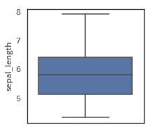
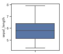
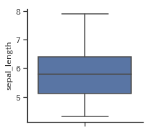
スタイル設定
前述の事前準備の項でsns.set()によりseabornの描画スタイルを適用しましたが、別スタイルにも変更できます。
sns.set(style='darkgrid')
plt.figure(figsize=(3,3))
sns.boxplot(y='sepal_length', data=iris)
# sns.despine()
| darkgrid(標準) | whitegrid | dark |
|---|---|---|
 |
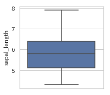 |
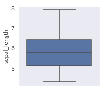 |
| white | ticks | sns.dispine |
|---|---|---|
 |
 |
 |
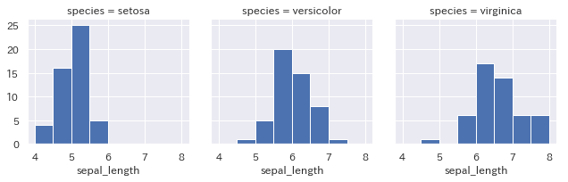
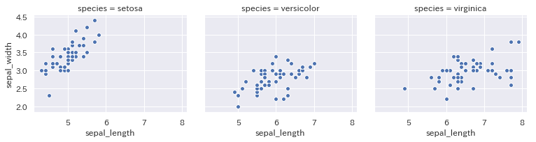
おまけ:seabornによる層別グラフ(FacetGrid)
層別ヒストグラム
g = sns.FacetGrid(iris, col="species") #colとrowでgridを描画
g = g.map(plt.hist, "sepal_length", bins=np.linspace(4,8,9)) #histを描画
層別散布図
g = sns.FacetGrid(iris, col="species", height=3, aspect=1.2) #colとrowでgridを描画、heightとaspcetで描画サイズを変更
g = g.map(plt.scatter, "sepal_length", "sepal_width", edgecolor="white") #scatterを描画
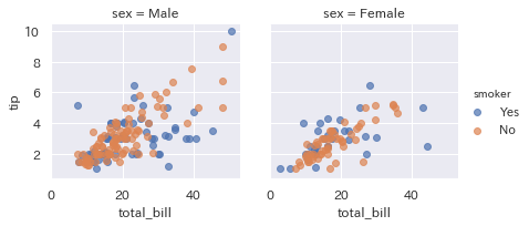
g = sns.FacetGrid(tips, col="sex", hue="smoker") #グループ分けしてみたり
g.map(plt.scatter, "total_bill", "tip", alpha=.7)
g.add_legend();
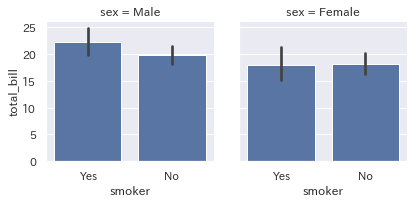
層別棒グラフ
g = sns.FacetGrid(tips, col="sex")
g = g.map(sns.barplot, "smoker", "total_bill")
まとめ
seabornのスタイルはggplot2に似ているため非常に見やすいグラフです。
同様に簡単に作れるので積極的に使っていこうと思います。