Nuxt.js(Vue) でライブラリ等を使用せずモーダルを作成する方法です。
モーダル用のコンポーネントを作る
Modal.vue
<template>
  <transition name="modal" appear>
    <div class="modal__overlay">
      <div class="modal__window">
        <div class="modal__content">
          <slot />
        </div>
      </div>
    </div>
  </transition>
</template>

<style lang="scss" scoped>
.modal {
  &__overlay {
    display: flex;
    align-items: center;
    justify-content: center;
    position: fixed;
    z-index: 100;
    top: 0;
    left: 0;
    height: 100%;
    width: 100%;
    background: rgba(0, 0, 0, 0.7);
  }

  &__window {
    height: 70%;
    width: 70%;
    overflow: hidden;
    background-color: aquamarine;
  }

  &__content {
    height: 100%;
    padding: 30px;
  }
}

// transition
.modal-enter-active,
.modal-leave-active {
  transition: opacity 0.4s;
  .modal__window {
    transition: opacity 0.4s, transform 0.4s;
  }
}
.modal-leave-active {
  transition: opacity 0.6s ease 0.4s;
}
.modal-enter,
.modal-leave-to {
  opacity: 0;
  .modal__window {
    opacity: 0;
    transform: translateY(-20px);
  }
}
</style>
<slot/>を使うことでモーダル中身を変更できるようになります。一度このコンポーネントを作ってしまえば使い回しも容易です。
上記で作ったmodalコンポーネントをモーダルを実装したいコンポーネントで読み込みます。
index.vue
<template>
  <div >
    <button class="help_link__button" @click="openModal">
      モーダルを開く
    </button>
    <Modal v-if="modalFlag">
      <div>モーダルの内容</div>
      <div>モーダルの内容</div>
      <div>モーダルの内容</div>
      <div>モーダルの内容</div>
      <div>モーダルの内容</div>
      <button @click="closeModal">閉じる</button>
    </Modal>
  </div>
</template>

<script lang="ts">
import Vue from 'vue'
import Modal from '~/components/Modal.vue'

export default Vue.extend({
  components: {
    Modal
  },
  data() {
    return {
      modalFlag: false
    }
  },
  methods: {
    openModal() {
      this.modalFlag = true
    },
    closeModal() {
      this.modalFlag = false
    }
  }
})
</script>
@click="openModal"でmodalFlag = true or falseに切り替えています。
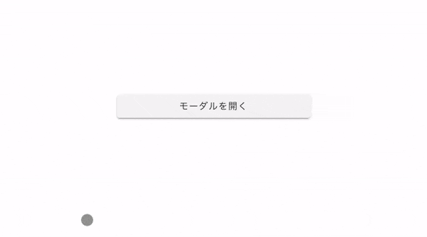
上記の画像のように、閉じるボタンを押せばモーダルが消える仕様です。
どこを押しても閉じるモーダルの実装
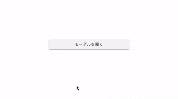
モーダルの実装方法で、下記の画像のように、外枠のどこを押しても閉じるパターンがあります。
そのパターンの実装方法です。
Modal.vue
<template>
  <transition name="modal" appear>
    <div class="modal__overlay" @click.self="closeModal">
      <div class="modal__window">
        <div class="modal__content">
          <slot />
        </div>
      </div>
    </div>
  </transition>
</template>

<script lang="ts">
import Vue from 'vue'
export default Vue.extend({
  methods: {
    closeModal() {
      this.$emit('close-modal')
    }
  }
})
</script>

<style lang="scss" scoped>
// 変更箇所ないので省略
</style>
外枠部分にclickイベントを設定します。そして、$emitを使い親要素のイベントを発火させます。
index.vue
<template>
  <div >
    <button class="help_link__button" @click="openModal">
      モーダルを開く
    </button>
    <Modal v-if="modalFlag" @close-modal="closeModal" >
      <div>モーダルの内容</div>
      <div>モーダルの内容</div>
      <div>モーダルの内容</div>
      <div>モーダルの内容</div>
      <div>モーダルの内容</div>
      <button @click="closeModal">閉じる</button>
    </Modal>
  </div>
</template>

<script lang="ts">
import Vue from 'vue'
import Modal from '~/components/Modal.vue'

export default Vue.extend({
  components: {
    Modal
  },
  data() {
    return {
      modalFlag: false
    }
  },
  methods: {
    openModal() {
      this.modalFlag = true
    },
    closeModal() {
      this.modalFlag = false
    }
  }
})
</script>
@close-modal="closeModal"で子要素であるModal.vueのイベントを受け取っており、modalFlag = true or falseを切り替えています。
これで外枠どこを押しても閉じるモーダルウィンドウができます。
最後に
今回は、ライブラリを使わずにNuxt.js(Vue) で、自作モーダル作成する方法をまとめました。
一度コンポーネントを作ってしまえば、使い回しもできるのでかなり便利です。
ライブラリを使ってサクッとモーダルを実装する方法も下記の記事でまとめているので、良かったらご覧ください。
【vue-js-modal】を使ってNuxt.js(vue.js)でモーダルを実装してみた