はじめに
百聞は一見にしかず
以下は Phoenix Storybook 公式の画像です

バッジやスライドバーなどの部品について、どういうプロパティがあり、それをどう設定したらどういう外観、動作になるのか表示しています
これがあれば、画面に配置する前に部品=コンポーネントだけで外観、動作の確認ができます
ブラウザ上でプロパティを対話的に変えてみることも可能です
各コンポーネントにどういうプロパティがあって、どういう動作をするのか、開発者間で共有するのにも直観的で簡単です
部品を組み合わせて画面を作っていく「コンポーネントベース開発」には欠かせないツールと言えるでしょう
今回はこの Phoenix Storybook を Phoenix フレームワークのプロジェクトに組み込んでいきます
実装したコード(Petal Boilerplate のフォーク)はこちら
Storybook とは
前述の通り、 Storybook は画面のコンポーネントを開発する際、外観や動作、プロパティなどをブラウザ上で動かしながら確認できるツールです
本家は React 用のものですが、 Vue など他のフレームワークのバージョンも存在しています
公式の TOP には以下の文言があります
Build UIs without the grunt work
「面倒な作業のない UI 開発」です
Storybook なしの React 開発は考えたくありません
そして、 Storybook の Phoenix バージョンが Phoenix Storybook です
実行環境
実行日: 2023/02/24
- macOS Ventura 13.2.1
- Erlang/OTP 25.2.3
- Elixir 1.14.3
- Rancher Desktop 1.7.0
実行日現在、 Phoenix Storybook の Hex 上の最新は 0.4.5 ですが、 GitHub 上の最新版が Phoenix 1.7 に対応しているため、こちらを使います
元リポジトリー
今回は Petal Components を使ったボイラープレート(プロジェクトの雛形)である Petal Boilerplate に Storybook を組み込んでいきます
元のプロジェクトをそのままいじりたくたいので、フォークしてからクローンします
私の場合は https://github.com/RyoWakabayashi/petal_boilerplate にフォークしました
git clone https://github.com/RyoWakabayashi/petal_boilerplate.git
以降、このプロジェクトのディレクトリー内で作業します
cd petal_boilerplate
環境構築
依存モジュールへの追加
各モジュールについて、最新版を取ってきたいので mix.lock は消しておきます
rm -rf mix.lock
mix.exs に phoenix_storybook を追加します
...
      {:phoenix_live_view, "~> 0.18.3"},
+     {:phoenix_storybook, "~> 0.5.0"},
      {:floki, ">= 0.30.0", only: :test},
...
2023/02/27 Phoenix Storybook 0.5.0 がリリースされました
mix.exs の変更後、依存モジュールを取得します
mix deps.get
Storybook 用の変更
以下のコマンドを実行すると、 Storybook 用のファイルが生成されます
ただし、一部手動で変更する必要があるため、コマンド実行中に変更箇所を教えてくれます
mix phx.gen.storybook
以下、各手作業について説明します
ルーターの変更
mix phx.gen.storybook 実行中、以下のメッセージが表示されます
...
* manual setup instructions:
  Add the following to your router.ex:

    use PetalBoilerplateWeb, :router
    import PhoenixStorybook.Router

    scope "/" do
      storybook_assets()
    end

    scope "/", PetalBoilerplateWeb do
      pipe_through(:browser)
      live_storybook "/storybook", backend_module: PetalBoilerplateWeb.Storybook
    end


[Y to continue] [Yn]
lib/<プロジェクト名>_web/router.ex を以下のように編集し、 /storybook でストーリーブックにアクセスできるようにします
defmodule PetalBoilerplateWeb.Router do
  use PetalBoilerplateWeb, :router
+ import PhoenixStorybook.Router

  pipeline :browser do
    ...
  end

  pipeline :api do
    plug :accepts, ["json"]
  end

+ scope "/" do
+   storybook_assets()
+ end

  scope "/", PetalBoilerplateWeb do
    pipe_through :browser

    get "/", PageController, :home
    live "/live", PageLive, :index
    live "/live/modal/:size", PageLive, :modal
    live "/live/slide_over/:origin", PageLive, :slide_over
    live "/live/pagination/:page", PageLive, :pagination
+   live_storybook "/storybook", backend_module: PetalBoilerplateWeb.Storybook
  end
...
設定ファイルの変更
続いて config/config.exs を変更するように言われます
* manual setup instructions:
  Add js/storybook.js as a new entry point to your esbuild args in config/config.exs:

    config :esbuild,
    default: [
      args:
        ~w(js/app.js js/storybook.js --bundle --target=es2017 --outdir=../priv/static/assets ...),
      ...
    ]


[Y to continue] [Yn]
config/config.exs の JavaScript ビルドに関する設定に js/storybook.js を追加します
config :esbuild,
  version: "0.15.5",
  default: [
    args:
-     ~w(js/app.js --bundle --target=es2017 --outdir=../priv/static/assets --external:/fonts/* --external:/images/*),
+     ~w(js/app.js js/storybook.js --bundle --target=es2017 --outdir=../priv/static/assets --external:/fonts/* --external:/images/*),
    cd: Path.expand("../assets", __DIR__),
    env: %{"NODE_PATH" => Path.expand("../deps", __DIR__)}
  ]
また config/config.exs を変更するよう言われます
* manual setup instructions:
  Add a new Tailwind build profile for css/storybook.css in config/config.exs:

    config :tailwind,
      ...
      default: [
        ...
      ],
      storybook: [
        args: ~w(
          --config=tailwind.config.js
          --input=css/storybook.css
          --output=../priv/static/assets/storybook.css
        ),
        cd: Path.expand("../assets", __DIR__)
      ]


[Y to continue] [Yn]
config/config.exs の Tailwind CSS に関する設定について、 Storybook 用の設定を追加します
config :tailwind,
  version: "3.2.4",
  default: [
    ...
- ]
+ ],
+ storybook: [
+   args: ~w(
+     --config=tailwind.config.js
+     --input=css/storybook.css
+     --output=../priv/static/assets/storybook.css
+   ),
+   cd: Path.expand("../assets", __DIR__)
+ ]
今度は config/dev.exs を変更するよう言われます
* manual setup instructions:
  Add a new endpoint watcher for your new Tailwind build profile in config/dev.exs:

    config :petal_boilerplate_web, PetalBoilerplateWeb.Endpoint,
      ...
      watchers: [
        ...
        storybook_tailwind: {Tailwind, :install_and_run, [:storybook, ~w(--watch)]}
      ]


[Y to continue] [Yn]
config/dev.exs のリロード用監視先に Storybook 用の設定を追加します
config :petal_boilerplate, PetalBoilerplateWeb.Endpoint,
  ...
  watchers: [
    esbuild: {Esbuild, :install_and_run, [:default, ~w(--sourcemap=inline --watch)]},
-   tailwind: {Tailwind, :install_and_run, [:default, ~w(--watch)]}
+   tailwind: {Tailwind, :install_and_run, [:default, ~w(--watch)]},
+   storybook_tailwind: {Tailwind, :install_and_run, [:storybook, ~w(--watch)]}
  ]
再び config/dev.exs の変更を求められます
* manual setup instructions:
  Add a new live_reload pattern to your endpoint in config/dev.exs:

    config :petal_boilerplate_web, PetalBoilerplateWeb.Endpoint,
      live_reload: [
        patterns: [
          ...
          ~r"storybook/.*(exs)$"
        ]
      ]


[Y to continue] [Yn]
config/dev.exs の LiveReload 監視先に Storybook のコードを追加します
config :petal_boilerplate, PetalBoilerplateWeb.Endpoint,
  live_reload: [
    patterns: [
      ...
-     ~r"lib/petal_boilerplate_web/(controllers|live|components)/.*(ex|heex)$"
+     ~r"lib/petal_boilerplate_web/(controllers|live|components)/.*(ex|heex)$",
+     ~r"storybook/.*(exs)$"
    ]
  ]
フォーマッターの変更
最後に .formatter.exs の変更を要求されます
* manual setup instructions:
  Add your storybook content to .formatter.exs

    [
      import_deps: [...],
      inputs: [
        ...
        "storybook/**/*.exs"
      ]
    ]


[Y to continue] [Yn]
.formatter.exs の入力元に Storybook のコードを追加します(横に長くなるので整えています)
- inputs: ["*.{heex,ex,exs}", "priv/*/seeds.exs", "{config,lib,test}/**/*.{heex,ex,exs}"],
+ inputs: [
+   "*.{heex,ex,exs}",
+   "priv/*/seeds.exs",
+   "{config,lib,test}/**/*.{heex,ex,exs}",
+   "storybook/**/*.exs"
+ ],
これで mix gen.phx.storybook の実行が完了します
この時点でサンプルの Storybook も生成されていますが、あくまでもサンプルなので動かないものもあります
DB 構築
すでに DB を別途用意している場合は不要ですが、まだの場合は PostgreSQL の DB を構築します
今回は Docker コンテナで PostgreSQL を起動します
docker-compose.yml を以下の内容で作成します
version: "3.8"
services:
  db:
    image: postgres:14.4
    restart: always
    environment:
      - POSTGRES_PASSWORD=postgres
      - POSTGRES_USER=postgres
    ports:
      - 5432:5432
    volumes:
      - db:/var/lib/postgresql/data
volumes:
  db:
    driver: local
コンテナを起動します
docker-compose up -d
セットアップを実行します
mix setup
CSS の修正
Petal Boilerplate では assets/css/app.css を以下のように修正する必要がありました
@import "tailwindcss/base";
-@import "../../../petal_components/assets/default.css";
+@import "../../deps/petal_components/assets/default.css";
@import "tailwindcss/components";
@import "tailwindcss/utilities";
また、生成される assets/css/storybook.css でも同じものをインポートする必要があります
@import "tailwindcss/base";
+@import "../../deps/petal_components/assets/default.css";
@import "tailwindcss/components";
@import "tailwindcss/utilities";
...
Phoenix の起動
以下のコマンドで Phoenix を起動します
mix phx.server
ブラウザで htpp://localhost:4000 を開きます
Petal Boilerplate の TOP 画面では、 Petal Components の外観が表示されます
ただし、これだと各コンポーネントをどう使えばいいのか分かりません
もちろん、ボイラープレートの lib/petal_boilerplate_web/controllers/page_html/home.html.heex を見ればコードの実例が分かるのですが、それは面倒だし、プロパティの項目や値の全量も分かりません
Storybook の表示
いよいよ Storybook の出番です
ブラウザから http://localhost:4000/storybook にアクセスします
すると、自動的に Storybook の Welcome ページに遷移します
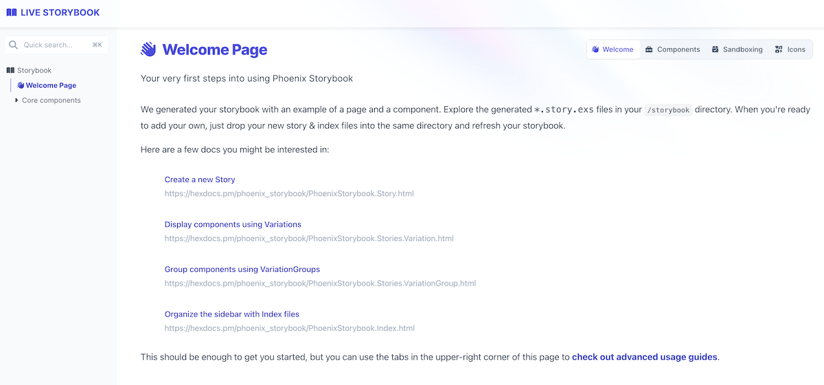
Welcome ページでは Storybook の使い方について説明があります
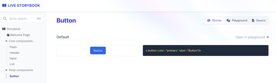
左メニューにある Core components 配下がサンプルとして生成されたものです
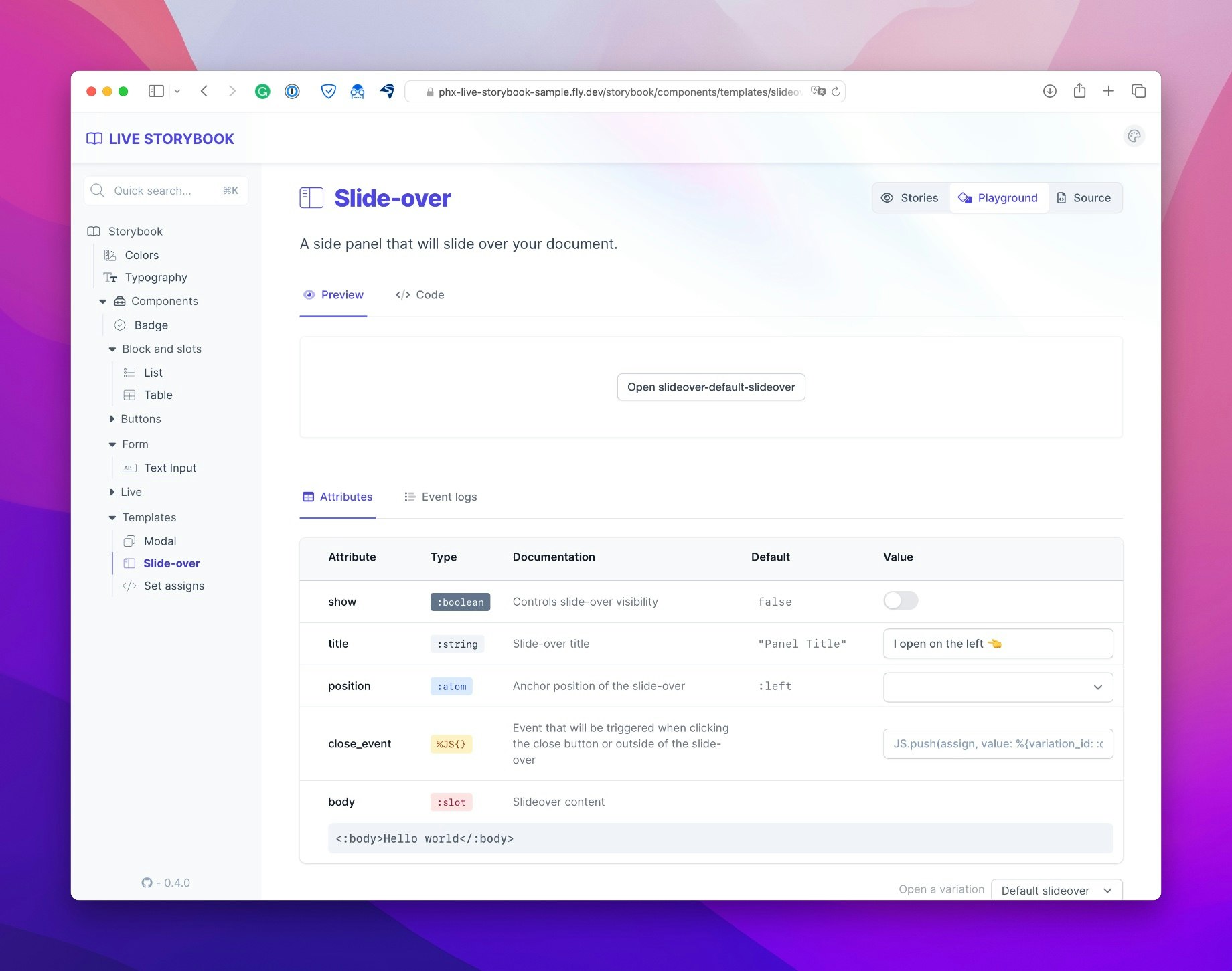
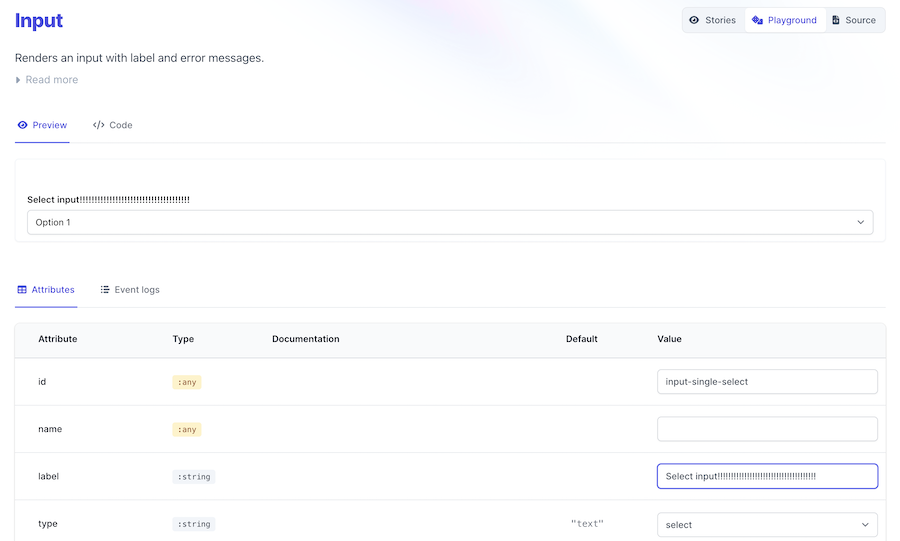
Core components を開くと出てくる Input をクリックします
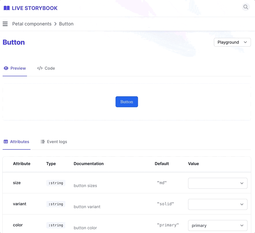
すると、した画像のように、左側に UI 、 右側にコードが表示されます
これなら「どう書いたら、どうなるのか」が一目瞭然です
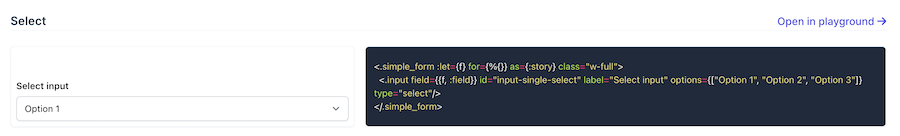
下へスクロールしていくと、 Select の場合があるので、その Select の文言の右端にマウスカーソルを持っていくと、 Open in playground → のリンクが見えるで、クリックします
Playground では、プロパティを変えてみることができます
ここで色々な実験ができるわけです
Storybook の修正
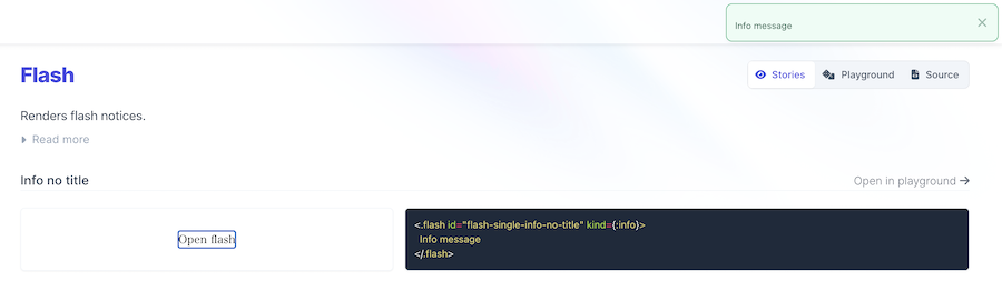
サンプルで作成された Storybook のうち、 Flash と Header はエラーになります
このプロジェクトの CoreComponents の中に button 関数が存在しないためです
それぞれ以下のように修正します
Flash
storybook/core_components/flash.story.exs
defmodule Storybook.CoreComponents.Flash do
  use PhoenixStorybook.Story, :component
  alias Elixir.PetalBoilerplateWeb.CoreComponents

  def function, do: &CoreComponents.flash/1
- def imports, do: [{CoreComponents, [button: 1, show: 1]}]
+ def imports, do: [
+   {PetalComponents.Button, [button: 1]},
+   {CoreComponents, [show: 1]}
+ ]
...
修正後に Flash の Storybook を開くと、 Open Flash ボタンクリックで画面右上にメッセージが表示されます
Header
storybook/core_components/header.story.exs
defmodule Storybook.CoreComponents.Header do
  use PhoenixStorybook.Story, :component
  alias Elixir.PetalBoilerplateWeb.CoreComponents

  def function, do: &CoreComponents.header/1
- def imports, do: [{CoreComponents, [button: 1]}]
+ def imports, do: [{PetalComponents.Button, [button: 1]}]
...
こちらも修正後に Header を開くとヘッダーのプレビューを見ることができあます
Storybook の作成
では、自分で Storybook を作ってみましょう
バリエーション
以下の内容で storybook/petal_components/button.story.exs を作成します
defmodule Storybook.PetalComponents.Button do
  use PhoenixStorybook.Story, :component

  def function, do: &PetalComponents.Button.button/1

  def variations do
    [
      %Variation{
        id: :default,
        attributes: %{
          label: "Button",
          color: "primary"
        }
      }
    ]
  end
end
def function, do: ... で Storybook の対象にしたい関数(コンポーネント)を指定します
def variations do ... end で Storybook に表示したいプロパティのバリエーションを指定します
ファイルを追加すると、自動的に左メニューにも追加されます
Playground で色々変えてみましょう
外観を自由自在に変化させられるので、非常に便利ですね
バリエーショングループ
VariationGroup を使うと、パラメーターを変化させた複数のコンポーネントをグループ化できます
先ほどの Storybook を以下のように書き換えます
defmodule Storybook.PetalComponents.Button do
  use PhoenixStorybook.Story, :component

  @colors ~w(primary secondary info success warning danger gray pure_white white)a

  def function, do: &PetalComponents.Button.button/1

  def variations do
    [
      %Variation{
        id: :default,
        attributes: %{
          label: "Button",
          color: "primary"
        }
      },
      %VariationGroup{
        id: :colors,
        variations:
          for color <- @colors do
            %Variation{
              id: color,
              attributes: %{
                color: to_string(color),
                label: String.capitalize("#{color}")
              }
            }
          end
      },
    ]
  end
end
すると、以下のように表示されます
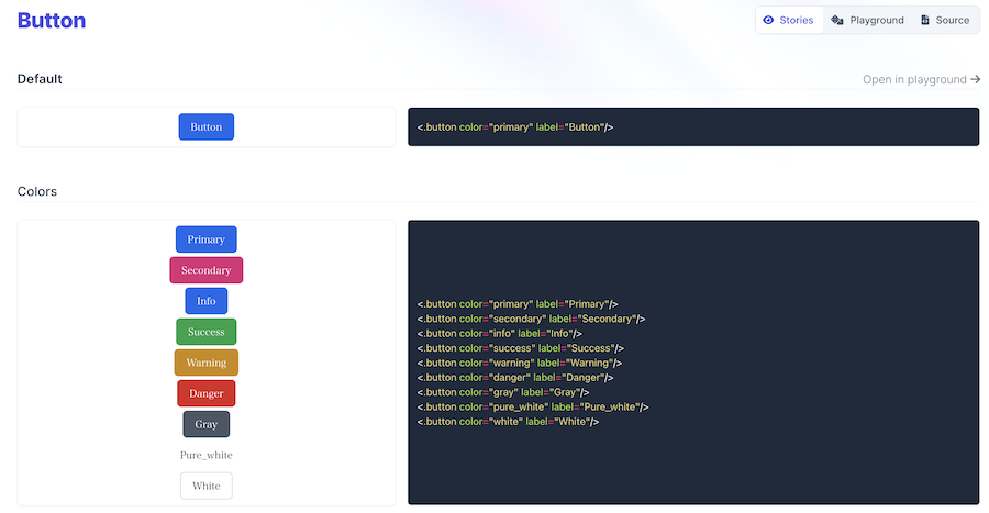
一度に並べて表示できるので、違いが分かりやすいです
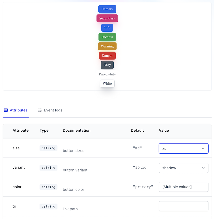
この状態で Playground に行くと、変化させた項目には [Multiple values] と表示されて変更不可になっています
それ以外の項目を変更すると、まとめて全部のボタンが変化します
イベント
Playground では、 JavaScript から Elixir に Push されたイベントをログとして表示できます
これでちゃんとイベントが発生しているか、イベントの内容がどうなっているか確認できます
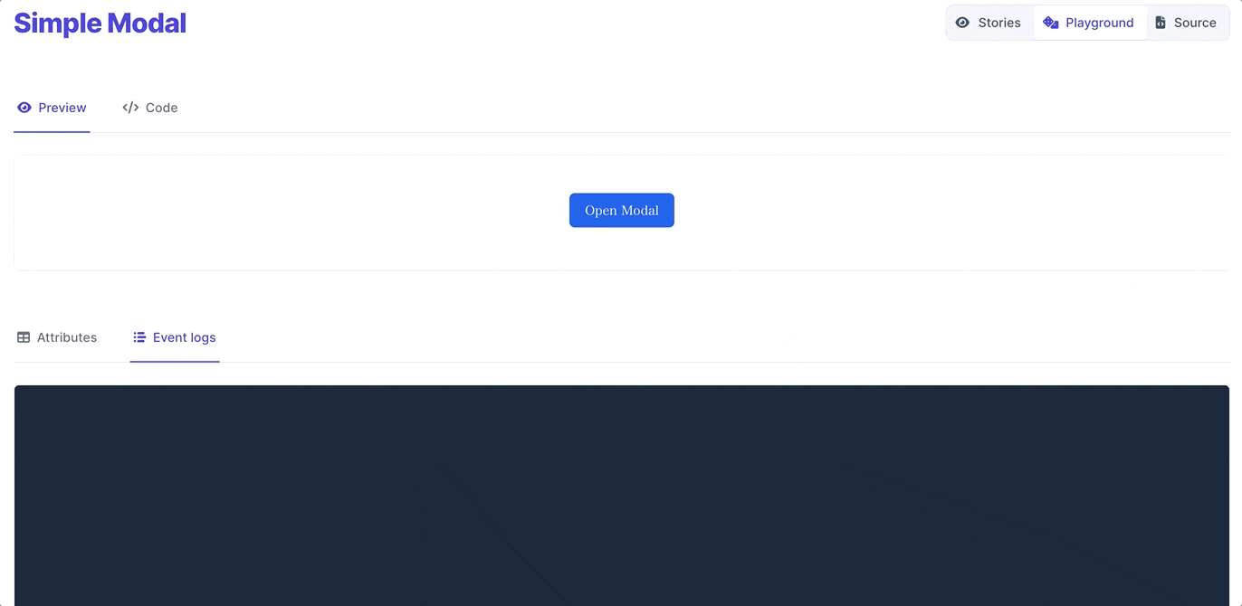
以下のようなコンポーネント(Petal Components の Modal を改造したもの)を作ります
モーダルが閉じたとき、 close_modal のイベントを Push しています
lib/petal_boilerplate_web/components/simple_modal.ex
defmodule PetalComponents.SimpleModal do
  use Phoenix.Component

  alias Phoenix.LiveView.JS

  import PetalComponents.Helpers

  attr(:title, :string, default: nil, doc: "modal title")

  attr(:close_modal_target, :string,
    default: nil,
    doc:
      "close_modal_target allows you to target a specific live component for the close event to go to. eg: close_modal_target={@myself}"
  )

  attr(:max_width, :string,
    default: "md",
    values: ["sm", "md", "lg", "xl", "2xl", "full"],
    doc: "modal max width"
  )

  attr(:rest, :global)
  slot(:inner_block, required: false)

  def modal(assigns) do
    assigns =
      assigns
      |> assign(:classes, get_classes(assigns))

    ~H"""
    <div {@rest} id="modal" phx-mounted={init_modal()}>
      <div id="modal-overlay" class="pc-modal__overlay" aria-hidden="true"></div>
      <div class="pc-modal__wrapper" id="modal-wrapper" role="dialog" aria-modal="true">
        <div
          id="modal-content"
          class={@classes}
          phx-click-away={hide_modal(@close_modal_target)}
          phx-window-keydown={hide_modal(@close_modal_target)}
          phx-key="escape"
        >
          <!-- Header -->
          <div class="pc-modal__header">
            <div class="pc-modal__header__container">
              <div class="pc-modal__header__text">
                <%= @title %>
              </div>
              <button phx-click={hide_modal(@close_modal_target)} class="pc-modal__header__button">
                <div class="sr-only">Close</div>
                <svg class="pc-modal__header__close-svg">
                  <path d="M7.95 6.536l4.242-4.243a1 1 0 111.415 1.414L9.364 7.95l4.243 4.242a1 1 0 11-1.415 1.415L7.95 9.364l-4.243 4.243a1 1 0 01-1.414-1.415L6.536 7.95 2.293 3.707a1 1 0 011.414-1.414L7.95 6.536z" />
                </svg>
              </button>
            </div>
          </div>
          <!-- Content -->
          <div class="pc-modal__content">
            <%= render_slot(@inner_block) %>
          </div>
        </div>
      </div>
    </div>
    """
  end

  def init_modal() do
    %JS{}
    |> JS.remove_class("overflow-hidden", to: "body")
    |> JS.hide(to: "#modal-overlay")
    |> JS.hide(to: "#modal-content")
    |> JS.hide(to: "#modal-wrapper")
    |> JS.hide(to: "#modal")
  end

  # The live view that calls <.modal> will need to handle the "close_modal" event. eg:
  # def handle_event("close_modal", _, socket) do
  #   {:noreply, push_patch(socket, to: Routes.moderate_users_path(socket, :index))}
  # end
  def hide_modal(close_modal_target \\ nil) do
    js =
      %JS{}
      |> JS.remove_class("overflow-hidden", to: "body")
      |> JS.hide(
        transition: {
          "ease-in duration-200",
          "opacity-100",
          "opacity-0"
        },
        to: "#modal-overlay"
      )
      |> JS.hide(
        transition: {
          "ease-in duration-200",
          "opacity-100 translate-y-0 md:scale-100",
          "opacity-0 translate-y-4 md:translate-y-0 md:scale-95"
        },
        to: "#modal-content"
      )
      |> JS.hide(to: "#modal-wrapper")
      |> JS.hide(to: "#modal")

    if close_modal_target do
      JS.push(js, "close_modal", target: close_modal_target)
    else
      JS.push(js, "close_modal")
    end
  end

  # We are unsure of what the best practice is for using this.
  # Open to suggestions/PRs
  def show_modal(js \\ %JS{}) do
    js
    |> JS.add_class("overflow-hidden", to: "body")
    |> JS.show(
      transition: {
        "ease-in duration-300",
        "opacity-0",
        "opacity-100"
      },
      to: "#modal-overlay"
    )
    |> JS.show(
      transition: {
        "transition ease-in-out duration-200",
        "opacity-0 translate-y-4",
        "opacity-100 translate-y-0"
      },
      to: "#modal-content"
    )
    |> JS.show(to: "#modal-wrapper", display: "flex")
    |> JS.show(to: "#modal")
  end

  defp get_classes(assigns) do
    opts = %{
      max_width: assigns[:max_width] || "md",
      class: assigns[:class] || ""
    }

    base_classes = "pc-modal__box"
    max_width_class = "pc-modal__box--#{opts.max_width}"
    custom_classes = opts.class

    build_class([max_width_class, base_classes, custom_classes])
  end
end
このモーダルは show_modal で開き、 hide_modal で閉じます
Storybook を以下のように実装しましょう
モーダルが開いたり閉じたりするのを見るため、ボタンを用意しています
storybook/petal_components/simple_modal.story.exs
defmodule Storybook.PetalComponents.SimpleModal do
  use PhoenixStorybook.Story, :component

  def function, do: &PetalComponents.SimpleModal.modal/1

  def imports, do: [
    {PetalComponents.Button, [button: 1]},
    {PetalComponents.SimpleModal, [hide_modal: 0, show_modal: 0]}
  ]

  def template do
    """
    <.button phx-click={show_modal()} lsb-code-hidden>
      Open Modal
    </.button>
    <.lsb-variation/>
    """
  end

  def variations do
    [
      %Variation{
        id: :default,
        attributes: %{
          title: "Modal"
        },
        slots: [
          "Hello Modal",
          """
          <div class="flex justify-end">
            <.button phx-click={hide_modal()}>
              Close
            </.button>
          </div>
          """
        ]
      }
    ]
  end
end
Playground で下部のタブを Event logs にしていると、モーダルを閉じたときにイベントが来たのを確認できます
まとめ
これで部品作りが楽になったので、色々な部品を作ってみましょう