前回まででsinのグラフを表示できるようになりました。でもこのままだと「何のグラフか」が一目でわかりませんよね。今回はグラフにタイトルと軸ラベルを追加して、見やすいグラフに仕上げていきましょう。
第2弾
第3弾
目次
出発点:第2弾で作ったsinグラフ
第2弾で作ったこのグラフを出発点にします。
import matplotlib.pyplot as plt
import numpy as np

fig = plt.figure()
ax = fig.add_axes([0.1, 0.1, 0.8, 0.8])

x = np.linspace(0, 10, 100)
y = np.sin(x)

ax.plot(x, y)
plt.show()
表示結果
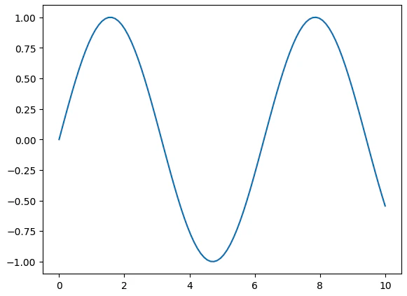
グラフは表示できていますが、タイトルも軸ラベルもなく、何を表しているグラフなのかわかりません。ここから順番に装飾していきましょう。
タイトルを追加する
タイトルを追加するにはax.set_title()を使います。
ax.set_title("sin(x)")
axのメソッドであることに注目してください。タイトルはAxes(グラフエリア)に対して設定するものです。
import matplotlib.pyplot as plt
import numpy as np

fig = plt.figure()
ax = fig.add_axes([0.1, 0.1, 0.8, 0.8])

x = np.linspace(0, 10, 100)
y = np.sin(x)

ax.plot(x, y)
ax.set_title("sin(x)")  # タイトルを追加
plt.show()
表示結果

軸ラベルを追加する
x軸・y軸のラベルはそれぞれax.set_xlabel()とax.set_ylabel()で追加します。
ax.set_xlabel("x")   # x軸ラベル
ax.set_ylabel("y")   # y軸ラベル
こちらもaxのメソッドです。
import matplotlib.pyplot as plt
import numpy as np

fig = plt.figure()
ax = fig.add_axes([0.1, 0.1, 0.8, 0.8])

x = np.linspace(0, 10, 100)
y = np.sin(x)

ax.plot(x, y)
ax.set_title("sin(x)")
ax.set_xlabel("x")    # x軸ラベルを追加
ax.set_ylabel("y")    # y軸ラベルを追加
plt.show()
表示結果

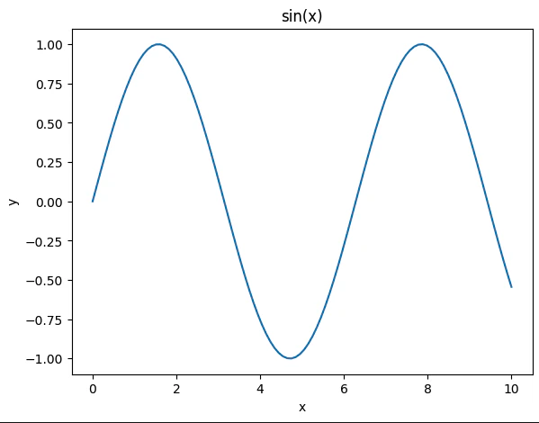
完成形:全部まとめて書く
タイトルと軸ラベルをすべて追加したコードがこちらです。
import matplotlib.pyplot as plt
import numpy as np

# ① Figureを作る
fig = plt.figure()

# ② Axesを作る
ax = fig.add_axes([0.1, 0.1, 0.8, 0.8])

# ③ データ作成
x = np.linspace(0, 10, 100)
y = np.sin(x)

# ④ Axesにプロット
ax.plot(x, y)

# ⑤ 装飾
ax.set_title("sin(x)")   # タイトル
ax.set_xlabel("x")       # x軸ラベル
ax.set_ylabel("y")       # y軸ラベル

# ⑥ 表示
plt.show()
表示結果
今回追加したメソッドを整理するとこうなります:
| メソッド | 役割 |
|---|---|
ax.set_title("文字列") |
グラフのタイトルを設定する |
ax.set_xlabel("文字列") |
x軸のラベルを設定する |
ax.set_ylabel("文字列") |
y軸のラベルを設定する |
まとめ
- タイトルは
ax.set_title()、軸ラベルはax.set_xlabel()/ax.set_ylabel()で追加できる - いずれも
ax(Axes)のメソッドなので、ax.から始まる -
ax.plot()でデータを描いた後に書くと整理しやすい
次回はグラフの線の色やスタイルを変える方法を見ていきます!