python==3.8
plotly==4.10.0
公式のギャラリーを参考にオプションを弄ってみる記事
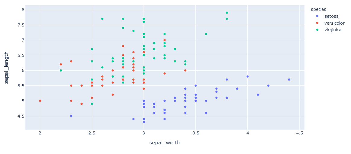
scatter(散布図)
基本
import plotly.express as px

df = px.data.iris()
fig = px.scatter(df, x="sepal_width", y="sepal_length", color="species", title="iris scatter plot")
fig.show()
分割
facetで描画する図面を分けて
add_traceからrow,colを指定してどの図面に上書きするか決める
import plotly.express as px
df = px.data.iris()
fig = px.scatter(df, x="sepal_width", y="sepal_length", color="species", facet_col="species",
                 title="Add line subplot")

reference_line = go.Scatter(x=[2, 4],
                            y=[4, 8],
                            mode="lines",
                            line=go.scatter.Line(color="gray"),
                            showlegend=False)

fig.add_trace(reference_line, row=1, col=1)
fig.add_trace(reference_line, row=1, col=2)
fig.add_trace(reference_line, row=1, col=3)

fig.show()

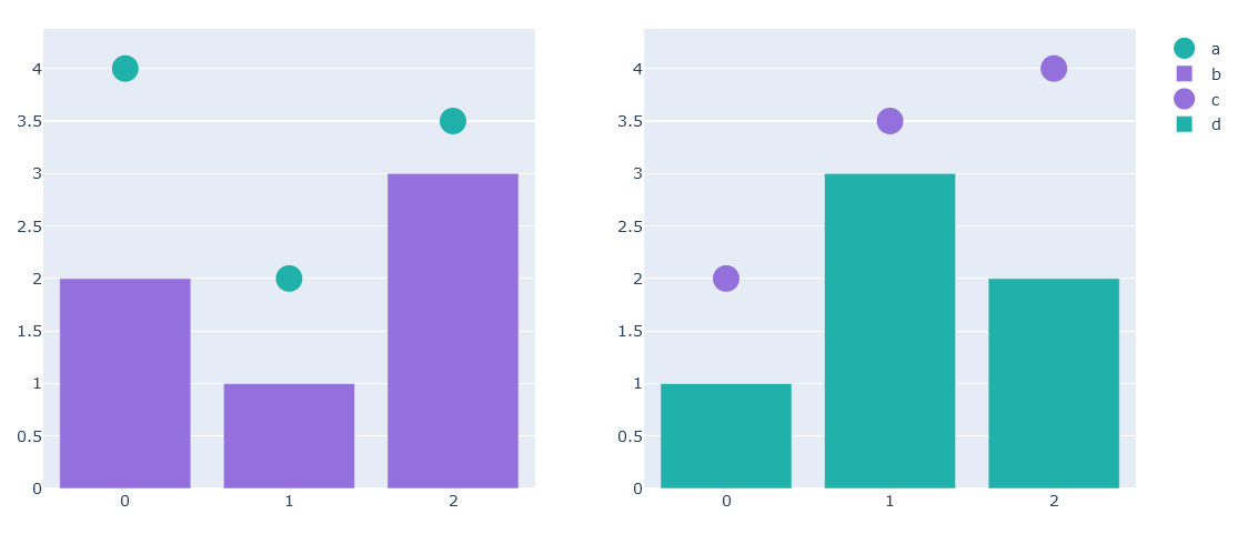
異なるタイプのグラフオブジェクトを上書き
from plotly.subplots import make_subplots

fig = make_subplots(rows=1, cols=2)

fig.add_scatter(y=[4, 2, 3.5], mode="markers",
                marker=dict(size=20, color="LightSeaGreen"),
                name="a", row=1, col=1)

fig.add_bar(y=[2, 1, 3],
            marker=dict(color="MediumPurple"),
            name="b", row=1, col=1)

fig.add_scatter(y=[2, 3.5, 4], mode="markers",
                marker=dict(size=20, color="MediumPurple"),
                name="c", row=1, col=2)

fig.add_bar(y=[1, 3, 2],
            marker=dict(color="LightSeaGreen"),
            name="d", row=1, col=2)

fig.show()
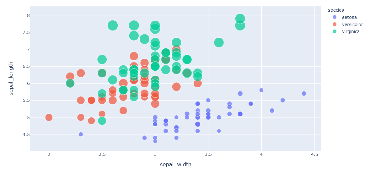
値の大きさによってsizeを変える(bubble)
import plotly.express as px
df = px.data.iris()
fig = px.scatter(df, x="sepal_width", y="sepal_length", color="species",
                 size='petal_length')
fig.show()
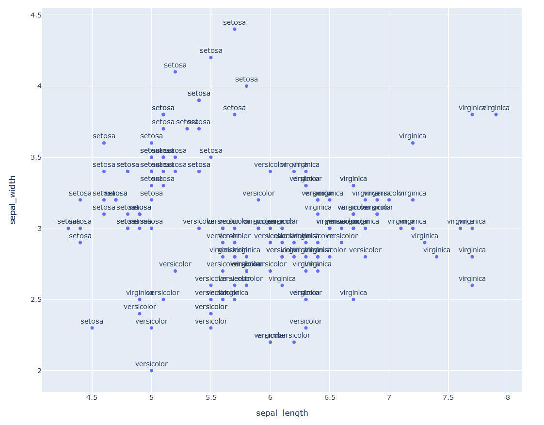
点ごとにテキストを振る
import plotly.express as px
fig = px.scatter(df, x="sepal_length", y="sepal_width", text="species", size_max=60)

fig.update_traces(textposition='top center')

fig.update_layout(
    height=800,
    title_text='iris label'
)

fig.show()
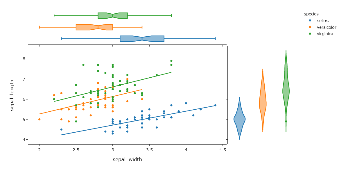
scatterでのjoin plot
import plotly.express as px
df = px.data.iris()
fig = px.scatter(df, x="sepal_width", y="sepal_length", color="species", marginal_y="violin",
           marginal_x="box", trendline="ols", template="simple_white")
fig.show()
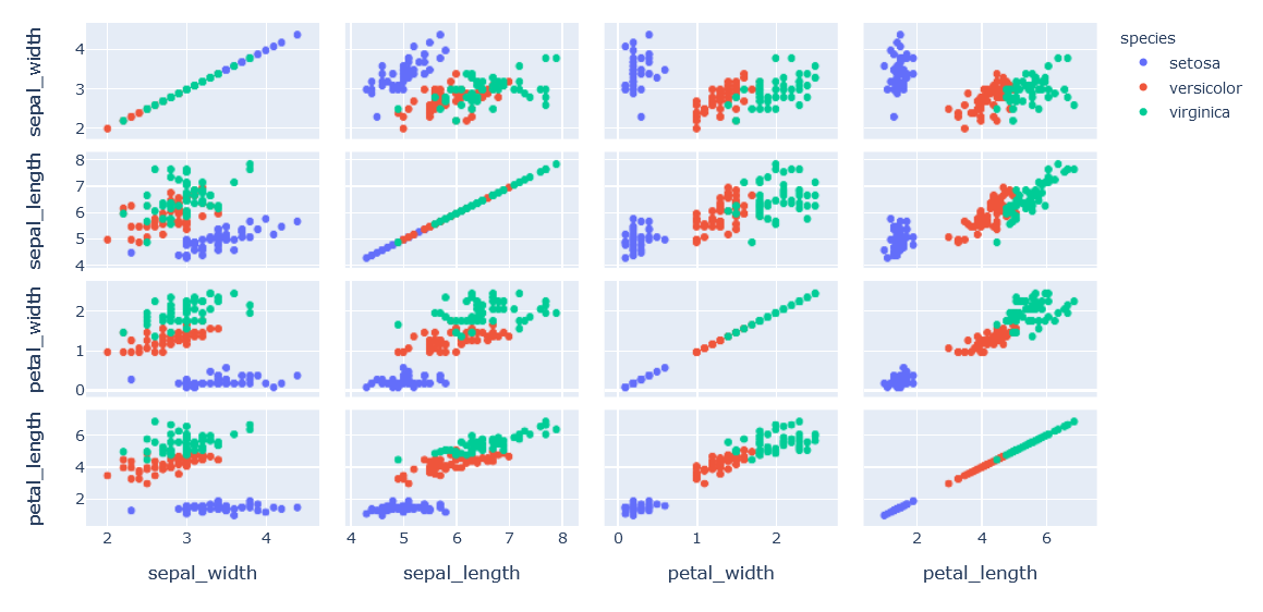
pair plot
import plotly.express as px
df = px.data.iris()
fig = px.scatter_matrix(df, dimensions=["sepal_width", "sepal_length", "petal_width", "petal_length"], color="species")
fig.show()
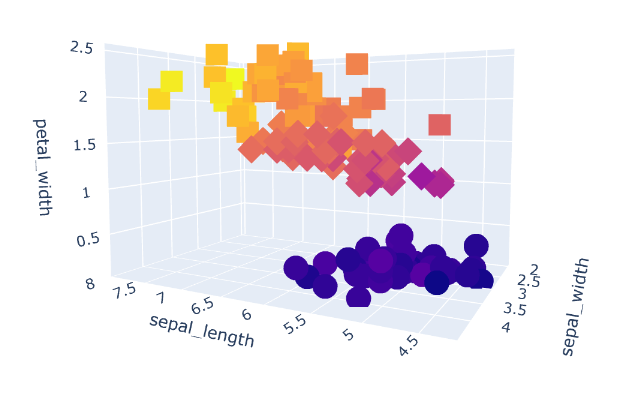
3d scatter
import plotly.express as px
df = px.data.iris()
fig = px.scatter_3d(df, x='sepal_length', y='sepal_width', z='petal_width',
                    color='petal_length', symbol='species')
fig.show()
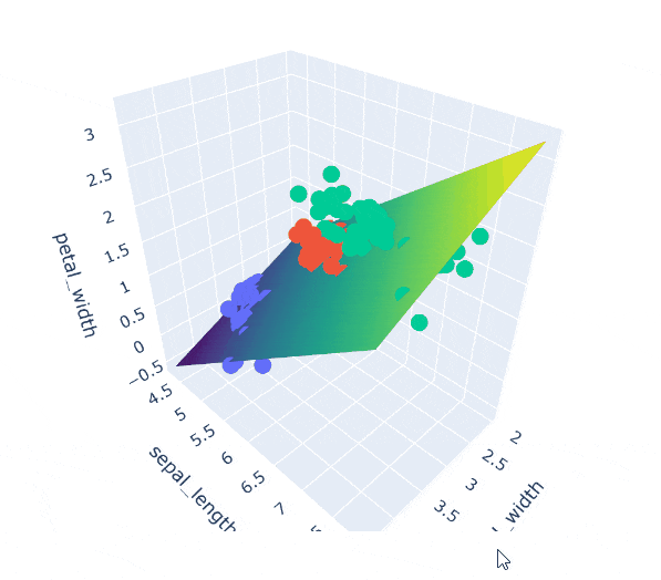
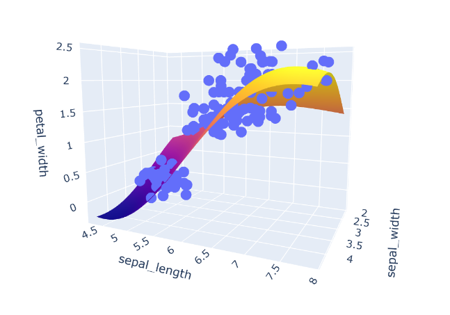
平面を追加する(surface)
import numpy as np
import plotly.express as px
import plotly.graph_objects as go
from sklearn.svm import SVR

df = px.data.iris()

# Xからの写像を作っておく

margin = 0
X = df[['sepal_width', 'sepal_length']]
y = df['petal_width']
model = SVR(C=1.)
model.fit(X, y)

# 細かい点(メッシュ,グリッド)を発生

mesh_size = .02
x_min, x_max = X.sepal_width.min() - margin, X.sepal_width.max() + margin
y_min, y_max = X.sepal_length.min() - margin, X.sepal_length.max() + margin
xrange = np.arange(x_min, x_max, mesh_size)
yrange = np.arange(y_min, y_max, mesh_size)
xx, yy = np.meshgrid(xrange, yrange)

# メッシュのすべての点について予測

pred = model.predict(np.c_[xx.ravel(), yy.ravel()])
pred = pred.reshape(xx.shape)

# 元の点をplotしてから、x1,x2によるgrid面をzによって押し上げる
# 面は全ての点をつなぐsurfaceをつかって描く

fig = px.scatter_3d(df, x='sepal_width', y='sepal_length', z='petal_width')
fig.update_traces(marker=dict(size=5))
fig.add_traces(go.Surface(x=xrange, y=yrange, z=pred, name='pred_surface'))
fig.show()
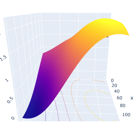
prjection Zで三次元グラフの等高線を軸面に表示することもできる
fig = go.Figure(data=[go.Surface(z=pred)])
fig.update_traces(contours_z=dict(show=True, usecolormap=True,
                                  highlightcolor="limegreen", project_z=True))

fig.show()
平面図での等高線
import plotly.graph_objects as go

fig = go.Figure()

fig.add_trace(go.Contour(
    z=pred,
    colorscale="Cividis",
))

fig.show()
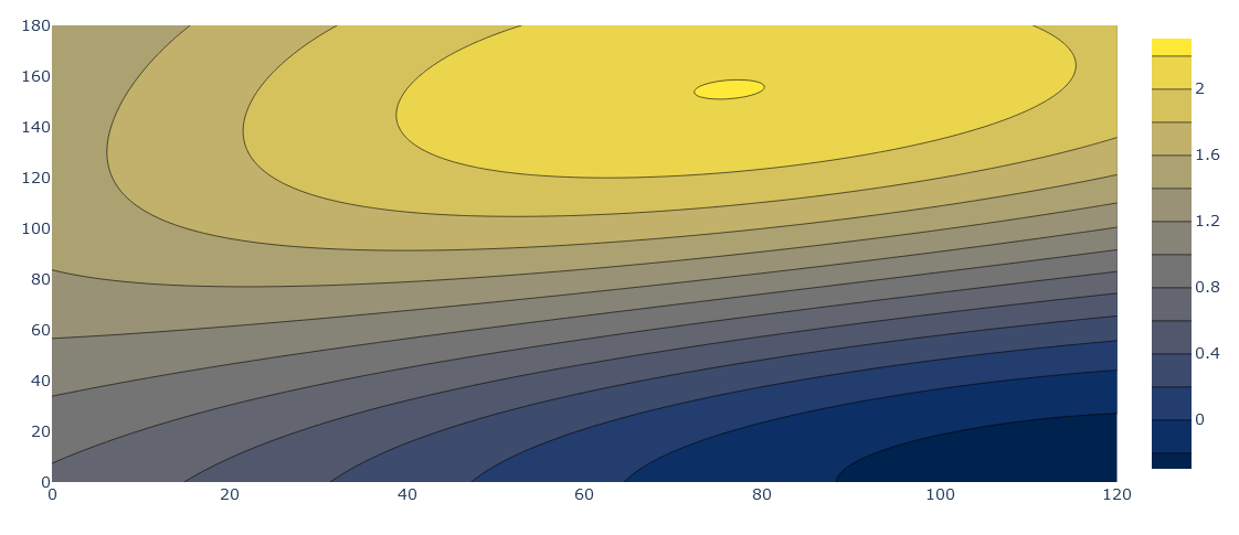
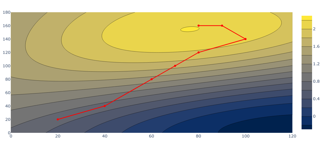
学習過程を可視化する
import plotly.graph_objects as go

fig = go.Figure()

fig.add_trace(go.Contour(
    z=pred,
    colorscale="Cividis",
))

fig.add_trace(
    go.Scatter(
        x=[20,40,60,70,80,100,90,80],
        y=[20,40,80,100,120,140,160,160],
        mode="markers+lines",
        name="steepest",
        line=dict(
            color="red"
        )
    )
)


fig.show()
モデルを置き換えてもいい
from sklearn.linear_model import LinearRegression

model_LR = LinearRegression()
model_LR.fit(X, y)


pred_LR = model_LR.predict(np.c_[xx.ravel(), yy.ravel()])
pred_LR = pred_LR.reshape(xx.shape)

fig = px.scatter_3d(df, x='sepal_width', y='sepal_length', z='petal_width',color='species')
fig.update_traces(marker=dict(size=5))
fig.add_traces(go.Surface(x=xrange, y=yrange, z=pred_LR, name='pred_LR_surface',colorscale='Viridis'))
fig.show()
その他
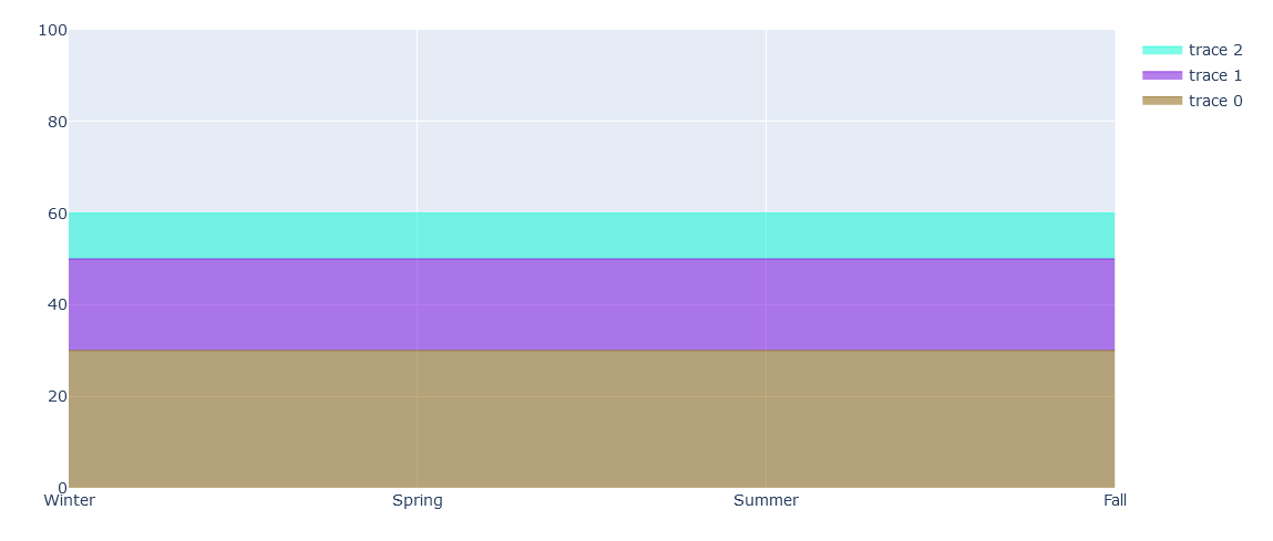
type = line
scatterをtype=lineにしてstackを指定することで積み上げ面積グラフにする
import plotly.graph_objects as go

x=['Winter', 'Spring', 'Summer', 'Fall']

fig = go.Figure()

fig.add_trace(go.Scatter(
    x=x, y=[30, 30, 30, 30],
    hoverinfo='x+y',
    mode='lines',
    line=dict(width=0.5, color='rgb(131, 90, 1)'),
        stackgroup='one'
))
fig.add_trace(go.Scatter(
    x=x, y=[20, 20, 20, 20],
    hoverinfo='x+y',
    mode='lines',
    line=dict(width=0.5, color='rgb(111, 1, 219)'),
        stackgroup='one'
))
fig.add_trace(go.Scatter(
    x=x, y=[10, 10, 10, 10],
    hoverinfo='x+y',
    mode='lines',
    line=dict(width=0.5, color='rgb(1, 247, 212)'),
        stackgroup='one'
))

fig.update_layout(yaxis_range=(0, 100))
fig.show()
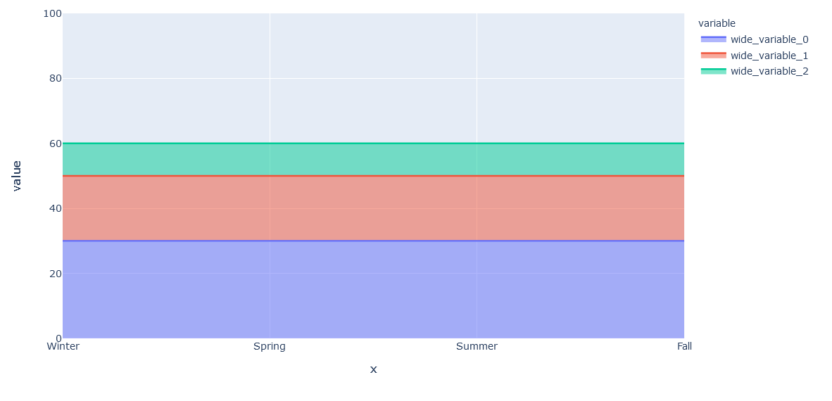
pxから簡単に行うのがarea
import plotly.express as px

fig = px.area(x=['Winter', 'Spring', 'Summer', 'Fall'],
              y=[[30, 30, 30, 30],
                [20, 20, 20, 20],
                [10, 10, 10, 10]]
             )
fig.update_layout(yaxis_range=(0, 100))
fig.show()
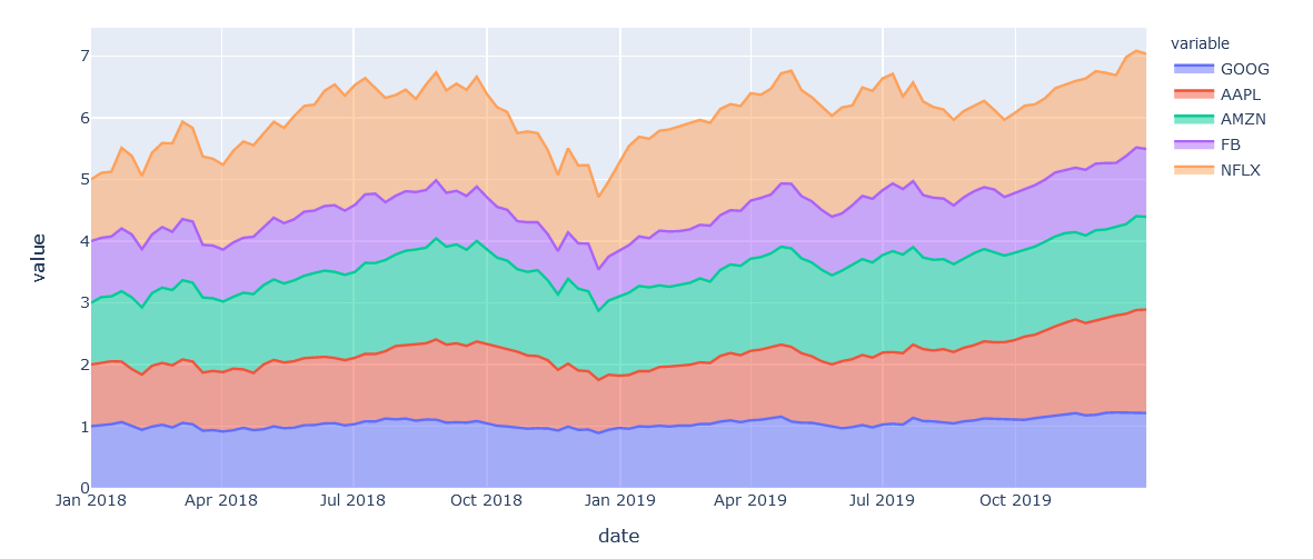
データフレームでareaに指定する場合
df = px.data.stocks()
fig = px.area(df,x='date', y=df.columns[1:6], title="6 company stocks plot")
fig.show()
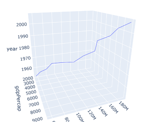
ついでにline_3dも
import plotly.express as px
df = px.data.gapminder().query("country=='Brazil'")
fig = px.line_3d(df, x="gdpPercap", y="pop", z="year")
fig.show()