python==3.8
plotly==4.10.0
ダッシュボード作成時に役立つtipsとしてインジケーターとガントチャートの紹介
インジケーター
基本
インジケーターを表示させるにはgraph_objectsのインジケーターから
import plotly.graph_objects as go
fig = go.Figure()

fig.add_trace(go.Indicator(
    mode = "number+delta",
    value = 300,
    number = {'prefix': "$"},
    delta = {'position': "top", 'reference': 320}))
fig.show()

図の上に表示させることもできる
import plotly.graph_objects as go

fig = go.Figure(go.Indicator(
    mode = "number+delta",
    value = 400,
    number = {'prefix': "$"},
    delta = {'position': "top", 'reference': 320},
    domain = {'x': [0, 1], 'y': [0, 1]}))

fig.add_trace(go.Scatter(
    y = [325, 324, 405, 400, 424, 404, 417, 432, 419, 394, 410, 426, 413, 419, 404, 408, 401, 377, 368, 361, 356, 359, 375, 397, 394, 418, 437, 450, 430, 442, 424, 443, 420, 418, 423, 423, 426, 440, 437, 436, 447, 460, 478, 472, 450, 456, 436, 418, 429, 412, 429, 442, 464, 447, 434, 457, 474, 480, 499, 497, 480, 502, 512, 492]))

#fig.update_layout(paper_bgcolor = "lightgray")

fig.show()

満タンまでのゲージで表示する
modeで数字だけか、三角形を表示するか、ゲージを表示するかを選択
三角形の数字はdeltaに指定したreferenceからvalueまでの差を表示する
domainには何行何列に表示させるかを指定する
ゲージを指定する場合には、ゲージが表示エリア中でどこから始まり、どこまでの領域で表示するかをx,yに指定する
ゲージの色表示はsteosやbarのcolorから指定する
何行何列のエリアを作るのかはupdateからgrid指定でつくる
colとrowの数がdomainと違うので注意
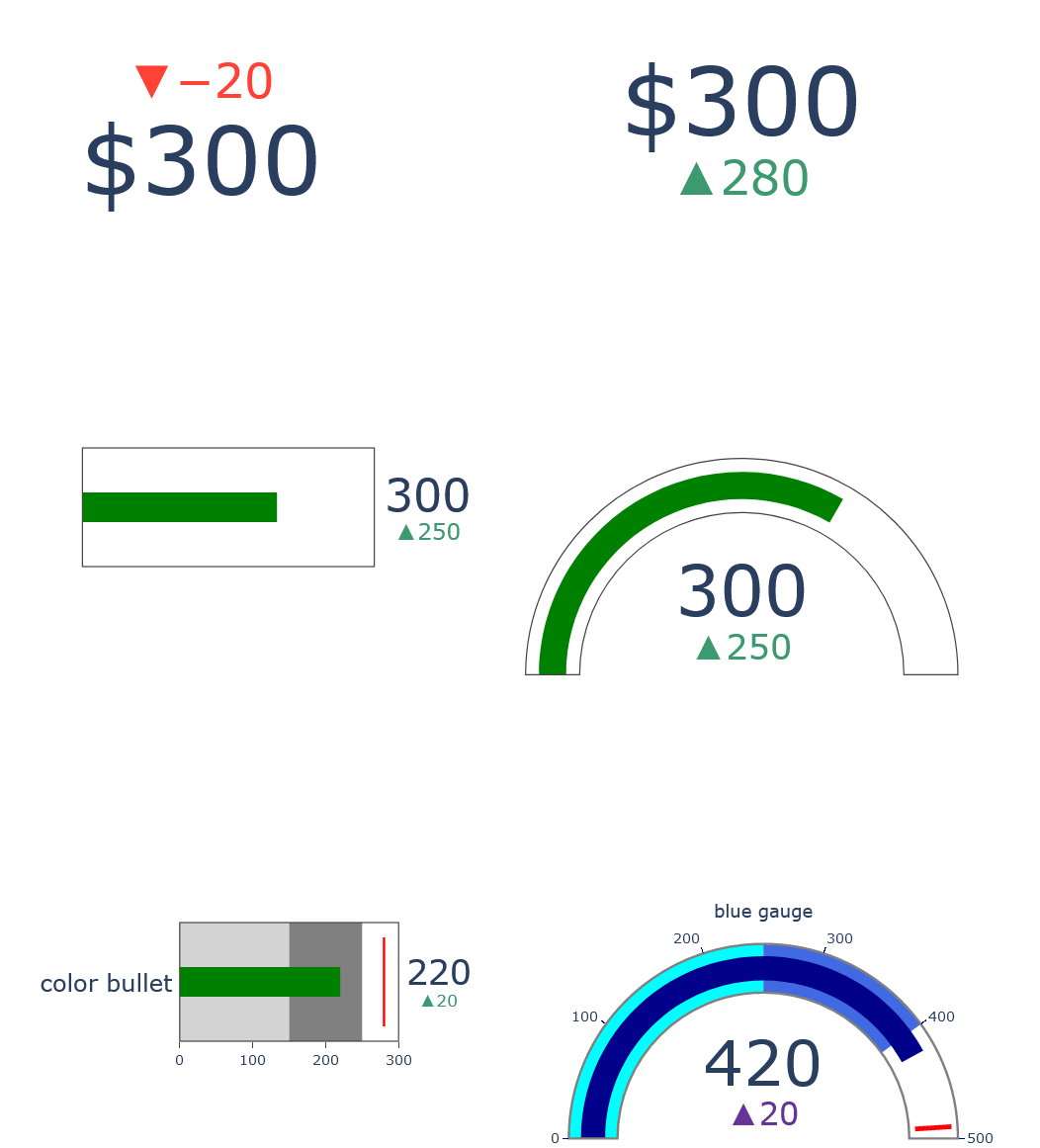
いろいろ弄ってみたので、参照しながら確認してみてください
import plotly.graph_objects as go

fig = go.Figure()

#down

fig.add_trace(go.Indicator(
    mode = "number+delta",
    value = 300,
    number = {'prefix': "$"},
    delta = {'position': "top", 'reference': 320},
    domain = {'row': 0, 'column': 0}))

#up

fig.add_trace(go.Indicator(
    mode = "number+delta",
    value = 300,
    number = {'prefix': "$"},
    delta = {'position': "bottom", 'reference': 20},
    domain = {'row': 0, 'column': 1}))

#bullet

fig.add_trace(go.Indicator(
    mode = "number+gauge+delta",
    value = 300,
    delta = {'position': "bottom", 'reference': 50},
    gauge = {'shape': "bullet",'axis' : {'visible': False}},
    domain = {'x': [0.1,0.5],'y':[0.5,0.6],'row': 1, 'column': 0}))

#gurge
fig.add_trace(go.Indicator(
    mode = "number+gauge+delta",
    value = 300,
    delta = {'position': "bottom", 'reference': 50},
    gauge = {'axis' : {'visible': False}},
    domain = {'row': 1, 'column': 1}))

#color bullet

fig.add_trace(go.Indicator(
    mode = "number+gauge+delta", value = 220,
    domain = {'x': [0.2, 0.5], 'y': [0.1, 0.2],'row': 2, 'column': 1},
    title = {'text' :"color bullet"},
    delta = {'reference': 200},
    gauge = {
        'shape': "bullet",
        'axis': {'range': [None, 300]},
        'threshold': {
            'line': {'color': "red", 'width': 2},
            'thickness': 0.75,
            'value': 280},
        'steps': [
            {'range': [0, 150], 'color': "lightgray"},
            {'range': [150, 250], 'color': "gray"}]}))

#blue gauge

fig.add_trace(
    go.Indicator(
    mode = "gauge+number+delta",
    value = 420,
    domain = {'x': [0.6, 1], 'y': [0, 0.2],'row': 2, 'column': 1},
    title = {'text': "blue gauge", 'font': {'size': 15}},
    delta = {'reference': 400, 'increasing': {'color': "RebeccaPurple"}},
    gauge = {
        'axis': {'range': [None, 500],
        'tickwidth': 1,
        'tickcolor': "darkblue"},
        'bar': {'color': "darkblue"},
        'bgcolor': "white",
        'borderwidth': 2,
        'bordercolor': "gray",
        'steps': [
            {'range': [0, 250], 'color': 'cyan'},
            {'range': [250, 400], 'color': 'royalblue'}],
        'threshold': {
            'line': {'color': "red", 'width': 4},
            'thickness': 0.75,
            'value': 490}})
)

fig.update_layout(
    grid = {'rows': 3, 'columns': 2, 'pattern': "independent"})

fig.update_layout(height = 1000 ,width = 900, margin = {'t':0, 'b':0, 'l':0})
fig.show()
ガントチャート
データの準備
カラム名をTask,Start,Finish,Completeにしておく

進捗率の確認
from plotly.figure_factory import create_gantt
import pandas as pd

df = pd.DataFrame([['Run', '2010-01-01', '2011-02-02', 10],
                   ['Fast', '2011-01-01', '2012-06-05', 55],
                   ['Eat', '2012-01-05', '2013-07-05', 94]],
                  columns=['Task', 'Start', 'Finish', 'Complete'])

fig = create_gantt(df, colors='Blues', index_col='Complete',
                   show_colorbar=True, bar_width=0.5,
                   showgrid_x=True, showgrid_y=True)

fig.show()
期間表示を週、年。月などにボタンで変えられる
進捗状態率「Complete」が数字として与えられた場合にはグラデーションで表示

完了状態の確認
from plotly.figure_factory import create_gantt
import pandas as pd

df = pd.DataFrame([['Run', '2010-01-01', '2011-02-02', 'Complete'],
                   ['Fast', '2011-01-01', '2012-06-05', 'Not Complete'],
                   ['Eat', '2012-01-05', '2013-07-05', 'Stopped']],
                  columns=['Task', 'Start', 'Finish', 'Resource'])

fig = create_gantt(df, index_col='Resource', show_colorbar=True,
                      group_tasks=True)

fig.show()
状態「Resource」に文字として与えられた場合は色分けで表示

以上
ダッシュボードがはかどる