python==3.8
plotly==4.10.0
ヒストグラム
積み上げるか、透かすかはbarmodeで操作する
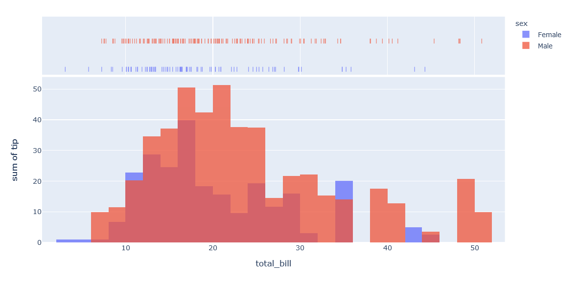
透かし
import plotly.graph_objects as go
df = px.data.tips()

fig = px.histogram(df, x="total_bill", y="tip", color="sex", marginal="rug", hover_data=df.columns)
fig.update_layout(barmode='overlay')
fig.update_traces(opacity=0.75)
fig.show()
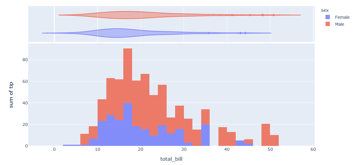
積み上げ
import plotly.graph_objects as go
df = px.data.tips()

fig = px.histogram(df, x="total_bill", y="tip", color="sex", marginal="violin", hover_data=df.columns)
fig.update_layout(barmode='stack')
fig.update_traces(opacity=0.75)
fig.show()
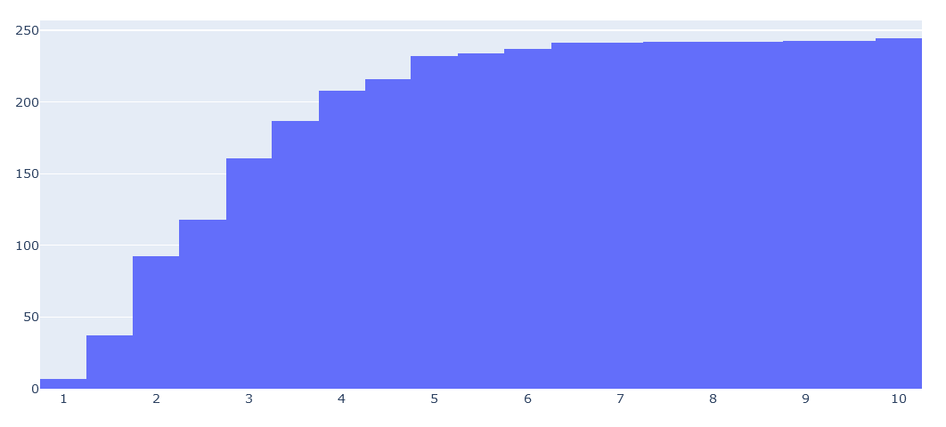
累積ヒストグラム(cumsum)
import plotly.graph_objects as go
df = px.data.tips()
fig = go.Figure(data=[go.Histogram(x=df.tip.values, cumulative_enabled=True)])
fig.show()
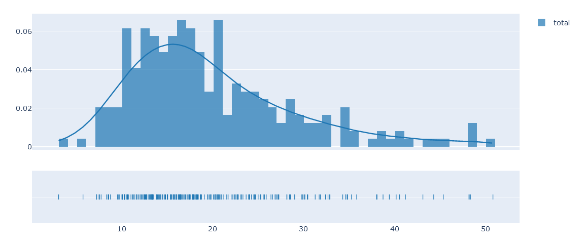
カーネル密度推定(kde)とhist
kdeをplotするにはfigure_factoryのdistplotをつかう
すこしめんどくさい
データはarrayをdict型で渡す必要がある
import plotly.figure_factory as ff
df = px.data.tips()
group_labels=["total"]
fig = ff.create_distplot([df["total_bill"].values], group_labels)
fig.show()
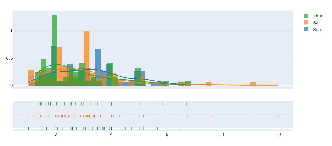
histとkdeで色分け
arrayの入れ子状で渡すことで自然に色分けしてくれる
import plotly.figure_factory as ff
df = px.data.tips()
hist_data = [df.query("day=='Sun'").tip.values,
             df.query("day=='Sat'").tip.values,
             df.query("day=='Thur'").tip.values]

group_labels = ['Sun', 'Sat', 'Thur']

fig = ff.create_distplot(hist_data, group_labels, bin_size=.2)
fig.show()
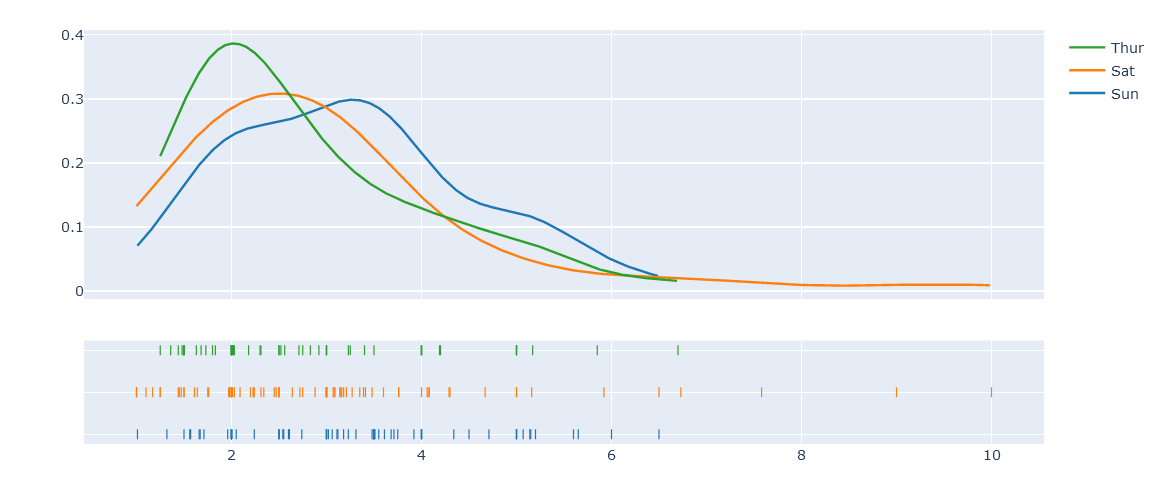
histを消してkdeだけを残す
import plotly.figure_factory as ff
df = px.data.tips()
hist_data = [df.query("day=='Sun'").tip.values,
             df.query("day=='Sat'").tip.values,
             df.query("day=='Thur'").tip.values]

group_labels = ['Sun', 'Sat', 'Thur']

fig = ff.create_distplot(hist_data, group_labels, bin_size=.2,show_hist=False)

fig.update_layout(title_text='only kde plot')

fig.show()
他にもcolors,bin_size,show_curveなどが指定できる
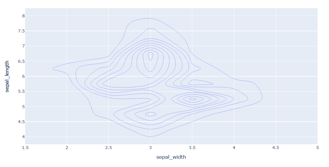
密度等高線図
import plotly.express as px
df = px.data.iris()
fig = px.density_contour(df, x="sepal_width", y="sepal_length")
fig.show()
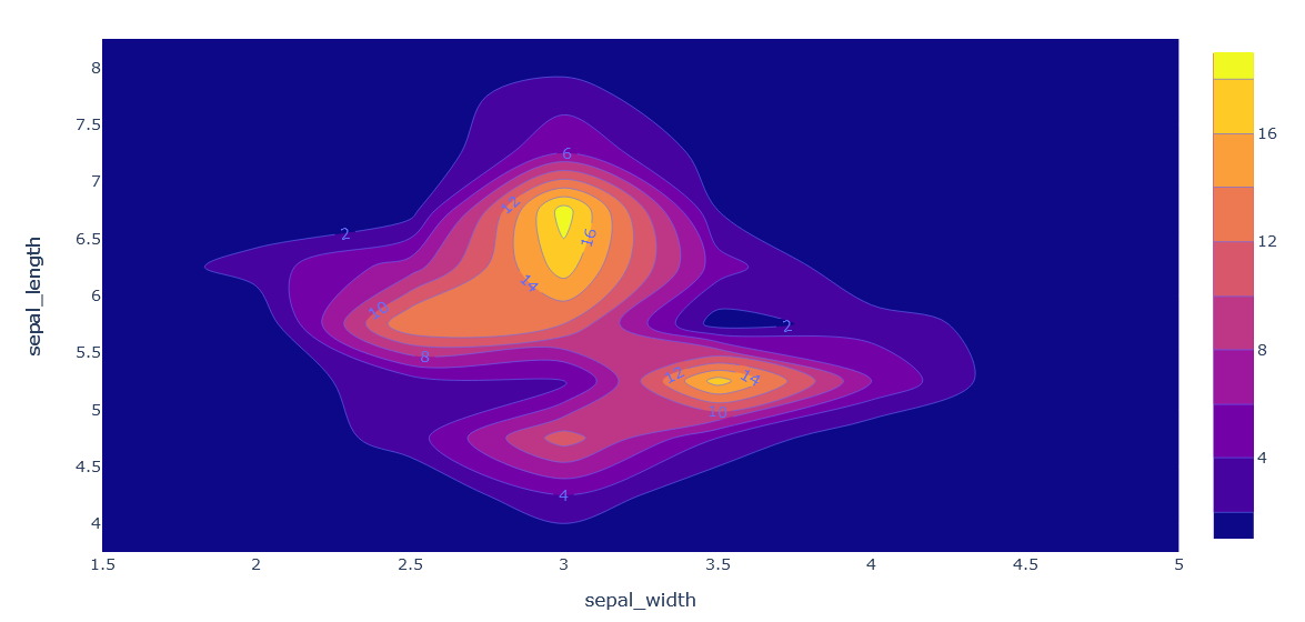
等高線の高さで塗りつぶす
import plotly.express as px
df = px.data.iris()
fig = px.density_contour(df, x="sepal_width", y="sepal_length")
fig.update_traces(contours_coloring="fill", contours_showlabels = True)
fig.show()
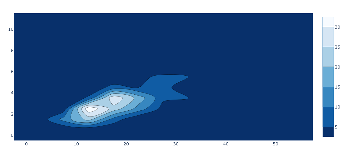
こういう作り方もある
import plotly.express as px

df = px.data.tips()
fig = go.Figure()

fig.add_trace(go.Histogram2dContour(
        x = df['total_bill'].values,
        y = df['tip'].values,
        colorscale = 'Blues',
        reversescale = True,
        xaxis = 'x',
        yaxis = 'y'
    ))

fig.show()
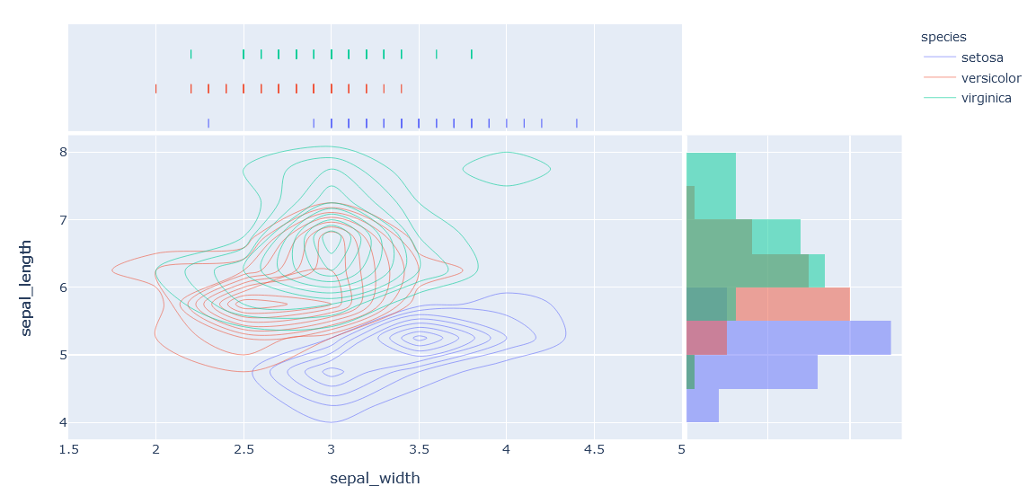
join plotも密度等高線図から作れる
import plotly.express as px
df = px.data.iris()
fig = px.density_contour(df, x="sepal_width", y="sepal_length", color="species", marginal_x="rug", marginal_y="histogram")
fig.show()
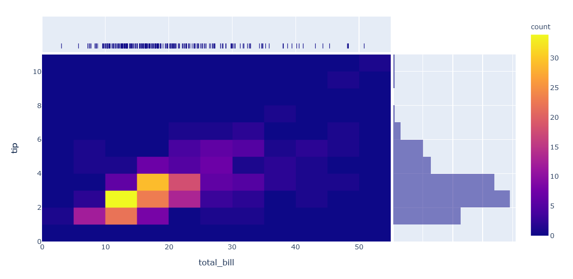
heat map
ヒストグラム同士の等高線図をheatmapとして表すjoin plot
import plotly.express as px
df = px.data.tips()
fig = px.density_heatmap(df, x="total_bill", y="tip", marginal_x="rug", marginal_y="histogram")
fig.show()