python==3.8
plotly==4.10.0
headを表示
いつもの
import plotly.express as px
df = px.data.tips()
df.head()

素朴にdataframeを渡す
import plotly.figure_factory as ff
fig = ff.create_table(df.head())#only df ok
fig.show()

Figure にgraph objectsを入れる
import plotly.graph_objects as go

fig = go.Figure(data=[go.Table(
    header=dict(values=df.columns,
                line_color='darkslategray',
                fill_color='lightskyblue',
                align='left'),
    cells=dict(values=df[0:5].transpose(),
               line_color='darkslategray',
               fill_color='lightcyan',
               align='left'))
])

fig.update_layout(width=600, height=400)
fig.show()
もちろんadd_traceでもいい
import plotly.graph_objects as go

fig = go.Figure()

fig.add_trace(go.Table(
    header=dict(values=df.columns,
                line_color='darkslategray',
                fill_color='lightskyblue',
                align='left'),
    cells=dict(values=df[0:5].transpose(),
               line_color='darkslategray',
               fill_color='lightcyan',
               align='left'))
)

fig.update_layout(width=600, height=400)
fig.show()

棒グラフ
事前に前処理をしておけばいつものbar plotになる
import plotly.express as px

df_bar = df.groupby('day',as_index=False).sum()

fig = px.bar(df_bar, y='total_bill', x='day', text='total_bill')
fig.update_traces(texttemplate='%{text:.2s}', textposition='outside')
fig.update_layout(uniformtext_minsize=8, uniformtext_mode='hide')
fig.show()

前処理していないと細かい積み上げになる
import plotly.express as px

df = px.data.tips()
fig = px.bar(df, x="sex", y="total_bill", color="time",
                  title="Total Bill")
fig.update_layout(showlegend=False)
fig.show()

細かい積み上げ、まとめて表示したければbarでなくhistgramを使う
import plotly.express as px

df = px.data.tips()
fig = px.histogram(df, x="sex", y="total_bill", color="time",
                  title="Total Bill by Sex")
fig.update_layout(showlegend=False)
fig.show()

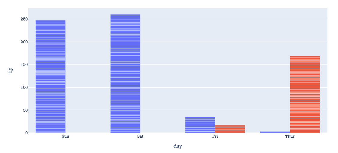
barmodeで積み上げ(stack)かグループで横に置くか(group,dodge)を指定することができる
import plotly.express as px
df = px.data.tips()
fig = px.bar(df, x="day", y="tip", color="time", barmode="group",title="bar")
fig.update_layout(font_family="Rockwell", showlegend=False)

fig.show()
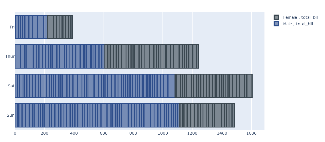
add_traceによる積み上げ
import plotly.graph_objects as go
df = px.data.tips()
fig = go.Figure()
fig.add_trace(go.Bar(
    y=df.query("sex=='Male'")['day'],
    x=df['total_bill'],
    name='Male , total_bill',
    orientation='h',
    marker=dict(
        color='rgba(46, 78, 139, 0.6)',
        line=dict(color='rgba(46, 78, 139, 1.0)', width=3)
    )
))

fig.add_trace(go.Bar(
    y=df.query("sex=='Female'")['day'],
    x=df['total_bill'],
    name='Female , total_bill',
    orientation='h',
    marker=dict(
        color='rgba(58, 71, 80, 0.6)',
        line=dict(color='rgba(58, 71, 80, 1.0)', width=3)
    )
))

fig.update_layout(barmode='stack')

fig.show()
年代(順序のある)データがついていればanimationを指定することもできる
import plotly.express as px
df = px.data.gapminder()
fig = px.bar(df, x="continent", y="pop", color="continent",
  animation_frame="year", animation_group="country", range_y=[0,4000000000])
fig.show()

バイオリン
plotly.expressでバイオリン
import plotly.express as px
df = px.data.tips()
fig = px.violin(df, x="sex", y="tip",
                color="time", facet_col="smoker")
fig.show()

graph_objectsでのバイオリン
import plotly.graph_objects as go
df = px.data.tips()
fig = go.Figure()

for day in days:
    fig.add_trace(go.Violin(x=df['day'][df['day'] == day],
                            y=df['total_bill'][df['day'] == day],
                            name=day,
                            box_visible=True,
                            meanline_visible=True))

fig.show()

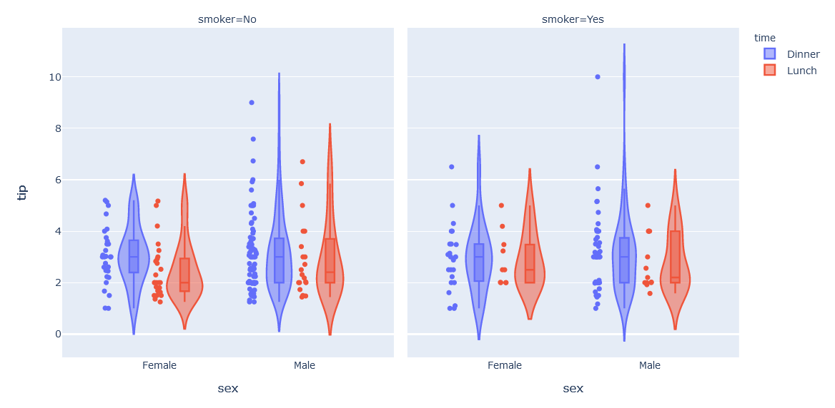
点と箱を追加する
import plotly.express as px

fig = px.violin(df, x="sex", y="tip",
                color="time", facet_col="smoker",
               box=True, points="all")
fig.show()
sideで片面に限定する
from plotly.subplots import make_subplots

fig = make_subplots(rows=1, cols=2)

fig.add_trace(go.Violin(x=df.total_bill), row=1, col=1)
fig.update_traces(orientation='h', side='positive', width=3, points=False)
fig.update_layout(xaxis_showgrid=False, xaxis_zeroline=False)

fig.add_trace(go.Violin(x=df.total_bill), row=1, col=2)
fig.update_traces(orientation='h', width=3, points=False)
fig.update_layout(xaxis_showgrid=False, xaxis_zeroline=False)

fig.show()

片面ずつ作って合わせる(split violin)
import plotly.graph_objects as go

fig = go.Figure()

fig.add_trace(go.Violin(x=df['day'][ df['smoker'] == 'Yes' ],
                        y=df['total_bill'][ df['smoker'] == 'Yes' ],
                        legendgroup='Yes', scalegroup='Yes', name='Yes',
                        side='negative',
                        line_color='blue')
             )
fig.add_trace(go.Violin(x=df['day'][ df['smoker'] == 'No' ],
                        y=df['total_bill'][ df['smoker'] == 'No' ],
                        legendgroup='No', scalegroup='No', name='No',
                        side='positive',
                        line_color='orange')
             )
fig.update_traces(meanline_visible=True)
fig.update_layout(violingap=0, violinmode='overlay')
fig.show()

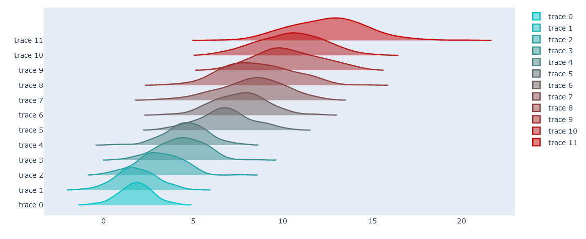
バイオリンを使ったjoy plot
import plotly.graph_objects as go
from plotly.colors import n_colors
import numpy as np
np.random.seed(1)

data = (np.linspace(1, 2, 12)[:, np.newaxis] * np.random.randn(12, 200) +
            (np.arange(12) + 2 * np.random.random(12))[:, np.newaxis])

colors = n_colors('rgb(5, 200, 200)', 'rgb(200, 10, 10)', 12, colortype='rgb')

fig = go.Figure()
for data_line, color in zip(data, colors):
    fig.add_trace(go.Violin(x=data_line, line_color=color))

fig.update_traces(orientation='h', side='positive', width=3, points=False)
fig.update_layout(xaxis_showgrid=False, xaxis_zeroline=False)
fig.show()
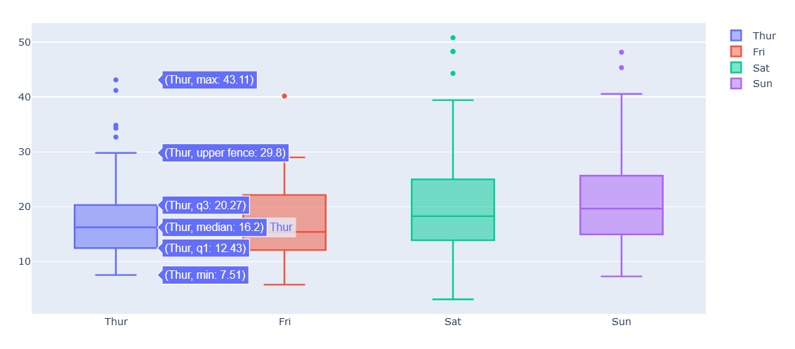
箱ひげ
pxでの箱ひげ
import plotly.express as px
df = px.data.tips()
fig = px.box(df, x="sex", y="tip",
                color="time", facet_col="smoker")
fig.show()

goでの箱ひげ
import plotly.graph_objects as go
df = px.data.tips()
fig = go.Figure()

for day in days:
    fig.add_trace(go.Box(x=df['day'][df['day'] == day],
                            y=df['total_bill'][df['day'] == day],
                            name=day))

fig.show()
信頼区間を付ける
notchedを使うと信頼区間を調べられる
くびれている範囲が95%区間
import plotly.express as px

fig = px.box(df, x="sex", y="tip",
                color="time", facet_col="smoker", notched=True)
fig.show()
