概要
Matplotlibで覚えておきたいことをメモ
(神記事ありました、こちらで全て済むかも笑)
タスク
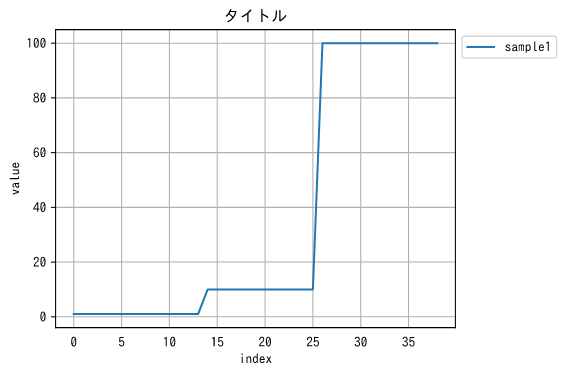
1. plt.〇〇で折れ線グラフを描画
2. plt.〇〇で複数の折れ線グラフを描画
3. 日本語化について(Mac)
4. 目盛りの整数化
5. x軸の目盛りを時刻表示
6. 縦線と横線の追加
方法
1. plt.〇〇で折れ線グラフを描画
1で扱うサンプル
| sample1 | sample2 | sample3 |
|---|---|---|
| 1 | 2 | 3 |
| 1 | 2 | 3 |
| 1 | 2 | 3 |
| 1 | 2 | 3 |
| 1 | 2 | 3 |
| 1 | 2 | 3 |
| 1 | 2 | 3 |
| 1 | 2 | 3 |
| 1 | 2 | 3 |
| 1 | 2 | 3 |
| 1 | 2 | 3 |
| 1 | 2 | 3 |
| 1 | 2 | 3 |
| 1 | 2 | 3 |
| 10 | 20 | 30 |
| 10 | 20 | 30 |
| 10 | 20 | 30 |
| 10 | 20 | 30 |
| 10 | 20 | 30 |
| 10 | 20 | 30 |
| 10 | 20 | 30 |
| 10 | 20 | 30 |
| 10 | 20 | 30 |
| 10 | 20 | 30 |
| 10 | 20 | 30 |
| 10 | 20 | 30 |
| 100 | 200 | 300 |
| 100 | 200 | 300 |
| 100 | 200 | 300 |
| 100 | 200 | 300 |
| 100 | 200 | 300 |
| 100 | 200 | 300 |
| 100 | 200 | 300 |
| 100 | 200 | 300 |
| 100 | 200 | 300 |
| 100 | 200 | 300 |
| 100 | 200 | 300 |
| 100 | 200 | 300 |
| 100 | 200 | 300 |
import matplotlib as mpl
import matplotlib.pyplot as plt
df = pd.read_csv("./matplotlib1.csv")
name="sample1"
x = df.index
y = df[name]
plt.figure(figsize=(6, 4), dpi=72, tight_layout=True)
plt.title('タイトル')
plt.tick_params(bottom=False)
plt.plot(x, y, label=name)
plt.ylabel("value")
plt.xlabel("index")
plt.legend(loc="upper left",bbox_to_anchor=(1, 1))
plt.grid()
plt.show()
2. plt.〇〇で複数の折れ線グラフを描画
2で扱うサンプル
| sample1 | sample2 | sample3 |
|---|---|---|
| 1 | -2 | 3 |
| 1 | -2 | 3 |
| 1 | -2 | 3 |
| 1 | -2 | 3 |
| 1 | -2 | 3 |
| 1 | -2 | 3 |
| 1 | -2 | 3 |
| 1 | -2 | 3 |
| 1 | -2 | 3 |
| 1 | -2 | 3 |
| 1 | -2 | 3 |
| 1 | -2 | 3 |
| 1 | -2 | 3 |
| 1 | -2 | 3 |
| 10 | -20 | 30 |
| 10 | -20 | 30 |
| 10 | -20 | 30 |
| 10 | -20 | 30 |
| 10 | -20 | 30 |
| 10 | -20 | 30 |
| 10 | 20 | -30 |
| 10 | 20 | -30 |
| 10 | 20 | -30 |
| 10 | 20 | -30 |
| 10 | 20 | -30 |
| 10 | 20 | -30 |
| 100 | 200 | 300 |
| 100 | 200 | 300 |
| 100 | 200 | 300 |
| 100 | 200 | 300 |
| 100 | 200 | 300 |
| 100 | 200 | 300 |
| 100 | 200 | 30 |
| 100 | 200 | 30 |
| 100 | 200 | 30 |
| 100 | 200 | 30 |
| 100 | 20 | 30 |
| 100 | 2 | 3 |
| 100 | 2 | 3 |
# 1行3列表示
# tight_layout: 重なっている部分を重ならないようにする
df = pd.read_csv("./matplotlib2.csv")
plt.figure(figsize=(6*3, 4), dpi=72, tight_layout=True)
for i in range(3):
    plt.subplot(1,3,i+1)
    name="sample1"
    x = df.index
    y = df[df.columns[i]]
    plt.title(df.columns[i])
    plt.tick_params(bottom=False)
    plt.plot(x, y, label=df.columns[i])
    # plt.plot(x, y, 'rs:', label='line_1')
    plt.ylabel("value")
    plt.xlabel("index")
    plt.legend(loc="upper left",bbox_to_anchor=(1, 1))
    plt.grid()
plt.show()

3. 日本語化について
基本はいろんな記事で紹介されているように(例:MacでMatplotlibの日本語の文字化けを直す)
①ipaexフォントのダウンロード
↓
②(pythonパス)/site-packages/matplotlib/mpl-data/fonts/ttfにipaexg.ttfを配置
↓
③(pythonパス)/site-packages/matplotlib/mpl-data/matplotlibrcの編集
自分は③で詰まった
デフォ設定のfont.familyをコメントアウトしようとしたら、最初から#が1つあった。
そのときは特に考えず、「最初からコメントアウトされてるじゃんラッキー!」と思って、下にfont.family: IPAexGothic を記述したらduplicatedの警告が。
ちゃんとファイルの説明を読むと、matplotlibrcのコメントアウトは#1つではなくて、##なので注意
、みたいな旨の文章ありました。やっぱり説明はしっかり読まんとですね。。。
# font.family:〜〜を、## font.family〜〜にしたらちゃんと日本語になりましたとさ
4. 目盛りの整数化
4で扱うサンプルデータ
| sample1 | sample2 | sample3 |
|---|---|---|
| NaN | NaN | NaN |
| 0.0 | 0.0 | 0.0 |
| 0.0 | 0.0 | 0.0 |
| 0.0 | 0.0 | 0.0 |
| 0.0 | 1.0 | 1.0 |
| 0.0 | 0.0 | 0.0 |
| 0.0 | 0.0 | 0.0 |
| 0.0 | 0.0 | 0.0 |
| 0.0 | 1.0 | 1.0 |
| 0.0 | 0.0 | 0.0 |
| 0.0 | 0.0 | 0.0 |
| 0.0 | 0.0 | 0.0 |
| 0.0 | 1.0 | 1.0 |
| 0.0 | 0.0 | 0.0 |
| 0.0 | 0.0 | 1.0 |
| 0.0 | 1.0 | 0.0 |
| 0.0 | 0.0 | 0.0 |
| 0.0 | 0.0 | 0.0 |
| 0.0 | 0.0 | 1.0 |
# 目盛りの整数化
import matplotlib.ticker as ticker
import numpy as np

# x = np.array([2006, 2007, 2008])
# y = np.array([35.2, 27.4, 41.2])

# plt.plot(x, y)
# plt.show()

x = df.index
y = df[name]
plt.figure(figsize=(12, 4), dpi=72, tight_layout=True)

# 値の範囲がわかっているならこっちのほうが楽
# こっちは目盛り幅も調整できる、今回は4
plt.xticks(np.arange(0, 100 + 1, 4))
# X軸の数字をオフセットを使わずに表現する(状況によっては追加)
# plt.gca().get_xaxis().get_major_formatter().set_useOffset(False)
# X軸の数字が必ず整数になるようにする
# plt.gca().get_xaxis().set_major_locator(ticker.MaxNLocator(integer=True))

# Y軸の数字をオフセットを使わずに表現する(状況によっては追加)
# plt.gca().get_yaxis().get_major_formatter().set_useOffset(False)
# Y軸の数字が必ず整数になるようにする
plt.gca().get_yaxis().set_major_locator(ticker.MaxNLocator(integer=True))
plt.title('タイトル')
plt.tick_params(bottom=False)
plt.plot(x, y, marker='.', label=name)
plt.ylabel("value")
plt.xlabel("index")
plt.legend(loc="upper left",bbox_to_anchor=(1, 1))
plt.grid()

plt.show()

5. x軸の目盛りを時刻表示
サンプルデータ
| time | s1 |
|---|---|
| 0:00:00 | 105 |
| 0:05:00 | 100 |
| 0:10:00 | 105 |
| 0:15:00 | 100 |
| 0:20:00 | 105 |
| 0:25:00 | 100 |
| 0:30:00 | 105 |
| 0:35:00 | 100 |
| 0:40:00 | 105 |
| 0:45:00 | 100 |
| 0:50:00 | 105 |
| 0:55:00 | 100 |
| 1:00:00 | 105 |
import pandas as pd
from matplotlib import pyplot as plt
import matplotlib.dates as mdates

df = pd.read_csv("./excel-sample8-qiita.csv")
# 型をObjectからdatetimeに変換
df.time2 = pd.to_datetime(df.time)

# 変数用意
param = df[col]
leng = len(param)

fig =plt.figure(figsize=(12, 4),tight_layout=True)
ax = fig.add_subplot(111)
# 必要な情報に応じてDateFormatter()の中身を書き換える
ax.xaxis.set_major_formatter(mdates.DateFormatter('%H:%M'))
plt.setp(ax.get_xticklabels(), rotation=30)
plt.plot(df.time2, param, lw=2)
plt.show()

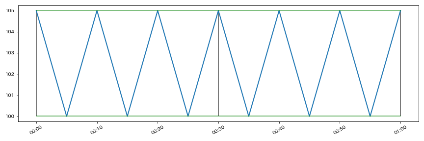
6. 縦線と横線の追加
サンプルデータ
| time | s1 |
|---|---|
| 0:00:00 | 105 |
| 0:05:00 | 100 |
| 0:10:00 | 105 |
| 0:15:00 | 100 |
| 0:20:00 | 105 |
| 0:25:00 | 100 |
| 0:30:00 | 105 |
| 0:35:00 | 100 |
| 0:40:00 | 105 |
| 0:45:00 | 100 |
| 0:50:00 | 105 |
| 0:55:00 | 100 |
| 1:00:00 | 105 |
import pandas as pd
from matplotlib import pyplot as plt
import matplotlib.dates as mdates

df = pd.read_csv("./excel-sample8-qiita.csv")
# 型をObjectからdatetimeに変換
df.time2 = pd.to_datetime(df.time)

# 変数用意
param = df[col]
leng = len(param)

fig =plt.figure(figsize=(12, 4),tight_layout=True)
ax = fig.add_subplot(111)
ax.xaxis.set_major_formatter(mdates.DateFormatter('%H:%M'))

plt.setp(ax.get_xticklabels(), rotation=30)
plt.plot(df.time2, param, lw=2)
# 横線追加
# hlinesでいいかも???⇛参考記事:https://ensekitt.hatenablog.com/entry/2018/10/01/200000
plt.plot(df.time2, leng*[param.max()], "green", alpha=0.7)
plt.plot(df.time2, leng*[param.min()], "green", alpha=0.7)

# vlinesで縦線追加
plt.vlines(df.time2[0],param.min(),param.max(), "black", alpha = 0.7)
plt.vlines(df.time2[6],param.min(),param.max(), "black", alpha = 0.7)
plt.vlines(df.time2[12],param.min(),param.max(), "black", alpha = 0.7)

plt.show()
fig.savefig("mlp-no6.png")