0. はじめに
やりたいことがあるたびにいちいちGoogleや公式サイトで検索してそれっぽいのを探すのはもう面倒だ。
やっとそれっぽいのを見つけたのに、一行で済むようなことを「plt.なんちゃら」だの「set_なんちゃら」をたくさん並べましたなんてブログはもはや検索妨害だ。
Qiitaにすら僕のためのいい感じのまとめがないなんて……
よく考えたら自分が普段使うようなメソッドなんて限られているじゃないか。
もう自分でまとめるわ。自分のために。
というわけでインポート。
import matplotlib as mpl
import matplotlib.pyplot as plt
ちなみにmplは6.4.と6.5.でしか使わない。
1. 図(Figure)の作成
matplotlibの描き方は、まず台紙となるFigureをつくり、そこに付箋Axesを貼り、その付箋にプロットしていくというのが僕の中のイメージ。
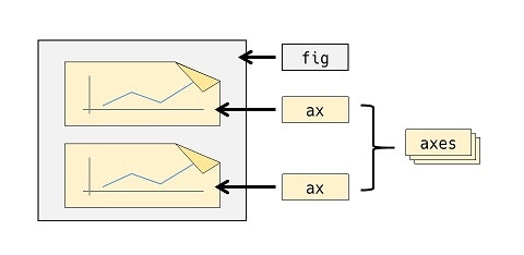
したがってまず台紙を作る。これにはplt.figure()を用いる。plt.subplots()もあるが後述。
1.1. plt.figure()
fig = plt.figure(
    figsize=(6.4, 4.8),
    dpi=100,
    facecolor="w",
    linewidth=0,
    edgecolor="w",
)
# <Figure size 640x480 with 0 Axes>
plt.figure()を実行すると、無地の台紙Figureが戻り値として返される。このときパラメータを入力すると図の設定ができる。
| 主な引数 | 説明 |
|---|---|
| figsize |
Figureのサイズ。横×縦を(float, float)で指定。 |
| dpi | dpi。整数で指定。 |
| facecolor | 図の背景色。Jupyterだと透過色になってたりする。 |
| linewidth | 図の外枠の太さ。デフォルトは0(枠なし)。 |
| edgecolor | 図の外枠の色。linewidthを指定しないと意味ない。 |
| subplotpars |
AxesSubplotの基準を指定する。 |
| layout |
"constrained"や"tight"等を指定するとオブジェクトが自動調整される。 |
-
figsize×dpiの値が、画像として出力した際のFigureのピクセルサイズになる。 - 上記パラメータのうち、
dpiからedgecolorはFigure.get_XXX(AAA)で取得でき、Figure.set_XXX(AAA)で後から変更できる。figsizeを取得変更するときはfigwidthとfigheightを用いる。 - Tight Layout(
layout="tight")やConstrained Layout("constrained")にすると、オブジェクト同士が重なっていたらそれを避け、また無駄な余白があればそれを埋めるように各オブジェクトの配置が自動調整される。
# `.get_figsize()`は存在せず、`.get_figwidth()`/`.get_figheight()`を用いる。
fig = plt.figure(figsize=(6, 4), dpi=72)
print(fig.get_figsize())
# AttributeError: 'Figure' object has no attribute 'get_figsize'
print(fig.get_figwidth(), fig.get_figheight())
# 6.0 4.0
以下、例(plt.figure()だけでは画像出力できないのでAxesオブジェクトを作成する作業を加えている)。
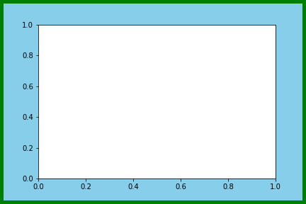
fig = plt.figure(
    figsize=(6, 4), dpi=72, facecolor="skyblue", linewidth=10, edgecolor="green"
)
ax = fig.add_subplot(111)

fig.savefig("1-1_a.png", facecolor=fig.get_facecolor(), edgecolor=fig.get_edgecolor())
1.2. plt.subplots()
2.2.を参照。
2. グラフ(Axes)の作成
1.で作ったFigureにAxesを追加する。いろいろ方法がある。
-
Axesが1つ ⇒Figure.add_subplot(111)(Figure.add_axes((0, 0, 1, 1))でも可) - 同じ大きさの
Axesを並べる ⇒Figure.add_subplot() - いろいろな大きさの
Axesを並べる ⇒ GridSpec - グラフの大きさ、位置をとにかく自由に決めたい ⇒
Figure.add_axes()
2.1. Figure.add_subplot()
# グラフ1つ
ax = fig.add_subplot(1, 1, 1)

# グラフ縦に2つ
ax1 = fig.add_subplot(2, 1, 1)
ax2 = fig.add_subplot(2, 1, 2)
Figure.add_subplot(nrows, ncols, index)を実行すると、無地の付箋Axes(正確にはAxesSubplotオブジェクト)が戻り値として返される。
nrows,ncols,indexは位置と大きさを決めるパラメータで、整数を入れる。台紙Figureを、縦nrows分割・横ncols分割したうちのindex番目の位置に配置されたAxesが返される。グラフを1つしか作らないときは(1, 1, 1)で良い。
nrows,ncols,indexが全て一桁のときは、カンマを省略して三桁の整数を一つ指定する書き方(pos引数)もできる。
# グラフ1つ
ax = fig.add_subplot(111)

# グラフ縦に2つ
ax1 = fig.add_subplot(211)
ax2 = fig.add_subplot(212)
このほかパラメータを入力するとグラフ枠の設定ができる。
| 主な引数 | 説明 |
|---|---|
| title | グラフのタイトル。 |
| facecolor | グラフの背景色。fcでも可。 |
| alpha | グラフの透明度を0~1で指定。 |
| zorder | オブジェクトが重なっていた時この値が大きい方が前面に描画される。 |
| xlabel | 横軸名。 |
| xmargin | データの最小値・最大値から横軸の最小値・最大値までのサイズ。 |
| xlim | 横軸の最小値・最大値を(float, float)で指定。 |
| xticks | 横軸の目盛線を表示する値をリストで指定。 |
| xticklabels | 横軸の目盛のラベルをリストで指定。 |
| sharex | 横軸を共有するAxesを指定。 |
- 横軸パラメータ名の「x」を「y」に変えると縦軸の設定も同様にできる。
例
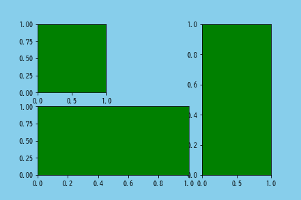
fig = plt.figure(facecolor="skyblue")
ax1 = fig.add_subplot(2, 3, 1)  # 2行3列の1番目
ax2 = fig.add_subplot(2, 2, 3)  # 2行2列の3番目
ax3 = fig.add_subplot(1, 4, 4)  # 1行4列の4番目

fig.savefig("2-1_a.png", facecolor=fig.get_facecolor())
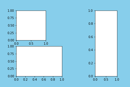
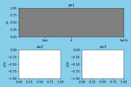
fig = plt.figure(facecolor="skyblue", tight_layout=True)
ax1 = fig.add_subplot(
    211,
    title="ax1",
    fc="gray",
    ylabel="y1",
    xticks=[2, 4, 8],
    xticklabels=["two", "4", "hachi"],
)
ax2 = fig.add_subplot(223, title="ax2", ylim=(-1, 0), ylabel="y2a")
ax3 = fig.add_subplot(224, title="ax3", sharey=ax2, ylabel="y2b")

fig.savefig("2-1_b.png", facecolor=fig.get_facecolor())
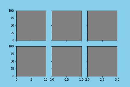
2.2. plt.subplots()
>>> fig, ax = plt.subplots()

>>> fig, (ax1, ax2) = plt.subplots(1, 2, sharey=True)

>>> fig, axes = plt.subplots(2, 2, sharey='row')
... ax1 = axes[0, 0]
... ax2 = axes[0, 1]
plt.subplots(nrows, ncols)を実行すると、無地の台紙Figureと、無地の付箋Axes(複数の場合はそのリスト)が戻り値として返される。
nrows,ncolsはAxesの配置を決めるパラメータで、指定するとFigureを縦nrows分割、横ncols分割した全ての位置のAxesの行列が返される。
sharexをTrueにすると全ての横軸が共有される。sharexをcolにすると同じ列同士で横軸が共有される。
このほかplt.figure()と同じようにパラメータを入力するとFigureの設定ができる(1.1.を参照)。また、subplot_kw=dict()内にAxesのパラメータを指定できる(2.1.を参照)。
例
fig, axes = plt.subplots(facecolor="skyblue", subplot_kw=dict(facecolor="gray"))

fig.savefig("2-2_a.png", facecolor=fig.get_facecolor())
fig, axes = plt.subplots(
    2,
    3,
    facecolor="skyblue",
    sharex="col",
    sharey=True,
    subplot_kw=dict(facecolor="gray"),
)

axes[0, 0].set_xlim(0, 10)  # 一番左上のグラフのx軸の範囲を0~10に設定
axes[1, 2].set_xlim(2, 3)  # 一番右下のグラフのx軸の範囲を2~3に設定
axes[0, 1].set_ylim(0, 100)  # 上段中央のグラフのy軸の範囲を0~100に設定

fig.savefig("2-2_b.png", facecolor=fig.get_facecolor())
2.3. GridSpec
>>> gs = fig.add_gridspec(2, 4)
... ax1 = fig.add_subplot(gs[0, 0])
... ax2 = fig.add_subplot(gs[1, 1:3])
... ax3 = fig.add_subplot(gs[:, 3])
Figure.add_gridspec(nrows, ncols)を実行すると、GridSpecオブジェクトが戻り値として返される。GridSpecはFigureを分割するマス目のようなもの。
nrowsとncolsは分割基準を決めるパラメータで、指定するとFigureを縦nrows分割、横ncols分割するGridSpecが返される。
Figure.add_subplot(pos)(2.1.参照)の第一引数にGridSpecオブジェクトのスライスを渡すことで、その大きさ・位置のAxesを得ることができる。
また、デフォルトではFigureを等分割するが、width_ratios,height_ratiosに縦横の分割の比率のリストを渡すことができる。
例
fig = plt.figure(facecolor="skyblue", tight_layout=True)
gs = fig.add_gridspec(2, 3)
ax1 = fig.add_subplot(gs[0, 0:2], facecolor="gray")
ax2 = fig.add_subplot(gs[1, 0:2], facecolor="lightgreen")
ax3 = fig.add_subplot(gs[:, 2])

fig.savefig("2-3_a.png", facecolor=fig.get_facecolor())
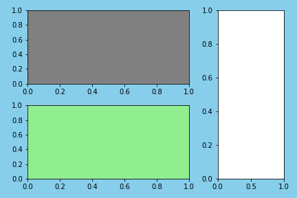
fig = plt.figure(facecolor="skyblue")
gs = fig.add_gridspec(2, 2, width_ratios=[2, 1])
ax1 = fig.add_subplot(gs[0], facecolor="gray")
ax2 = fig.add_subplot(gs[2], facecolor="lightgreen")
ax3 = fig.add_subplot(gs[:, 1])

fig.savefig("2-3_b.png", facecolor=fig.get_facecolor())
2.4. Figure.add_axes()
>>> ax = fig.add_axes((0, 0, 1, 1))

>>> ax1 = fig.add_axes((0, 1/2, 1/4, 1/2))
... ax2 = fig.add_axes((0, 0.1, 0.5, 0.2))
... ax3 = fig.add_axes((3/4, 0, 1/4, 1))
Figure.add_axes((left, bottom, width, height))を実行すると、無地の付箋Axesが戻り値として返される。
left,bottom,width,heightは位置と大きさを決めるパラメータで、Figureの縦横を1とした相対サイズで指定する。left,bottomでAxesの左下隅の位置座標を指定し、width,heightでAxesのサイズを指定する。(0, 0, 1, 1)で台紙Figureいっぱいにグラフを描く。
このほかパラメータを入力するとグラフ枠の設定ができる(2.1.の表を参照)。
例
fig = plt.figure(facecolor="skyblue")
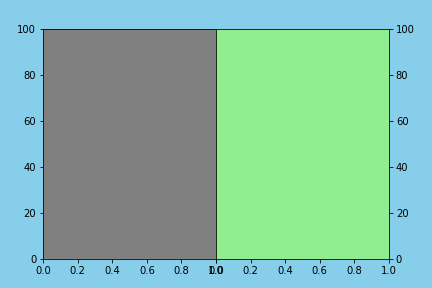
ax = fig.add_axes((0, 0, 1, 1), facecolor="gray")
fig.savefig("2-4_a.png", facecolor=fig.get_facecolor())

fig = plt.figure(facecolor="skyblue")
ax1 = fig.add_axes((0.1, 0.1, 0.4, 0.8), facecolor="gray", ylim=(0, 100))
ax2 = fig.add_axes((0.5, 0.1, 0.4, 0.8), facecolor="lightgreen", sharey=ax1)

ax2.tick_params(
    # 縦軸目盛を右側に表示
    left=False,
    right=True,
    # 縦軸目盛ラベルを右側に表示
    labelleft=False,
    labelright=True,
)

fig.savefig("2-4_b.png", facecolor=fig.get_facecolor())
2.5. Figure.subplot_mosaic()
Figure.subplot_mosaic(layout)を実行すると、Axes(正確にはAxesSubplotオブジェクト)を要素とする、辞書が戻り値として返される。
第一引数layoutに、Axesのラベル名を要素とする行列(リストのリスト)を渡すことで、等間隔にAxesを並べることができる。
fig = plt.figure(facecolor="skyblue")
axes = fig.subplot_mosaic(
    [
        ["A", "B"],
    ],
    subplot_kw=dict(facecolor="green"),
)

fig.savefig("2-5_a.png", facecolor=fig.get_facecolor())
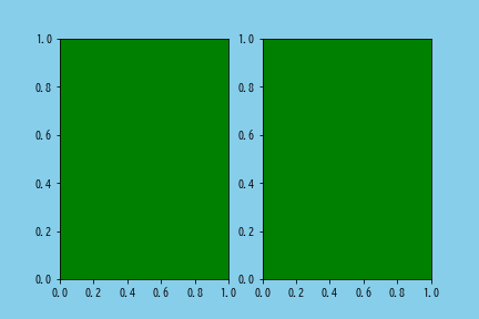
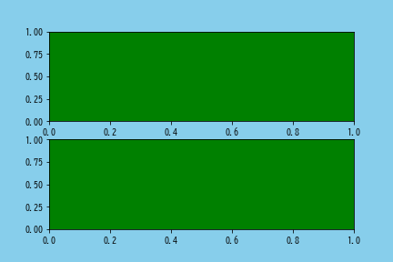
fig = plt.figure(facecolor="skyblue")
axes = fig.subplot_mosaic(
    [
        ["A"],
        ["B"],
    ],
    subplot_kw=dict(facecolor="green"),
)

fig.savefig("2-5_b.png", facecolor=fig.get_facecolor())
隣接するAxesのラベル名に同じ名前が指定されていると結合される。また'.'を指定するとその部分は余白になる。
fig = plt.figure(facecolor="skyblue")
axes = fig.subplot_mosaic(
    [
        ["A", ".", "C"],
        ["B", "B", "C"],
    ],
    subplot_kw=dict(facecolor="green"),
)

fig.savefig("2-5_c.png", facecolor=fig.get_facecolor())
リストではなく文字列で表現することも可能。
fig = plt.figure(facecolor="skyblue")
axes = fig.subplot_mosaic(
    """
    A.C
    BBC
    """,
    subplot_kw=dict(facecolor="green"),
)

fig.savefig("2-5_c2.png", facecolor=fig.get_facecolor())

3. プロットする
2.で作ったAxesに各種メソッドを適用して点や線をプロットしていく。
基本的に第一引数xに横軸の値の配列、第二引数yに縦軸の値の配列を渡す。値に文字列型の配列を渡した場合は[0, 1, 2, ..., N-1](x=range(len(x)))として扱われる。
ここでは、2022年7月の東京・札幌・那覇の気象データ(平均気温・降水量・平均雲量)を例に用いる。気象庁のサイトよりダウンロードの後、ヘッダを変更した。
,Tokyo,Tokyo,Tokyo,Sapporo,Sapporo,Sapporo,Naha,Naha,Naha
date,Temperature,Precipitation,CloudCover,Temperature,Precipitation,CloudCover,Temperature,Precipitation,CloudCover
2022/7/1,30.4,0,0.5,20.4,0.0,8.8,27.1,7.0,9.5
2022/7/2,29.5,0,5.0,21.5,0.0,7.5,26.8,26.5,9.5
2022/7/3,28.9,0.0,8.3,25.9,0,5.0,26.5,33.5,9.0
2022/7/4,26.5,3.5,9.3,24.8,0.0,8.0,28.9,0.0,7.3
2022/7/5,26.2,2.0,9.8,23.6,0.0,7.0,28.7,0.5,6.5
(以下略)
import pandas as pd

df = pd.read_csv("data.csv", header=[0, 1], index_col=[0])
df.index = pd.to_datetime(df.index)
print(df.head())
|
date |
Tokyo Temperature |
Tokyo Precipitation |
Tokyo CloudCover |
Sapporo Temperature |
Sapporo Precipitation |
Sapporo CloudCover |
Naha Temperature |
Naha Precipitation |
Naha CloudCover |
|---|---|---|---|---|---|---|---|---|---|
| 2022-07-01 | 30.4 | 0 | 0.5 | 20.4 | 0 | 8.8 | 27.1 | 7 | 9.5 |
| 2022-07-02 | 29.5 | 0 | 5 | 21.5 | 0 | 7.5 | 26.8 | 26.5 | 9.5 |
| 2022-07-03 | 28.9 | 0 | 8.3 | 25.9 | 0 | 5 | 26.5 | 33.5 | 9 |
| 2022-07-04 | 26.5 | 3.5 | 9.3 | 24.8 | 0 | 8 | 28.9 | 0 | 7.3 |
| 2022-07-05 | 26.2 | 2 | 9.8 | 23.6 | 0 | 7 | 28.7 | 0.5 | 6.5 |
3.1. 折れ線グラフ(Axes.plot())
ax.plot(x, y1, "rs:", label="line_1")
ax.plot(y2, color="C0", marker="^", linestyle="-", label="line_2")
折れ線グラフはAxes.plot()。
第一引数x(横軸の値)は省略可能。省略すると $[0, 1, 2, ..., N-1]$(x=range(len(y)))として扱われる。
第三引数fmtには、color,marker,linestyleをひとまとめにして記述できる。
| 主な引数 | 説明 |
|---|---|
| label | プロットのラベル。凡例に表示される。 |
| color | 折れ線の色。cでも可。 |
| dashes | 折れ線の実線部分と空白部分の長さをリストで指定。 |
| linestyle | 折れ線の線種。lsでも可。dashesが指定されていると無効。 |
| linewidth | 折れ線の太さ。lwでも可。 |
| alpha | 透明度を0~1で指定。 |
| zorder | オブジェクトが重なっていた時この値が大きい方が前面に描画される。 |
| marker | マーカーの形状。Noneでマーカーなし。 |
| markersize | マーカーのサイズ。msでも可。 |
| markerfacecolor | マーカーの色。mfcでも可。 |
| markeredgewidth | マーカーの縁の太さ。mewでも可。 |
| markeredgecolor | マーカーの縁の色。mecでも可。 |
戻り値はLine2Dオブジェクトのリスト。
fig = plt.figure(facecolor="white")
ax = fig.add_subplot(111, xlabel="xlabel", ylabel='ylabel')

# xの値のリストとyの値リストを個別に与える
x = [0, 2, 3, 4, 10]
y = [8, 5, 3, 4, 1]
ax.plot(x, y, marker="o", label="blue")

# xの値を与えない場合
y = [1, 3, 2, 5, 4, 3, 6, 5, 8, 7, 9]
ax.plot(y, marker="o", label="orange")

ax.legend()  # 凡例表示
fig.savefig("3-1_a.png")  # 画像保存
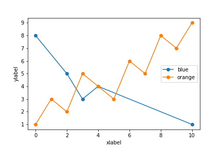
fig = plt.figure(facecolor="white")
ax = fig.add_subplot(111, xlabel="date", ylabel="Temperature [℃]")

data = df.swaplevel(0, 1, axis=1)["Temperature"]
ax.plot(data, label=data.columns, lw=2)

ax.legend()
ax.grid(axis="y", lw=0.5)
ax.tick_params(rotation=20)
fig.savefig("3-1_b.png")
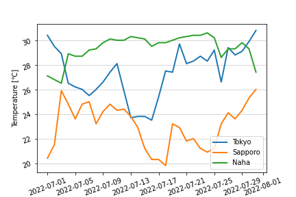
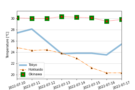
fig = plt.figure(facecolor="white")
ax = fig.add_subplot(
    111,
    ylabel="Temperature [℃]",
    xlim=(pd.Timestamp("2022-07-10"), pd.Timestamp("2022-07-17")),
)

data = df.swaplevel(0, 1, axis=1)["Temperature"]
ax.plot(data["Tokyo"], lw=5, alpha=0.5, label="Tokyo")
ax.plot(data["Sapporo"], marker="^", linestyle="-.", mfc="black", label="Hokkaido")
# fmt="rs:"はcolor="r(ed)", marker="s(quare)", linestyle=":" の意味
ax.plot(data["Naha"], "rs:", ms=10, mew=5, mec="green", label="Okinawa")

ax.legend()
ax.grid(axis="y", lw=0.5)
ax.tick_params(axis="x", rotation=20)
fig.savefig("3-1_c.png")
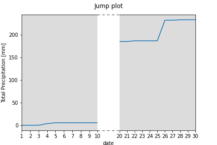
# 軸の中間を省略するということはできないので、
# 省略の前後と中央部を作って擬似的に作成する
fig = plt.figure()
ax1 = fig.add_axes(
    (0.1, 0.1, 0.35, 0.8),
    fc="gainsboro",
    xlim=tuple(pd.to_datetime(["2022-07-01", "2022-07-10"])),
    xticklabels=range(1, 11),
    ylabel="Total Precipitation [mm]",
)
ax2 = fig.add_axes(
    (0.55, 0.1, 0.35, 0.8),
    fc="gainsboro",
    xlim=tuple(pd.to_datetime(["2022-07-20", "2022-07-30"])),
    xticklabels=range(20, 31),
    sharey=ax1,
)
fig.suptitle("Jump plot")
fig.text(0.5, 0, "date", horizontalalignment="center")

ax1.plot(df[("Tokyo", "Precipitation")].cumsum())
ax2.plot(df[("Tokyo", "Precipitation")].cumsum())

ax0 = fig.add_axes((0.45, 0.1, 0.1, 0.8), fc="white", xticks=[], yticks=[])
ax1.spines["right"].set_visible(False)
ax0.spines["left"].set_visible(False)
ax0.spines["right"].set_visible(False)
ax2.spines["left"].set_visible(False)
ax2.tick_params(left=False, labelleft=False)

ax0.spines["top"].set_linestyle((0, (5, 7)))
ax0.spines["bottom"].set_linestyle((0, (5, 7)))

fig.savefig("3-1_d.png")
3.2. 散布図(Axes.scatter())
ax.scatter(x, y, marker="o")
散布図はAxes.scatter()。
| 主な引数 | 説明 |
|---|---|
| marker | マーカーの形状。 |
| s | マーカーのサイズ。 |
| c | マーカーの色。facecolor,facecolorsでも可。 |
| linewidths | マーカーの縁の太さ。全て同じ場合はlinewidth,lwでも可。 |
| edgecolors | マーカーの縁の色。デフォルトは'face'(cと同じ色)。 |
| label | プロットのラベル。凡例に表示される。 |
| alpha | 透明度を0~1で指定。 |
| zorder | オブジェクトが重なっていた時この値が大きい方が前面に描画される。 |
- マーカーに関するパラメータは、データ数と同じ要素数のリストを渡すと各点ごとに設定できる。
戻り値はPathCollectionオブジェクト。
fig = plt.figure()
ax = fig.add_subplot(111, xlabel="CloudCover", ylabel="Temperature [℃]")

ax.scatter(df[("Tokyo", "CloudCover")], df[("Tokyo", "Temperature")])

fig.savefig("3-2_a.png")
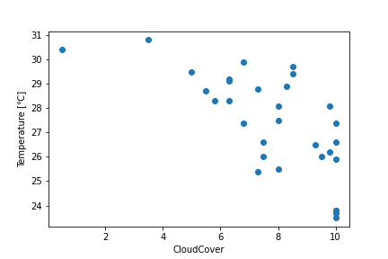
fig = plt.figure()
ax = fig.add_subplot(111, xlabel="CloudCover", ylabel="Temperature [℃]")

ax.scatter(df[("Tokyo", "CloudCover")], df[("Tokyo", "Temperature")], s=df[("Tokyo", "CloudCover")]**2)
ax.scatter(df[("Sapporo", "CloudCover")], df[("Sapporo", "Temperature")], s=df[("Sapporo", "CloudCover")]**2)
ax.scatter(df[("Naha", "CloudCover")], df[("Naha", "Temperature")], s=df[("Naha", "CloudCover")]**2)

fig.savefig("3-2_b.png")
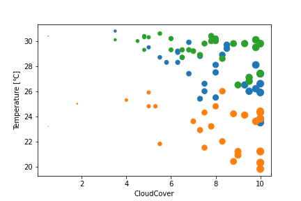
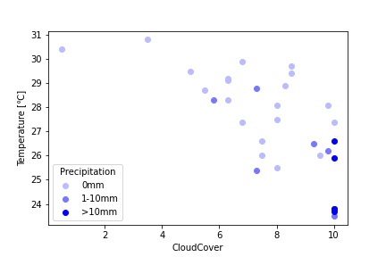
fig = plt.figure()
ax = fig.add_subplot(111, xlabel="CloudCover", ylabel="Temperature [℃]")

color_label = {"0mm": "#BBBBFF", "1-10mm": "#7777FF", ">10mm": "#0000FF"}
colors = pd.cut(
    df[("Tokyo", "Precipitation")],
    [0, 1, 10, 100],
    right=False,
    labels=color_label.keys(),
)
for color, data in df["Tokyo"].groupby(colors):
    ax.scatter(
        data["CloudCover"], data["Temperature"], c=color_label[color], label=color
    )

ax.legend(title="Precipitation")
fig.savefig("3-2_c.png")
3.3. 棒グラフ(Axes.bar())
ax.bar(x, height)
棒グラフはAxes.bar()。
| 主な引数 | 説明 |
|---|---|
| width | 棒の幅(太さ)。横軸の値で指定。デフォルトは0.8。 |
| bottom | 棒の下端。主に積み上げ棒グラフにするときに用いる。 |
| align | 棒の横位置。デフォルトは'center'(xの値に棒の中心が来る)。'edge'にするとxの値に棒の左端が来る。 |
| color | 棒の色。facecolor,fcでも可。 |
| hatch | 棒の網掛け。 |
| linewidth | 棒の縁の太さ。lwでも可。 |
| edgecolor | 棒の縁の色。ecでも可。 |
| alpha | 透明度を0~1で指定。 |
| zorder | オブジェクトが重なっていた時この値が大きい方が前面に描画される。 |
-
xの値に棒の右端が来るようにする場合は、widthを負にしてalign='edge'とする。
戻り値はBarContainerオブジェクト。
fig = plt.figure()
ax = fig.add_subplot(111, xlabel="date", ylabel="Precipitation [mm]")
ax.bar(df.index, df[("Tokyo", "Precipitation")])
ax.tick_params(axis="x", rotation=20)
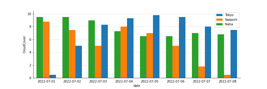
fig.savefig("3-3_a.png")
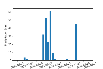
fig = plt.figure(figsize=(12, 4))
ax = fig.add_subplot(
    111,
    xlabel="date",
    ylabel="CloudCover",
    xlim=tuple(pd.to_datetime(["2022-06-30 12:00", "2022-07-08 12:00"])),
)

data = df.xs("CloudCover", level=1, axis=1)

w = pd.Timedelta("6H")
[
    ax.bar(data.index - w * (i - 1), data[cityname], label=cityname, width=w, zorder=10)
    for i, cityname in enumerate(data.columns)
]

ax.tick_params(bottom=False)
ax.grid(axis="y", c="gainsboro", zorder=9)
[ax.spines[side].set_visible(False) for side in ["right", "top"]]
ax.legend()
fig.savefig("3-3_b.png")
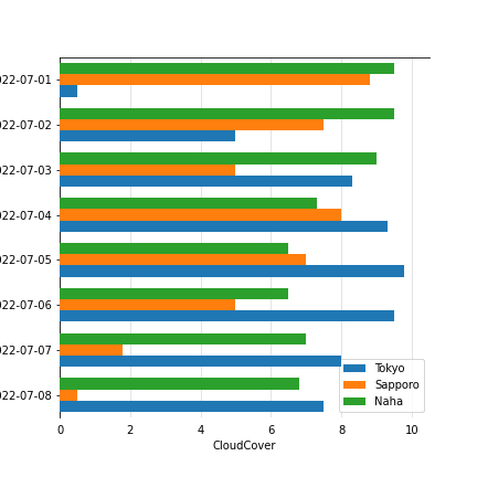
3.3.1. 横持ち棒グラフ(Axes.barh())
ax.barh(y, width)
横棒グラフはAxes.barh()。
使い方はほぼAxes.bar()と同じだが、第一引数に横軸の値・第二引数に縦軸の値を渡す。
fig = plt.figure(figsize=(6, 6))
ax = fig.add_subplot(
    111,
    xlabel="CloudCover",
    ylabel="date",
    ylim=tuple(pd.to_datetime(["2022-07-08 12:00", "2022-06-30 12:00"])),
)

data = df.xs("CloudCover", level=1, axis=1)

w = pd.Timedelta("6H")
[
    ax.barh(data.index - w * (i - 1), data[cityname], label=cityname, height=w, zorder=10)
    for i, cityname in enumerate(data.columns)
]

ax.tick_params(bottom=False)
ax.grid(axis="x", c="gainsboro", zorder=9)
[ax.spines[side].set_visible(False) for side in ["right", "bottom"]]
ax.legend()
fig.savefig("3-3_b_2.png")
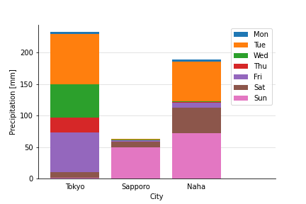
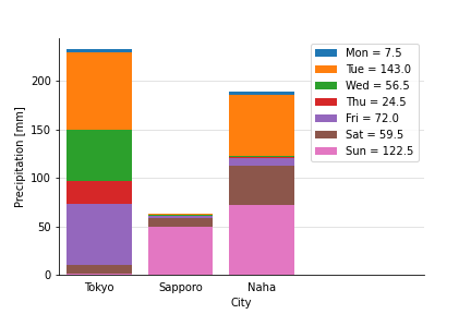
3.3.2. 積み上げ棒グラフ
積み上げ棒グラフを直接描くようなメソッドはない。トリックを使う必要がある。
以下は曜日別の降水量の例である。一番上に位置する月曜日のデータ値を全体の合計にし、火曜日のデータ(実際には火曜日から日曜日までの合計)の棒を月曜日の棒の上から描くことで、積み上げ棒グラフを再現している。欠点としては棒の塗りを半透明にしたい場合は(実際には棒が重なっているので)変になってしまう。
fig = plt.figure()
ax = fig.add_subplot(111, xlabel="City", ylabel="Precipitation [mm]", xlim=(-0.6, 3.3))

data = df.xs("Precipitation", level=1, axis=1).groupby(df.index.weekday).sum()
data_cumsum = data.loc[::-1].cumsum()

day_names = ["Mon", "Tue", "Wed", "Thu", "Fri", "Sat", "Sun"]
for i in data.index:
    ax.bar(data.columns, data_cumsum.loc[i], label=day_names[i], zorder=10+i)

ax.tick_params(bottom=False)
ax.grid(axis="y", c="gainsboro", zorder=9)
[ax.spines[side].set_visible(False) for side in ["right", "top"]]
ax.legend()
fig.savefig("3-3_c_1.png")

次の例はAxes.barのbottom=引数を用いる方法である。これは月曜日のデータの下端(bottom=引数)に火曜日から日曜日までの合計値を指定している。
fig = plt.figure()
ax = fig.add_subplot(111, xlabel="City", ylabel="Precipitation [mm]", xlim=(-0.6, 3.3))

data = df.xs("Precipitation", level=1, axis=1).groupby(df.index.weekday).sum()

day_names = ["Mon", "Tue", "Wed", "Thu", "Fri", "Sat", "Sun"]
for i in data.index:
    ax.bar(
        data.columns,
        data.loc[i],
        bottom=data.loc[i + 1 :].sum(axis=0),
        label=day_names[i],
        zorder=10,
    )

ax.tick_params(bottom=False)
ax.grid(axis="y", c="gainsboro", zorder=9)
[ax.spines[side].set_visible(False) for side in ["right", "top"]]
ax.legend()
fig.savefig("3-3_c_2.png")
3.4. ヒストグラム(Axes.hist())
n, bins, patches = ax.hist([x1, x2], bins=10, range=(x.min(), x.max()))
ヒストグラムはAxes.hist()。第一引数にxにデータ配列を渡す(集計は自動で行われる)。
| 主な引数 | 説明 |
|---|---|
| bins | ビン(柱)の本数。デフォルトは10。各階級区間(境界)のリストを指定することもできる。 |
| range | 対象範囲を(float, float)で指定。デフォルトは(x.min(), x.max())。 |
| density |
True:n(下記参照)の合計が1になるように正規化する。 |
| cumulative |
True:グラフを累積分布にする。 |
| histtype | グラフの種類(下記参照)。デフォルトは'bar'。 |
| align | 柱の横位置。デフォルトは'mid'(区間の中央)。'left','right'が選べる。 |
| orientation | デフォルトは'vertical'。'horizontal'にすると横持ちになる。 |
| color | ビンの色。リストで系列毎に指定可。 |
| label | 系列名。リストで系列毎に指定可。 |
| facecolor | ビンの色。fcでも可。colorとは違いリスト不可(全系列同色)。 |
| hatch | ビンの網掛け。 |
| linewidth | ビンの縁の太さ。lwでも可。 |
| edgecolor | ビンの縁の色。ecでも可。 |
| alpha | 透明度を0~1で指定。 |
| zorder | オブジェクトが重なっていた時この値が大きい方が前面に描画される。 |
histtypeではグラフの種類を以下から指定する。
-
'bar':デフォルト。通常のヒストグラム。系列が複数ある場合は、横に並べて表示する。 -
'barstacked':系列が複数ある場合、各ビンが積み上げ棒グラフになる。 -
'step':ステップ折れ線グラフ。 -
'stepfilled':ステップ折れ線グラフ(塗りつぶし)。系列が複数ある場合は重なって背面に来た系列は見えなくなるので、alphaを同時に設定することを推奨。
Axes.hist()の戻り値は3つ。グラフオブジェクトのほか、度数のデータを取得することができる。
- 第一戻り値
nは、各階級の度数(=各ビンの高さ)の配列(系列が2つ以上の場合は配列のリスト)。 - 第二戻り値
binsは、各階級区間(境界)の配列。 - 第三戻り値
patchesは、Patchオブジェクトのリスト。
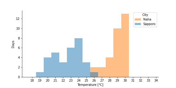
fig = plt.figure(figsize=(8, 4))
ax = fig.add_subplot(
    111, xticks=range(18, 35, 1), xlabel="Temperature [℃]", ylabel="Days"
)

data = df.xs("Temperature", level=1, axis=1).stack()
n, bins, patches = ax.hist(data, bins=range(18, 35, 1))

# 度数を棒の頭に表示
texts = [
    ax.text(bin + 0.5, num + 0.3, int(num), horizontalalignment="center")
    for num, bin in zip(n, bins)
    if num
]

[ax.spines[side].set_visible(False) for side in ["right", "top"]]
fig.savefig("3-4_a.png")
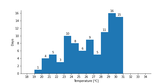
fig = plt.figure(figsize=(8, 4))
ax = fig.add_subplot(
    111, xticks=range(18, 35, 1), xlabel="Temperature [℃]", ylabel="Days"
)

data = df.xs("Temperature", level=1, axis=1)
n, bins, patches = ax.hist(
    [data["Sapporo"], data["Naha"]],
    bins=range(18, 35, 1),
    label=["Sapporo", "Naha"],
    align="left",
    histtype="stepfilled",
    alpha=0.5,
)

[ax.spines[side].set_visible(False) for side in ["right", "top"]]
ax.legend(title="City")
fig.savefig("3-4_b.png")
3.5. 箱ひげ図(Axes.boxplot())
ax.boxplot(x)

ax.boxplot([x1, x2], notch=True, sym="b+", labels=["x1", "x2"])
箱ひげ図はAxes.boxplot()。第一引数にxにデータ配列を渡す(集計は自動で行われる)。
| 主な引数 | 説明 |
|---|---|
| notch |
True:箱を切れ目ありにする。95%信頼区間が可視化される。 |
| sym | 外れ値のマーカーの色と形状を文字列型で指定。''で非表示。 |
| vert |
False:グラフを横持ちにする。 |
| whis | 外れ値の境界をIQR=1とした値で指定。デフォルトは1.5。また [5, 95]のようにするとパーセンタイル区間でも指定可。'range'にすると外れ値を考慮しない。 |
| widths | 箱の幅(太さ)。横軸の値で指定。デフォルトは0.5。 |
| labels | 系列名(x軸目盛りラベルに表示される)をリストで指定。 |
| showmeans |
True:平均値を表すマーカーを表示。なお、 meanline=Trueを指定しているとマーカーではなく線になる。 |
| patch_artist |
True:箱をLine2DオブジェクトではなくPatchオブジェクトで描画する。 |
| zorder | オブジェクトが重なっていた時この値が大きい方が前面に描画される。 |
| capprops | 最大値・最小値を表す線のスタイルを辞書型で指定。 |
| boxprops | 箱のスタイルを辞書型で指定。 |
| whiskerprops | ひげ線のスタイルを辞書型で指定。 |
| medianprops | 中央値を表す線のスタイルを辞書型で指定。 |
| flierprops | 外れ値のマーカーのスタイルを辞書型で指定。symを指定している場合は無効。 |
| meanprops | 平均値のマーカーのスタイルを辞書型で指定。 |
-
capprops,boxprops,whiskerprops,medianpropsに渡すキーワードはcolor(色),linewidth(太さ),linestyle(線種)など。なお、c,lwなどは不可。 -
patch_artist=True時にboxpropsに渡すキーワードはfacecolor(色),color(縁色),linewidth(縁の太さ)など。なお、fc,lwなどは不可。 -
flierprops,meanpropsに渡すキーワードはmarker(形状),markeresize(大きさ),markerfacecolor(色),markeredgecolor(縁色)など。なお、ms,mfcなどは不可。
戻り値は複数のLine2D(patch_artist=True時は箱のみPatchオブジェクト)オブジェクトからなる辞書。
fig = plt.figure()
ax = fig.add_subplot(111, xlabel="City", ylabel="Temperature [℃]")

data = df.xs("Temperature", level=1, axis=1)
ax.boxplot(data, labels=data.columns, zorder=10)

ax.grid(axis="y", c="gainsboro", zorder=9)
fig.savefig("3-5_a.png")
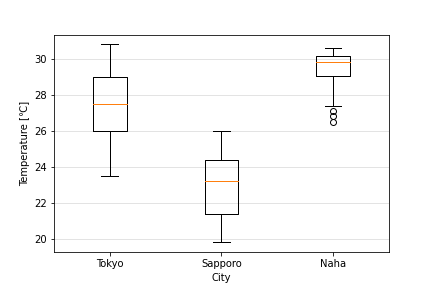
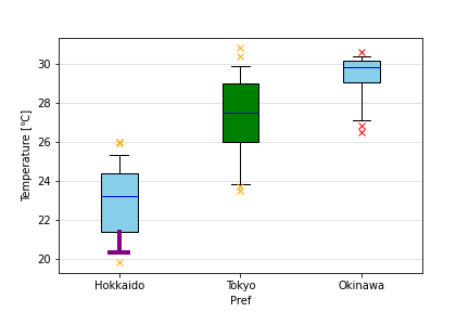
fig = plt.figure()
ax = fig.add_subplot(111, xlabel="Pref", ylabel="Temperature [℃]")

data = df.xs("Temperature", level=1, axis=1)
result = ax.boxplot(
    [data["Sapporo"], data["Tokyo"], data["Naha"]],
    labels=["Hokkaido", "Tokyo", "Okinawa"],
    whis=[5, 95],
    patch_artist=True,
    boxprops=dict(facecolor="skyblue"),  # 箱を水色に
    medianprops=dict(color="blue"),  # 中央値を示す横線を青色に
    flierprops=dict(marker="x", markeredgecolor="orange"),  # 外れ値を橙色に
    zorder=10,
)

# オブジェクトをあとから個別に変更する例
result["fliers"][2].set_markeredgecolor("red")  # 那覇の外れ値を赤に
result["boxes"][1].set_facecolor("green")  # 東京の箱を緑に
# 北海道のひげ下側と最小値を太い紫に
[result[p][0].set(color="purple", linewidth=4) for p in ["caps", "whiskers"]]

ax.grid(axis="y", c="gainsboro", zorder=9)
fig.savefig("3-5_b.png")
3.6. バイオリン図(Axes.violinplot())
ax.violinplot([x1, x2], [1, 2])
バイオリン図はAxes.violinplot()。
第一引数datasetに各データ、第二引数positions(オプション)にy軸の位置を与える。すなわちdatasetとpositionsの長さは一致していなければならない。
主な引数は以下の通り。x軸目盛りラベルや、色・線の太さ、zorderが指定できないなどオプション引数が少ない。
| 主な引数 | 説明 |
|---|---|
| vert |
False:バイオリンを横向きにする。 |
| widths | バイオリンの最大幅(太さ)。横軸の値で指定。デフォルトは0.5。 |
| showmeans |
True:平均値を表す横線を表示。 |
| showextrema |
False:縦線と、最大値と最小値を表す短い横線を非表示。 |
| showmedians |
True:中央値を表す横線を表示。 |
| quantiles | 短い横線を表示するパーセンタイル値(0~1)をデータごとに指定。 |
-
quantilesは例えば[[.25], [.25, .5, .75]]のように指定すると、1つ目のデータは25%タイル値、2つ目のデータは25%・50%・75%タイル値を表す短い横線が表示される。datasetと同じ長さでなければならない。
戻り値は複数のLine2Dオブジェクトからなる辞書。線や色を変更する場合はこれを用いる。
fig = plt.figure()
ax = fig.add_subplot(111, xlabel="City", ylabel="Temperature [℃]")

data = df.xs("Temperature", level=1, axis=1)
ax.violinplot(data, showmedians=True)

# x軸目盛りラベルを設定
ax.set_xticks(range(1, data.shape[1] + 1), labels=data.columns)

ax.grid(axis="y", c="gainsboro")
fig.savefig("3-6_a.png")

4. 文字・注釈を入れる
4.1. 文字列の挿入(Figure.text(),Axes.text())
fig.text(0.1, 0.1, "fig_text")
# Text(0.1, 0.1, 'fig_text')

ax.text(0.1, 0.1, "ax_text")
# Text(0.1, 0.1, 'ax_text')
図中に文字列を挿入する場合はFigure.text(),Axes.text()を用いる。第一引数xに横位置・第二引数yに縦位置・第三引数sに文字列を渡す。
Figure.text()はFigureの左下を(0, 0)・右上を(1, 1)とした座標でx,yを指定する。Axes.text()はグラフの値でx,yを指定する。
なお、文字列中の改行は'\n'。
| 主な引数 | 説明 |
|---|---|
| horizontalalignment | 左右揃え。haでも可。'left','center','right'から指定。 |
| verticalalignment | 上下揃え。vaでも可。'top','center','bottom','baseline'から指定。 |
| rotation | 回転角度。90度の場合は90のほか'vertical'でも指定可能。 |
| rotationmode |
'anchor':(x, y)の値を中心に文字列を回転する。haやvaの挙動が変わる。 |
| fontfamily | フォント。 |
| fontname | フォント。 |
| fontsize | 大きさ。sizeでも可。 |
| fontweight | ウェイト。0~1000の数値,或いはウェイトネームの文字列を指定。 |
| fontstyle |
'italic':斜体。 |
| color | 色。 |
| bbox | 図形スタイルを辞書形式で指定(4.5.参照)。 |
| alpha | 透明度を0~1で指定。 |
| zorder | オブジェクトが重なっていた時この値が大きい方が前面に描画される。 |
| withdash |
True:文字列から(x, y)に向かって線を伸ばす。 |
| dashlength | 線の長さ。 |
| dashdirection | 線の方向。0:文字列の右側。1:文字列の左側。 |
| dashrotation | 線の角度。(x, y)から見て反時計回りに0~180で指定。0未満や180以上も可能だが非推奨。 |
| dashpad | 線の端と文字列の間の余白の距離。デフォルトは3。 |
| dashpush | 線の端と(x, y)の間の余白の距離。 |
戻り値はTextオブジェクト。
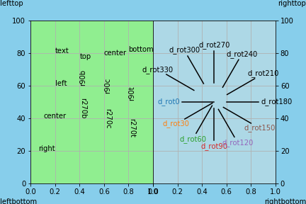
fig = plt.figure(facecolor="skyblue")
ax1 = fig.add_axes((0.1, 0.1, 0.4, 0.8), facecolor="lightgreen", ylim=(0, 100))
ax2 = fig.add_axes((0.5, 0.1, 0.4, 0.8), facecolor="lightblue", sharey=ax1)
ax2.tick_params(left=False, right=True, labelleft=False, labelright=True)
ax1.grid()
ax2.grid()

# 基本
ax1.text(0.2, 80, "text")
ax1.text(0.2, 60, "left", ha="left")
ax1.text(0.2, 40, "center", ha="center")
ax1.text(0.2, 20, "right", ha="right")
ax1.text(0.4, 80, "top", va="top")
ax1.text(0.6, 80, "center", va="center")
ax1.text(0.8, 80, "bottom", va="bottom")

# 回転
ax1.text(0.4, 60, "r90b", rotation="vertical", va="bottom")
ax1.text(0.6, 60, "r90c", rotation="vertical", va="center")
ax1.text(0.8, 60, "r90t", rotation="vertical", va="top")
ax1.text(0.4, 40, "r270b", rotation=270, va="bottom")
ax1.text(0.6, 40, "r270c", rotation=270, va="center")
ax1.text(0.8, 40, "r270t", rotation=270, va="top")

# fig
fig.text(0, 0, "leftbottom")
fig.text(1, 0, "rightbottom", ha="right")
fig.text(0, 1, "lefttop", va="top")
fig.text(1, 1, "righttop", ha="right", va="top")

# withdash
[
    ax2.text(
        0.5,
        50,
        "d_rot" + str(r),
        withdash=True,
        dashlength=45,
        dashrotation=r,
        dashpush=r / 10,
        color="C" + str(int(r / 30)),
    )
    for r in range(0, 180, 30)
]
[
    ax2.text(
        0.5,
        50,
        "d_rot" + str(r + 180),
        withdash=True,
        dashlength=45,
        dashdirection=1,
        dashrotation=r,
        dashpush=(r + 180) / 10,
    )
    for r in range(0, 180, 30)
]

fig.savefig("4-1_a.png", facecolor=fig.get_facecolor())
4.2. 図タイトル(Figure.suptitle())
fig.suptitle("title")
# Text(0.5, 0.98, 'title')
図Figure全体に対してにタイトルを挿入する場合は、Figure.suptitle()に文字列を渡すのが容易。
なお、個別のグラフAxesに対してにタイトルを挿入する場合は、作成時にtitleで指定する(2.参照)のが容易だが、後から追加変更する場合はAxes.set_title()で可能。
| 主な引数 | 説明 |
|---|---|
x |
x座標。 |
y |
y座標。 |
- その他のパラメータは4.1.を参照。
戻り値はTextオブジェクト。Figure.text(),Axes.text()に専用のデフォルトパラメータが与えられているだけのようである。
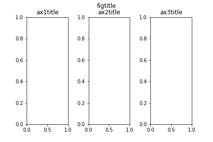
fig = plt.figure()
fig.subplots_adjust(wspace=0.5)
ax1 = fig.add_subplot(131)
ax2 = fig.add_subplot(132)
ax3 = fig.add_subplot(133)

fig.suptitle("figtitle")
ax1.set_title("ax1title")
ax2.set(title="ax2title")
ax3.update(dict(title="ax3title"))

fig.savefig("4-2_a.png")
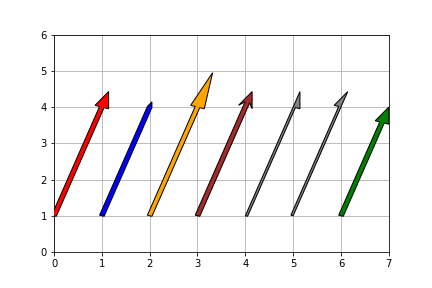
4.3. 矢印(Axes.arrow())
ax1.arrow(0, 1, 1, 3, width=0.1)
矢印の挿入はAxes.arrow()で行う。第一引数x・第二引数yに始点の座標、第三引数dx・第四引数dyに矢の長さを、グラフの座標系で渡す。
| 主な引数 | 説明 |
|---|---|
| width | 矢柄の太さ。 |
| head_width | 矢尻の太さ。デフォルトではwidthに依存。 |
| head_length | 矢尻の長さ。デフォルトではhead_widthに依存。 |
| overhang | 矢尻の返しの長さ。デフォルトは0(返しなし)。 |
| shape |
left,rightで縦半分のみの表示。 |
| length_includes_head |
True:(dx, dy)を矢印の先端にする。デフォルトはFalse((dx, dy)に矢尻後端がくる)。 |
| facecolor | 色。fcでも可。 |
| hatch | 網掛け。 |
| linewidth | 縁の太さ。lwでも可。 |
| edgecolor | 縁の色。ecでも可。 |
| alpha | 透明度を0~1で指定。 |
| zorder | オブジェクトが重なっていた時この値が大きい方が前面に描画される。 |
戻り値はFancyArrowオブジェクト。
fig = plt.figure()
ax1 = fig.add_subplot(111, xlim=(0, 7), ylim=(0, 6))
ax1.grid(zorder=5)

ax1.arrow(0, 1, 1, 3, zorder=10, width=0.1, fc="red")
ax1.arrow(1, 1, 1, 3, zorder=10, width=0.1, fc="blue", head_width=0.1)
ax1.arrow(2, 1, 1, 3, zorder=10, width=0.1, fc="orange", head_length=1)
ax1.arrow(3, 1, 1, 3, zorder=10, width=0.1, fc="brown", overhang=0.3)
ax1.arrow(4, 1, 1, 3, zorder=10, width=0.1, fc="gray", shape="left")
ax1.arrow(5, 1, 1, 3, zorder=10, width=0.1, fc="gray", shape="right")
ax1.arrow(6, 1, 1, 3, zorder=10, width=0.1, fc="green", length_includes_head=True)

fig.savefig("4-3_a.png")
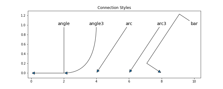
4.4. 座標に対して文字・矢印(Axes.annotate())
ax1.annotate("Text", (0, 1))
# Text(0, 1, 'Text')

ax1.annotate("Text", (1, 1), (2, 4), arrowprops=dict(arrowstyle="->"))
# Text(1, 1, 'Text')
ある座標に対して文字、或いは文字と矢印を指し示す場合はAxes.annotate()を用いる。第一引数sに文字列・第二引数xyに座標位置をタプルで渡す。
第三引数xytextに座標位置を渡すと、文字列がxytextの位置に、矢印の先がxyの位置になる。
| 主な引数 | 説明 |
|---|---|
| xytext | 文字列の座標を(float, float)で指定。 |
| xycoords |
xyの座標の指定方法。デフォルトはdata(グラフのデータの値)。'figure fraction':Figure左下を(0, 0),右上を(1, 1)とした座標。 |
| textcoords |
xytextの座標の指定方法。デフォルトはxycoordsに従う。 |
| arrowprops | 矢印に関するパラメータを辞書型で指定。 |
| ┣ arrowstyle | 矢印のスタイル(下記参照)。デフォルトは'simple'。 |
| ┣ mutation_scale | 矢印の大きさ。 |
| ┣ connectionstyle | 矢柄のスタイル(下記参照)。デフォルトは'arc3'。 |
| ┣ shrinkA | 文字列と矢印後端の間の余白の距離。 |
| ┣ shrinkB | 矢印先端とxyの間の余白の距離。 |
| ┗ **kwargs | ほかfc,hatch,lw,ec,alpha,zorderなど指定可(4.2.参照)。 |
- このほか、文字列に関するパラメータは4.1.を参照。
- Arrow Style,Connection Styleはスタイル名を文字列で渡すが、それに続けて細かい設定を指定することも可能。複雑になるのでここでは詳述しない。
戻り値はAnnotationオブジェクト。
fig = plt.figure(figsize=(12, 4))
ax = fig.add_subplot(111, title="Arrow Styles", xlim=(-0.2, 14.4), ylim=(-0.1, 1.2))

arrstyles = [
    *("-", "->", "-[", "-|>", "<-"),
    *("<->", "<|-", "<|-|>", "]-", "]-["),
    *("fancy", "simple", "wedge", "|-|"),
]
for i, arrstyle in enumerate(arrstyles):
    ax.annotate(
        arrstyle,
        (i, 0),
        (i + 1, 1),
        zorder=10,
        ha="center",
        size=14,
        arrowprops=dict(arrowstyle=arrstyle, mutation_scale=20),
    )

fig.savefig("4-4_a.png")
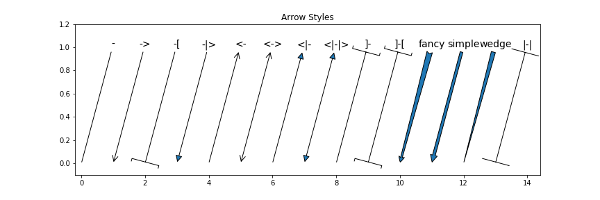
fig = plt.figure(figsize=(10, 4))
ax = fig.add_subplot(
    111, title="Connection Styles", xlim=(-0.2, 10.4), ylim=(-0.1, 1.3)
)

constyles = ["angle", "angle3", "arc", "arc3", "bar"]
for i, constyle in enumerate(constyles):
    ax.annotate(
        constyle,
        (i * 2, 0),
        (i * 2 + 2, 1),
        zorder=10,
        ha="center",
        size=14,
        arrowprops=dict(arrowstyle="-|>", mutation_scale=20, connectionstyle=constyle),
    )

fig.savefig("4-4_b.png")
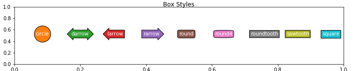
4.5. 図形の設定(Bbox)
ax.text(1, 1, "TextWithBox", bbox=(dict(boxstyle="circle")))
# Text(1, 1, 'TextWithBox')
引数bboxに辞書形式でパラメータを指定することで、文字列を任意の図形で囲む事ができる。
| 主な引数 | 説明 |
|---|---|
| boxstyle | 図形のスタイル(下記参照)。 |
| color | 背景と縁の色。 |
| facecolor | 背景色。fcでも可。 |
| hatch | 網掛け。 |
| linewidth | 縁の太さ。lwでも可。colorを指定していると無効。 |
| edgecolor | 縁の色。ecでも可。colorを指定していると無効。 |
| alpha | 透明度を0~1で指定。 |
| zorder | オブジェクトが重なっていた時この値が大きい方が前面に描画される。 |
- Box Styleはスタイル名を文字列で渡すが、それに続けて細かい設定を指定することも可能。複雑になるのでここでは詳述しない。
fig = plt.figure(figsize=(10, 2))
fig.suptitle("Box Styles")
ax = fig.add_axes((0.04, 0.1, 0.92, 0.8))

bstyles = [
    *("circle", "darrow", "larrow", "rarrow", "round"),
    *("round4", "roundtooth", "sawtooth", "square"),
]
for i, bstyle in enumerate(bstyles, 1):
    fig.text(i * 0.1, 0.5, bstyle, color="w", bbox=(dict(boxstyle=bstyle, fc=f"C{i}")))

fig.savefig("4-5_a.png")
5. 凡例の設定
5.1. 凡例の追加
凡例はFigure.legend()あるいはAxes.legend()を用いる。このときパラメータを入力すると凡例の設定ができる。
| 主な引数 | 説明 |
|---|---|
| handles | 凡例に載せるデータ(5.2.参照)。 |
| labels | 各系列の表示名前(5.2.参照)。 |
| loc | 凡例の位置(5.3.参照)。 |
| bbox_to_inches | 凡例の位置と大きさ(5.4.参照)。 |
| mode |
'expand':幅を横いっぱいに広げる(5.4.も参照)。 |
| shadow |
True:凡例ボックスの影を表示。 |
| framealpha | 凡例ボックスの透明度を0~1で指定。 |
| facecolor | 凡例ボックスの背景色。 |
| edgecolor | 凡例ボックスの縁の色。 |
| title | 凡例のタイトル名。 |
| title_fontsize | 凡例のタイトルのフォントサイズ。 |
| ncol | 凡例の列数。デフォルトは1。 |
| fontsize | 凡例のフォントサイズ。 |
| numpoints | マーカーの数(折れ線グラフのとき)。 |
| scatterpoints | マーカーの数(散布図のとき)。 |
| markerscale | マーカーの多大きさ。 |
| borderpad | 凡例の文字とボックス縁の間の余白を、fontsizeを1とした値で指定。 |
| labelspacing | 凡例の行間を、fontsizeを1とした値で指定。 |
| handlelength | 凡例の線の長さを、fontsizeを1とした値で指定。 |
| handletextpad | 凡例の線と系列名の間の余白を、fontsizeを1とした値で指定。 |
| columnspacing | 凡例の列間を、fontsizeを1とした値で指定。 |
-
zorder引数は指定できない。前後の位置を指定する場合は、凡例オブジェクトの.set_zorder()メソッド(.set(zorder=)でも可)を用いる。
5.2. 表示データの設定
Figure.legend()あるいはAxes.legend()を用いると、自動でFigure或いはAxes内にあるArtistオブジェクト(プロット)をかきあつめて凡例に表示してくれる。このときオブジェクトにlabelが指定されていれば、それが表示名となる。
データを自分で設定する場合は引数handlesにArtistオブジェクトのリストを渡し、表示名を自分で設定する場合は引数labelsに表示名のリストを渡す。
fig = plt.figure()
ax = fig.add_subplot(111, xlabel="City", ylabel="Precipitation [mm]", xlim=(-0.5, 4))

data = df.xs("Precipitation", level=1, axis=1).groupby(df.index.weekday).sum()

bars = [
    ax.bar(
        data.columns,
        data.loc[i],
        bottom=data.loc[i + 1 :].sum(axis=0),
        zorder=10,
    )
    for i in data.index
]

ax.tick_params(bottom=False)
ax.grid(axis="y", c="gainsboro", zorder=9)
[ax.spines[side].set_visible(False) for side in ["right", "top"]]

day_names = ["Mon", "Tue", "Wed", "Thu", "Fri", "Sat", "Sun"]
ax.legend(
    handles=bars,
    labels=[f"{day_names[i]} = {data.loc[i].sum()}" for i in range(7)],
)
fig.savefig("3-3_c_2.png")
5.3. 凡例の位置設定
引数locに特定の文字列・数値を渡すことで凡例の位置を指定できる。
| 文字列 | 数字 | 説明 |
|---|---|---|
| 'best' | 0 | 以下から自動で位置を決定 |
| 'upper right' | 1 | 右上 |
| 'upper left' | 2 | 左上 |
| 'lower left' | 3 | 左下 |
| 'lower right' | 4 | 右下 |
| 'right' | 5 | 右中央 |
| 'center left' | 6 | 左中央 |
| 'center right' | 7 | 右中央 |
| 'lower center' | 8 | 中央下 |
| 'upper center' | 9 | 中央上 |
| 'center' | 10 | 中央 |
-
'center right'と'right'は同じ。 - 左下を(0, 0)・右上を(1, 1)とする座標を
(float, float)の形で渡すことで、凡例左下隅の位置を任意に指定可能。
5.4. 凡例の位置と大きさを細かく設定
引数bbox_to_inchesに、左下を(0, 0)・右上を(1, 1)とする座標を(float, float)の形で渡すことで、locで指定した凡例の隅がその位置にくる。
また、横位置・縦位置に続けて幅・高さを加えた(float, float, float, float)の形にすることで、大きさを指定することもできる。
mode引数のデフォルトはNoneになっている。これがNoneのとき、凡例の横幅は表示文字列に合わせて自動調整される。
mode='expand'とすることで、内容にかかわらず凡例の幅をbbox_to_inchesで指定した値にすることができる。
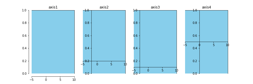
6. 軸の設定
グラフの軸は、横軸Axes.xaxisと縦軸Axes.yaxisと、グラフの枠Axes.spinesでできている。
6.1. グラフの枠(Axes.spines)の設定
グラフの枠Axes.spinesは、上下左右それぞれの枠線Spineオブジェクトの集合(辞書形式になっている)。キー'left','right','top','bottom'でそれぞれ取り出せる。
Spine.set(XXX=AAA)或いはSpine.update(dict(XXX=AAA))或いはSpine.set_XXX(AAA)でパラメータを変更することができる。
| 主な引数 | 説明 |
|---|---|
| position | 枠の位置を(position type, amount)あるいは'zero','center'で指定(下記参照)。 |
| color | 色。edgecolor,ecでも可。 |
| dashes | 実線部分と空白部分の長さをリストで指定。 |
| linestyle | 線種。lsでも可。dashesが指定されていると無効。 |
| linewidth | 太さ。lwでも可。 |
| alpha | 透明度を0~1で指定。 |
| zorder | オブジェクトが重なっていた時この値が大きい方が前面に描画される。 |
| visible |
False:非表示。 |
positionで指定できるposition typeは以下の通り。
-
'outward':amountpxだけAxesの外側に配置。amountを負にするとAxesの内側に配置。 -
'axes':Axes左下を(0, 0)・右上を(1, 1)とした座標の位置に配置。 -
'data':データの座標位置に配置。 -
position='zero'或いはposition=('data', 0)で0のところに軸を配置できる。 -
position='center'或いはposition=('axes', 0.5)でAxesの中心に軸を配置できる。
fig = plt.figure(figsize=(12, 4))
ax1 = fig.add_subplot(141, fc="skyblue", xlim=(-5, 10), title="axis1")
ax1.spines["left"].set(position=("outward", 10))
ax1.spines["bottom"].set(position=("outward", 10))

ax2 = fig.add_subplot(142, fc="skyblue", xlim=(-5, 10), title="axis2")
ax2.spines["left"].set(position=("axes", 0.2))
ax2.spines["bottom"].set(position=("axes", 0.2))

ax3 = fig.add_subplot(143, fc="skyblue", xlim=(-5, 10), title="axis3")
ax3.spines["left"].set(position=("data", -3))
ax3.spines["bottom"].set(position=("data", 0.1))

ax4 = fig.add_subplot(144, fc="skyblue", xlim=(-5, 10), title="axis4")
ax4.spines["left"].set(position="zero")
ax4.spines["bottom"].set(position="center")

fig.savefig("6-1_a.png")
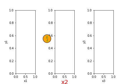
6.2. 軸ラベルの設定
グラフの軸ラベルは、Axes作成時にxlabel,ylabelで指定する(2.参照)のが容易だが、後から追加変更する場合はAxes.set_xlabel('横軸ラベル名'),Axes.set_ylabel('縦軸ラベル名')を用いる。この時4.1.のパラメータを用いて文字のスタイルを指定可能。
縦軸横軸のラベル名を同時に変更する場合は,Axes.set(xlabel='横軸ラベル名', ylabel='縦軸ラベル名')あるいはAxes.update(dict(xlabel='横軸ラベル名', ylabel='縦軸ラベル名'))で一行で書ける。
fig = plt.figure()
fig.subplots_adjust(wspace=1)

ax1 = fig.add_subplot(131, xlabel="x1", ylabel="y1")

ax2 = fig.add_subplot(132)
ax2.set_xlabel("x2", size=20, color="red")
ax2.set_ylabel(
    "y\n2",
    rotation=0,
    ha="center",
    color="g",
    bbox=dict(boxstyle="circle", fc="orange"),
)

ax3 = fig.add_subplot(133)
ax3.set(xlabel="x3", ylabel="y3")

fig.savefig("6-2_a.png")
6.3. 軸の最小値・最大値の設定
軸の最小値・最大値は、Axes作成時にxlim,ylimで指定する(2.参照)のが容易だが、後から追加変更する場合はAxes.set_xlim(left, right),Axes.set_ylim(bottom, top)を用いる。
縦軸横軸の最小値・最大値を同時に変更する場合は,Axes.set(xlim=(left, right), ylim=(bottom, top))あるいはAxes.update(dict(xlim=(left, right), ylim=(bottom, top)))で一行で書ける。
Axes.set_xlim(auto=True),Axes.set_ylim(auto=True)とすると、データの最小値・最大値から自動で軸の最小値・最大値が決定される。Axes作成時にxmargin,ymarginを指定していると、「(データの最大値 - データの最小値) * margin」が左右の余白の幅になる(デフォルトは0.05)。
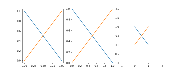
fig = plt.figure(figsize=(10, 4))

# デフォルト(margin=0.05)
ax1 = fig.add_subplot(131)
ax1.plot([[1, 0], [0, 1]])

# margin=0
ax2 = fig.add_subplot(132, xmargin=0, ymargin=0)
ax2.plot([[1, 0], [0, 1]])

# margin=1
ax3 = fig.add_subplot(133, xmargin=1, ymargin=1)
ax3.plot([[1, 0], [0, 1]])

fig.savefig("6-3_b.png")
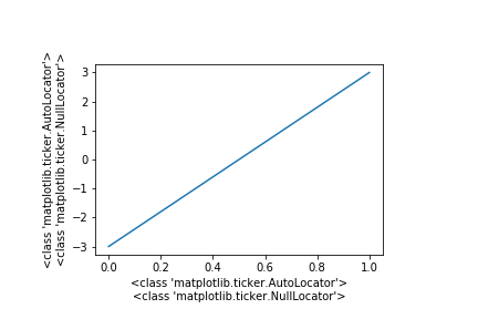
6.4. 軸の目盛の設定
軸の目盛はAxis.set_major_locator()(大目盛)とAxis.set_minor_locator()(補助目盛)に各種Locatorを渡すことで変更可能。Locatorはmpl.ticker.XXXLocator()で作成・取得する。
デフォルトではmajor_locator(大目盛)はAutoLocator,minor_locator(補助目盛)はNullLocatorになっている(っぽい)。
fig = plt.figure()
ax = fig.add_axes((0.2, 0.2, 0.6, 0.6))
ax.plot([0, 5])

ax.set_xlabel(
    str(type(ax.xaxis.get_major_locator()))
    + "\n"
    + str(type(ax.xaxis.get_minor_locator()))
)
ax.set_ylabel(
    str(type(ax.yaxis.get_major_locator()))
    + "\n"
    + str(type(ax.yaxis.get_minor_locator()))
)

fig.savefig("6-4_a.png")
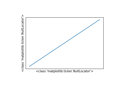
6.4.1. 目盛なし(NullLocator)
NullLocatorで目盛なしにできるが、Axes.set_xticks([]),Axes.set_yticks([])の方が簡単(6.4.8.参照)。
fig = plt.figure()
ax = fig.add_axes((0.2, 0.2, 0.6, 0.6))
ax.plot([0, 5])

ax.xaxis.set_major_locator(mpl.ticker.NullLocator())
ax.yaxis.set_major_locator(mpl.ticker.NullLocator())

ax.set(
    xlabel=type(ax.xaxis.get_major_locator()),
    ylabel=type(ax.yaxis.get_major_locator()),
)
fig.savefig("6-4_b.png")
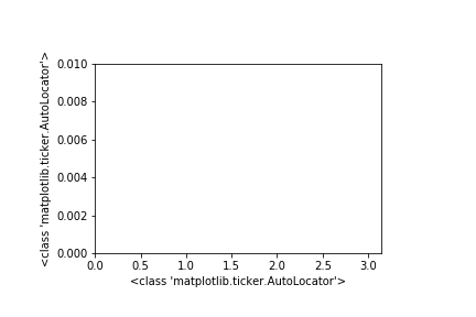
6.4.2. 自動で目盛りを設定(AutoLocator)
AutoLocatorにすると自動で目盛りを設定する。後からxlim,ylimが変わってもそれに合わせてくれる。
fig = plt.figure()
ax = fig.add_axes((0.2, 0.2, 0.6, 0.6))

ax.xaxis.set_major_locator(mpl.ticker.AutoLocator())
ax.yaxis.set_major_locator(mpl.ticker.AutoLocator())

ax.set(xlim=(0, 3.14), ylim=(0, 0.01))

ax.set(
    xlabel=type(ax.xaxis.get_major_locator()),
    ylabel=type(ax.yaxis.get_major_locator()),
)
fig.savefig("6-4_c.png")
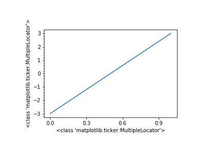
6.4.3. 特定の値の整数倍に目盛(MultipleLocator)
MultipleLocator(base)に数値を渡すことで、その値の整数倍の箇所に目盛りを入れることができる。デフォルトはbase=1.0。なお、0以下にするとエラーになる。
fig = plt.figure()
ax = fig.add_axes((0.2, 0.2, 0.6, 0.6))
ax.plot([-3, 3])

ax.xaxis.set_major_locator(mpl.ticker.MultipleLocator(0.3))

ax.yaxis.set_major_locator(mpl.ticker.MultipleLocator())  # 1.0
ax.yaxis.set_minor_locator(mpl.ticker.MultipleLocator(0.2))

ax.set(
    xlabel=type(ax.xaxis.get_major_locator()),
    ylabel=type(ax.yaxis.get_major_locator()),
)
fig.savefig("6-4_d.png")
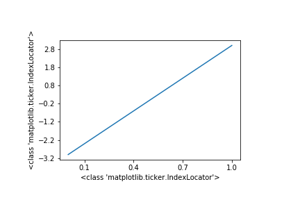
6.4.4. 等差数列の目盛を配置(IndexLocator)
IndexLocator(base, offset)に数値を渡すことで、「base×n+offset」の位置に目盛りを入れることができる。offset=0のときMultipleLocatorと同じ。
なお、デフォルト値はないので数値を与えないとエラーになる。なお、baseを0にするとエラーになる。
fig = plt.figure()
ax = fig.add_axes((0.2, 0.2, 0.6, 0.6))
ax.plot([-3, 3])

ax.xaxis.set_major_locator(mpl.ticker.IndexLocator(0.3, 0.1))
ax.yaxis.set_major_locator(mpl.ticker.IndexLocator(1, -0.2))

ax.set(
    xlabel=type(ax.xaxis.get_major_locator()),
    ylabel=type(ax.yaxis.get_major_locator()),
)
fig.savefig("6-4_e.png")
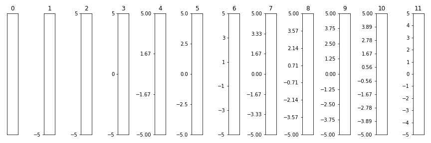
6.4.5. 特定の個数だけ目盛を配置(LinearLocator)
LinearLocator(numticks)に数値を渡すことで,グラフ最大値~最小値をnumticks-1等分する位置に目盛を配置することができる。
fig, axes = plt.subplots(
    1, 12, figsize=(12, 4), tight_layout=True, subplot_kw=dict(xticks=[], ylim=(-5, 5))
)

for i in range(len(axes)):
    axes[i].set_title(str(i))
    axes[i].yaxis.set_major_locator(mpl.ticker.LinearLocator(i))

fig.savefig("6-4_f.png")
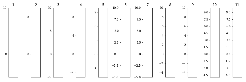
6.4.6. MaxNLocator
MaxNLocator(nbins)に値を渡すと、「目盛の間」の数がnbins以内で最大となるように、かつstepsにある値の倍数の位置に目盛を配置する(?)。integer=Trueにすると整数の値のみに目盛を配置する。
ちなみにAutoLocatorはMaxNLocator('auto', steps=[1, 2, 2.5, 5, 10])と同じらしい。
fig, axes = plt.subplots(
    1, 11, figsize=(12, 4), tight_layout=True, subplot_kw=dict(xticks=[], ylim=(-5, 10))
)

for i in range(len(axes)):
    axes[i].set_title(str(i + 1))
    axes[i].yaxis.set_major_locator(mpl.ticker.MaxNLocator(i + 1))

fig.savefig("6-4_g.png")
6.4.7. 対数軸
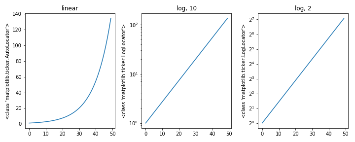
Axesのパラメータxsclae, yscaleを'log'にすると対数軸にできる(通常の軸スケールは'linear')。後から追加変更する場合はAxes.set_xscale(),Axes.set_yscale()を用いる。Axes.set_xscale(),Axes.set_yscale()はbaseで対数の底を指定可能(デフォルトは10)。
このときLocatorはLogLocatorになる。
import math

y = [math.exp(i / 10) for i in range(50)]
fig = plt.figure(figsize=(10, 4), tight_layout=True)

ax1 = fig.add_subplot(131, title="linear")
ax1.plot(y)
ax1.set_ylabel(type(ax1.yaxis.get_major_locator()))

ax2 = fig.add_subplot(132, title="log, 10", yscale="log")
ax2.plot(y)
ax2.set_ylabel(type(ax2.yaxis.get_major_locator()))

ax3 = fig.add_subplot(133, title="log, 2")
ax3.set_yscale("log", base=2)
ax3.plot(y)
ax3.set_ylabel(type(ax3.yaxis.get_major_locator()))

fig.savefig("6-4_h.png")
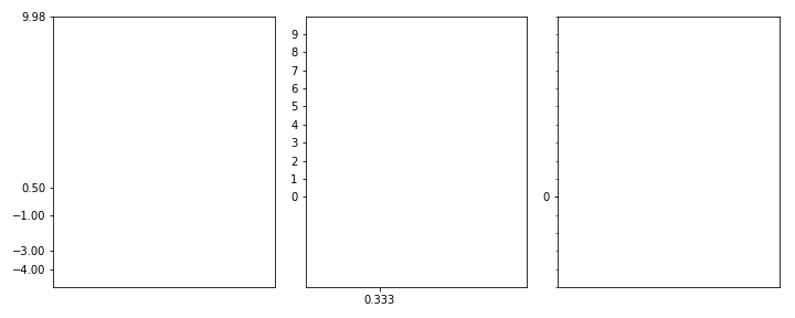
6.4.8. 目盛りの位置を自由に設定(FixedLocator)
Axesのパラメータxticks, yticksに数値のリストを渡すと、その値の箇所にだけ目盛を配置することができる。後から変更する場合はAxes.set_xticks(),Axes.set_yticks()を用いる。[]にすると目盛がなくなる。
このときLocatorはFixedLocatorになる。
fig, axes = plt.subplots(
    1,
    3,
    figsize=(10, 4),
    tight_layout=True,
    subplot_kw=dict(xlim=(0, 1), ylim=(-5, 10)),
)

axes[0].set_xticks([])
axes[0].set_yticks([-4, -3, -1, 0.5, 9.98])

axes[1].set(xticks=[1 / 3], yticks=range(10))

axes[2].xaxis.set_major_locator(mpl.ticker.FixedLocator([]))
axes[2].yaxis.set_major_locator(mpl.ticker.FixedLocator([0]))
axes[2].yaxis.set_minor_locator(mpl.ticker.FixedLocator(range(-5, 11)))

fig.savefig("6-4_i.png")
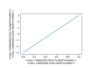
6.5. 軸の目盛ラベルの設定
軸の目盛はAxis.set_major_formatter()(大目盛)とAxis.set_minor_formatter()(補助目盛)に各種Formatterを渡すことで変更可能。Formatterはmpl.ticker.XXXFormatter()で作成・取得する。
fig = plt.figure()
ax = fig.add_axes((0.2, 0.2, 0.6, 0.6))
ax.plot([-3, 3])

ax.set_xlabel(
    str(type(ax.xaxis.get_major_formatter()))
    + "\n"
    + str(type(ax.xaxis.get_minor_formatter()))
)
ax.set_ylabel(
    str(type(ax.yaxis.get_major_formatter()))
    + "\n"
    + str(type(ax.yaxis.get_minor_formatter()))
)

fig.savefig("6-5_a.png")
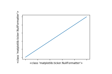
6.5.1. 目盛ラベルなし(NullFormatter)
NullFormatterで目盛ラベルなしにできるが、Axes.set_xticklabels([]),Axes.set_yticklabels([])の方が簡単(6.5.参照)。
fig = plt.figure()
ax = fig.add_axes((0.2, 0.2, 0.6, 0.6))
ax.plot([0, 5])

ax.xaxis.set_major_formatter(mpl.ticker.NullFormatter())
ax.yaxis.set_major_formatter(mpl.ticker.NullFormatter())

ax.set(
    xlabel=type(ax.xaxis.get_major_formatter()),
    ylabel=type(ax.yaxis.get_major_formatter()),
)
fig.savefig("6-5_b.png")
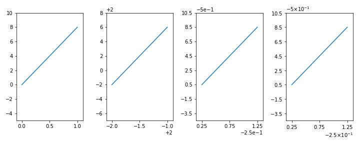
6.5.2. 値をそのまま表示(ScalarFormatter)
ScalarFormatter()は、値をそのまま表示する。
- 第一引数
useOffsetに数値を渡すと、その数だけ目盛ラベルの値が引かれる。 - 単位として表示される「e」を用いた表記は、
useMathText=Trueすると「×10^」を用いた表記になる。
fig, axes = plt.subplots(
    1,
    4,
    figsize=(10, 4),
    tight_layout=True,
    subplot_kw=dict(xlim=(-0.1, 1.1), ylim=(-5, 10)),
)
[ax.plot([0, 8]) for ax in axes]

axes[1].xaxis.set_major_formatter(mpl.ticker.ScalarFormatter(2))
axes[1].yaxis.set_major_formatter(mpl.ticker.ScalarFormatter(2))

axes[2].xaxis.set_major_formatter(mpl.ticker.ScalarFormatter(-1 / 4))
axes[2].yaxis.set_major_formatter(mpl.ticker.ScalarFormatter(-0.5))

axes[3].xaxis.set_major_formatter(mpl.ticker.ScalarFormatter(-1 / 4, useMathText=True))
axes[3].yaxis.set_major_formatter(mpl.ticker.ScalarFormatter(-0.5, useMathText=True))

fig.savefig("6-5_c.png")
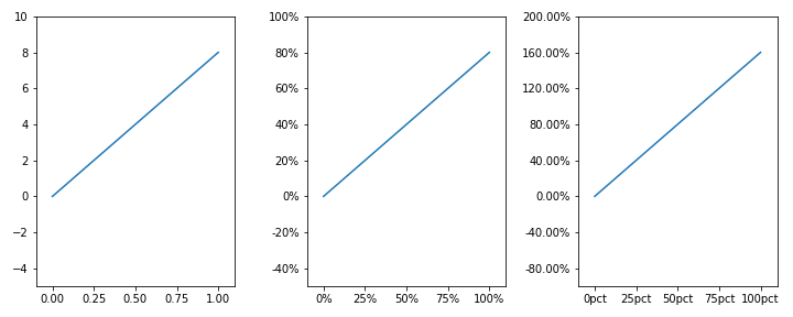
6.5.3. パーセント表示(PercentFormatter)
目盛ラベルをパーセント表示するときはPercentFormatterを用いる。
- 第一引数
xmax:100%とみなす値。デフォルトは100。 - 第二引数
decimals:少数第何位まで表示するか。デフォルトはNone(自動)。 - 第三引数
symbol:接尾辞。数字の後につける文字列。デフォルトは'%'。
fig, axes = plt.subplots(
    1,
    3,
    figsize=(10, 4),
    tight_layout=True,
    subplot_kw=dict(xlim=(-0.1, 1.1), ylim=(-5, 10)),
)
[ax.plot([0, 8]) for ax in axes]

axes[1].xaxis.set_major_formatter(mpl.ticker.PercentFormatter(1))
axes[1].yaxis.set_major_formatter(mpl.ticker.PercentFormatter(10))

axes[2].xaxis.set_major_formatter(mpl.ticker.PercentFormatter(1, 0, "pct"))
axes[2].yaxis.set_major_formatter(mpl.ticker.PercentFormatter(5, 2))

fig.savefig("6-5_d.png")
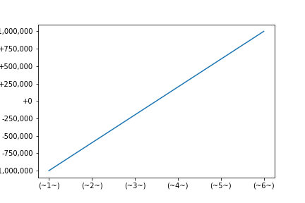
6.5.4. フォーマット文字列で指定(StrMethodFormatter)
StrMethodFormatter()に文字列を渡すと、str.format()で変換した結果が得られる。
{x}は目盛の値を表し、{pos}は目盛の位置(何番目か)を表す。
fig, ax = plt.subplots(1, 1)
ax.plot([-1000000, 1000000])

ax.xaxis.set_major_formatter(mpl.ticker.StrMethodFormatter("({pos:~^3})"))
ax.yaxis.set_major_formatter(mpl.ticker.StrMethodFormatter("{x:+,.0f}"))

fig.savefig("6-5_e.png")
なお、バージョン3.3.0からはset_major_formatter()に直接フォーマット文字列を渡すことができるようになった。
fig, ax = plt.subplots(1, 1)
ax.plot([-1000000, 1000000])

ax.xaxis.set_major_formatter("({pos:~^3})")
ax.yaxis.set_major_formatter("{x:+,.0f}")

fig.savefig("6-5_e.png")
6.5.5. 定義した関数で表示を指定(FuncFormatter)
FuncFormatter()に関数を渡すと、その関数にx(目盛の値),pos(目盛の位置)を渡した結果が表示される。引数の数が2つでない関数を指定するとエラーになる。
(自由度が高いが良い使い道が思いつかなかった(検索してもStrMethodFormatter等で済むことをわざわざFuncFormatterで行っている例が多かった))
fig, ax = plt.subplots(1, 1)
ax.plot([-1000000, 1000000])

ax.yaxis.set_major_formatter(mpl.ticker.FuncFormatter(lambda x, pos: x / (pos - 5)))

fig.savefig("6-5_f.png")

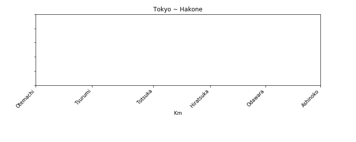
6.5.6. 目盛ラベルを自由に設定(FixedFormatter)
Axesのパラメータxticklabels, yticklabelsに数値のリストを渡すと、その値の箇所にだけ目盛を配置することができる。[]にすると目盛ラベルがなくなる。
後から変更する場合はAxes.set_xticklabels(),Axes.set_yticklabels()を用いる。このとき第二引数以降に文字列に関するパラメータを指定可能(4.1.参照)。
このときFormatterはFixedFormatterになる。
fig = plt.figure(figsize=(10, 4))
ax = fig.add_axes((0.1, 0.4, 0.8, 0.5))

tick_l = [0, 21.3, 44.4, 65.8, 86.7, 107.5]
label_l = ["Otemachi", "Tsurumi", "Totsuka", "Hiratsuka", "Odawara", "Ashinoko"]

ax.set(title="Tokyo ~ Hakone", xlabel="Km", xticks=tick_l, yticklabels=[])
ax.set_xticklabels(label_l, rotation=45, ha="right")

fig.savefig("6-5_g.png")
6.6. 補助線の設定
グラフエリアに罫線を引く方法。
6.6.1. 方眼線(Axes.grid())
Axes.grid()を用いるとグラフに方眼線(罫線)を引くことができる。
| 主な引数 | 説明 |
|---|---|
| which | 方眼線を引く基準の目盛を'major','minor','both'から指定。デフォルトは'major'。 |
| axis | 方眼線を引く方向を'x'(横軸),'y'(縦軸),'both'(両方)から指定。デフォルトは'both'。 |
- そのほかの設定は3.1.参照。
fig, ax = plt.subplots(1, 1)
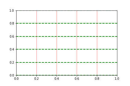
ax.grid(axis="x", color="red", lw=0.5)
ax.grid(axis="y", color="green", lw=2, ls="--")
fig.savefig("6-6_a.png")
6.6.2. 特定の位置に直線
方眼線は目盛と連動しているため、目盛と無関係に線を引きたいときには折れ線グラフを引くしか無い。
Axes.plot()を用いてもよいが、直線を引くにはAxes.axhline()(横線),Axes.axvline()(縦線)を用いるのが容易。
第一引数に線の位置座標を渡す。第二引数と第三引数に0~1の値を渡すと線を短くできる。Axes.axhline()(横線)の場合は以下のようになる。
| 主な引数 | 説明 |
|---|---|
| y | 線のy座標。縦の位置。デフォルトは0。 |
| xmin | 線の始点(左端)の位置。デフォルトは0。 |
| xmax | 線の終点(右端)の位置。デフォルトは1。 |
-
xmin,xmaxは、Axesの左下を(0, 0)・右上を(1, 1)とする座標で指定する。 - そのほかの設定は3.1.参照。
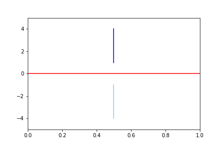
fig = plt.figure()
ax = fig.add_subplot(111, ylim=(-5, 5))

ax.axhline(c="r")
ax.axvline(0.5, 0.1, 0.4, c="skyblue")
ax.axvline(0.5, 0.6, 0.9, c="blue")

fig.savefig("6-6_b.png")
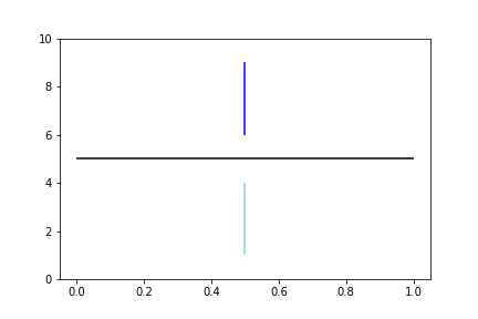
Axes.hlines()(横線),Axes.vlines()(縦線)を用いると複数の位置に同時に線を引くことができる。Axes.hlines()(横線)の場合は以下のようになる。
| 主な引数 | 説明 |
|---|---|
| y | 線のy座標。縦の位置。 |
| xmin | 線の始点(左端)の位置。 |
| xmax | 線の終点(右端)の位置。 |
| colors | 線の色。リストを渡すと一本ごとに決められる。 |
| linestyles | 線の種類。リストを渡すと一本ごとに決められる。 |
| zorder | オブジェクトが重なっていた時この値が大きい方が前面に描画される。 |
-
y,xmin,xmaxは、データの座標で指定する。
fig = plt.figure()
ax = fig.add_subplot(111, ylim=(0, 10))

ax.hlines(5, 0, 1)
ax.vlines([0.5, 0.5], [1, 6], [4, 9], colors=["skyblue", "blue"])

fig.savefig("6-6_c.png")
6.7. 軸目盛の一括設定
Locator,Formatter以外の軸目盛の設定はAxes.tick_params()を用いるのが容易。
第一引数axisには設定対象の軸名'x'(横軸),'y'(縦軸),'both'(両方)のいずれかを指定する(デフォルトは'both')。
| 主な引数 | 説明 |
|---|---|
| reset |
True:指定していないパラメータを全てデフォルト値に変更する。 |
| colors | 目盛線と目盛ラベルの色。color,labelcolorが指定されている場合はそちらが優先。 |
| zorder | オブジェクトが重なっていた時この値が大きい方が前面に描画される。 |
| which | 設定対象の目盛を'major','minor','both'から指定。デフォルトは'major'。 |
| direction | 目盛の向きを'in'(内側),'out'(外側),'inout'(両方)から指定。 |
| length | 目盛線の長さ。 |
| width | 目盛線の太さ。 |
| color | 目盛線の色。 |
| pad | 目盛線と目盛ラベルの間隔。 |
| labelsize | 目盛ラベルのフォントサイズ。 |
| labelcolor | 目盛ラベルの色。 |
| labelrotation | 目盛ラベルの角度。 |
| grid_color | 方眼線の色。 |
| grid_alpha | 方眼線の透明度を0~1で指定。 |
| grid_linewidth | 方眼線の太さ。 |
| grid_linestyle | 方眼線の線種。 |
-
top,bottom,left,rightに、True/Falseを渡すことで、上下左右の目盛線の表示/非表示を指定可能。 -
labeltop,labelbottom,labelleft,labelrightに、True/Falseを渡すことで、上下左右の目盛ラベルの表示/非表示を指定可能。
7. 画像出力
>>> fig.savefig("filename.png")
図Figureを画像として保存するにはFigure.savefig()を用いる。第一引数fnameにファイル名を指定する。このときパラメータを入力すると画像の設定ができる。
| 主な引数 | 説明 |
|---|---|
| figsize |
Figureのサイズ。横縦を(float, float)で指定。 |
| dpi | dpi。整数で指定。'figure'にするとFigureのパラメータを引き継ぐ。 |
| quality | JPEGの品質を0~100で指定。 |
| facecolor | 図の背景色。Figureのパラメータは無視される。 |
| edgecolor | 図の枠の色。Figureのパラメータは無視される。 |
| bbox_inches |
'tight':Figureではなく、オブジェクトが配置されている部分を出力する。 |
8. スタイルの設定に関して
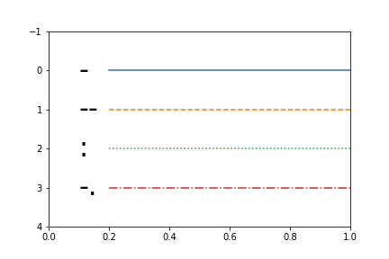
8.1. linestyle一覧
fig = plt.figure()
ax = fig.add_subplot(111, xlim=(0, 1), ylim=(4, -1))

ls_list = ["-", "--", ":", "-."]

for i, ls in enumerate(ls_list):
    ax.text(0.1, i, ls, size=30, va="center")
    ax.plot([0.2, 1], [i, i], ls=ls)

fig.savefig("8-1_a.png")
8.2. markerstyle一覧
fig = plt.figure(figsize=(12, 4))
ax = fig.add_subplot(111, xlim=(-0.2, 38), ylim=(0, 1))

m_list = [
    *(".", ",", "o", "v", "^", "<", ">", "1", "2", "3", "4", "8"),
    *("s", "p", "*", "h", "H", "+", "P", "x", "X", "D", "d", "|", "_"),
    *(0, 1, 2, 3, 4, 5, 6, 7, 8, 9, 10, 11, ""),
]
plot = [0.1, 0.6, 0.8]

for i, m in enumerate(m_list):
    ax.plot(
        [i + p for p in plot],
        plot,
        c="gainsboro",
        marker=m,
        ms=10,
        mfc="orange",
        mew=1.5,
        mec="green",
    )
    ax.text(i + 0.75, 0.9, m, size=15, ha="center")

fig.savefig("8-2_a.png")
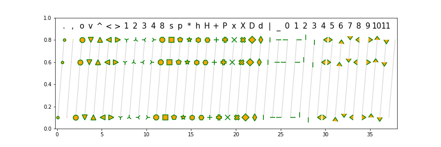
$...$で囲むと数式をマーカーにできる。
8.3. colorname一覧
名前がついている色一覧。
⇒公式