4
1

Delete article

Deleted articles cannot be recovered.

Draft of this article would be also deleted.

Are you sure you want to delete this article?

More than 1 year has passed since last update.

【HTML/CSS】スマートフォンのセーフエリアの対応方法

Posted at

はじめに

PWAで"display": "standalone"とした場合に、画面下端に配置したボタンとホームバーが重なってしまうことがあります。

IMG_6AF350887619-1.jpeg

これを改善する方法について記載します。

ビューポートのメタ値を追加する

HTMLのメタタグにviewport-fit=coverを追加します。

<meta name="viewport" content="viewport-fit=cover" />

CSSで余白を追加する

余白が必要な要素に以下を設定します。

.sample {
  padding-bottom: env(safe-area-inset-bottom);
}

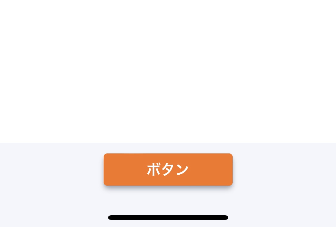
すると以下のようにボタンの下に適切な余白ができます。

IMG_1077BAF91629-1.jpeg

画面を横向きにした際にアイコンなどがノッチに重なるのを避けるには以下のようにします。

.sample {
  padding-left: env(safe-area-inset-left);
  padding-right: env(safe-area-inset-right);
}

参考

4
1
0

Register as a new user and use Qiita more conveniently

  1. You get articles that match your needs
  2. You can efficiently read back useful information
  3. You can use dark theme
What you can do with signing up
4
1

Delete article

Deleted articles cannot be recovered.

Draft of this article would be also deleted.

Are you sure you want to delete this article?