環境は、macOS。High Sierra。
まずはインストール。
brew tap caskroom/cask
brew cask install julia
でうまく行った。
続いていろいろインストール
julia
で julia を起動して、
julia> Pkg.add("DataFrames")
julia> Pkg.add("Gadfly")
julia> Pkg.add("CSV")
julia> Pkg.add("IJulia")
と、必要なパッケージを入れる。全部必要かどうかは知らない。
julia> using DataFrames
julia> using CSV
julia> using Gadfly
ruby でいうところの require なのかな。モジュールを使えるようにする。
読み込むための CSV を用意する。こんな感じ。
foo,bar,baz
0.301159526431945,0.313898454910858,1.17473791223684
0.325130268171028,0.560497185694232,1.11750475177855
0.372315907398201,0.611611162175372,0.97738803760451
0.547662216748869,0.623214687217486,0.916423163300621
0.935238506542586,0.816615537373106,0.658791349303661
1.18550683453858,0.94334310373166,0.397721258358077
1.76558291386366,1.06395657347973,-0.122663466326476
1.98231779465134,0.91729852516118,-0.318439265035155
2.13064106463242,0.867904655344771,-0.525066684500675
ちなみに上記データは味付けした乱数。
そして読み込む。
julia> dt=CSV.read( "foobarbaz.csv" )
9×3 DataFrames.DataFrame
│ Row │ foo      │ bar      │ baz       │
├─────┼──────────┼──────────┼───────────┤
│ 1   │ 0.30116  │ 0.313898 │ 1.17474   │
│ 2   │ 0.32513  │ 0.560497 │ 1.1175    │
│ 3   │ 0.372316 │ 0.611611 │ 0.977388  │
│ 4   │ 0.547662 │ 0.623215 │ 0.916423  │
│ 5   │ 0.935239 │ 0.816616 │ 0.658791  │
│ 6   │ 1.18551  │ 0.943343 │ 0.397721  │
│ 7   │ 1.76558  │ 1.06396  │ -0.122663 │
│ 8   │ 1.98232  │ 0.917299 │ -0.318439 │
│ 9   │ 2.13064  │ 0.867905 │ -0.525067 │
時刻 foo に bar と baz という値が計測されたと思うと、こんな風にグラフにする
julia> plot(
       layer(dt, x=:foo, y=:bar, Geom.line, Geom.point, Theme(default_color=colorant"red")),
       layer(dt, x=:foo, y=:baz, Geom.line, Geom.point), Guide.ylabel("Hoge"))
実行するとブラウザが起動して以下のようなグラフが見られる:
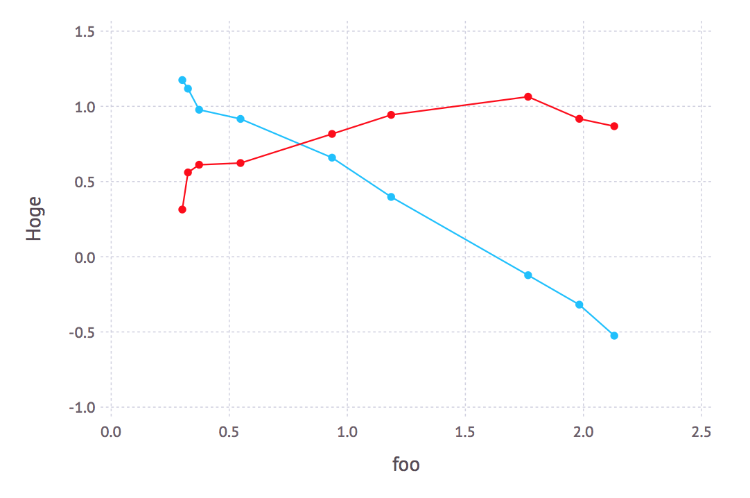
ラベルがないけどね。
値の範囲を指定するなら、こんな感じ:
julia> plot(
       layer(dt, x=:foo, y=:bar, Geom.line, Geom.point, Theme(default_color=colorant"red")),
       layer(dt, x=:foo, y=:baz, Geom.line, Geom.point),
       Guide.ylabel("Hoge"), Coord.cartesian(xmin=0.5, xmax=1.5, ymin=-2, ymax=2))
しかし。上記の処理を
foobarbaz.jl
using DataFrames
using CSV
using Gadfly

dt=CSV.read( "foobarbaz.csv" )
plot(
       layer(dt, x=:foo, y=:bar, Geom.line, Geom.point, Theme(default_color=colorant"red")),
       layer(dt, x=:foo, y=:baz, Geom.line, Geom.point),
       Guide.ylabel("Hoge"), Coord.cartesian(xmin=0.5, xmax=1.5, ymin=-2, ymax=2))
のように書いて
julia foobarbaz.jl
のように実行しても、グラフは見られない。
グラフを見るためには
foobarbaz2.jl
using DataFrames
using CSV
using Gadfly

dt=CSV.read( "foobarbaz.csv" )
p = plot(
       layer(dt, x=:foo, y=:bar, Geom.line, Geom.point, Theme(default_color=colorant"red")),
       layer(dt, x=:foo, y=:baz, Geom.line, Geom.point),
       Guide.ylabel("Hoge"), Coord.cartesian(xmin=0.5, xmax=1.5, ymin=-2, ymax=2))
draw(SVGJS("foobarbaz.js.svg", 6inch, 6inch), p)
のように、plot の結果を draw して、それをブラウザなどで表示する必要があるようだ。
あと。
実行時間が遅いのが気になる。
手元で
julia foobarbaz2.jl
を実行すると 40秒ほどかかる。遅すぎると思う。