Material 3 Expressive の実装例の紹介シリーズです。
今回は App bar 系を紹介します。
(androidx.compose.material3:material3:1.5.0-alpha04 時点での内容になります。)
Material 3 Expressive での変更点
- Top app bar から App bar にリネーム
- Search app bar の追加
- Material 3 で追加された Medium と Large の
TopAppBarが廃止され、新たに Medium flexible と Large flexible の App bar が追加
実装
Small app bar
TopAppBar に title や subtitle、navigationIcon、 actions 等が Slot として用意されています。
TopAppBar(
    title = {
        Text("Title", maxLines = 1, overflow = TextOverflow.Ellipsis)
    }
)

// with subtitle
TopAppBar(
    title = {
        Text("Title", maxLines = 1, overflow = TextOverflow.Ellipsis)
    },
    subtitle = { Text("Subtitle", maxLines = 1, overflow = TextOverflow.Ellipsis) },
)

// with actions
TopAppBar(
    title = {
        Text("Title", maxLines = 1, overflow = TextOverflow.Ellipsis)
    },
    subtitle = {
        Text("Subtitle", maxLines = 1, overflow = TextOverflow.Ellipsis)
    },
    navigationIcon = {
        IconButton(onClick = {}) {
            Icon(...)
        }
    },
    actions = {
        IconButton(onClick = {}) {
            Icon(...)
        }
    }
)

// Center aligned
CenterAlignedTopAppBar(
    title = {
        Text("Title", maxLines = 1, overflow = TextOverflow.Ellipsis)
    },
    navigationIcon = {
        IconButton(onClick = {}) { ... }
    },
    actions = {
        IconButton(onClick = {}) { ... }
    }
)

// Center aligned with subtitle
TopAppBar(
    title = {
        Text("Title", maxLines = 1, overflow = TextOverflow.Ellipsis)
    },
    subtitle = {
        Text("Subtitle", maxLines = 1, overflow = TextOverflow.Ellipsis)
    },
    titleHorizontalAlignment = Alignment.CenterHorizontally,
    navigationIcon = {
        IconButton(onClick = {}) { ... }
    },
    actions = {
        IconButton(onClick = {}) { ... }
    }
)

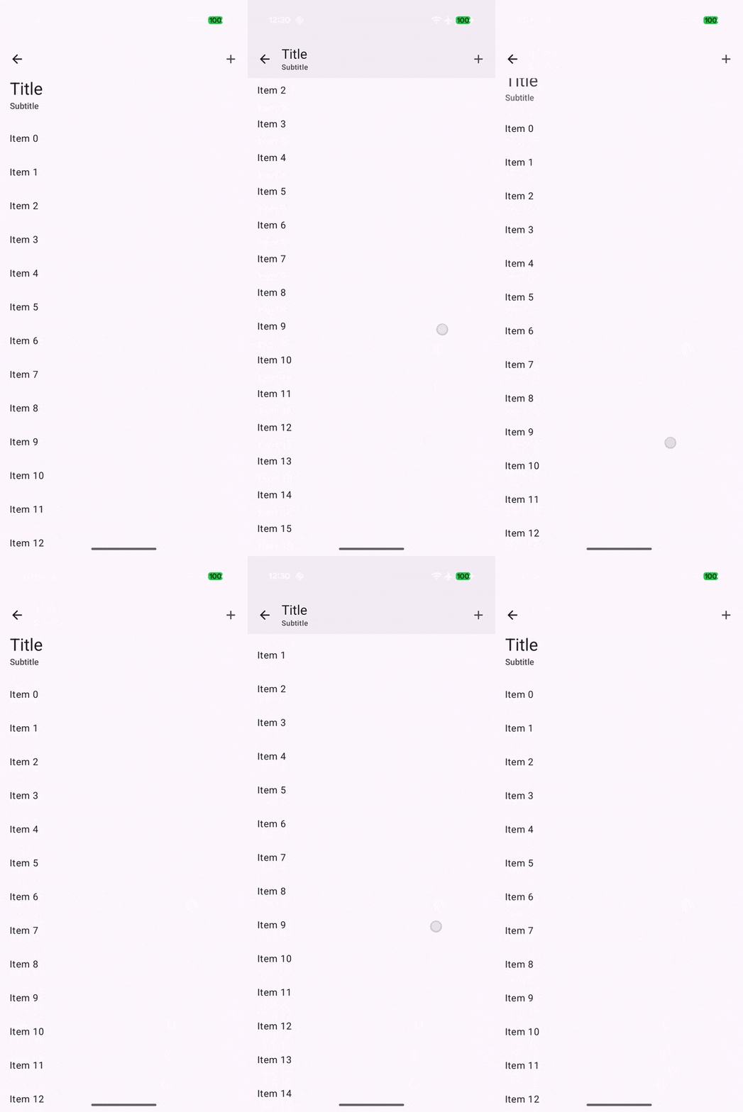
Medium flexible app bar
MediumFlexibleTopAppBar を使います。基本的には TopAppBar の使い方と同じになっています。
val scrollBehavior = TopAppBarDefaults.exitUntilCollapsedScrollBehavior()
Scaffold(
    modifier = Modifier.nestedScroll(scrollBehavior.nestedScrollConnection),
    topBar = {
        MediumFlexibleTopAppBar(
            title = {
                Text("Title", maxLines = 1, overflow = TextOverflow.Ellipsis)
            },
            subtitle = { Text("Subtitle", maxLines = 1, overflow = TextOverflow.Ellipsis) },
            navigationIcon = { ... },
            actions = { ... },
            scrollBehavior = scrollBehavior
        )
    },
) { ... }
Large flexible app bar
LargeFlexibleTopAppBar を使います。こちらも基本的には TopAppBar の使い方と同じになっています。
val scrollBehavior = TopAppBarDefaults.exitUntilCollapsedScrollBehavior()
Scaffold(
    modifier = Modifier.nestedScroll(scrollBehavior.nestedScrollConnection),
    topBar = {
        LargeFlexibleTopAppBar(
            title = {
                Text("Title", maxLines = 1, overflow = TextOverflow.Ellipsis)
            },
            subtitle = { Text("Subtitle", maxLines = 1, overflow = TextOverflow.Ellipsis) },
            navigationIcon = { ... },
            actions = { ... },
            scrollBehavior = scrollBehavior
        )
    },
) { ... }

App bar + Adaptive actions
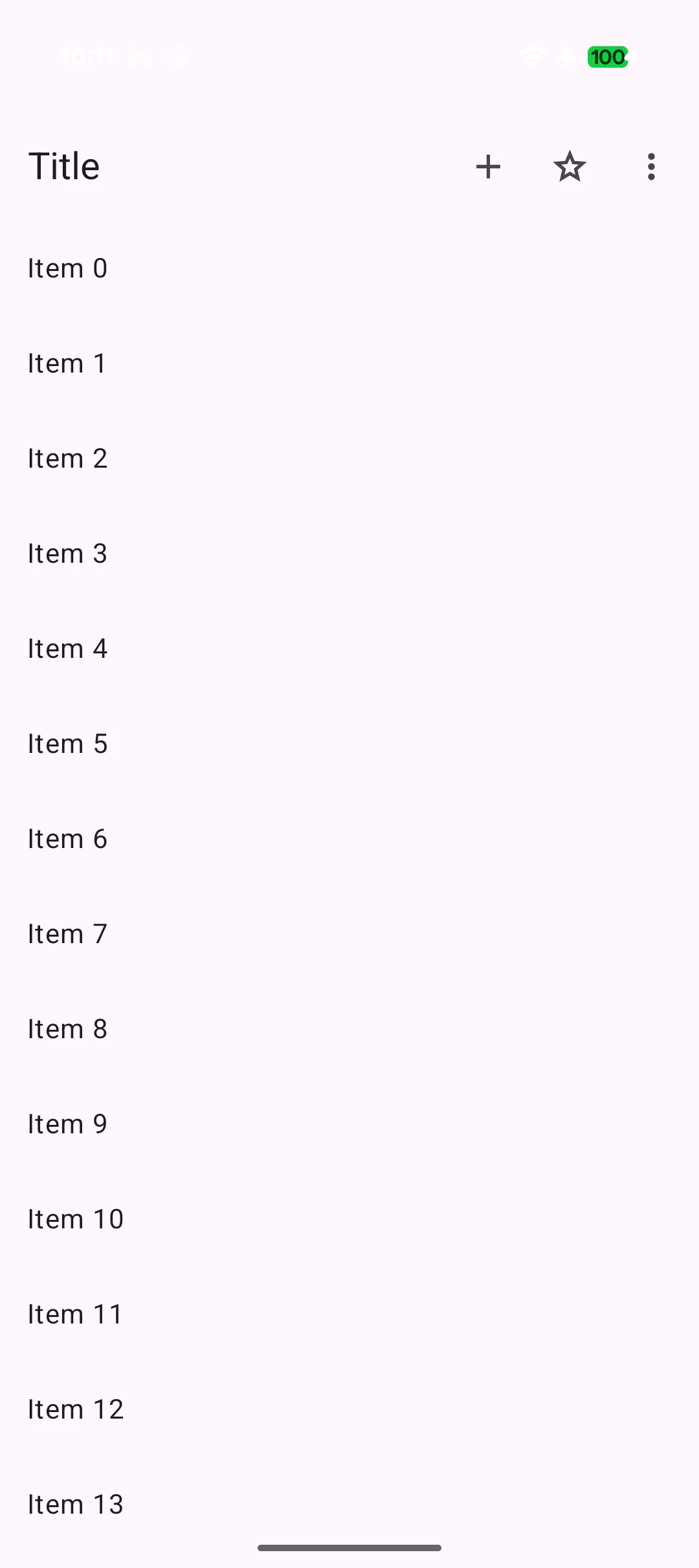
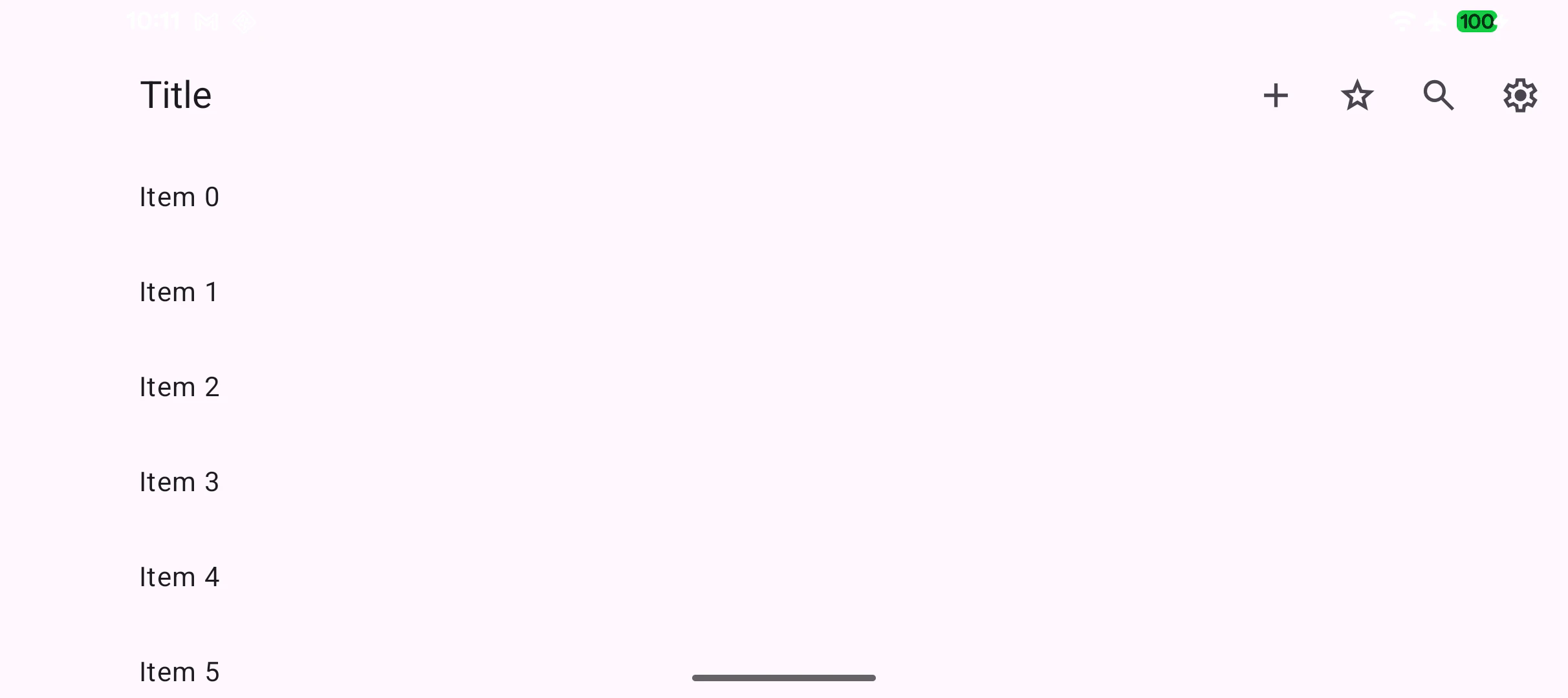
App bar の action 部分に AppBarRow / AppBarColumn を使うことで、画面サイズで action のアイテムを自動で省略する実装ができます。
App bar の action のアイテム数は Compact の時は最大 2 つまでに留め、それ以上の場合は Toolbar を検討しましょう。
Toolbar の配置が困難な場合に AppBarRow / AppBarColumn で省略するようにしましょう。
https://m3.material.io/components/app-bars/guidelines#224e8ca0-4177-45f4-9f4f-eef1fbb0e4b2
val sizeClass = currentWindowAdaptiveInfo().windowSizeClass
val maxItemCount = if (sizeClass.isWidthAtLeastBreakpoint(WindowSizeClass.WIDTH_DP_MEDIUM_LOWER_BOUND)) {
    5
} else {
    3
}
TopAppBar(
    title = {
        Text("Title", maxLines = 1, overflow = TextOverflow.Ellipsis)
    },
    actions = {
        AppBarRow(
            maxItemCount = maxItemCount,
            overflowIndicator = {
                IconButton(onClick = { it.show() }) {
                    Icon(
                        painter = painterResource(R.drawable.ic_more),
                        contentDescription = "Other options"
                    )
                }
            }
        ) {
            clickableItem(
                onClick = {},
                icon = {
                    Icon(
                        painter = painterResource(R.drawable.ic_add),
                        contentDescription = null
                    )
                },
                label = "Create"
            )

            clickableItem(
                onClick = {},
                icon = {
                    Icon(
                        painter = painterResource(R.drawable.ic_star),
                        contentDescription = null
                    )
                },
                label = "Favorites"
            )

            clickableItem(
                onClick = {},
                icon = {
                    Icon(
                        painter = painterResource(R.drawable.ic_search),
                        contentDescription = null
                    )
                },
                label = "Search"
            )

            clickableItem(
                onClick = {},
                icon = {
                    Icon(
                        painter = painterResource(R.drawable.ic_settings),
                        contentDescription = null
                    )
                },
                label = "Settings"
            )
        }
    }
}
| Compact | Medium |
|---|---|
 |
 |
Search app bar
SearchBar の実装でこれまで TopSearchBar を使用していた箇所を AppBarWithSearch に置き換えることで新しい Search app bar の見た目を実装することができます。
val textFieldState = rememberTextFieldState()
val searchBarState = rememberSearchBarState()
val scope = rememberCoroutineScope()
val scrollBehavior = SearchBarDefaults.enterAlwaysSearchBarScrollBehavior()

val inputField = @Composable {
    SearchBarDefaults.InputField(
        modifier = Modifier,
        searchBarState = searchBarState,
        textFieldState = textFieldState,
        onSearch = { scope.launch { searchBarState.animateToCollapsed() } },
        placeholder = {
            if (searchBarState.currentValue == SearchBarValue.Collapsed) {
                Text(
                    modifier = Modifier.fillMaxWidth(),
                    text = "Search",
                    textAlign = TextAlign.Center,
                )
            }
        },
        leadingIcon = {
            ...
        },
        trailingIcon = {
            ...
        },
    )
}

Scaffold(
    modifier = Modifier.nestedScroll(scrollBehavior.nestedScrollConnection),
    topBar = {
        AppBarWithSearch(
            scrollBehavior = scrollBehavior,
            state = searchBarState,
            inputField = inputField,
            navigationIcon = {
                ...
            },
            actions = {
                ...
            },
        )
        ExpandedFullScreenSearchBar(state = searchBarState, inputField = inputField) {
            // Search result list
            ...
        }
    },
) { padding ->
    // contents
    ...
}

TwoRowsTopAppBar によるカスタマイズ
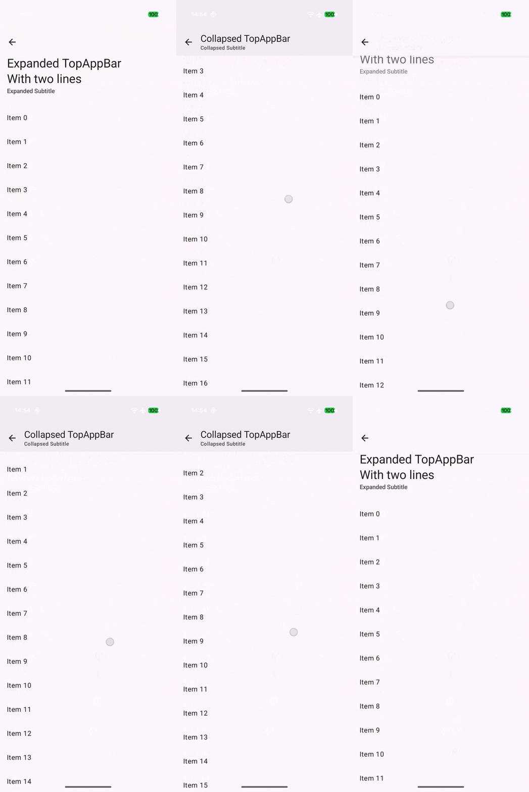
MediumFlexibleTopAppBar と LargeFlexibleTopAppBar は TwoRowsTopAppBar の上に実装されており、元となる TwoRowsTopAppBar を使うことで自由な Flexible app bar を実装することができます。
引数で collapsedHeight と expandedHeight のサイズを指定すれば固定の高さに、未指定であればコンテンツの高さになります。
val scrollBehavior = TopAppBarDefaults.exitUntilCollapsedScrollBehavior()
TwoRowsTopAppBar(
    title = { expanded ->
        if (expanded) {
            Text("Expanded TopAppBar\nWith two lines")
        } else {
            Text("Collapsed TopAppBar", maxLines = 1, overflow = TextOverflow.Ellipsis)
        }
    },
    subtitle = { expanded ->
        if (expanded) {
            Text(
                "Expanded Subtitle",
                maxLines = 1,
                overflow = TextOverflow.Ellipsis,
                modifier = Modifier.padding(bottom = 24.dp)
            )
        } else {
            Text("Collapsed Subtitle", maxLines = 1, overflow = TextOverflow.Ellipsis)
        }
    },
    navigationIcon = { ... },
    scrollBehavior = scrollBehavior
)