今回は、どうしてもよく理解しないとグラフが面倒ということで、Matplotlibを使ったグラフの書き方をまとめます。
【参考】
①matplotlib.pyplot.subplots
②Scatter plot on polar axis
内容は、参考の①の付属の例を動かしただけですが、現実にグラフを書くときは、少し工夫が必要だということを書きたいと思います。
やったこと
・まずとりあえず参考①の例を動かす(省略)
・最初の例から解説とその後の工夫を解説する
・最初の例から解説する
必要なLibは以下のとおり
import matplotlib.pyplot as plt
import numpy as np
まず、xとyを定義、特にnp.linspaceの第一引数は初期値、第二引数は最大値、そして第三引数は分割数。
ちなみに、デフォルトでは第二引数の値も結果に含むが、以下のように引数endpoint=Falseとすると、最大値$\ 2\pi\ $が含まれない。
x = np.linspace(0,2*np.pi,400,endopoint=False)
# First create some toy data:
x = np.linspace(0, 2*np.pi, 400)
y = np.sin(x**2)
以下で通常のグラフを表示する。
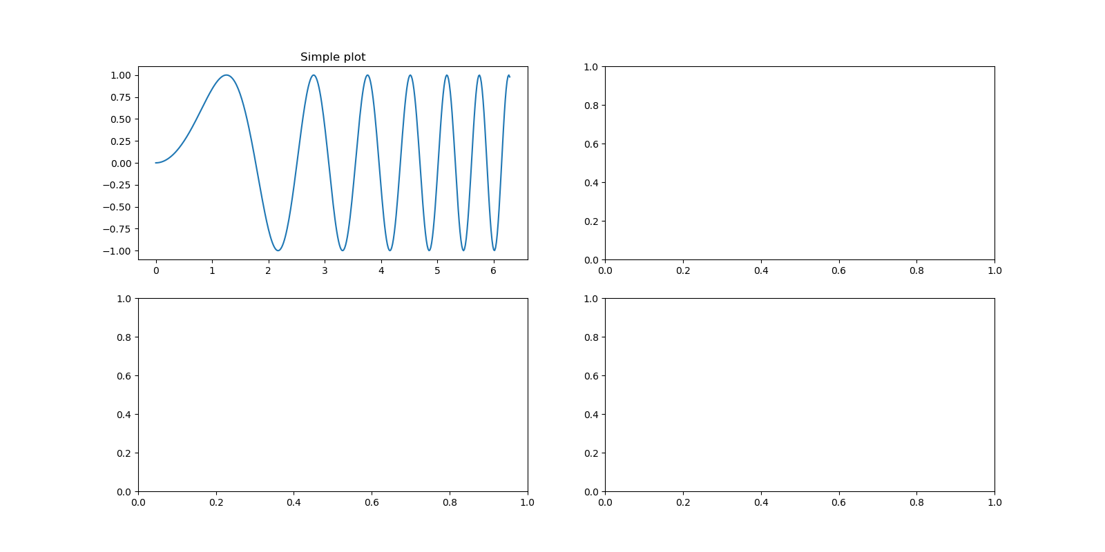
この定義だと4象限にグラフを4個記載できるが、ここではax[0,0]として、第二象限に通常のグラフを描画する。
# Creates just a figure and only one subplot
fig, ax = plt.subplots(2,2,figsize=(16, 8))
ax[0,0].plot(x, y)
ax[0,0].set_title('Simple plot')
工夫の一つ目
描画位置を指定して描画できればよいが、個数が不明な場合などはそういうこともできないことがある。
ということで、単に順番に綺麗に並べたいとき以下のようにすると実現できる。
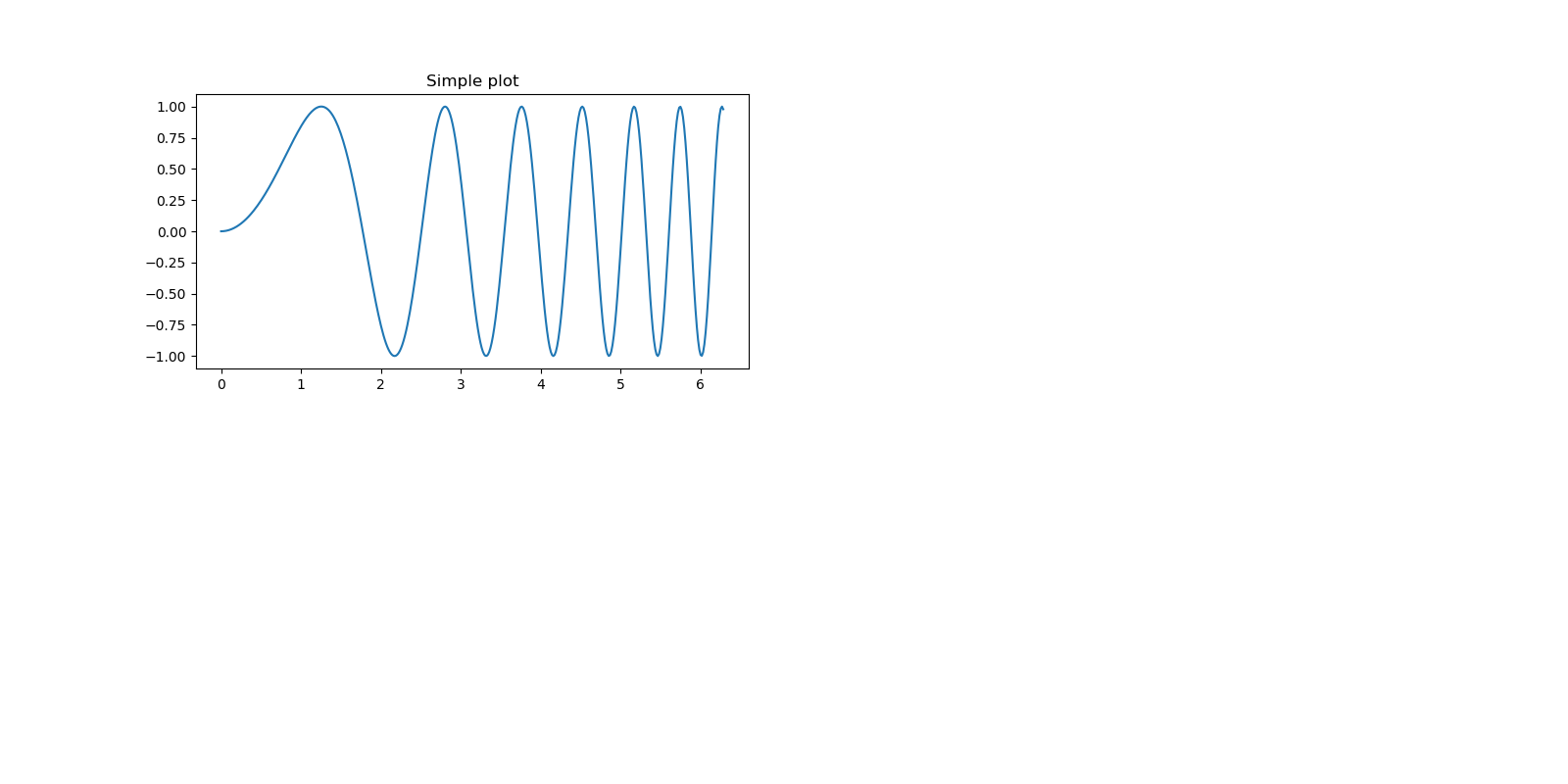
# Creates just a figure and only one subplot
_, ax = plt.subplots(4)
plt.close()
fig=plt.figure(figsize=(16, 8))
ax[0]=fig.add_subplot(2,2,1)
ax[0].plot(x, y)
ax[0].set_title('Simple plot')
上記を動かすと以下のようなグラフが描画できる。
上記では、もとのfigは宣言したあとすぐに消去してaxの宣言だけを利用している。
しかも描画位置はadd_subplot(2,2,1)のように再度指定している。
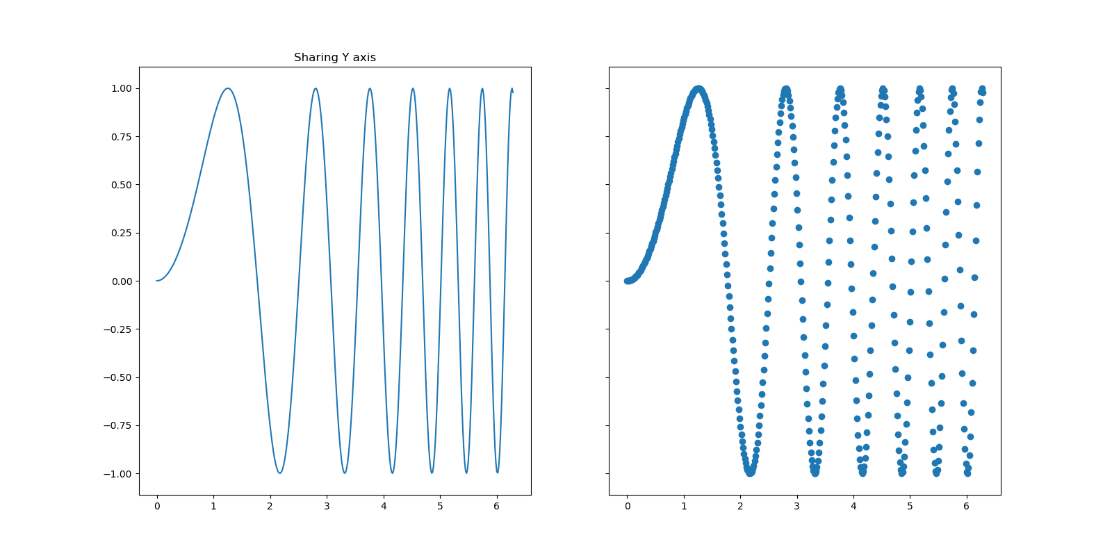
次は、通常のy軸シェアなplt.subplotsの例です。
# Creates two subplots and unpacks the output array immediately
f, (ax1, ax2) = plt.subplots(1, 2, sharey=True,figsize=(16, 8))
ax1.plot(x, y)
ax1.set_title('Sharing Y axis')
ax2.scatter(x, y)
通常の極座標のグラフを4つの象限に配置する書き方
# Creates four polar axes, and accesses them through the returned array
fig, axes = plt.subplots(2, 2, subplot_kw=dict(polar=True),figsize=(16, 8))
axes[0, 0].plot(x, y)
axes[1, 1].scatter(x, y)
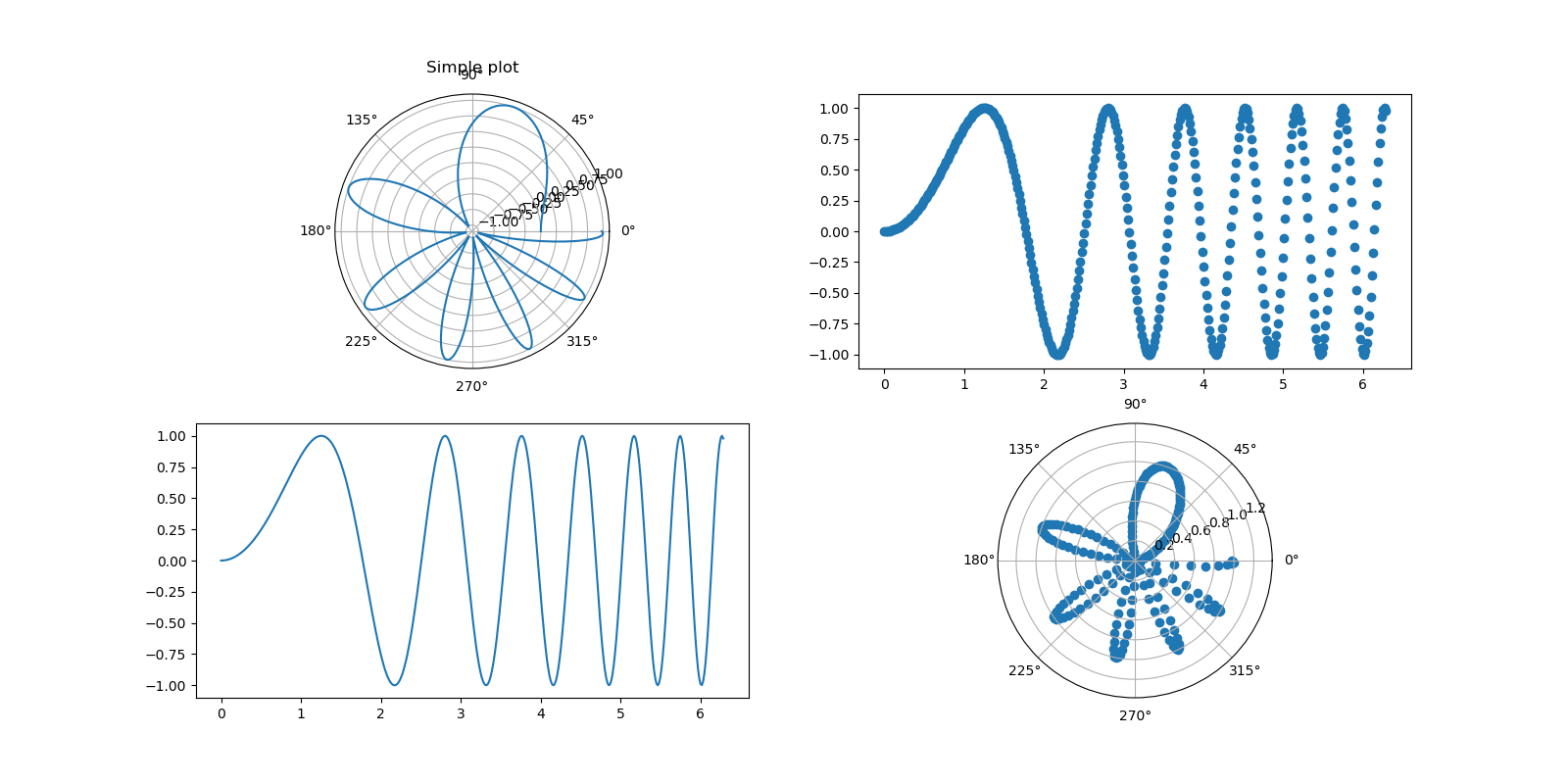
工夫の一品
これはいろいろなグラフを象限に配置するときに使えると思います。
# Creates four polar axes, and accesses them through the returned array
fig = plt.figure(figsize=(16, 8))
axes0 = fig.add_subplot(221, projection='polar')
axes0.plot(x, y)
axes0.set_title('Simple plot')
axes1=fig.add_subplot(222)
axes1.scatter(x, y)
axes2=fig.add_subplot(223)
axes2.plot(x, y)
axes3 = fig.add_subplot(224, projection='polar')
axes3.scatter(x, y)
軸の配置と座標シェアのやり方
# Share a X axis with each column of subplots
plt.subplots(2, 2, sharex='col')

# Share a Y axis with each row of subplots
plt.subplots(2, 2, sharey='row')

# Share both X and Y axes with all subplots
plt.subplots(2, 2, sharex='all', sharey='all')

# Note that this is the same as
plt.subplots(2, 2, sharex=True, sharey=True)

# Creates figure number 10 with a single subplot
# and clears it if it already exists.
fig, ax=plt.subplots(num=10, clear=True)
複雑な配置のやり方
全て、参考③のものを再掲しています。
【参考】
③In Matplotlib, what does the argument mean in fig.add_subplot(111)?
以下は、上記と同じ絵が描けますが、配置が記してあるので参考に掲載します。
fig = plt.figure()
fig.add_subplot(221)   #top left
fig.add_subplot(222)   #top right
fig.add_subplot(223)   #bottom left
fig.add_subplot(224)   #bottom right
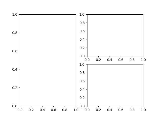
次は、以下のようにアンバランスな面白い配置を取れます。
fig = plt.figure()
fig.add_subplot(1, 2, 1)   #top and bottom left
fig.add_subplot(2, 2, 2)   #top right
fig.add_subplot(2, 2, 4)   #bottom right
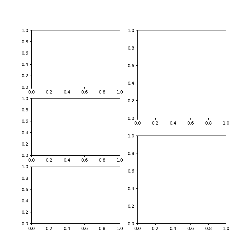
そして、さらに数が増えてアンバランスな配置を取れます。
plt.figure(figsize=(8,8))
plt.subplot(3,2,1)
plt.subplot(3,2,3)
plt.subplot(3,2,5)
plt.subplot(2,2,2)
plt.subplot(2,2,4)
配置については、最後に先日のウワンの記事では自由な配置を紹介しているので、参考にしてください。
・【matplotlib応用】グラフのもう一つの配置方法をやってみる♬
まとめ
・Matplotlibでグラフ描画の応用編をまとめた
・plt.figureの使い方、plt.subplot、そして配列の使い方を学んだ