何度もググっているので簡単なアプリ作って、理解しておこうと思う。
以下の参考に簡単な例から順に記載されている。
今回は、基本はわかっているけどな人対象に記載する。
【参考】
・matplotlib - 2D and 3D plotting in Python
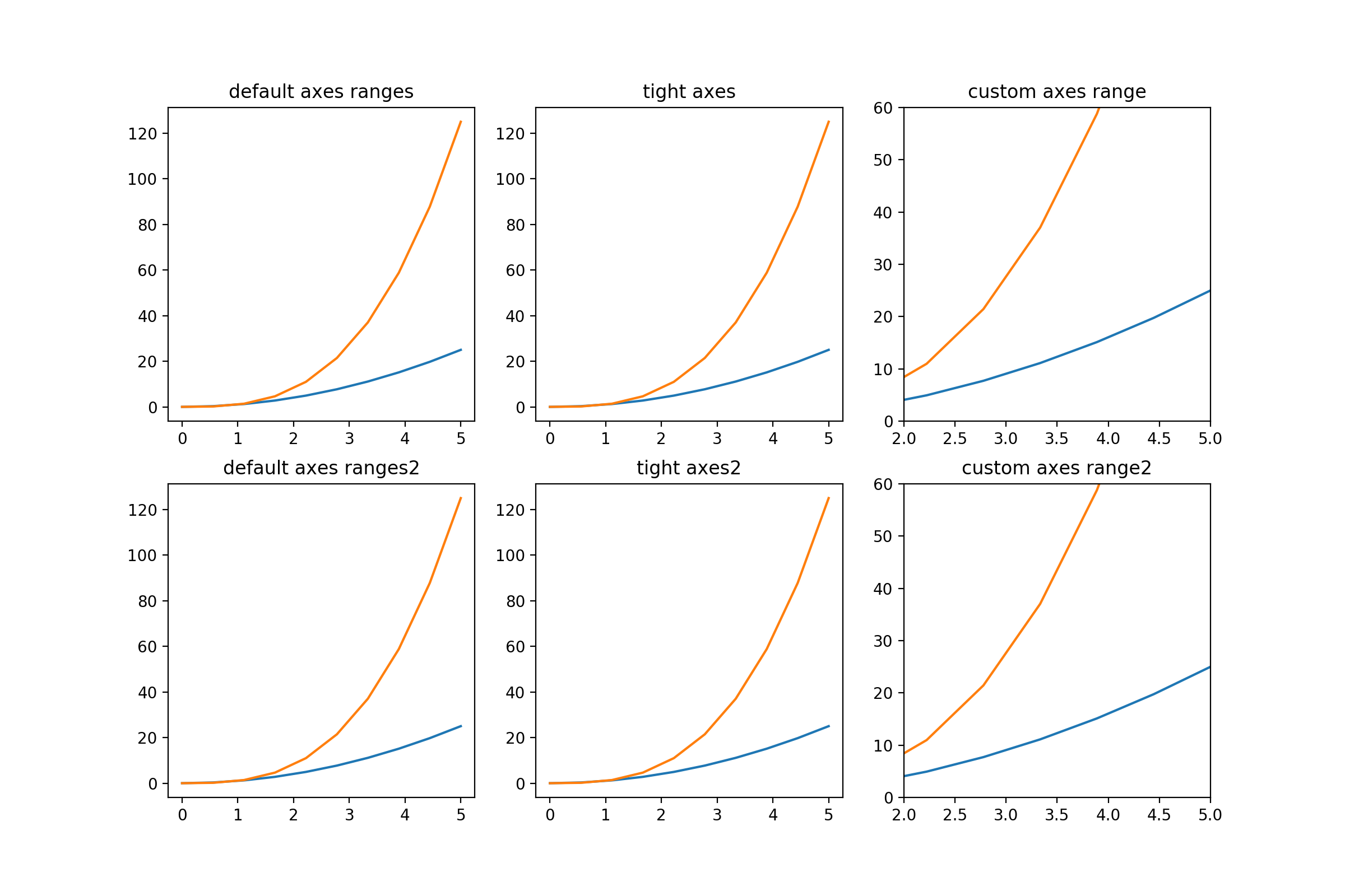
通常のグラフ配置と表示範囲制御
以下のように実施する。
以下は、プロットレンジの例として参考のIn [39]:に掲載されている例を2x3配置に変更したものである。
ここで、ぴったり表示するために真ん中ではaxis('tight')を利用し、さらに三つ目では、 set_ylim([0, 60])などを利用している。
※因みに、1x3配置ではaxes[0]など一次元とする
import matplotlib.pyplot as plt
import numpy as np
import matplotlib

fig, axes = plt.subplots(2, 3, figsize=(12, 8)) #2x3の配置
x = np.linspace(0, 5, 10)

axes[0,0].plot(x, x**2, x, x**3)
axes[0,0].set_title("default axes ranges")

axes[0,1].plot(x, x**2, x, x**3)
axes[0,1].axis('tight')
axes[0,1].set_title("tight axes")

axes[0,2].plot(x, x**2, x, x**3)
axes[0,2].set_ylim([0, 60])
axes[0,2].set_xlim([2, 5])
axes[0,2].set_title("custom axes range")

axes[1,0].plot(x, x**2, x, x**3)
axes[1,0].set_title("default axes ranges2")

axes[1,1].plot(x, x**2, x, x**3)
axes[1,1].axis('tight')
axes[1,1].set_title("tight axes2")

axes[1,2].plot(x, x**2, x, x**3)
axes[1,2].set_ylim([0, 60])
axes[1,2].set_xlim([2, 5])
axes[1,2].set_title("custom axes range2")
fig.savefig("./moving_fig/ordinary_fig.png", dpi=200)
plt.show()
plt.close()
座標を利用して図を配置する
以下は参考のIn [13]:のものを少し拡張して通常利用するものを追加して直感的に理解できるように一つのアプリにしたものである。
import matplotlib.pyplot as plt
import numpy as np
import matplotlib

x = np.linspace(0, 5, 10)
y = x ** 2

matplotlib.rcParams.update({'font.size': 18, 'font.family': 'sans', 'text.usetex': False})
fig = plt.figure(figsize=(8,6))  #(width,height)
for i in range(10):
    x_offset=np.round(0.05*4,decimals=2)
    y_offset=np.round(0.05*i,decimals=2)
    width=0.3
    height=0.3
    axes1 = fig.add_axes([0.1, 0.1, 0.8, 0.8]) # main axes
    axes2 = fig.add_axes([x_offset, y_offset, width, height]) # insert axes

    # main figure
    # possible marker symbols: marker = '+', 'o', '*', 's', ',', '.', '1', '2', '3', '4', ...
    # possible linestype options ‘-‘, ‘--’, ‘-.’, ‘:’, ‘steps’
    axes1.plot(x, y, color='r', lw=3, linestyle='--',marker='o' , label=r"$y = x^2$")
    axes1.legend(loc=1) # upper light corner
    axes1.grid(True)
    axes1.set_xlabel('x')
    axes1.set_ylabel('y')
    axes1.set_title('title')

    # insert
    axes2.plot(y, x, 'g', label=r"$x = y^2$")
    axes2.legend(loc=2) # upper left corner
    axes2.set_xlabel('y')
    axes2.set_ylabel('x')
    axes2.set_title('insert title;'+str(x_offset)+"_"+str(y_offset))
    plt.pause(1)
    fig.savefig("./moving_fig/moving_fig"+str(i)+".png", dpi=200)
    plt.clf()
while True:などで図を消去せずに回していると重くなるので、以下を適当に使って適宜消去する。上ではplt.clf()で図を毎回消去している。
cla()   # Clear axis
clf()   # Clear figure
close() # Close a figure window
まとめ
・通常のグラフ配置関連の描画方法をやってみた
・座標で配置する方が配置の自由度が高い
・その他、諸々の描画方法を試してみた