はじめに
以下のHTML設計とCSS設計を前提に話を進めていきます。
<html>
  <head>
    <meta charset="utf-8">
    <title>Position</title>
    <link rel="stylesheet" href="./position.css">
  </head>
  <body>
    <div class="contents">
      <div class="left-content">
        <div class="blue-content"></div>
      </div>
    </div>
  </body>
</html>
html, body {
  height: 100%;
  margin: 0;
  padding: 0;
}

.contents {
  background-color: black;
  height: 100vh;
  margin: auto;
  width: 960px;
}

.left-content {
  background-color: red;
  float: left;
  height: 300px;
  position: relative;
  width: 300px;
}

.blue-content {
  background-color: blue;
  height: 200px;
  width: 200px;
  position: absolute;
  top: 0;
  left: 0;
  right: 0;
  bottom: 0;
  margin: auto;
}
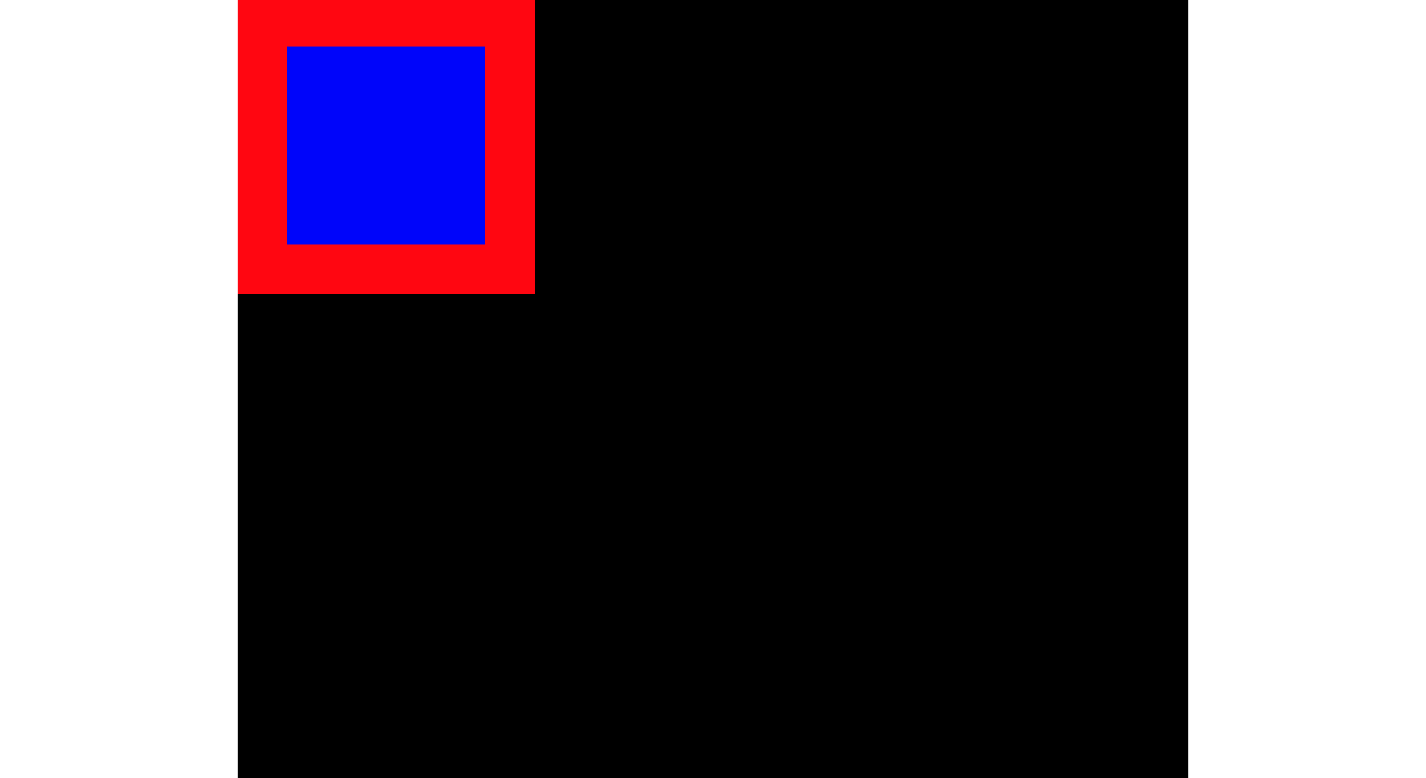
以上のようなCSSを当てた際に以下のような画面になります。ここでは青い要素にposition+marginを当てることで、上下左右を中央寄せしています。
上下左右が中央揃えになる条件
まず結論からお話しすると上下または左右を中央揃えさせるには、以下の2つの条件が必要になります。
-
topとbottomとheight(上下)またはleftとrightとwidth(左右)がauto以外であること
-
margin-topとmargin-bottom(上下)またはmargin-leftとmargin-right(左右)がautoであること
上記のCSS設計では、top・right・left・bottomを0に指定しており、marginにもautoの値を設定しているため、条件を全て満たしていると言えます。1の条件を満たすのであれば、top・right・left・bottomは「0」であることが重要なのではなく、auto以外の値になっていればOKということです。なので全ての値を1pxなどにしても、中央に来るはずです。(内包物の高さや長さがheightやwidthを超えてしまうとずれます。)
なぜpositionをabsoluteにするのか
上記の条件を見た際に、「それならpositionをabsoluteにする必要はないのでは?」と思うかもしれません。
なので、それについてこれから説明していきます。
そもそも、positionプロパティには4つの値があります。
.blue-content {
/*特に配置方法を制定しない。値がstaticの場合は、top、bottom、left、rightの値は適応されず、初期値であるautoになる。positionプロパティのデフォルト値である。*/
  position: static;

/*相対位置の配置になる。positionプロパティでstaticを指定した場合に表示される位置が基準位置となる。*/
  position: relative;

/*絶対位置への配置となる。親ボックスにpositionプロパティのstatic以外の値が指定されている場合には、親ボックスの左上が基準位置となる。親ボックスにpositionプロパティのstatic以外の値が指定されていない場合には、ウィンドウ全体の左上が基準位置となる。*/
  position: absolute;

/*絶対位置への配置となるのはabsoluteと同じだが、スクロールしても位置が固定されたままとなる。*/
  position: fixed;
}
上記からわかるように、positionをabsoluteにしなければならない理由は、positionはデフォルト値でstaticが当てられており、その条件下では、top、bottom、left、rightを指定しても適応されず、autoの値をとる。つまり、1の条件を満たせないからです。
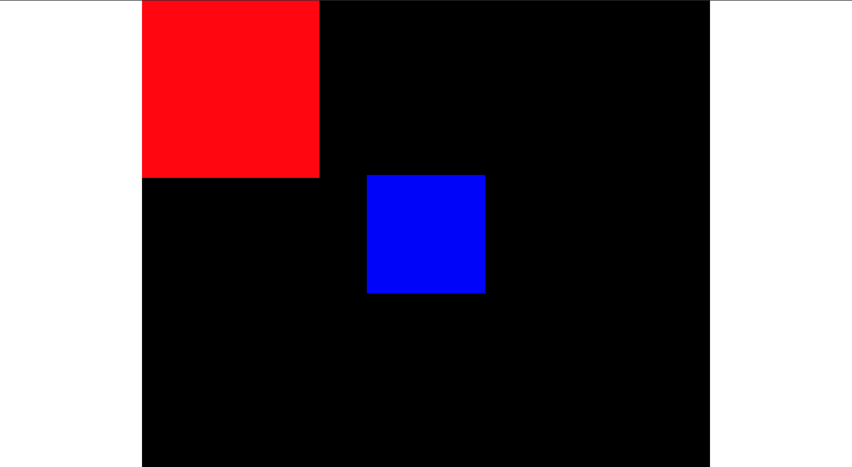
positionをfixにしたらダメなの?
結論からお話しすると、fixでも問題ありません。ただ、relativeの位置指定などが効かなくなるので、画面中央で固定されてしまいます。
.blue-content {
  background-color: blue;
  height: 200px;
  width: 200px;
  position: fixed;
  top: 0;
  left: 0;
  right: 0;
  bottom: 0;
  margin: auto;
}
なぜ上下左右が中央揃えになる条件が上記の2つなのか
なぜ、上記の2つの条件が必要なのかというのは、当たり前と言えば、当たり前なのですが、CSSの仕様書にそのように明記されているからです。
上下中央揃えに関する記述
If all three of 'top', 'height', and 'bottom' are auto, set 'top' to the static position and apply rule number three below. If none of the three are 'auto': If both 'margin-top' and 'margin-bottom' are 'auto', solve the equation under the extra constraint that the two margins get equal values. If one of 'margin-top' or 'margin-bottom' is 'auto', solve the equation for that value. If the values are over-constrained, ignore the value for 'bottom' and solve for that value.
翻訳
top'、'height'、'bottom' の 3 つがすべて 'auto' の場合、'top' を固定位置に設定し、以下の規則番号 3 を適用します。 3つのうちどれも 'auto' でない場合: 'margin-top' と 'margin-bottom' の両方が 'auto' の場合、2つのマージンの値が等しくなるという余分な制約の下で方程式を解く。margin-top' と 'margin-bottom' のどちらかが 'auto' の場合、その値の方程式を解きます。値が過度に制限されている場合は、'bottom' の値を無視して、その値を求めます。
左右中央揃えに関する記述
If all three of 'left', 'width', and 'right' are 'auto': First set any 'auto' values for 'margin-left' and 'margin-right' to 0. Then, if the 'direction' property of the element establishing the static-position containing block is 'ltr' set 'left' to the static position and apply rule number three below; otherwise, set 'right' to the static position and apply rule number one below. If none of the three is 'auto': If both 'margin-left' and 'margin-right' are 'auto', solve the equation under the extra constraint that the two margins get equal values, unless this would make them negative, in which case when direction of the containing block is 'ltr' ('rtl'), set 'margin-left' ('margin-right') to zero and solve for 'margin-right' ('margin-left'). If one of 'margin-left' or 'margin-right' is 'auto', solve the equation for that value. If the values are over-constrained, ignore the value for 'left' (in case the 'direction' property of the containing block is 'rtl') or 'right' (in case 'direction' is 'ltr') and solve for that value.
翻訳
left'、'width'、'right'の3つがすべて'auto'の場合。まず、'margin-left' と 'margin-right' のいずれかの 'auto' 値を 0 に設定し、ブロックを含む静的位置を確立する要素の 'direction' プロパティが 'ltr' であれば、'left' を静的位置に設定し、以下の規則 3 を適用します。 3つのうちどれも 'auto' でない場合: 'margin-left' と 'margin-right' の両方が 'auto' の場合、2つのマージンが等しい値になるという余分な制約の下で方程式を解きます。margin-left' と 'margin-right' のどちらかが 'auto' の場合は、その値に対して方程式を解く。値が過度に制限されている場合は、'left' (含むブロックの '方向' プロパティが 'rtl' の場合) または 'right' (方向' が 'ltr' の場合) の値を無視して、その値を求めて解いてください。
なぜmargin autoで左右だけ中央揃えになるのか(おまけ)
ここからはpositionは関係ありません。なぜ左右だけ中央揃えになるかを説明していきたいと思います。
結論から簡単にお話しすると、HTMLはデフォルトで水平フロー、つまり横書きであることから、左右のmarginのみ自動で計算してくれるからです。では、なぜ左右のみmarginが自動で算出されるのかを見ていきます。
8.4. ブロックレベル要素におけるwidth、height、marginsの制約
For block-level elements with horizontal flow in a containing block also with horizontal flow, the computed values of the 'width' and margins must satisfy this constraint:
水平フローのブロックレベル要素で、 その包含ブロックもまた水平フローの場合、 'width'の算出値とマージンは以下の等式を成立させなくてはいけない:
(1)
(width of containing block) = margin-left + border-left + padding-left + width + padding-right + border-right + margin-right
(包含ブロックの幅) = margin-left + border-left + padding-left + width + padding-right + border-right + margin-right
The following cases can occur:
次のケースがある:
None of width, margin-left and margin-right are specified as 'auto' and the values satisfy the constraint.
width、margin-left、margin-right全ての指定値が'auto'ではなく、等式が成立している場合。
None of width, margin-left or margin-right was specified as 'auto' and the equation is not satisfied. There are two sub-cases: (1) if the 'direction' of the element is 'ltr', the specified value of 'margin-right' is ignored and 'margin-right' is set to the value that makes the equation true; (2) if 'direction' is 'rtl', it is 'margin-left' that is ignored and computed from the equation.
width、margin-left、margin-rightの指定値が'auto'ではなく、等式が成立していない場合。 これにはふたつのサブケースがある: (1) 要素の'direction'が 'ltr'の場合、 'margin-right'の指定値は無視され、 'margin-right'には等式を成立させる値が設定される。 (2) 'direction'が 'rtl'の場合、 'margin-left'は等式を成立させるために無視される。
If exactly one of width, margin-left or margin-right is 'auto', its value is computed from the equation.
width、margin-leftもしくはmargin-rightのうちにひとつが'auto'の場合、 その値は等式が成立するように算出される。
If width and one or both margins are 'auto', the margins that are 'auto' are set to 0 and the equation is solved for width.
widthと片方、もしくは両方のマージンが'auto'の場合、マージンは共に'auto'となり、 更にそれらはゼロと算出され、widthによって等式を成立させる。
If both margin-left and margin-right are 'auto', the equation is solved under the extra constraint that margin-left = margin-right.
margin-leftとmargin-rightが共に'auto'の場合、 margin-left = margin-rightとなるように等式を成立させる。
上記にあるように、水平フローにおいて以上の等式を成り立たせなければならず、さらに、widthだけを指定し、marginがautoの場合はmargin-left = margin-rightとなるように等式を成立させてくれる。また、
通常フロー要素の場合で、 包含ブロックが水平フローの場合:
'auto' on 'margin-top' and 'margin-bottom' is equal to 0
'margin-top'と 'margin-bottom'の 'auto'はゼロになる
とあるように水平フローにおいて、margin-topとmargin-bottomのautoは値が0になってしまうため、上下は中央揃えされません。
垂直フローにしたらどうなるの?
垂直フローにした場合、全てが逆転します。つまり、margin autoが上下にしか効かなくなります。
垂直フローの包含ブロック内の垂直フローのブロックレベル要素も似ているが、 等式はheightとmargin-top、margin-bottomで作られる。
(2)
(height of containing block) = margin-top + border-top + padding-top + height + padding-bottom + border-bottom + margin-bottom
(包含ブロックの高さ) = margin-top + border-top + padding-top + height + padding-bottom + border-bottom + margin-bottom
通常フロー要素で、 包含ブロックが垂直フローの場合:
'auto' on 'margin-right' and 'margin-left' is equal to 0
'margin-right'と 'margin-left'の 'auto'はゼロになる
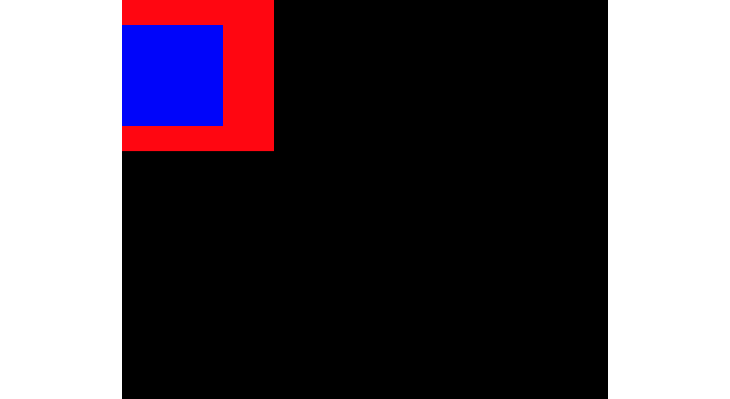
では実際にやってみましょう。
blue-contentの親要素であるred-contentに以下のCSSを当て、垂直フローにし、margin autoを当ててみましょう。
html, body {
  height: 100%;
  margin: 0;
  padding: 0;
}

.contents {
  background-color: black;
  height: 100vh;
  margin: auto;
  width: 960px;
}

.left-content {
  background-color: red;
  float: left;
  height: 300px;
  width: 300px;
  writing-mode: vertical-lr;  /*垂直フローにする記述*/
}

.blue-content {
  background-color: blue;
  height: 200px;
  width: 200px;
  margin: auto;
}
すると以下のようになります。上下のみmargin autoが効いてますね。
参考文献
positionプロパティについて
CSSで中央寄せする7つの方法
position: absolute; の指定で要素が上下左右中央配置になる理由
CSS3ボックスモデルモジュール(英語)
CSS3ボックスモデルモジュール(日本語)
margin autoで真ん中による理由