はじめに
初となる大きな変更があった新しい Apple Watch が発売してから少し経ちました。珍しく納期が 3-4 週となったのを見た気がします。今回は Apple の時計盤の見せ方の仕方がうまかったのもあるけど需要自体はあるんだなぁと感じました。
今回大きく変わった部分のひとつが色使いが実に美しい新しい Complications の追加でした。今まで以上に時計盤のカスタマイズが可能となり,より個性が出せるようになったと思います。中でも私はグラデーションのあるゲージの見せ方に魅力を感じました。さてどうやったら実装できるんだろうとずっと思っていたもののなかなか機会に恵まれなかったですが今回いい機会なので実装してみます。
Complications に関する資料など
Apple Watch発表後に Tech Talk として解説セッションが用意されましたので参考にしています。
Developing Complications for Apple Watch Series 4
https://developer.apple.com/videos/play/tech-talks/208/
また,デザイン面に関しては Human Interface Guideline に項目があります。
Human Interface Guideline Complications
https://developer.apple.com/design/human-interface-guidelines/watchos/app-architecture/complications/
実際のプログラミングに関しては下記が参考になりました。
Complication Essentials
https://developer.apple.com/library/archive/documentation/General/Conceptual/WatchKitProgrammingGuide/ComplicationEssentials.html
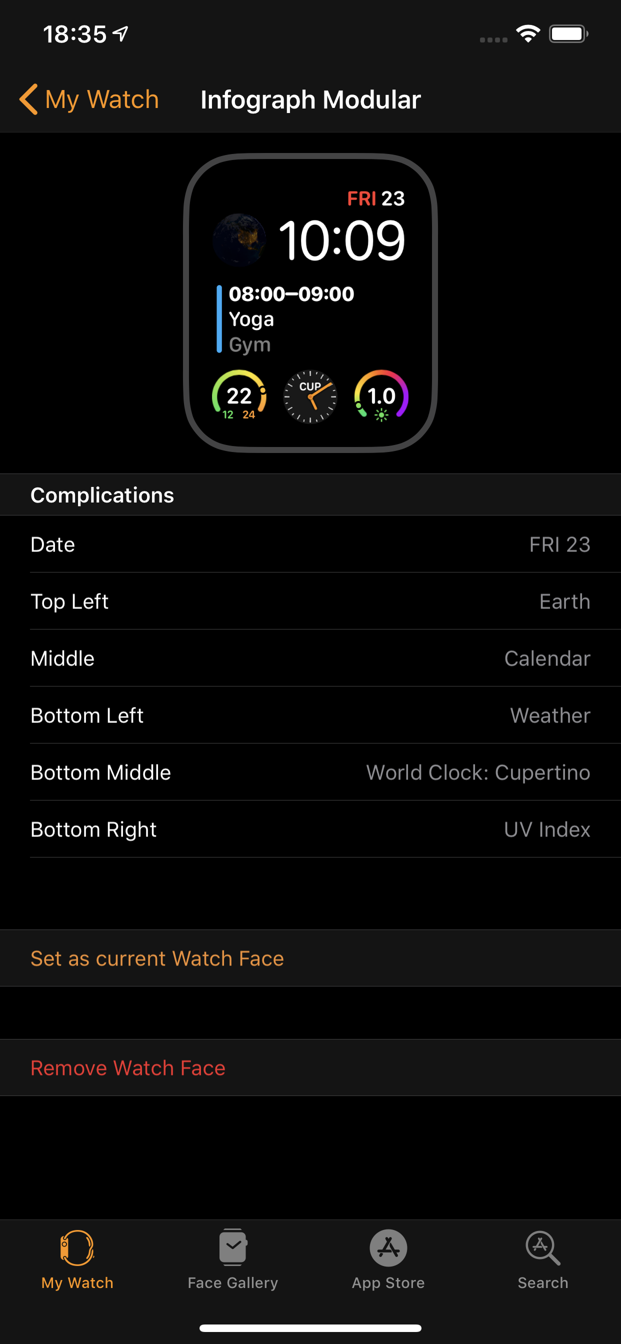
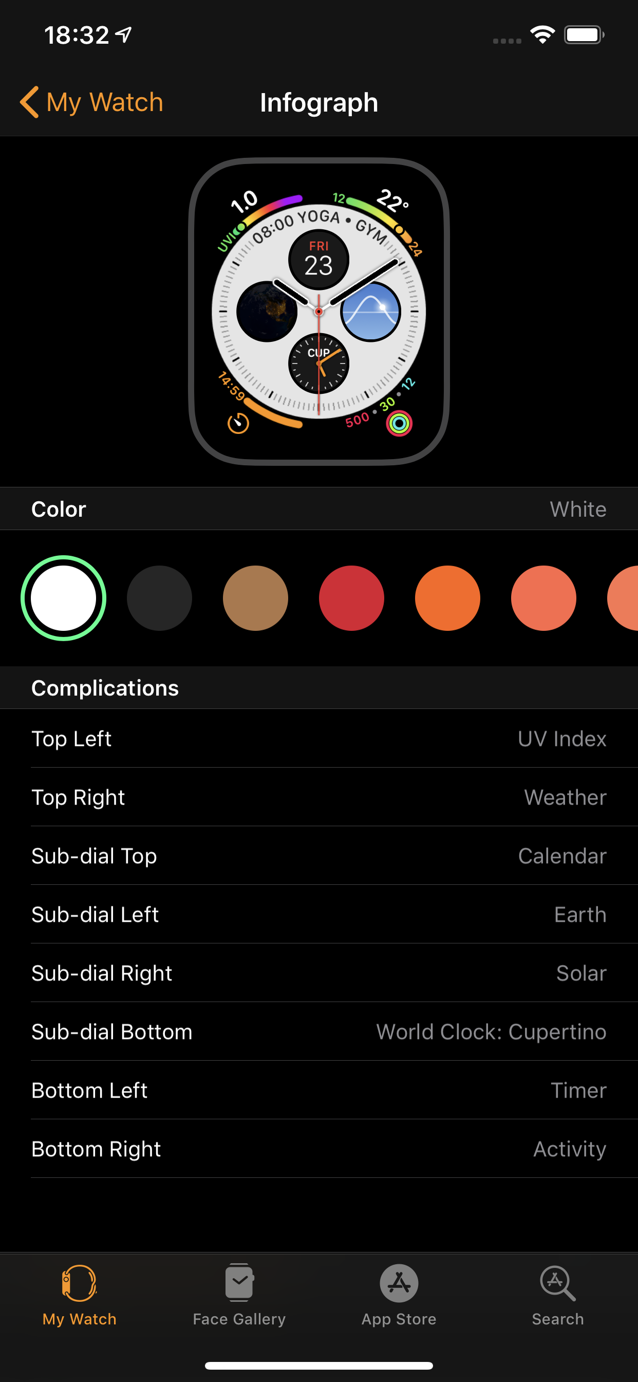
Apple Watch Series 4 から増えたWatch face
Apple Watch Series 4 から増えたのは Infograph Modular と Infograph の 2種類です。
| Infograph Modular | Infograph |
|---|---|
 |
 |
|
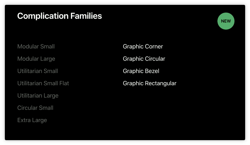
Apple Watch Series 4 から増えた Complication Families
Apple Watch Series 4 から増えた Complication は 4 つです。
Infograph Modular と Infograph の Watch face のみ対応しているので
過去の Watch face との連携を考える必要がない感じですね。
引用:https://developer.apple.com/videos/play/tech-talks/208/
Graphic Corner

引用:Human Interface Guideline Complications
Apple Watch Series 4 の Infograph の Watch face 限定で
Watch face のコーナーにフルカラーの画像・テキスト・ゲージを表示できる。
いくつかはマルチカラーのテキストをサポートしている。
Graphic Circular

引用:Human Interface Guideline Complications
Apple Watch Series 4 の Infograph Modular と Infograph の Watch face 限定。
テキスト・ゲージ,フルカラーの画像を小さな丸い領域に表示できる。
いくつかはマルチカラーのテキストをサポートしている。
Graphic Bezel

引用:Human Interface Guideline Complications
Apple Watch Series 4 の Infograph の Watch face 限定。
Infograph のベゼルに沿って任意のテキストがラップされた
円形のテンプレートを表示できる。
テキストはベゼルのほぼ180度を満たすことができる。
Graphic Rectangular

引用:Human Interface Guideline Complications
Rectangular は 長方形のくらいの意味。
Apple Watch Series 4 の Infograph Modular の Watch face 限定。
Infograph Modular の真ん中の大きな長方形の領域に
フルカラーの画像・テキストそしてゲージを表示可能。
グラフみたいな Provider あるのかと思ったけど残念。
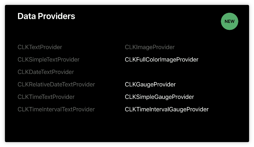
Apple Watch Series 4 から増えた Data Providers
Complications に値を提供するクラスは複数ありましたが,
4 つのデータ提供クラスが追加されています。
(全てを同じインデントで記載するのはちょっと書き方よくないですよね)
引用:https://developer.apple.com/videos/play/tech-talks/208/
CLKFullColorImageProvider
Infograph Modular と Infograph の Watch face ではフルカラーの画像対応になった。
これらの画像はしばしば円形画像または角丸の画像を生成するためにマスクされることが多い。
画像サイズに関しては Apple Watch Human Interface Guidelines で確認。
CLKGaugeProvider
ゲージすべての一般的な動作を提供するスーパークラス。
このクラスのインスタンスを直接作成せず,
代わりに作成しようとしているゲージのタイプに基づいて
サブクラスのインスタンスを作成する。
CLKSimpleGaugeProvider
CLKGaugeProvider のサブクラス。
ゲージプロバイダはシンプルに 0.0〜1.0 の範囲にマップされた値を表示する。
例としては完了したタスクの割合や指定された温度範囲内の現在の温度の表示などが該当します。
CLKTimeIntervalGaugeProvider
CLKGaugeProvider のサブクラス。
指定された時間間隔内に経過した時間を視覚的に表示します。
新しい Watch face と Complications
新しい Watch face のどの部分が新しい Complication なのかを確認します。
Infograph Modular の場合
- Graphic Circular (4つ)
| 左上 | 左下 |
|---|---|
 |
 |
| 中央下 | 右下 |
 |
 |
- Graphic Rectangular (1つ)
中央の長形部分
Infograph
- Graphic Corner (4つ)
| 左上 | 左下 |
|---|---|
 |
 |
| 右下 | 右上 |
 |
 |
- Graphic Circular (3つ+1)
| 中央左 | 中央下 | 中央右 |
|---|---|---|
 |
 |
 |
- Graphic Bezel (1つ)
中央上部のテキスト部分と丸い部分(Graphic Circular)で構成
サンプル実装
今回やること
- 新しい Complication Families に適当な値を代入して表示を見てみたい
今回やらないこと
- iPhone と Apple Watch のアプリの実装とデータ連携
- 実データを用いた実装
開発環境
- Xcode 10 以上
- watchOS 5 以上
- macOS 10.13.6
サンプルコードは GitHub に上げましたので気になる方がいらっしゃいましたらご覧ください。
MilanistaDev/ComplicationsWatchSample
https://github.com/MilanistaDev/ComplicationsWatchSample
Apple Watch 対応 App にして Complication を使えるようにする
詳しくは多くの導入記事があるので省略します。
Complication を使えるようにするには大体下記の通りです。
新しい Target(WatchKit App) を追加し,
その際に Include Complication にチェックを入れます。

使いたい Complication にチェック入れます。

Graphic Circular,Graphic Corner,Graphic Bezel,Graphic Rectangular を
それぞれ1つずつ実装しようと思います。
今回はあくまでも表示を見るだけなので時間による更新は考慮しないことにします。
よって CLKComplicationDataSource の下記のメソッドのみを実装します。
- (void)getCurrentTimelineEntryForComplication:(CLKComplication *)complication withHandler:(void(^)(CLKComplicationTimelineEntry * __nullable))handler;
Watch face の設定で各 Complication を選択する際の
サンプル値を設定する場合は Optional のメソッドを実装します。
実装は任意ですが,実装しなかった場合はアプリ名が表示されたりするだけで,
どういう情報を表示できるかわからないのでサンプル値など実装しておいた方がいいと感じました。
- (void)getLocalizableSampleTemplateForComplication:(CLKComplication *)complication withHandler:(void(^)(CLKComplicationTemplate * __nullable complicationTemplate))handler CLK_AVAILABLE_WATCHOS_IOS(3_0, 10_0);
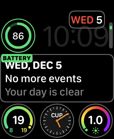
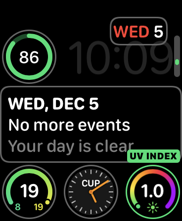
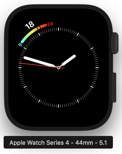
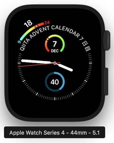
Graphic Corner
今回は Gauge Text の実装をしました。
使う Template は CLKComplicationTemplateGraphicCornerGaugeText です。
gaugeProvider,leadingTextProvider,
trailingTextProvider,outerTextProvider が必要です。
ゲージの左右に表示させるテキスト,ゲージの色,ゲージの外側に表示するテキストを設定する感じです。
個人的には,ゲージのグラデーションの出し方,現在の値の表示方法が気になっていました。
サンプルとして,Tech Talk でも紹介あった気温をイメージして
最低・最高気温をゲージの端にテキスト表示,
現在の気温をゲージ外のテキスト表示,
最低気温側のゲージをシアン,最高気温側をレッドにしました。
func getCurrentTimelineEntry(for complication: CLKComplication, withHandler handler: @escaping (CLKComplicationTimelineEntry?) -> Void) {
    switch complication.family {
    case .graphicCorner:
        // Infographのみ
        // gaugeProvider, leadingTextProvider, trailingTextProvider, outerTextProvider が必要
        let cornerTemplate = CLKComplicationTemplateGraphicCornerGaugeText()

        // leadingTextProviderの実装(ゲージの左側に表示するテキスト)
        let leadingText = CLKSimpleTextProvider(text: "9")
        leadingText.tintColor = .cyan
        cornerTemplate.leadingTextProvider = leadingText

        // trailingTextProviderの実装(ゲージの右側に表示するテキスト)
        let trailingText = CLKSimpleTextProvider(text: "24")
        trailingText.tintColor = .red
        cornerTemplate.trailingTextProvider = trailingText

        // outerTextProviderの実装(コーナーに表示するテキスト)
        let outerText = CLKSimpleTextProvider(text: "18")
        outerText.tintColor = .white
        cornerTemplate.outerTextProvider = outerText

        // gaugeProviderの実装
        // ゲージに使用する色
        let gaugeColors = [UIColor.cyan, UIColor.yellow, UIColor.red]
        // ゲージに使用する色の位置合い
        let gaugeColorLocations = [0.0, 0.5, 1.0]
        let gaugeProvider =
            CLKSimpleGaugeProvider(style: .ring,
                                   gaugeColors: gaugeColors,
                                   gaugeColorLocations: gaugeColorLocations as [NSNumber],
                                   fillFraction: 0.75)
        cornerTemplate.gaugeProvider = gaugeProvider

        // 用意したTemplateをセット
        let entry = CLKComplicationTimelineEntry(date: Date(),
                                                 complicationTemplate: cornerTemplate)
        handler(entry)
    default:
        handler(nil)
    }
}
実行して,Watch face に設定したら下記のようになります。
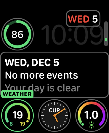
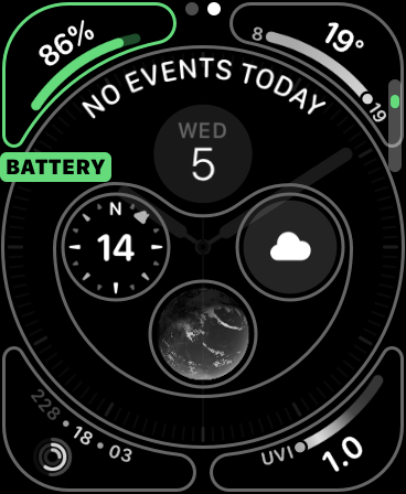
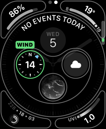
Graphic Circular
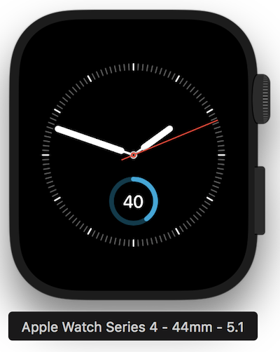
今回は Closed Gauge Text を実装しました。
使う Template は CLKComplicationTemplateGraphicCircularClosedGaugeText です。
gaugeProvider, centerTextProvider が必要です。
サンプルとして,バッテリの残量みたいに
ある割合分ゲージが満たされているようなものにしました。
ゲージの色は東西線スカイブルー,センターの数字は 40 % にしてみました。
func getCurrentTimelineEntry(for complication: CLKComplication, withHandler handler: @escaping (CLKComplicationTimelineEntry?) -> Void) {
    switch complication.family {
    case .graphicCircular:
        // Infograph Modular, Infographのみ
        // circularTemplateの実装
        // gaugeProvider, centerTextProvider が必要
        let circularClosedGaugeTemplate = CLKComplicationTemplateGraphicCircularClosedGaugeText()

        // centerTextProviderの実装
        let centerText = CLKSimpleTextProvider(text: "40")
        centerText.tintColor = .white
        circularClosedGaugeTemplate.centerTextProvider = centerText

        // gaugeProviderの実装
        let gaugeColor = UIColor(red: 0.0, green: 167.0/255.0, blue: 219.0/255.0, alpha: 1.0)
        let gaugeProvider =
            CLKSimpleGaugeProvider(style: .fill,
                                   gaugeColor: gaugeColor,
                                   fillFraction: 0.4)
        circularClosedGaugeTemplate.gaugeProvider = gaugeProvider
        // 用意したTemplateをセット
        let entry = CLKComplicationTimelineEntry(date: Date(),
                                                 complicationTemplate: circularClosedGaugeTemplate)
        handler(entry)
    default:
        handler(nil)
    }
}
実行して,Watch face に設定したら下記のようになります。
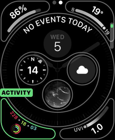
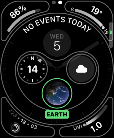
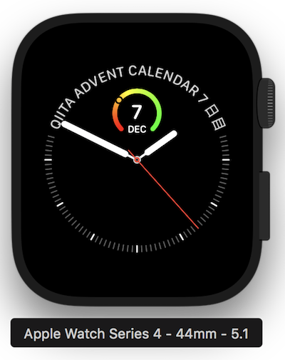
Graphic Bezel
丸みを帯びたテキストと部分と丸い部分を別々に作る感じになります。
使う Template は CLKComplicationTemplateGraphicBezelCircularText です。
先ほどの circularTemplate と textProvider が必要です。
丸い部分は,Open Gauge Text にしました。
Template は CLKComplicationTemplateGraphicCircularOpenGaugeSimpleText にしました。
gaugeProvider,bottomTextProvider,centerTextProvider が必要です。
サンプルとして,丸みを帯びたテキスト部分にはアドベントカレンダーの7日目表示を,
丸い部分には,12/1-25までのゲージを想定し,7日目(25%くらい)であることを表示させます。
func getCurrentTimelineEntry(for complication: CLKComplication, withHandler handler: @escaping (CLKComplicationTimelineEntry?) -> Void) {
    switch complication.family {
    case .graphicBezel:
        // Infographのみ
        // circularTemplate, textProvider が必要
        let bezelCircularTemplate = CLKComplicationTemplateGraphicBezelCircularText()

        // textProviderの実装
        let bezelText = CLKSimpleTextProvider(text: "Qiita Advent Calendar 7 日目")
        bezelText.tintColor = .white
        bezelCircularTemplate.textProvider = bezelText

        // circularTemplateの実装
        // gaugeProvider, bottomTextProvider, centerTextProvider が必要
        let circularTemplate = CLKComplicationTemplateGraphicCircularOpenGaugeSimpleText()

        // bottomTextProviderの実装
        let bottomText = CLKSimpleTextProvider(text: "DEC")
        bottomText.tintColor = .white
        circularTemplate.bottomTextProvider = bottomText

        // centerTextProviderの実装
        let centerText = CLKSimpleTextProvider(text: "7")
        centerText.tintColor = .white
        circularTemplate.centerTextProvider = centerText

        // gaugeProviderの実装
        let gaugeColors = [UIColor.red, UIColor.yellow, UIColor.green]
        let gaugeColorLocations = [0.0, 0.4, 1.0]
        let gaugeProvider =
            CLKSimpleGaugeProvider(style: .ring,
                                   gaugeColors: gaugeColors,
                                   gaugeColorLocations: gaugeColorLocations as [NSNumber],
                                   fillFraction: 0.3)
        circularTemplate.gaugeProvider = gaugeProvider
        bezelCircularTemplate.circularTemplate = circularTemplate

        // 用意したTemplateをセット
        let entry = CLKComplicationTimelineEntry(date: Date(),
                                                 complicationTemplate: bezelCircularTemplate)
        handler(entry)
    default:
        handler(nil)
    }
}
実行して,Watch face に設定したら下記のようになります。
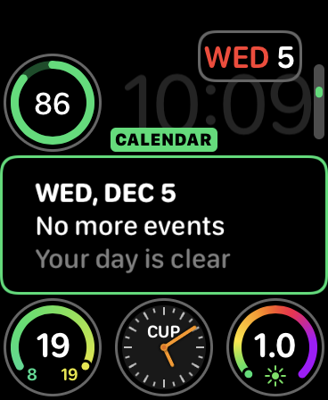
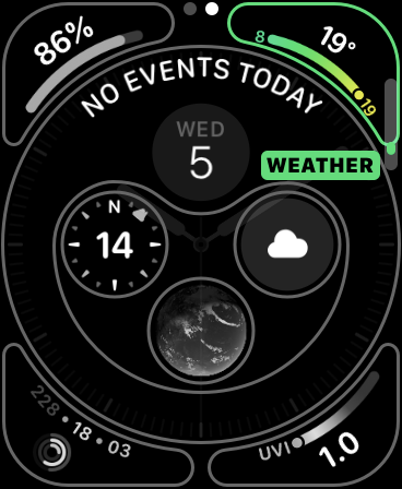
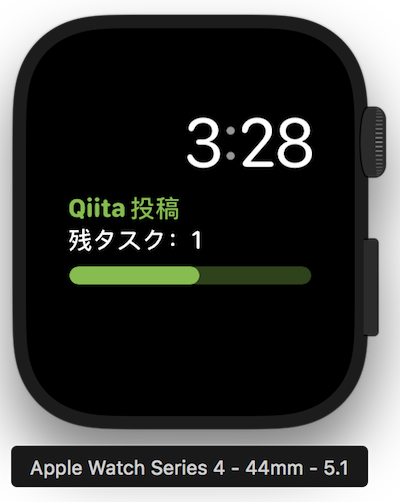
Graphic Rectangular
今回は Text Gauge を実装しました。
使う Template は CLKComplicationTemplateGraphicRectangularTextGauge です。
headerImageProvider(nil可),headerTextProvider,
body1TextProvider,gaugeProvider が必要です。
サンプルとして
私は今年の Qiita Advent Calendar の投稿は 2 つ行いますが,
全部で 2 件中残りの投稿はひとつという意味でゲージは 50% にします。
ヘッダのテキストカラーとゲージの色は Qiita のグリーンにしました。
func getCurrentTimelineEntry(for complication: CLKComplication, withHandler handler: @escaping (CLKComplicationTimelineEntry?) -> Void) {
    switch complication.family {
    case .graphicRectangular:
        // Infograph Modularのみ
        // headerImageProvider(nil可), headerTextProvider, body1TextProvider,  gaugeProviderが必要
        let rectangularTemplate = CLKComplicationTemplateGraphicRectangularTextGauge()

        // headerTextProviderを実装
        let headerText = CLKSimpleTextProvider(text: "Qiita 投稿")
        headerText.tintColor = UIColor(red: 116.0/255.0, green: 192.0/255.0, blue: 58.0/255.0, alpha: 1.0)
        rectangularTemplate.headerTextProvider = headerText

        // body1TextProviderを実装
        let bodyText = CLKSimpleTextProvider(text: "残タスク:1")
        bodyText.tintColor = .white
        rectangularTemplate.body1TextProvider = bodyText

        // gaugeProviderの実装
        let gaugeColor = UIColor(red: 116.0/255.0, green: 192.0/255.0, blue: 58.0/255.0, alpha: 1.0)
        let gaugeProvider =
            CLKSimpleGaugeProvider(style: .fill,
                                   gaugeColor: gaugeColor,
                                   fillFraction: 0.5)
        rectangularTemplate.gaugeProvider = gaugeProvider
        // 用意したTemplateをセット
        let entry = CLKComplicationTimelineEntry(date: Date(),
                                                 complicationTemplate: rectangularTemplate)
        handler(entry)
    default:
        handler(nil)
    }
}
実行して, Watch face に設定したら下記のようになります。
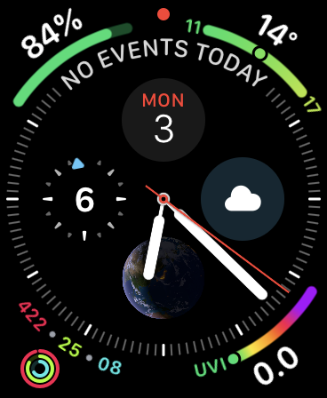
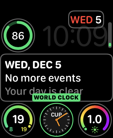
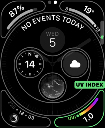
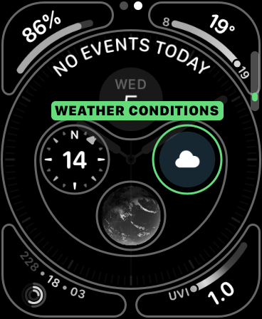
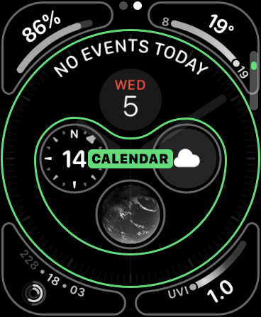
今回作成した Complication たちをできる限り設定したら下記のようになりました。
おわりに
今回は Apple Watch Series 4 で新しく追加された,
Complication Families の確認とそのサンプル実装をしてみました。
実機にうまくインストールできたりできなかったり不安定だったのが気がかりです。
途中で時間がもったいなかったのでシミュレータの方に切り替えました🤔
Complication 周りの実装もまだやったことなかったので雰囲気がつかめてよかったです。
今回はあまり頭が働かずで表示させる情報が考えつきませんでしたが,
より表現力が増した Complication を活かせるようにしたいです。
今後 Apple Watch 用のアプリ開発を個人開発以外で行う機会があるかわかりませんが,
しばらく触れてなかったので色々な復習も兼ねて一通り ClockKit を触ってみようかなと考えています。
ご覧いただきありがとうございました!