Python & Pandasにトライしてみた
今後、Pythonでデータ分析するときに必ず実行すると思われたスクリプトをメモ。
IBM のData Science Experience 環境で Python2 with Spark 2.0で実行。(今回はSparkである必要は全くないw)
実際の分析作業ではフィールド数がかなり多いので、効率よく分析できるようにスクリプト中でフィールド名(列名)をできるだけコーディングしなくていい方法を考えながらやってみました。
機械学習のデータ準備で必要になるSPSS Modelerの「フィールド再編成」相当の機能となるカテゴリーデータの列展開&フラグ化についてもトライ!
欠損値関連は今回は試しませんでしたので、次の機会に。
(本記事で使用しているdf_wiskeyには、予めデータを入力済み)
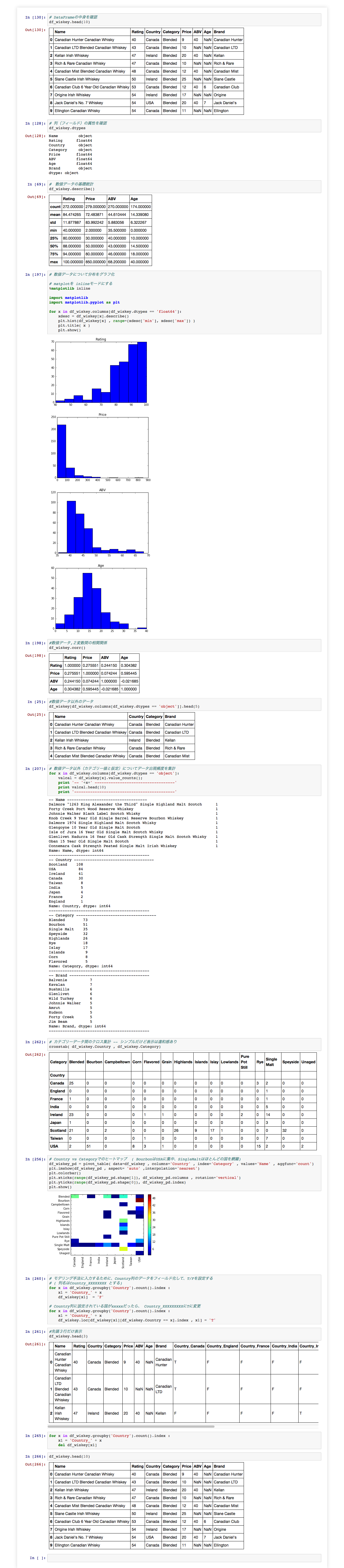
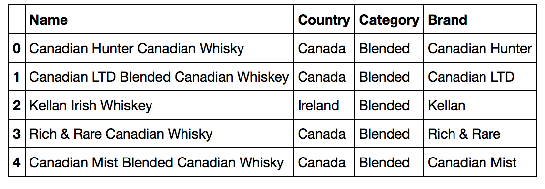
# まずはDataFrameの中身を確認
df_wiskey.head(10)
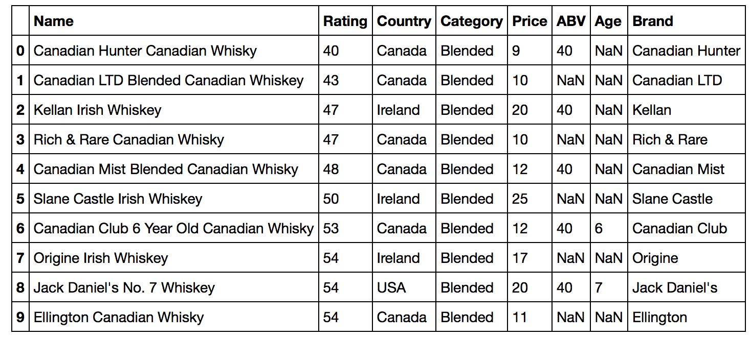
# 続いて列(フィールド)の属性を確認 (今回はかなり適当なまま進めるw)
df_wiskey.dtypes
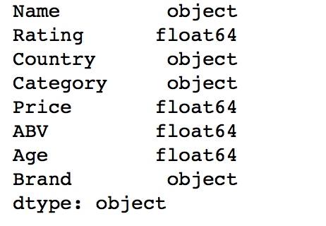
#  数値データの基礎統計
df_wiskey.describe()
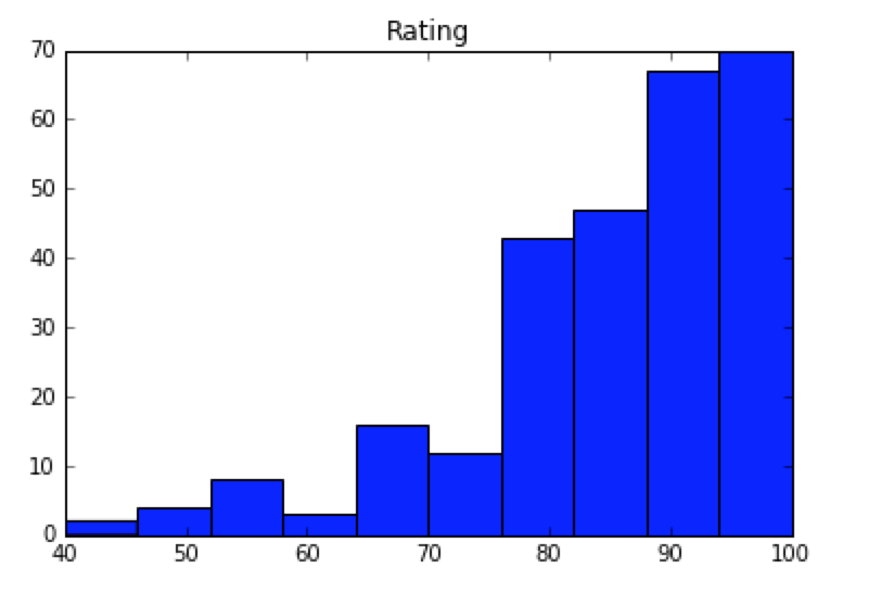
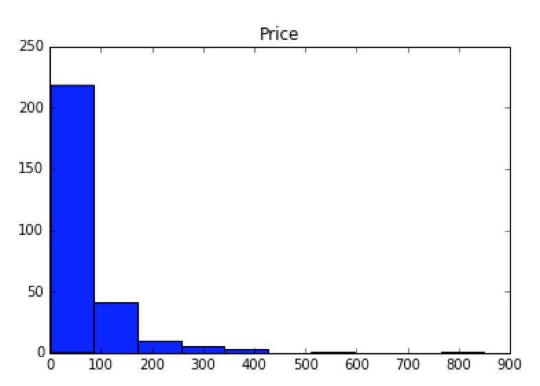
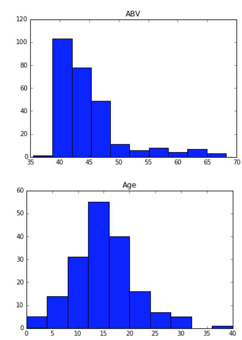
# 数値データについて分布をグラフ化

# matplotを inlineモードにする
%matplotlib inline

import matplotlib
import matplotlib.pyplot as plt

for x in df_wiskey.columns[df_wiskey.dtypes == 'float64']:
    xdesc = df_wiskey[x].describe()
    plt.hist(df_wiskey[x] , range=(xdesc['min'], xdesc['max']) )
    plt.title( x )
    plt.show()
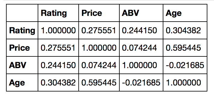
# 数値データ,2変数間の相関関係
df_wiskey.corr()
# 数値データ以外のデータ
df_wiskey[df_wiskey.columns[df_wiskey.dtypes == 'object']].head(5)
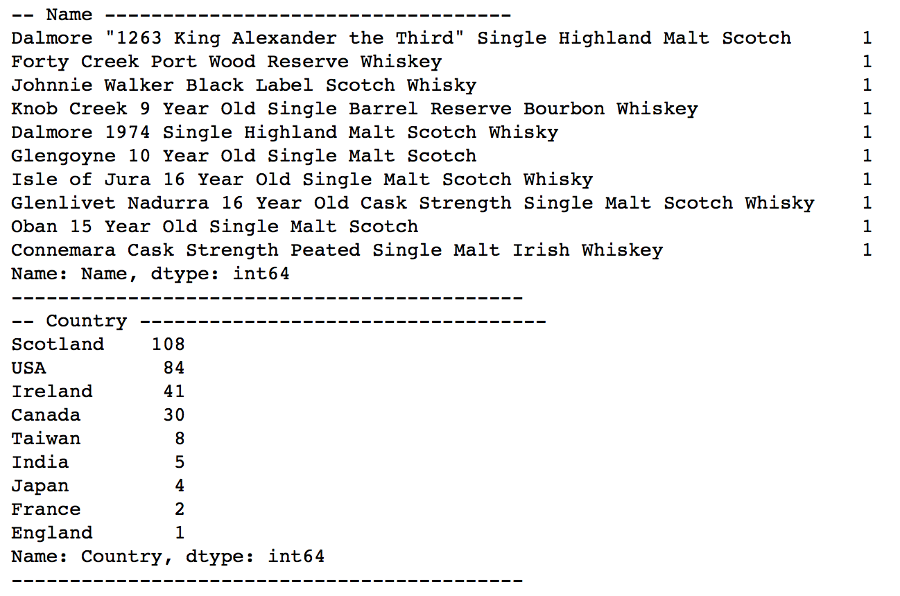
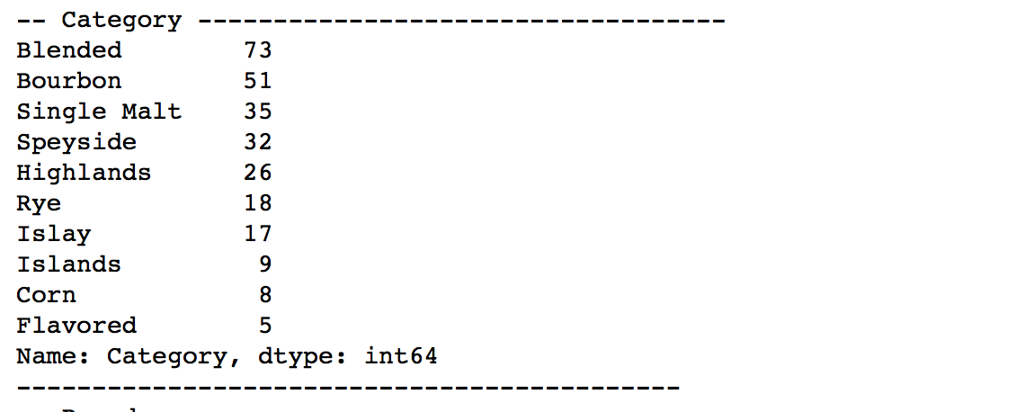
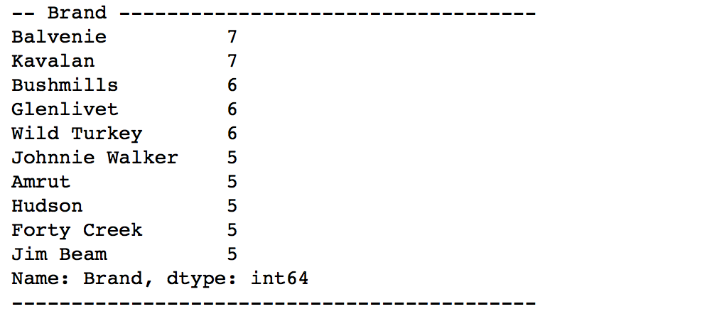
# 数値データ以外(カテゴリー値と仮定)についてデータ出現頻度を集計
for x in df_wiskey.columns[df_wiskey.dtypes == 'object']:
    valcal = df_wiskey[x].value_counts();
    print '-- '+x+' -----------------------------------'
    print valcal.head(10)
    print '--------------------------------------------'
# カテゴリーデータ間のクロス集計 -- シンプルだけど表示は違和感あり
crosstab( df_wiskey.Country , df_wiskey.Category)
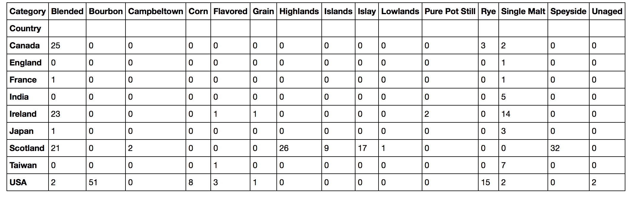
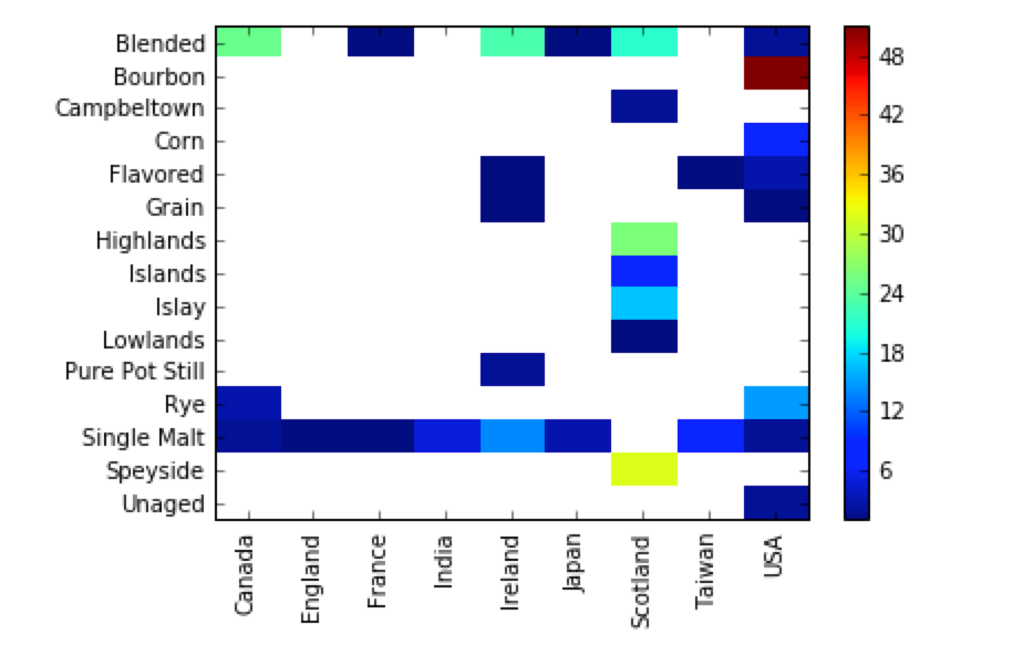
# Country vs Categoryでのヒートマップ  ( BourbonはUSAに集中、SingleMaltはほとんどの国を網羅)
df_wiskey_pd = pivot_table( data=df_wiskey , columns='Country' , index='Category' , values='Name' , aggfunc='count')
plt.imshow(df_wiskey_pd , aspect= 'auto' ,interpolation='nearest')
plt.colorbar()
plt.xticks(range(df_wiskey_pd.shape[1]), df_wiskey_pd.columns , rotation='vertical')
plt.yticks(range(df_wiskey_pd.shape[0]), df_wiskey_pd.index)
plt.show()
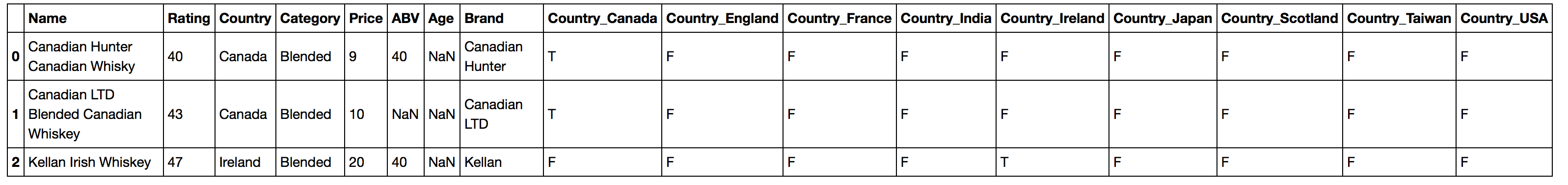
# モデリング手法に入力するために、Country列のデータをフィールド化して、T/Fを設定する
# ( 列名はCountry_XXXXXXXX とする)
for x in df_wiskey.groupby('Country').count().index :
    x1 = 'Country_' + x
    df_wiskey[x1]  = 'F'
    # Country列に設定されている国がxxxxxだったら、 Country_XXXXXXXXXにTに変更
    df_wiskey.loc[df_wiskey[x1][df_wiskey.Country == x].index , x1] = 'T'
# 先頭3行だけ表示
df_wiskey.head(3)
追記
Data Scientist Experienceのノートブックはなかなか使いやすいかもしれない![]()
<スクリーンショット>