はじめに
この記事ではNuxt3でVuetify3のテーマを設定する方法について、公式ドキュメントを参考にして書いています。
前提条件
Nuxt3、Vuetify3の環境構築は完了している前提で進めていきます。
もしVuetify3の環境構築ができていない場合は、以前書いた記事がありますのでぜひ参考にしてください。
環境
- Nuxt:3.0.0
- Vue:3.2.45
- Vuetify:3.0.2
テーマの設定
まずはテーマを設定するためにVuetify.jsを編集します。
import { createVuetify } from 'vuetify'
import * as components from 'vuetify/components'

export default defineNuxtPlugin((nuxtApp) => {
  // テーマを定義
  const customTheme = {
    colors: {
      primary: '#2196F3',
      secondary: '#b0bec5',
    }
  }
  const vuetify = createVuetify({
    components,
    theme: {
      themes: {
        customTheme // テーマを設定
      },
    }
  })
  nuxtApp.vueApp.use(vuetify)
})
使用する色は下記を参考にすると良いです。
テーマを反映
以下の2つの方法について書きます。
-
v-theme-providerでの反映 - コンポーネントのテーマpropでの反映
それでは説明していきます。
v-theme-providerで反映する方法
v-theme-providerタグを使用してテーマを設定します。
公式によると、より大きなまとまりに対してテーマを反映するために使用すると良いみたいです。
<template>
  <v-app>
    <!-- 配下の要素にテーマが反映される -->
    <v-theme-provider theme="customTheme">
      <v-container class="d-flex justify-center align-center h-100">
        <v-card
          class="bg-primary"
          title="customTheme primary"
        >
          <v-card-item class="bg-secondary">
            customTheme secondary
          </v-card-item>
        </v-card>
      </v-container>
    </v-theme-provider>
  </v-app>
</template>
コンポーネントのテーマpropで反映する方法
下記のv-cardようにテーマpropを設定すると、コンポーネント自身とその配下にテーマが反映されます。
<template>
  <v-app>
    <v-container class="d-flex justify-center align-center h-100">
      <!-- コンポーネント自身とその配下にテーマが反映される -->
      <v-card
        theme="customTheme"
        class="bg-primary"
        title="customTheme primary"
      >
        <v-card-item class="bg-secondary">
          customTheme secondary
        </v-card-item>
      </v-card>
    </v-container>
  </v-app>
</template>
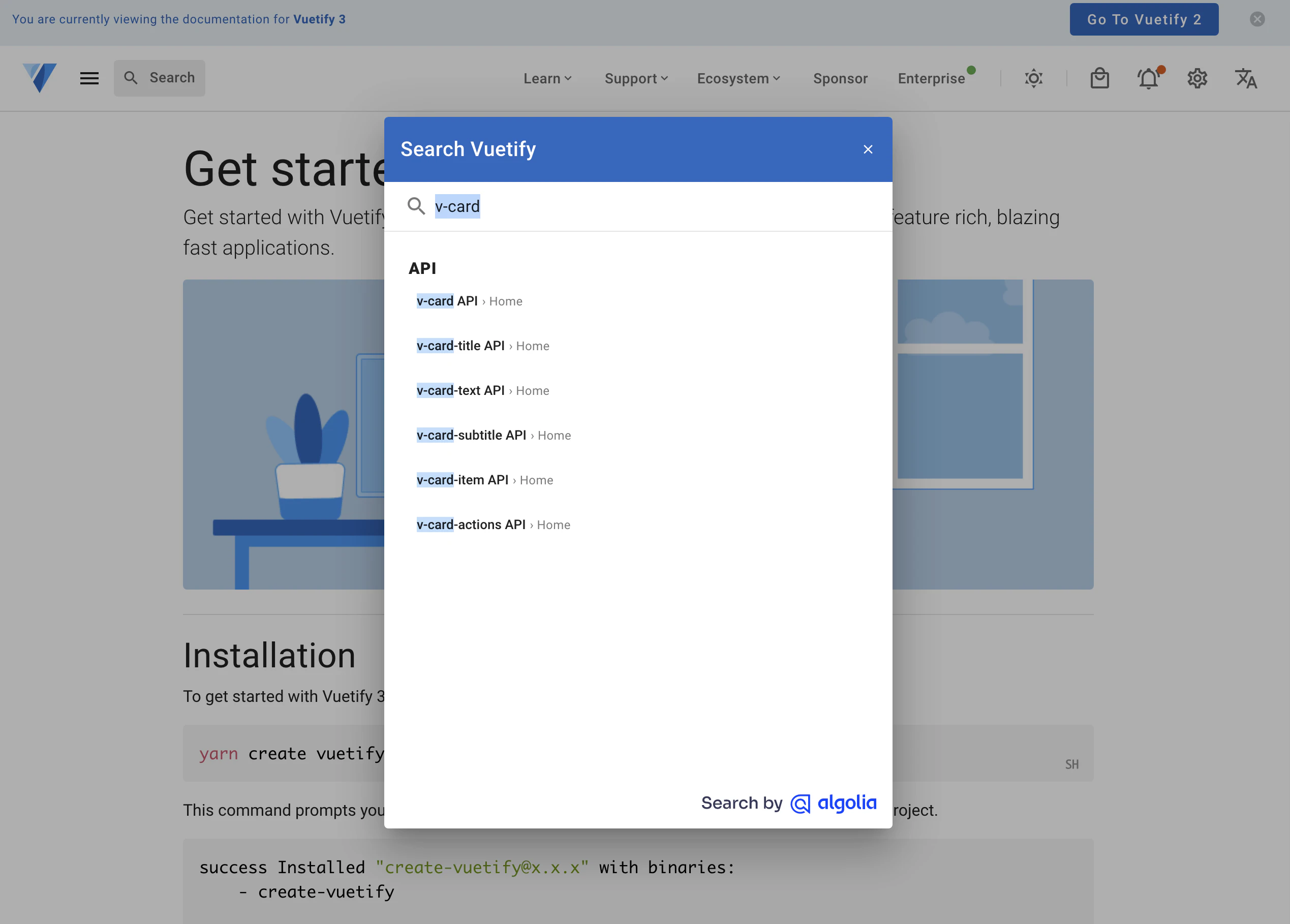
ちなみにドキュメントによるとほとんどのコンポーネントはテーマpropに対応しているそうですが、一部対応していないコンポーネントもあるようです。反映されない場合はコンポーネントが対応しているpropを確認してみてください。
確認方法ですが、下記のように公式ドキュメントの検索フォームにコンポーネント名を入力して、「コンポーネント名 API」を選択すると対応しているprop一覧が見れます。
その他の設定方法
以下について書いています。
- デフォルトテーマの設定
- 複数テーマの設定
デフォルトのテーマを設定
下記のようにデフォルトのテーマを設定することもできます。
import { createVuetify } from 'vuetify'
import * as components from 'vuetify/components'

export default defineNuxtPlugin((nuxtApp) => {
  // テーマを追加
  const customTheme = {
    colors: {
      primary: '#2196F3',
      secondary: '#b0bec5'
    }
  }
  const vuetify = createVuetify({
    components,
    theme: {
      defaultTheme: 'customTheme', // デフォルトテーマ設定
      themes: {
        customTheme
      },
    }
  })
  nuxtApp.vueApp.use(vuetify)
})
<template>
  <v-app>
    <v-container class="d-flex justify-center align-center h-100">
      <v-card
        class="bg-primary"
        title="customTheme primary"
      >
        <v-card-item class="bg-secondary">
          customTheme secondary
        </v-card-item>
      </v-card>
    </v-container>
  </v-app>
</template>
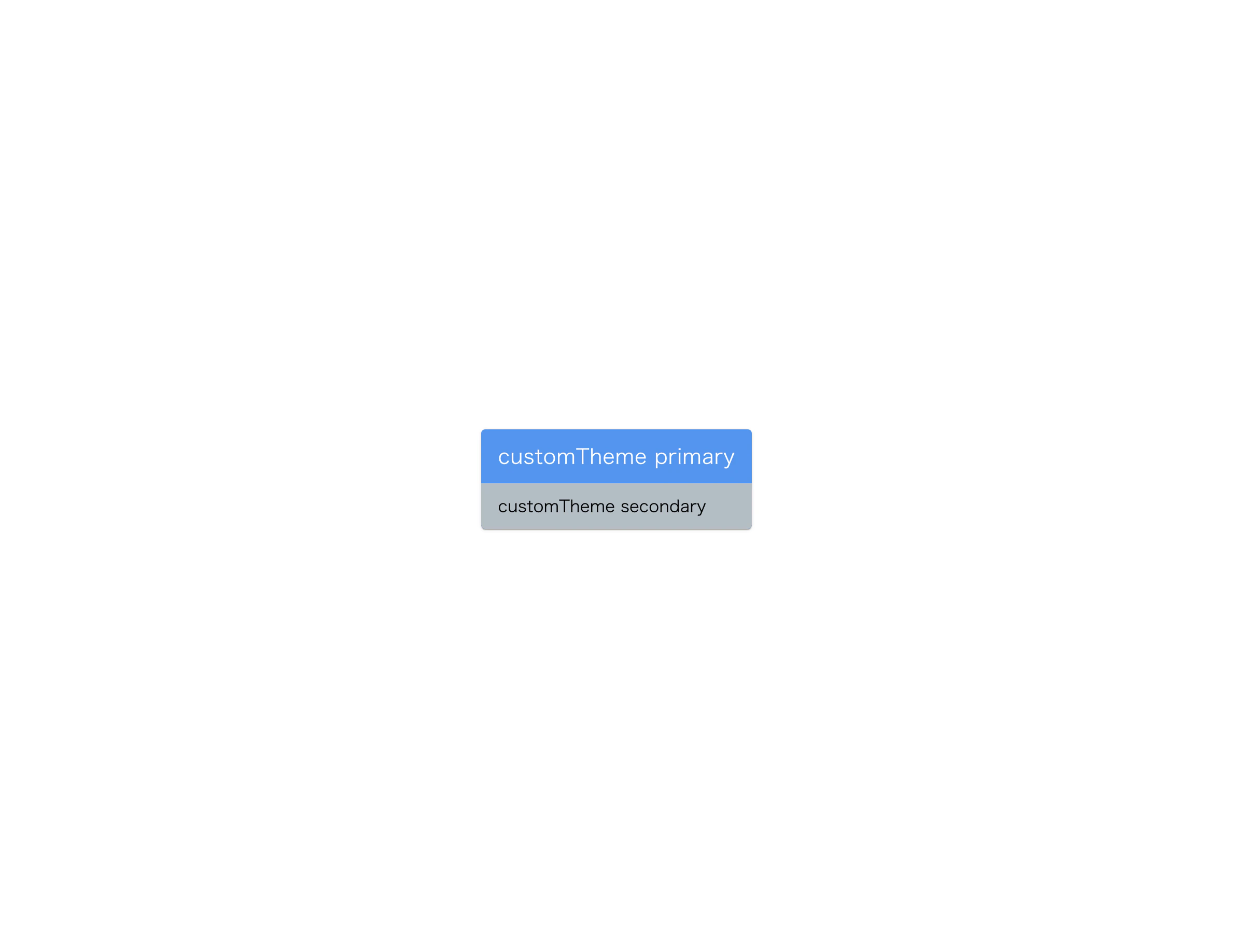
上記のtemplateタグ内でテーマは設定していませんが、下記のように背景の色が変わっており、デフォルトテーマが反映されていることが確認できます。
複数テーマの設定
複数のテーマを定義し、それぞれ反映させる方法を書いていきます。
方法はとても簡単で、テーマを2つ定義してthemesに追加し、先ほど説明したように反映するだけです。
import { createVuetify } from 'vuetify'
import * as components from 'vuetify/components'

export default defineNuxtPlugin((nuxtApp) => {
  const customTheme1 = {
    colors: {
      primary: '#2196F3',
      secondary: '#b0bec5'
    }
  }

  const customTheme2 = {
    colors: {
      primary: '#ff9800',
      secondary: '#A1887F',
      error: '#b71c1c',
    }
  }

  const vuetify = createVuetify({
    components,
    theme: {
      themes: {
        customTheme1,
        customTheme2
      },
    }
  })
  nuxtApp.vueApp.use(vuetify)
})
<template>
  <v-app>
    <v-container class="d-flex justify-center align-center h-100">
      <v-card
        theme="customTheme1"
        class="bg-primary"
        title="customTheme primary"
      >
        <v-card-item class="bg-secondary">
          customTheme secondary
        </v-card-item>
      </v-card>
      <v-card
        theme="customTheme2"
        class="bg-primary"
        title="customTheme primary"
      >
        <v-card-item class="bg-secondary">
          customTheme secondary
        </v-card-item>
      </v-card>
    </v-container>
  </v-app>
</template>
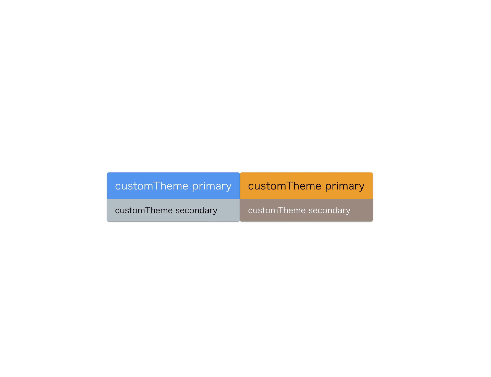
2種類のテーマが反映されていることが確認できます。
最後に
ここまで見ていただきありがとうございました。
Vuetifyって以外と勉強しないといけないこと多いですよね...
参考