0
0

Delete article

Deleted articles cannot be recovered.

Draft of this article would be also deleted.

Are you sure you want to delete this article?

More than 3 years have passed since last update.

スマホの時、htmlをfont-size:62.5%;にしないと画面に余白ができる

Posted at

iPhone(safari)では大丈夫なのに、Androidは余白が!!!

パソコンでの開発では出なかったのですが、
実機チェックした時、
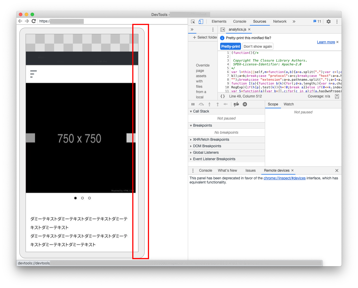
Android端末では、以下のような空白ができました。。。
chromeだけでなく、chatworkやslackのプレビューでもこの空白ができました。
スクリーンショット-2020-09-15-14.24.58.png

原因

スマホの時、htmlを**「font-size: 62.5%;」**にしていなかったためです。

これは**「ルートのフォントサイズ」**で、
あるサイトにはこう書いていました。

font-size: 62.5%;は呪文みたいなもの」

[引用][css]html, bodyのfont-sizeはいくつにしてる?~よく見る62.5%ってなに!?~

有無を言わずに入れとけ!ということですね。

対処法

とはいえ、全部のフォントサイズを変えるのは大変なので、
以下のように応急処置しました。
ポイントは、htmlとbody両方に**overflow-x: hidden;**を入れること。
※overflow:hidden;にすると、スクロールできなくなります。

@media screen and (max-width:768px) { //スマホ時
    html {
        font-size: 90%; //自分が設定したい大きさで
        overflow-x: hidden;
    } 
    body{
        overflow-x: hidden;
    }
}
0
0
0

Register as a new user and use Qiita more conveniently

  1. You get articles that match your needs
  2. You can efficiently read back useful information
  3. You can use dark theme
What you can do with signing up
0
0

Delete article

Deleted articles cannot be recovered.

Draft of this article would be also deleted.

Are you sure you want to delete this article?