やりたいこと / Purpose
Seabornでヒートマップを描くとき、項目の並び順を自由にカスタマイズしたい。
You may want to order entries arbitrarily as you like when drawing a heatmap with seaborn. Here's how to do that.
データ準備 / Data preparation
はじめに元データを用意します。ここでは、三箇所の場所で四種類の動物を目撃した回数をデータにします。
Prepare a dataset to visualize first. Suppose you went out to three different places and counted how many times you saw some animal species.
import matplotlib.pyplot as plt
import seaborn as sns
import pandas as pd

df = pd.DataFrame(data={"cat": [5,2,1],
                        "tiger": [0,3,0],
                        "crow": [4, 3, 3],
                        "crab":[0,1,3],
                        "penguin": [0,0,2]},
                  index=["city", "forest", "beach"])
| cat | crab | crow | penguin | tiger | |
|---|---|---|---|---|---|
| city | 5 | 0 | 4 | 0 | 0 |
| forest | 2 | 1 | 3 | 0 | 3 |
| beach | 1 | 3 | 3 | 2 | 0 |
相関行列作成&ヒートマップ / Generate a correlation matrix and draw a heatmap
次に、出現頻度について動物種間での相関を計算します。pandasは関数一発でやってくれます。
Then calculate a correlation matrix. You just have to call corr() function of pandas.
corr = df.corr()
| cat | crab | crow | penguin | tiger | |
|---|---|---|---|---|---|
| cat | 1.000000 | -0.891042 | 0.970725 | -0.693375 | -0.277350 |
| crab | -0.891042 | 1.000000 | -0.755929 | 0.944911 | -0.188982 |
| crow | 0.970725 | -0.755929 | 1.000000 | -0.500000 | -0.500000 |
| penguin | -0.693375 | 0.944911 | -0.500000 | 1.000000 | -0.500000 |
| tiger | -0.277350 | -0.188982 | -0.500000 | -0.500000 | 1.000000 |
相関行列ができました。が、元データの並び順が失われてしまいましたね。このままヒートマップを描くと以下のようになります。
Here's the correlation matrix, but the entries have been reordered. You can just try draw a heatmap and here's how it would look like:
sns.heatmap(corr, square=True, annot=True)
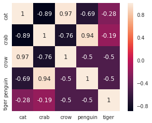
市松模様になっていて、並び順が悪そうなのがわかります。並び替えてみましょう。
Looks like a checkerboard. Some problems with ordering, right? Let's order neatly.
並び替え / Order entries
pandasで列を並び替えるのは簡単です。並び順を表すリストを用意してやって、それで列を取り出すだけです。カラスとネコ、ネコとトラ、カニとペンギンが固まるように並べてあげましょう。
It's easy to order columns with pandas. You just need a list of column labels and you can extract data from a data frame. Let's make put crow and cat, cat and tiger, and crab and penguin next to each other.
order = ["cat", "tiger", "crow", "crab", "penguin"]
corr[order]
| crow | cat | tiger | crab | penguin | |
|---|---|---|---|---|---|
| cat | 0.970725 | 1.000000 | -0.277350 | -0.891042 | -0.693375 |
| crab | -0.755929 | -0.891042 | -0.188982 | 1.000000 | 0.944911 |
| crow | 1.000000 | 0.970725 | -0.500000 | -0.755929 | -0.500000 |
| penguin | -0.500000 | -0.693375 | -0.500000 | 0.944911 | 1.000000 |
| tiger | -0.500000 | -0.277350 | 1.000000 | -0.188982 | -0.500000 |
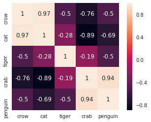
これで列は並び変わりましたが、行はそのままなので対角線が乱れてしまいました。これでは困るので行も並べましょう。やりかたはいろいろありそうですが、手っ取り早いのは転置を取ってやることでしょう。対称行列なので二度転置を取ってやる必要はありません。
Now you get the columns ordered, but rows aren't. Diagonal is messed up and this is not what you wanted. You have order rows as well. Perhaps the easiest way is to use transpose. Since the matrix is symmetric, you don't have to transpose it again in the end.
corr_ordered = corr[order].T[order]
| crow | cat | tiger | crab | penguin | |
|---|---|---|---|---|---|
| crow | 1.000000 | 0.970725 | -0.500000 | -0.755929 | -0.500000 |
| cat | 0.970725 | 1.000000 | -0.277350 | -0.891042 | -0.693375 |
| tiger | -0.500000 | -0.277350 | 1.000000 | -0.188982 | -0.500000 |
| crab | -0.755929 | -0.891042 | -0.188982 | 1.000000 | 0.944911 |
| penguin | -0.500000 | -0.693375 | -0.500000 | 0.944911 | 1.000000 |
めでたく行も並び変わりました! あらためてヒートマップを描いてみましょう。
Congrats! You have everything right now. Let's draw heatmap again.
sns.heatmap(corr_ordered, square=True, annot=True)
You see it's nicely ordered. Amazing!
いい感じにかたまりが見えるようになりましたね。
カラーパレット変更 / Change color palettes
ついでにカラーパレットを変更しておきましょう。相関ですから+1と-1の両側が重要なので、"sequential color palettes"ではなく" diverging color palettes"を使います。
Let's change the color palette too so that it looks even better. For correlation, you want to use "diverging color palettes" rather than "sequential color palettes" because both extremes (+1 and -1) are important.
cf. https://seaborn.pydata.org/tutorial/color_palettes.html#diverging-color-palettes
cmap = sns.color_palette("coolwarm", 200)
sns.heatmap(corr_ordered, square=True, annot=True, cmap=cmap)
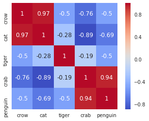
色が変わりました。これがベストなわけでもなさそうですが……。あとはみなさんの好みの色を探してみてください。
Now you have successfully changed the color palette. This may not be the best choice though... You can find a better one bu yourself!
Clustermapを使う / Use clustermap instead
ここまでいろいろやってきましたが、実はseabornにはclustermapという便利なものがあります。
Now I'll tell you the truth. Seaborn has clustermap function and you don't have to worry about ordering entries.
sns.clustermap(corr, cmap=cmap)
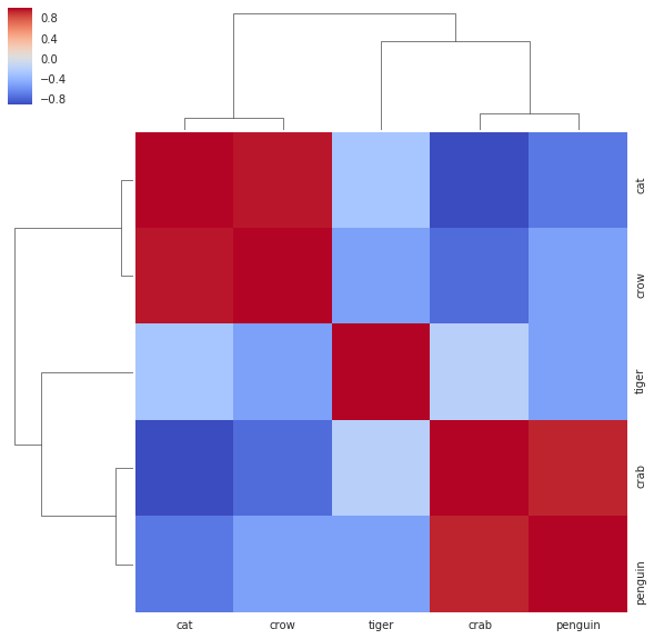
なんと何も指示しなくても類似する項目が近接するように並べ替えてくれます。実際にはもっと多機能なので詳細はドキュメントを参照してください。
It automatically takes care of distance between entries and orders them! It actually has many more functions and I recommend you to read the document.
cf. https://seaborn.pydata.org/generated/seaborn.clustermap.html
とはいえ、任意の順番で並べたいことはあるでしょうから、その場合には上記の方法で並べることになります。
Nonetheless, you may sometimes want to order as you like, and the above is how you can do it.