はじめに
自作カラーマップ操作についていろいろなサイトを検索するのが面倒だと感じたので,解析と整理を行うことにした.
下記のコマンドはJupyterでそのまま実行可能(冒頭に%matplotlib inlineを忘れずに).
colormap情報の取得【plt.get_cmap()とColormapクラス】
デフォルトのcolormapに関する情報は,plt.get_cmap()から取得する.
import numpy as np
import matplotlib.pyplot as plt

cm_name = 'jet' # B->G->R
cm = plt.get_cmap(cm_name)
print(type(cm)) # matplotlib.colors.LinearSegmentedColormap
デフォルトのカラーマップは256段階で色が変化する.
この段階の数字および各段階のRGB情報は以下のように取得できる.
print(cm.N) # 256
cm(0) # (R,G,B,alpha) = (0.0, 0.0, 0.5, 1.0)
たとえば,各色ごとの値を段階的に取得しようとすれば,下記のようになる.
Rs = []
Gs = []
Bs = []
As = []

for n in range(cm.N):
    Rs.append(cm(n)[0])
    Gs.append(cm(n)[1])
    Bs.append(cm(n)[2])
    As.append(cm(n)[3])
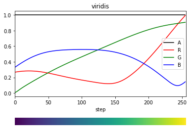
これを用いて,グラフを描画してみる.
0から1までの値をとる1次元配列と,それを2段重ねただけの2次元配列を作成する,後者はカラーバーっぽい画像をimshow()で表示するために用いる.
# 1d array
gradient = np.linspace(0, 1, cm.N)
# 2d array (for imshow)
gradient_array = np.vstack((gradient, gradient))
色段階ステップを横軸にとったRGB値のグラフと,その下にカラーバーを描画するコード.
fig = plt.figure()
ax  = fig.add_axes((0.1,0.3,0.8,0.6))
ax.plot(As,'k',label='A')
ax.plot(Rs,'r',label='R')
ax.plot(Gs,'g',label='G')
ax.plot(Bs,'b',label='B')
ax.set_xlabel('step')
ax.set_xlim(0,cm.N)
ax.set_title(cm_name)
ax.legend()

ax2 = fig.add_axes((0.1,0.1,0.8,0.05))
ax2.imshow(gradient_array, aspect='auto', cmap=cm)
ax2.set_axis_off()

他のカラーバーについても同様にRGB情報を抽出すると結構面白い.

色段階の変更【plt.get_cmap(cm_name, N)】
デフォルトで256段階とされている色分け段階を,例えば10段階に変更すると,下記のようになる.
cm10 = plt.get_cmap(cm_name,10)
print(cm10.N) # 10
先ほどと同様にRGB情報を取得するとそのふるまいが分かる.
R10s = []
G10s = []
B10s = []
A10s = []

for n in range(cm10.N):
    R10s.append(cm10(n)[0])
    G10s.append(cm10(n)[1])
    B10s.append(cm10(n)[2])
    A10s.append(cm10(n)[3])

gradient10 = np.linspace(0, 1, cm10.N)
gradient10_array = np.vstack((gradient10, gradient10))

fig = plt.figure()
ax  = fig.add_axes((0.1,0.3,0.8,0.6))
ax.plot(A10s,'k',label='A')
ax.plot(R10s,'r',label='R')
ax.plot(G10s,'g',label='G')
ax.plot(B10s,'b',label='B')
ax.set_xlabel('step')
ax.set_xlim(0,cm10.N)
ax.set_title(cm_name)
ax.legend()

ax2 = fig.add_axes((0.1,0.1,0.8,0.05))
ax2.imshow(gradient10_array, aspect='auto', cmap=cm10)
ax2.set_axis_off()

なお,256段階以上の数字を入力した場合、これ以上色段階は増えないものの、各値に対応する色が割り当てられる(下はviridisに対してN=2560を入力した結果.拡大して見ると、10進むごとに色が更新されていることがわかる).

色段階を指定することで,colormapの色合いを用いた折れ線グラフの描画も可能.
fig = plt.figure()
ax  = fig.add_subplot(111)
for n in range(10):
    ax.plot([0,1],[n,n], label=n, c=cm10(n))
ax.legend(bbox_to_anchor=(1.05, 1), loc='upper left')
fig.tight_layout()

カラーコードを指定した離散カラーマップの定義【LinearSegmentedColormap.from_list()】
ここでは,自分で色を指定した離散カラーマップを作成したいと思う.たとえば、既存の比較をしたい図が下のようなカラーマップで定義されていたとする.

これと同じカラーマップの作成を目指す.
はじめに、各色のカラーコード(RGBに対応する16進法2桁の数を3つ並べたもの)を取得する必要がある.様々な方法があるが、最もシンプルな方法の一つは、Chromeの拡張機能「ColorPick Eyedropper」を使用して抽出する方法である.これを用いれば、画像上の該当ピクセルにおけるカラーコードの取得が可能となる.
さて、抽出ができれば、LinearSegmentedColormap.from_list()を用いて定義を行う.custom_cmapという名前の新たなカラーマップを定義する.
from matplotlib.colors import LinearSegmentedColormap

list_cid = ['#FFFFFF', '#43C3D0',
            '#9BB9DE', '#BAE5F5',
            '#EDF5ED', '#D2EDC1',
            '#DAF161', '#E5F302',
            '#F2E703', '#EA0406']
list_label = [  '0-0.1', '0.1-0.2',
              '0.2-0.3', '0.3-0.4',
              '0.4-0.5', '0.5-0.6',
              '0.6-0.7', '0.7-0.8',
              '0.8-0.9', '0.9-1.0']
list_ticks = [0.05, 0.15,
              0.25, 0.35,
              0.45, 0.55,
              0.65, 0.75,
              0.85, 0.95]
vmin,vmax = 0, 1

cm = LinearSegmentedColormap.from_list('custom_cmap', list_cid, N=len(list_cid))
plt.imshow(np.linspace(0, 1, 25).reshape(5,5), cmap=cm, interpolation='nearest', vmin=vmin, vmax=vmax)
cbar = plt.colorbar(orientation='horizontal', extend='neither', ticks=list_ticks)
cbar.ax.set_xticklabels(list_label, rotation=45, fontsize = 14)

0-1で値が変化する5×5の行列を描画している.
元データにあるようなカラーマップが正しく定義できていることがわかる.
また、RGB値を0-1の値で示すこともできる。LinearSegmentedColormap.from_list()のNを省略した場合、連続値のカラーマップが自動的に生成される。
c1 = np.array([ 65,129,239]) / 256
c2 = np.array([ 51,163, 83]) / 256
c3 = np.array([244,184,  6]) / 256
c4 = np.array([228, 64, 52]) / 256

cm = LinearSegmentedColormap.from_list(name='google', colors=[c1, c2, c3, c4])

離散値を指定した離散カラーマップの定義【BoundaryNorm()】
ここでは,描画に用いる値と色段階とを対応させることにより,色段階スケールを変更したいと思う.これを,「ノルム(norm)を変化させる」と呼ぶ.
valuesに対応させたノルムを定義するには,BoundaryNorm()を用いる.
from matplotlib.colors import BoundaryNorm
values = [0, 0.05, 0.10, 0.20, 0.50, 0.80, 0.90, 0.95, 1.00]
norm = BoundaryNorm(values, ncolors=cm.N)
ここでは,valuesの中にある要素で隔てられた値の間隔(”0-0.05,0.05-0.10,...”)の数だけ,0~(ncolors-1)までのncolors個の数字をを等間隔に区切る.
下記では,normに数字を代入して色段階のint値を取り出している.valuesの端の数字に対して0と255が割り当てられているほか,0.5を境に色段階が変化していることが分かる.
print(norm.N) # 9
print(norm.boundaries) # array([0., 0.05, 0.1,...,1.])
print(norm(0))    #   0
print(norm(1))    # 255
print(norm(0.48)) # 109
print(norm(0.49)) # 109
print(norm(0.50)) # 145
print(norm(0.51)) # 145
注意すべきなのは,valuesで指定しているのは値の間隔の端の数字(植木算で言う植木の位置座標)であり,色段階はそれより一つ小さい数だけ作成される点である.
cm_constでこの「一つ小さい数」を指定して作成したカラーマップと比較してほしい.
cm_const = plt.get_cmap(cm_name,len(values)-1)

fig = plt.figure()

# real value (0-1) vs norm value (0-255)
ax  = fig.add_axes((0.1,0.5,0.8,0.4))
ax.plot(gradient, norm(gradient),'b')
ax.set_xlabel('step value (0-1)')
ax.set_xlim(0,1)
ax.set_title('jet')

# Colormap with norm
ax2  = fig.add_axes((0.1,0.3,0.8,0.05))
ax2.imshow(gradient_array, aspect='auto', cmap=cm, norm=norm)
ax2.set_axis_off()

# Linear step colormap
ax3 = fig.add_axes((0.1,0.2,0.8,0.05))
ax3.imshow(gradient_array, aspect='auto', cmap=cm_const)
ax3.set_axis_off()

# Default (256 step) colormap
ax4 = fig.add_axes((0.1,0.1,0.8,0.05))
ax4.imshow(gradient_array, aspect='auto', cmap=cm)
ax4.set_axis_off()

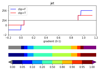
外れ値の色指定とカラーバーの拡張【set_over,set_under】
ノルムで定義されたの最大値と最小値の外側の値を代入した際のふるまいは,norm.clipがTrueであるかFalseであるかで異なる.Trueであれば端の色が延長され,False (default)であれば新規に定義されるその外側の色が指定される.
下記ではclipをTrueとしたnormT,FalseとしたnormFを作成し,外れ値を代入したときの色段階を確認している.
from copy import copy

print(norm(0))       #   0
print(norm(1)),'\n'  # 255
# clip=False
normF = copy(norm)
normF.clip = False
print(normF(-1))     #  -1
print(normF(2)),'\n' # 256
# clip=True
normT = copy(norm)
normT.clip=True
print(normT(-1))     #   0
print(normT(2))      # 255
外れ値に対する色は,set_over(),set_under()で指定する.
cm.set_over('purple')
cm.set_under('gray')
外れ値も含めたカラーマップを描画する.同時に,imshowで表示したカラーマップに対するカラーバーもfig.colorbar()で表示する.こちらは,デフォルトでは長方形の形をしているが,extendオプションを'both'に設定すると,三角形の外れ値色を表示させることができる.
# new gradient including out-of-range values
new_gradient = np.linspace(-0.2, 1.2, 300)
new_gradient_array = np.vstack((new_gradient, new_gradient))

fig = plt.figure()
# upper-side outputs of normF & normT
ax  = fig.add_axes((0.1,0.7,0.8,0.2))
ax.plot(new_gradient, normF(new_gradient),'b',label='clip=F')
ax.plot(new_gradient, normT(new_gradient),'r',label='clip=T')
ax.set_ylim(254,257)
ax.set_title(cm_name)
ax.legend()

# lower-side outputs of normF & normT
ax1  = fig.add_axes((0.1,0.5,0.8,0.2))
ax1.plot(new_gradient, normF(new_gradient),'b',label='clip=F')
ax1.plot(new_gradient, normT(new_gradient),'r',label='clip=T')
ax1.set_ylim(-2,1)
ax1.set_xlabel('gradient (0-1)')
ax1.set_xlim(-0.2,1.2)

# colormap with normF
ax2  = fig.add_axes((0.1,0.3,0.8,0.05))
im = ax2.imshow(new_gradient_array, aspect='auto', cmap=cm, norm=normF)
ax2.set_axis_off()

# colormap with normT
ax3 = fig.add_axes((0.1,0.2,0.8,0.05))
ax3.imshow(new_gradient_array, aspect='auto', cmap=cm, norm=normT)
ax3.set_axis_off()

# colorbar (extended)
cax = fig.add_axes((0.1,0.1,0.8,0.05))
fig.colorbar(im,cax=cax, orientation='horizontal', extend='both')
終わりに
- 描画に用いる値→(norm)→色段階→(colormap)→RGB値
- カラーマップは,デフォルトで256段階のRGB情報をもつ
- 256段階はそれより小さい数にも大きい数にも変更可能(Nを指定)
- normの作成にはBoundaryNorm()などを用いる(他には対数用のLogNormなど)
- 外れ値の色を扱うためには,cm.set_under()とcm.set_over().
- このときカラーバーはextend='both'とする
追記:正負に対数を伸ばしたカラーバー
0を中心として,正負両方向に対数のノルムが設定されているカラーバーの要求があったため作成してみた.LogNormで作成しようとすると負の値をとれないため,BoundaryNormで作成する.下記のケースでは,[-1e-5,0),[0,1e-5)の値はそれぞれ単一色となっていることに注意.より0に近い値も区分したい場合は,plogsの最小指数を変更する.
# positive log norm ( 1e-5 to  1e+3)
plogs = np.power(10,np.linspace(-5,3,1000))
# negative log norm (-1e+3 to -1e-5)
nlogs = -plogs[::-1]
# concatenate norms
logs = np.append(nlogs,[0])
logs = np.append(logs,plogs)

# apply for BoundaryNorm()
cm = plt.get_cmap('jet')
lnorm = BoundaryNorm(logs, ncolors=cm.N)

### drawing
# 2-d array
ar  = np.linspace(-1e3,1e3,100).reshape(10,10)

fig = plt.figure(figsize=(10,5))
# left: linear norm
ax1  = fig.add_axes((0.1,0.2,0.35,0.7))
im1 = ax1.imshow(ar, cmap=cm, vmin=-1e3, vmax=1e3)
cax1 = fig.add_axes((0.1,0.1,0.35,0.05))
cbar1 = fig.colorbar(im1,cax1,orientation='horizontal')

# right: new norm
ax2  = fig.add_axes((0.6,0.2,0.35,0.7))
im2 = ax2.imshow(ar, cmap=cm, norm = lnorm)
cax2 = fig.add_axes((0.6,0.1,0.35,0.05))
cbar2 = fig.colorbar(im2,cax2,orientation='horizontal',
            ticks=[-1e3,-1e1,-1e-1,-1e-3,0,1e-3,1e-1,1e1,1e3], format="%.0e")
cbar2.ax.tick_params(rotation=45)
