Rのシャイニーでレイアウトがどうなってるのか分からん!
公式チュートリアルを読んでみるとリアクティブなデータの可視化ができそうだと分かったけれども、ここに箱ひげを書いて、箱ひげはこのくらいの大きさで、、、
とか細かいレイアウトがどうするのか分からなかった。
結論から言うと、
サイドバーを除いた部分のレイアウトは
fluidRowの中でcolumnという部分によって調節されている。
columnを大きくすると表示される割合は大きくなるし、小さければ小スペースになる。
一行あたり12までwidthが調整できる。
グローバル変数は <<- で書くと他の部分で使いたいときにも呼び出せる。
より細かく設定するときにはHTMLの指定を学べばできるらしい。
とりあえずserver.Rで表示したいもののスクリプトを書く。
書いたモノをoutputってものに入れる。outputに入れる時になにをしてほしいものなのかも指定しておく。
output$table1とか、output$table2とか、output$text1
ui.Rでoutputに指定したものを読み込んで表示させる。
tableOutput("table2")、tableOutput("table2")、textOutput("text1")が表示にあたる。
ui.Rではリアクティブにするためのボタンやスライダーなどがある。
これらはinputに入る
  selectInput("A",
        label = "ラベル",
        choices = c("選択肢1","選択肢1"),
        selected = "選択肢1" #最初に選択されているものを書く
        ,width = "%表示で大きさを指定"
        )
たとえば上記で選択式のボックスが表示される。
選択したものはinput$Aという変数に入る。
選択肢2を選択したら、input$A <- "選択肢2"という行為をしたのと同じ。
server.Rの中でinput$Aを使って反映させることもできる。
動き方の実験用に使ったスクリプトを貼っておく。
同じフォルダにserver.Rとui.Rを入れて作業用フォルダに設定しておく。
動かすときは以下のコマンド。
エラーで止めたいときはEscキーを押す。
setwd("C:\\Users\\Desktop\\test")
library(shiny)
runApp(display.mode = "showcase")
#ui.R

shinyUI(
  fluidPage(
    titlePanel("title"),
    sidebarLayout(
      sidebarPanel(
        helpText("side"),
        selectInput("select_data", label = "please select",choices = c("iris", "trees","ToothGrowth"),selected = "iris" ,width = "50%"),
        actionButton("btn_go", "plot")
        ),
      fluidRow(
        column(width = 2,textOutput("text1")),
        column(width = 4,tableOutput("table1")),
        column(width = 12,plotOutput("plot1")),
        column(width = 12,plotOutput("plot2"))
      )
    )
  )
)
#server.R

shinyServer(
  function(input, output) {

    output$text1 <- renderText({
    if(input$select_data == "iris"){
    text_data <<- "you select iris"
    } else if (input$select_data == "trees"){
    text_data <<- "you select trees"
    } else if (input$select_data == "ToothGrowth"){
    text_data <<- "you select ToothGrowth"
    }
    text_data
    })

    output$table1 <- renderTable({
    if(input$select_data=="iris"){
    plot_data <<- data.frame(iris)
    } else if (input$select_data=="trees"){
    plot_data <<- data.frame(trees)
    } else if (input$select_data=="ToothGrowth"){
    plot_data <<- data.frame(ToothGrowth)
    }
    head(plot_data)
    })

    output$plot1 <- renderPlot({
    input$btn_go
    plot(plot_data)
    })

    output$plot2 <- renderPlot({
    input$btn_go
    library(scatterplot3d)
    scatterplot3d(plot_data)
    })
  }
)
ちなみにこんな感じの出力が得られる。
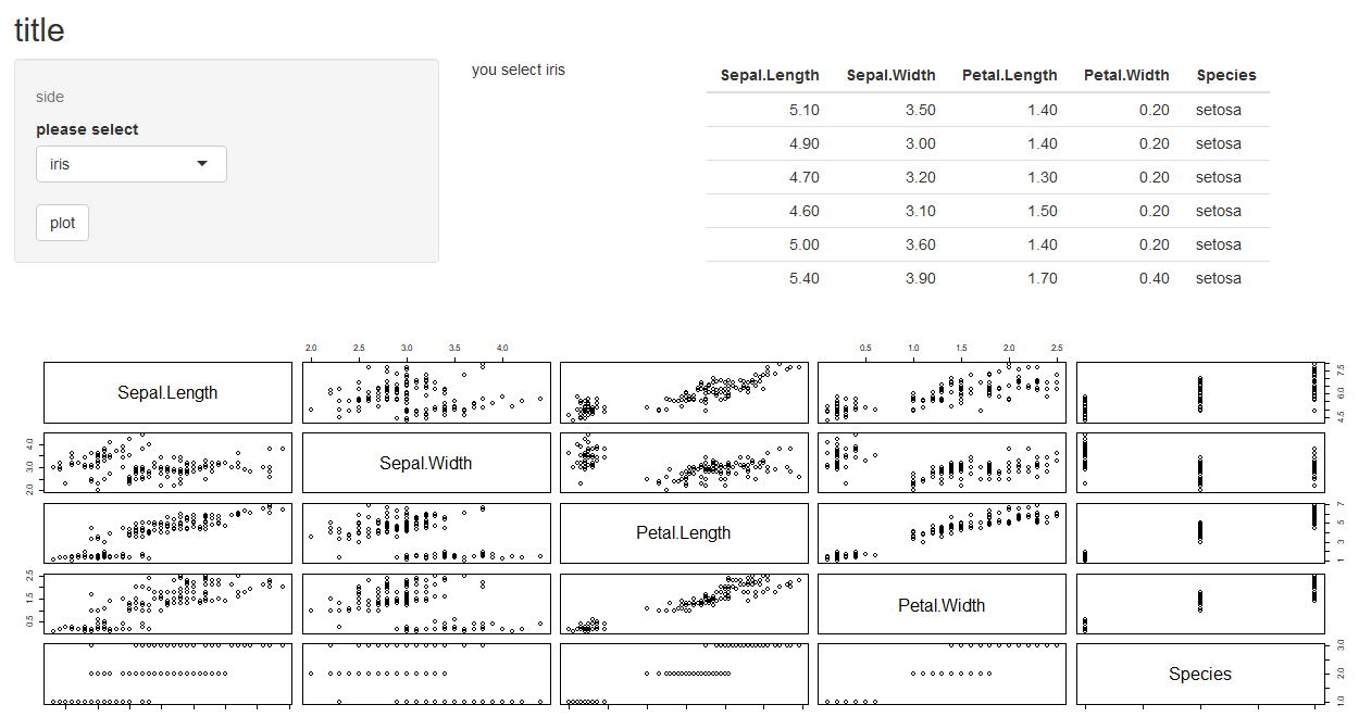
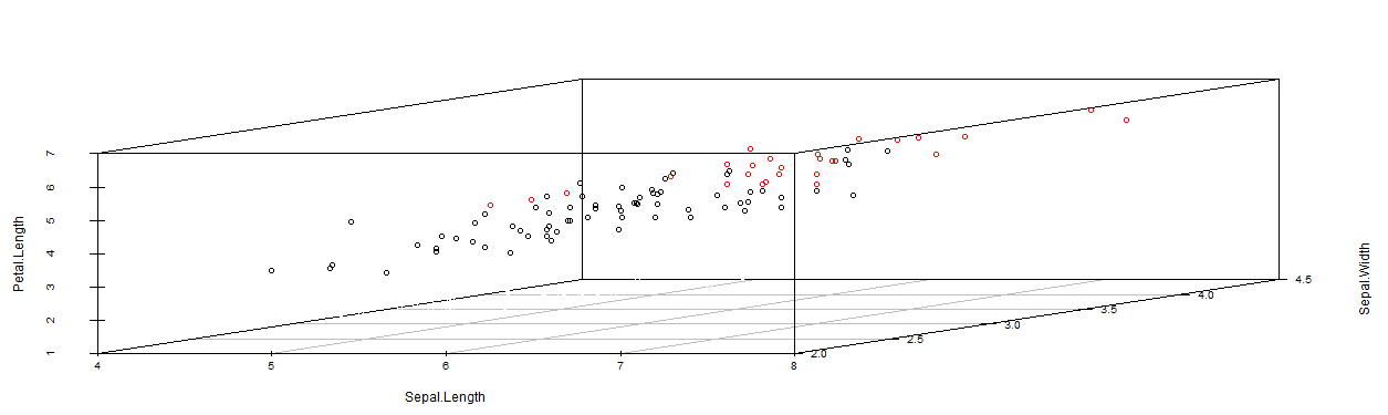
結果説明などプレゼンするときに使いやすい。
そこのデータ除いたらどうなるの?という議論の時にはいちいちスクリプトを書くよりも早いし変化が分かりやすい。
ただ準備がものすごく手間。