The world's most popular React UI framework - Material-UI のカラーを細かくカスタマイズする方法。
Color - Material-UI によると、カスタマイズ方法はこう書かれてます
import { createMuiTheme } from '@material-ui/core/styles';

const theme = createMuiTheme({
  palette: {
    primary: {
      light: '#757ce8',
      main: '#3f50b5',
      dark: '#002884',
      contrastText: '#fff',
    },
    secondary: {
      light: '#ff7961',
      main: '#f44336',
      dark: '#ba000d',
      contrastText: '#000',
    },
  },
});
これでも十分なんですが、デザイナーがもっと薄い色を使いたい場合などがあり、 main,light,darkでは足りない場合もあります。
またレスポンシブのブレイクポイントを変更したい場合も。
Material UIテーマをカスタマイズしたい時は以下の書き方で上書き、カラー追加しました。
styles/theme.js
import { createMuiTheme } from '@material-ui/core/styles'

// Material UIのテーマ上書き
export const theme = createMuiTheme({
  // カラーパレット追加
  palette: {
    type: 'light',
    primary: {
    '50': 'e8eaf6',
    '100': 'c5cbe9',
    '200': '9fa8da',
    '300': '7985cb',
    '400': '5c6bc0',
    '500': '3f51b5',
    '600': '394aae',
    '700': '3140a5',
    '800': '29379d',
    '900': '1b278d',
    'A100': 'c6cbff',
    'A200': '939dff',
    'A400': '606eff',
    'A700': '4757ff',
    'contrastDefaultColor': 'light',
    },
    secondary: {
    '50': 'f9e0e0',
    '100': 'f0b3b3',
    '200': 'e68080',
    '300': 'db4d4d',
    '400': 'd42626',
    '500': 'cc0000',
    '600': 'c70000',
    '700': 'c00000',
    '800': 'b90000',
    '900': 'ad0000',
    'A100': 'ffd7d7',
    'A200': 'ffa4a4',
    'A400': 'ff7171',
    'A700': 'ff5858',
    'contrastDefaultColor': 'light',
    },
  },
  // レスポンシブのブレイクポイント
  'breakpoints': {
    'keys': [
      'xs',
      'sm',
      'md',
      'lg',
      'xl',
    ],
    'values': {
      'xs': 360, // スマホ用
      'sm': 768, // タブレット用
      'md': 992, // PC用
      'lg': 1400,
      'xl': 1800,
    },
  },
  typography: {
    useNextVariants: true, // Migration to typography v2
    htmlFontSize: 10,
    fontSize: 13,
  },
  // classのstyleを上書き
  overrides: {
    MuiButton: {
      root: {
        // ボタン内アルファベット文字を大文字変換しない
        textTransform: 'none',
      },
    },
  },
});

export default theme;
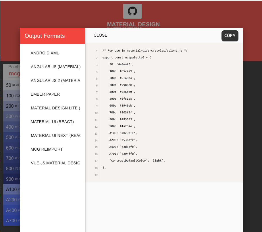
ちなみにカラーコードの生成は Material Design Theme & Palette Color Generator が楽です。
Output Formatsを MATERIAL UI(REACT)から出力してます。
参照方法はこんな感じ
sample.js
import { theme } from 'styles/theme'
import styled from "styled-components";

const Root = styled.button`
  color: ${theme.palette.primary['500']};
  background-color: ${theme.palette.secondary.A100};
`;
これでデザイナーの細かい要望にも応えられます。
(デザイナーがMaterial UIの色数縛りでデザインするべき議論は置いておいて)
デフォルトのthemeの値
参考までにデフォルトを出力してみました( console.log(theme) の出力結果の見た目を調整しただけ)
breakpoints: {
  between: ƒ between(start,
    end)
  arguments: (...)
  caller: (...)
  length: 2
  name: "between"
  prototype: { constructor: ƒ}
  __proto__: ƒ ()
  [[FunctionLocation]]: createBreakpoints.js: 54
  [[Scopes]]: Scopes[3]
  down: ƒ down(key)
  keys: (5) [
    "xs",
    "sm",
    "md",
    "lg",
    "xl"
  ]
  only: ƒ only(key)
  up: ƒ up(key)
  values: {
    xs: 0,
    sm: 600,
    md: 960,
    lg: 1280,
    xl: 1920
  }
  width: ƒ width(key)
  __proto__: Object
  direction: "ltr"
}
mixins: {gutters: ƒ, toolbar: {…}}
overrides: {}
palette: {
  action: {
    active: "rgba(0,0,0,0.54)",
    hover: "rgba(0,0,0,0.08)",
    hoverOpacity: 0.08,
    selected: "rgba(0,0,0, 0.14)",
    disabled: "rgba(0,0,0, 0.26)",
  }
  augmentColor: ƒ augmentColor(color)
  background: {paper: "#fff",
      default: "#fafafa"}
  common: {
    black: "#000",
    white: "#fff"
  }
  contrastThreshold: 3
  divider: "rgba(0,0,0, 0.12)"
  error: {
    light: "#e57373",
    main: "#f44336",
    dark: "#d32f2f",
    contrastText: "#fff"
  }
  getContrastText: ƒ getContrastText(background)
  grey: {
    50: "#fafafa",
    100: "#f5f5f5",
    200: "#eeeeee",
    300: "#e0e0e0",
    400: "#bdbdbd",
    500: "#9e9e9e",
    600: "#757575",
    700: "#616161",
    800: "#424242",
    900: "#212121",
    A100: "#d5d5d5",
    A200: "#aaaaaa",
    A400: "#303030",
    A700: "#616161"}
  primary: {
    light: "#7986cb",
    main: "#3f51b5",
    dark: "#303f9f",
    contrastText: "#fff"
  }
  secondary: {
    light: "#ff4081",
    main: "#f50057",
    dark: "#c51162",
    contrastText: "#fff"
  }
  text: {
    primary: "rgba(0,0,0,0.87)",
    secondary: "rgba(0,0,0,
    0.54)",
    disabled: "rgba(0,0,0,0.38)",
    hint: "rgba(0,0,0,0.38)"
  }
  tonalOffset: 0.2
  type: "light"
  __proto__: Object
}
props: {}
shadows: (25) [
  "none",
  "0px 1px 3px 0px rgba(0,0,0,0.2),0px 1px 1px 0px rgba(0,0,0,0.14),0px 2px 1px -1px rgba(0,0,0,0.12)",
  "0px 1px 5px 0px rgba(0,0,0,0.2),0px 2px 2px 0px rgba(0,0,0,0.14),0px 3px 1px -2px rgba(0,0,0,0.12)",
  "0px 1px 8px 0px rgba(0,0,0,0.2),0px 3px 4px 0px rgba(0,0,0,0.14),0px 3px 3px -2px rgba(0,0,0,0.12)",
  "0px 2px 4px -1px rgba(0,0,0,0.2),0px 4px 5px 0px rgba(0,0,0,0.14),0px 1px 10px 0px rgba(0,0,0,0.12)",
  "0px 3px 5px -1px rgba(0,0,0,0.2),0px 5px 8px 0px rgba(0,0,0,0.14),0px 1px 14px 0px rgba(0,0,0,0.12)",
  "0px 3px 5px -1px rgba(0,0,0,0.2),0px 6px 10px 0px rgba(0,0,0,0.14),0px 1px 18px 0px rgba(0,0,0,0.12)",
  "0px 4px 5px -2px rgba(0,0,0,0.2),0px 7px 10px 1px rgba(0,0,0,0.14),0px 2px 16px 1px rgba(0,0,0,0.12)",
  "0px 5px 5px -3px rgba(0,0,0,0.2),0px 8px 10px 1px rgba(0,0,0,0.14),0px 3px 14px 2px rgba(0,0,0,0.12)",
  "0px 5px 6px -3px rgba(0,0,0,0.2),0px 9px 12px 1px rgba(0,0,0,0.14),0px 3px 16px 2px rgba(0,0,0,0.12)",
  "0px 6px 6px -3px rgba(0,0,0,0.2),0px 10px 14px 1px…gba(0,0,0,0.14),0px 4px 18px 3px rgba(0,0,0,0.12)",
  "0px 6px 7px -4px rgba(0,0,0,0.2),0px 11px 15px 1px…gba(0,0,0,0.14),0px 4px 20px 3px rgba(0,0,0,0.12)",
  "0px 7px 8px -4px rgba(0,0,0,0.2),0px 12px 17px 2px…gba(0,0,0,0.14),0px 5px 22px 4px rgba(0,0,0,0.12)",
  "0px 7px 8px -4px rgba(0,0,0,0.2),0px 13px 19px 2px…gba(0,0,0,0.14),0px 5px 24px 4px rgba(0,0,0,0.12)",
  "0px 7px 9px -4px rgba(0,0,0,0.2),0px 14px 21px 2px…gba(0,0,0,0.14),0px 5px 26px 4px rgba(0,0,0,0.12)",
  "0px 8px 9px -5px rgba(0,0,0,0.2),0px 15px 22px 2px…gba(0,0,0,0.14),0px 6px 28px 5px rgba(0,0,0,0.12)",
  "0px 8px 10px -5px rgba(0,0,0,0.2),0px 16px 24px 2p…gba(0,0,0,0.14),0px 6px 30px 5px rgba(0,0,0,0.12)",
  "0px 8px 11px -5px rgba(0,0,0,0.2),0px 17px 26px 2p…gba(0,0,0,0.14),0px 6px 32px 5px rgba(0,0,0,0.12)",
  "0px 9px 11px -5px rgba(0,0,0,0.2),0px 18px 28px 2p…gba(0,0,0,0.14),0px 7px 34px 6px rgba(0,0,0,0.12)",
  "0px 9px 12px -6px rgba(0,0,0,0.2),0px 19px 29px 2p…gba(0,0,0,0.14),0px 7px 36px 6px rgba(0,0,0,0.12)",
  "0px 10px 13px -6px rgba(0,0,0,0.2),0px 20px 31px 3…gba(0,0,0,0.14),0px 8px 38px 7px rgba(0,0,0,0.12)",
  "0px 10px 13px -6px rgba(0,0,0,0.2),0px 21px 33px 3…gba(0,0,0,0.14),0px 8px 40px 7px rgba(0,0,0,0.12)",
  "0px 10px 14px -6px rgba(0,0,0,0.2),0px 22px 35px 3…gba(0,0,0,0.14),0px 8px 42px 7px rgba(0,0,0,0.12)",
  "0px 11px 14px -7px rgba(0,0,0,0.2),0px 23px 36px 3…gba(0,0,0,0.14),0px 9px 44px 8px rgba(0,0,0,0.12)",
  "0px 11px 15px -7px rgba(0,0,0,0.2),0px 24px 38px 3…gba(0,0,0,0.14),0px 9px 46px 8px rgba(0,0,0,0.12)"
]
shape: {borderRadius: 4}
spacing: {unit: 8}
transitions: {
  easing: {…},
  duration: {…},
  create: ƒ,
  getAutoHeightDuration: ƒ
}
typography: {
  pxToRem: ƒ,
  round: ƒ,
  fontFamily: ""Roboto",
  "Helvetica",
  "Arial",
  sans-serif",
  fontSize: 14,
  fontWeightLight: 300,
…}
zIndex: {
  mobileStepper: 1000,
  appBar: 1100,
  drawer: 1200,
  modal: 1300,
  snackbar: 1400,
  …
}
__proto__: Object
参考)