マテリアルデザインはGoogleが提唱するデザインフォーマットです。
フラットデザインに現実の物理要素(影やフィードバック)を持たせたようなデザインです。
Androidアプリでの全面的な利用など最近のアプリケーションのデザインは大体マテリアルデザインでできています。
ReactJSではマテリアルデザインを踏襲したMaterial-UIというライブラリがあります。
つい数日前にようやくv1(正式版リリース)になったので導入方法をまとめておきます。
サンプルは以下においてあります。
https://github.com/teradonburi/learnReactJS/tree/MaterialUI
サンプルの動かし方
$ git clone https://github.com/teradonburi/learnReactJS/tree/MaterialUI
$ git checkout MaterialUI
$ yarn
$ yarn webpack
# ビルド後,index.htmlをブラウザで開く
$ open index.html
Material-UIでモダンな画面を作る
Material-UIのパッケージをインストールします。
$ yarn add --dev @material-ui/core @material-ui/icons
index.jsにmaterial-uiのテーマの指定をします。
createMuiThemeでテーマを作成し、
MuiThemeProviderでテーマを全体に指定します。
import React  from 'react'
import ReactDOM from 'react-dom'
import { createStore, applyMiddleware, compose } from 'redux'
import { Provider } from 'react-redux'
import { MuiThemeProvider, createMuiTheme } from '@material-ui/core/styles'
import client from 'axios'
import thunk from 'redux-thunk'

import App from './App'
import reducer from './reducer'

// redux-devtoolの設定
const composeEnhancers = window.__REDUX_DEVTOOLS_EXTENSION_COMPOSE__ || compose
// axiosをthunkの追加引数に加える
const thunkWithClient = thunk.withExtraArgument(client)
// redux-thunkをミドルウェアに適用
const store = createStore(reducer, composeEnhancers(applyMiddleware(thunkWithClient)))

// Material-UIテーマを上書きする
const theme = createMuiTheme({
  // カラーパレット
  palette: {
    type: 'light',
    // メインカラー
    primary: {
      50: '#e3f2fd',
      100: '#bbdefb',
      200: '#90caf9',
      300: '#64b5f6',
      400: '#42a5f5',
      500: '#2196f3',
      600: '#1e88e5',
      700: '#1976d2',
      800: '#1565c0',
      900: '#0d47a1',
      A100: '#82b1ff',
      A200: '#448aff',
      A400: '#2979ff',
      A700: '#2962ff',
      contrastDefaultColor: 'light', // 対象色のデフォルト色をlightテーマにする
    },
    // アクセントカラー
    secondary: {
      50: '#fce4ec',
      100: '#f8bbd0',
      200: '#f48fb1',
      300: '#f06292',
      400: '#ec407a',
      500: '#e91e63',
      600: '#d81b60',
      700: '#c2185b',
      800: '#ad1457',
      900: '#880e4f',
      A100: '#ff80ab',
      A200: '#ff4081',
      A400: '#f50057',
      A700: '#c51162',
      contrastDefaultColor: 'light', // 対象色のデフォルト色をlightテーマにする
    },
  },
  // レスポンシブレイアウト用の指定
  'breakpoints': {
    'keys': [
      'xs',
      'sm',
      'md',
      'lg',
      'xl',
    ],
    'values': {
      'xs': 360, // スマホ用
      'sm': 768, // タブレット用
      'md': 992, // PC用
      'lg': 1000000000,
      'xl': 1000000000,
    },
  },
  // Material-UIコンポーネントのclassのstyleを上書きする
  overrides: {
    MuiButton: {
      root: {
        // ボタン内アルファベット文字を大文字変換しない
        textTransform: 'none',
      },
    },
  },
})

ReactDOM.render(
  // MuiThemeProviderにテーマの指定をする
  <MuiThemeProvider theme={theme}>
    <Provider store={store}>
      <App />
    </Provider>
  </MuiThemeProvider>,
  document.getElementById('root')
)
ユーザを取得したApp.jsをmaterial-uiで実装します。

import React from 'react'
import { connect } from 'react-redux';
import { load } from './user'
import { withTheme, withStyles } from '@material-ui/core/styles'
import { AppBar,Toolbar, Avatar, Card, CardContent, Button, Dialog, DialogTitle, DialogContent } from '@material-ui/core'
import { Email } from '@material-ui/icons'
import withWidth from '@material-ui/core/withWidth'
import { orange } from '@material-ui/core/colors'
// connectのdecorator
@connect(
// propsに受け取るreducerのstate
state => ({
users: state.user.users
}),
// propsに付与するactions
{ load }
)
@withWidth()
@withTheme()
@withStyles({
root: {
fontStyle: 'italic',
fontSize: 21,
minHeight: 64,
}
})
export default class App extends React.Component {
constructor (props) {
super(props)
this.state = {
open:false,
user:null,
}
}
componentDidMount() {
// user取得APIコールのactionをキックする
this.props.load()
}
handleClickOpen (user) {
this.setState({
open: true,
user: user,
})
}
handleRequestClose () {
this.setState({ open: false })
}
render () {
const { users, theme, classes, width } = this.props
const { primary, secondary } = theme.palette
// 初回はnullが返ってくる(initialState)、処理完了後に再度結果が返ってくる
console.log(users)
return (
<div>
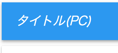
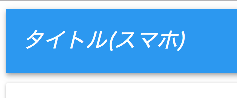
<AppBar position="static" color="primary">
<Toolbar classes={{root: classes.root}} >
タイトル({ width === 'xs' ? 'スマホ' : 'PC'})
</Toolbar>
</AppBar>
{/* 配列形式で返却されるためmapで展開する */}
{users && users.map((user) => {
return (
// ループで展開する要素には一意なkeyをつける(ReactJSの決まり事)
<Card key={user.email} style={{marginTop:'10px'}}>
<CardContent style={{color:'#408040'}}>
<Avatar src={user.picture.thumbnail} />
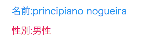
<p style={{margin:10, color:primary[500]}}>{'名前:' + user.name.first + ' ' + user.name.last} </p>
<p style={{margin:10, color:secondary[500]}}>{'性別:' + (user.gender == 'male' ? '男性' : '女性')}</p>
<div style={{textAlign: 'right'}} >
<Button variant="raised" color='secondary' onClick={() => this.handleClickOpen(user)}><Email style={{marginRight: 5, color: orange[200]}}/>Email</Button>
</div>
</CardContent>
</Card>
)
})}
{
this.state.open &&
<Dialog open={this.state.open} onClose={() => this.handleRequestClose()}>
<DialogTitle>メールアドレス</DialogTitle>
<DialogContent>{this.state.user.email}</DialogContent>
</Dialog>
}
</div>
)
}
}
Material-UIの各コンポーネントに関しては
公式:Material-UIのComponents Demoに各種コンポーネントのデモがあるので、それを見たほうが理解できると思います。
テーマ
Material-UIではマテリアルデザインガイドに沿った
色パレットやテーマの指定を行います。
デフォルトではlightテーマとdarkテーマが用意されていますが、
サービスによってテーマ色を変えたいという要望は普通なのでカラーパレットを上書きします。
独自に色作るときは、色の濃淡も規則性があるのでGeneratorを使って生成したほうがマテリアルデザインガイド通りなので無難です。
MATERIAL DESIGN PALETTE GENERATORを使うと指定色ベースで作ってくれます。
const theme = createMuiTheme({
  // カラーパレット
  palette: {
    type: 'light',
    // メインカラー
    primary: {
      50: '#e3f2fd',
      100: '#bbdefb',
      200: '#90caf9',
      300: '#64b5f6',
      400: '#42a5f5',
      500: '#2196f3',
      600: '#1e88e5',
      700: '#1976d2',
      800: '#1565c0',
      900: '#0d47a1',
      A100: '#82b1ff',
      A200: '#448aff',
      A400: '#2979ff',
      A700: '#2962ff',
      contrastDefaultColor: 'light', // 対象色のデフォルト色をlightテーマにする
    },
    // アクセントカラー
    secondary: {
      50: '#fce4ec',
      100: '#f8bbd0',
      200: '#f48fb1',
      300: '#f06292',
      400: '#ec407a',
      500: '#e91e63',
      600: '#d81b60',
      700: '#c2185b',
      800: '#ad1457',
      900: '#880e4f',
      A100: '#ff80ab',
      A200: '#ff4081',
      A400: '#f50057',
      A700: '#c51162',
      contrastDefaultColor: 'light', // 対象色のデフォルト色をlightテーマにする
    },
  },
})
利用側では、
withThemeデコレータを使うとprops.themeが使えるようになります。
カラーパレットからcommon,primary,secondary,grey,errorなどが使えます。
color属性を持っているButton等のコンポーネントは'primary'、'secondary'、'default'、'inherit'などで背景色指定することもできます
import { withTheme } from '@material-ui/core/styles'

@withTheme()
export default class App extends React.Component {
  render () {
    const { theme } = this.props
    const { primary, secondary } = theme.palette

    return (
      <div>
        <p style={{margin:10, color:primary[500]}}>名前</p>
        <p style={{margin:10, color:seconary[500]}}>性別</p>
        <Button variant="raised" color='secondary'>Email</Button>
      </div>
    )
  }
}
Material UIコンポーネントstyleのオーバライド
Material UIのコンポーネントのスタイルも基本的にはstyle属性で記述できるのですが、稀にstyleが効かない場合があります。
その場合はMaterial-UIコンポーネント自体のclass styleを上書きします。
コンポーネント全体を上書きしたい場合はテーマのoverrideにstyleを書きます。
const theme = createMuiTheme({
  // Material-UIコンポーネントのclassのstyleを上書きする
  overrides: {
    MuiButton: {
      root: {
        // ボタン内アルファベット文字を大文字変換しない
        textTransform: 'none',
      },
    },
  },
})
ピンポイントでMaterial UIコンポーネントのスタイルを上書きしたい場合は
withStylesデコレータを使います。
上書き対象となるMaterial UIコンポーネントのclasses属性に指定します。
import { withStyles } from '@material-ui/core/styles'

@withStyles({
  root: {
    fontStyle: 'italic',
    fontSize: 21,
    minHeight: 64,
  }
})
export default class App extends React.Component {
  render() {
    const { classes } = this.props

    return (
      <AppBar position="static" color="primary">
        <Toolbar classes={{root: classes.root}} >
          タイトル
        </Toolbar>
      </AppBar>
    )
  }
}
もっと詳細はこちら
レスポンシブレイアウト対応
withWidthを使えば,
widthのpropsが画面サイズに合わせて渡ってきます。
xs < sm < md < lg < xlの順に横幅の大きさが大きいです。
index.jsのcreateMuiThemeのbreakpointsにて上書きしています。
md以上は変える必要性があまりない気がしているので大きい値で返ってこないようにしています。
const theme = createMuiTheme({
  // レスポンシブレイアウト用の指定
  'breakpoints': {
    'keys': [
      'xs',
      'sm',
      'md',
      'lg',
      'xl',
    ],
    'values': {
      'xs': 360, // スマホ用
      'sm': 768, // タブレット用
      'md': 992, // PC用
      'lg': 1000000000,
      'xl': 1000000000,
    },
  },
})
withWidthデコレータでコンポーネントをwrapすることで
this.props.widthが参照できるようになります。
ブラウザの画面サイズを変えることでxs, sm, mdに変わり、再度renderが呼ばれます。
import withWidth from '@material-ui/core/withWidth'

@withWidth()
export default class App extends React.Component {
  render () {
    const { width } = this.props

    return (
        <AppBar>
          <Toolbar >
            タイトル({ width === 'xs' ? 'スマホ' : 'PC'})
          </Toolbar>
        </AppBar>
    )
  }
}
アイコン
Material UIのアイコンに関しては下記ページのアイコンが使えます。
Material icons
今回はメールのアイコンを使っています。
emailというアイコン名になっているので、
次のように先頭大文字でメールアイコンを読み込みできます。
import { Email } from '@material-ui/icons'

export default class App extends React.Component {
  render() {
    return <Email/>
  }
}
テーマ外の色を使う
アイコン色など、テーマ外の色をピンポイントで使いたい場合もあると思います。
その場合は、@material-ui/core/colorsをimportすることで直接定義色を参照できます。
ちなみに、アイコンの背景色はcolorsで変更できます。
import { orange } from '@material-ui/core/colors'

export default class App extends React.Component {
  render() {
    return <Email style={{color: orange[200]}} />
  }
}