JetNewsのサンプルコード見ながら、
Jetpack Composeについて、理解や分析のメモです。
Flutterと似ているので、比べてながらメモします。
Theme
- theme PackageのTheme.ktを見るとこんな感じ。
- lightColorPaletteとdarkColorPaletteの関数はなんだろう?
- https://material.io/design/color/the-color-system.html#color-theme-creation
private val LightThemeColors = lightColorPalette(
    primary = Red700,
    primaryVariant = Red900,
    onPrimary = Color.White,
    secondary = Red700,
    secondaryVariant = Red900,
    onSecondary = Color.White,
    error = Red800
)

private val DarkThemeColors = darkColorPalette(
    primary = Red300,
    primaryVariant = Red700,
    onPrimary = Color.Black,
    secondary = Red300,
    onSecondary = Color.White,
    error = Red200
)

@Composable
val ColorPalette.snackbarAction: Color
    get() = if (isLight) Red300 else Red700

@Composable
fun JetnewsTheme(
    darkTheme: Boolean = isSystemInDarkTheme(),
    content: @Composable() () -> Unit
) {
    MaterialTheme(
        colors = if (darkTheme) DarkThemeColors else LightThemeColors,
        typography = themeTypography,
        shapes = shapes,
        content = content
    )
}
lightColorPalette
/**
 * Creates a complete color definition for the
 * [Material color specification](https://material.io/design/color/the-color-system.html#color-theme-creation)
 * using the default light theme values.
 *
 * @see darkColorPalette
 */
fun lightColorPalette(
    primary: Color = Color(0xFF6200EE),
    primaryVariant: Color = Color(0xFF3700B3),
    secondary: Color = Color(0xFF03DAC6),
    secondaryVariant: Color = Color(0xFF018786),
    background: Color = Color.White,
    surface: Color = Color.White,
    error: Color = Color(0xFFB00020),
    onPrimary: Color = Color.White,
    onSecondary: Color = Color.Black,
    onBackground: Color = Color.Black,
    onSurface: Color = Color.Black,
    onError: Color = Color.White
): ColorPalette = ObservableColorPalette(
    primary,
    primaryVariant,
    secondary,
    secondaryVariant,
    background,
    surface,
    error,
    onPrimary,
    onSecondary,
    onBackground,
    onSurface,
    onError,
    true
)
darkColorPalette
/**
 * Creates a complete color definition for the
 * [Material color specification](https://material.io/design/color/the-color-system.html#color-theme-creation)
 * using the default dark theme values.
 *
 * @see lightColorPalette
 */
fun darkColorPalette(
    primary: Color = Color(0xFFBB86FC),
    primaryVariant: Color = Color(0xFF3700B3),
    secondary: Color = Color(0xFF03DAC6),
    background: Color = Color(0xFF121212),
    surface: Color = Color(0xFF121212),
    error: Color = Color(0xFFCF6679),
    onPrimary: Color = Color.Black,
    onSecondary: Color = Color.Black,
    onBackground: Color = Color.White,
    onSurface: Color = Color.White,
    onError: Color = Color.Black
): ColorPalette = ObservableColorPalette(
    primary,
    primaryVariant,
    secondary,
    // Secondary and secondary variant are the same in dark mode, as contrast should be
    // higher so there is no need for the variant.
    secondary,
    background,
    surface,
    error,
    onPrimary,
    onSecondary,
    onBackground,
    onSurface,
    onError,
    false
)
Flutterでは?
- ThemeDataというのがあります。
- https://api.flutter.dev/flutter/material/ThemeData-class.html
ThemeData({Brightness brightness,
VisualDensity visualDensity,
MaterialColor primarySwatch,
Color primaryColor,
Brightness primaryColorBrightness,
Color primaryColorLight,
Color primaryColorDark,
Color accentColor,
Brightness accentColorBrightness,
Color canvasColor,
Color scaffoldBackgroundColor,
Color bottomAppBarColor,
Color cardColor,
Color dividerColor,
 Color focusColor,
Color hoverColor,
Color highlightColor,
Color splashColor,
InteractiveInkFeatureFactory splashFactory,
Color selectedRowColor,
Color unselectedWidgetColor,
 Color disabledColor,
Color buttonColor,
ButtonThemeData buttonTheme,
ToggleButtonsThemeData toggleButtonsTheme,
Color secondaryHeaderColor,
Color textSelectionColor,
Color cursorColor,
Color textSelectionHandleColor,
Color backgroundColor,
Color dialogBackgroundColor,
Color indicatorColor,
Color hintColor,
 Color errorColor,
Color toggleableActiveColor,
 String fontFamily,
 TextTheme textTheme,
TextTheme primaryTextTheme,
TextTheme accentTextTheme,
InputDecorationTheme inputDecorationTheme,
 IconThemeData iconTheme,
IconThemeData primaryIconTheme,
IconThemeData accentIconTheme,
 SliderThemeData sliderTheme,
TabBarTheme tabBarTheme, TooltipThemeData tooltipTheme, CardTheme cardTheme, ChipThemeData chipTheme, TargetPlatform platform, MaterialTapTargetSize materialTapTargetSize, bool applyElevationOverlayColor, PageTransitionsTheme pageTransitionsTheme, AppBarTheme appBarTheme, BottomAppBarTheme bottomAppBarTheme, ColorScheme colorScheme, DialogTheme dialogTheme, FloatingActionButtonThemeData floatingActionButtonTheme, NavigationRailThemeData navigationRailTheme, Typography typography, CupertinoThemeData cupertinoOverrideTheme, SnackBarThemeData snackBarTheme, BottomSheetThemeData bottomSheetTheme, PopupMenuThemeData popupMenuTheme, MaterialBannerThemeData bannerTheme, DividerThemeData dividerTheme, ButtonBarThemeData buttonBarTheme})
HomeScreenを分析する。
- HomeScreenのComposable関数はFlutterでよく見るScaffoldがある。
@Composable
fun HomeScreen(
    postsRepository: PostsRepository,
    scaffoldState: ScaffoldState = remember { ScaffoldState() }
) {
    Scaffold(
        scaffoldState = scaffoldState,
        drawerContent = {
            AppDrawer(
                currentScreen = Screen.Home,
                closeDrawer = { scaffoldState.drawerState = DrawerState.Closed }
            )
        },
        topAppBar = {
            TopAppBar(
                title = { Text(text = "Jetnews") },
                navigationIcon = {
                    IconButton(onClick = { scaffoldState.drawerState = DrawerState.Opened }) {
                        Icon(vectorResource(R.drawable.ic_jetnews_logo))
                    }
                }
            )
        },
        bodyContent = { modifier ->
            HomeScreenContent(postsRepository, modifier)
        }
    )
}
ComposeのScaffold
* Scaffoldはマテリアルデザインの基本レイアウトだと理解してもいい
- Scaffold implements the basic material design visual layout structure.
- This component provides API to put together several material components to construct your
- screen, by ensuring proper layout strategy for them and collecting necessary data so these
- components will work together correctly.
@Composable
fun Scaffold(
    scaffoldState: ScaffoldState = remember { ScaffoldState() },
    topAppBar: @Composable (() -> Unit)? = null,
    bottomAppBar: @Composable ((FabConfiguration?) -> Unit)? = null,
    floatingActionButton: @Composable (() -> Unit)? = null,
    floatingActionButtonPosition: FabPosition = FabPosition.End,
    drawerContent: @Composable (() -> Unit)? = null,
    bodyContent: @Composable (Modifier) -> Unit
) {
    val child = @Composable {
        Surface(color = MaterialTheme.colors.background) {
            Column(Modifier.fillMaxSize()) {
                if (topAppBar != null) {
                    ScaffoldSlot(Modifier.zIndex(TopAppBarZIndex), topAppBar)
                }
                Stack(Modifier.weight(1f, fill = true)) {
                    ScaffoldContent(Modifier.fillMaxSize(), scaffoldState, bodyContent)
                    ScaffoldBottom(
                        Modifier.gravity(Alignment.BottomCenter),
                        scaffoldState = scaffoldState,
                        fabPos = floatingActionButtonPosition,
                        fab = floatingActionButton,
                        bottomBar = bottomAppBar
                    )
                }
            }
        }
    }

    if (drawerContent != null) {
        ModalDrawerLayout(
            drawerState = scaffoldState.drawerState,
            onStateChange = { scaffoldState.drawerState = it },
            gesturesEnabled = scaffoldState.isDrawerGesturesEnabled,
            drawerContent = { ScaffoldSlot(content = drawerContent) },
            bodyContent = child
        )
    } else {
        child()
    }
}
FlutterのScaffold
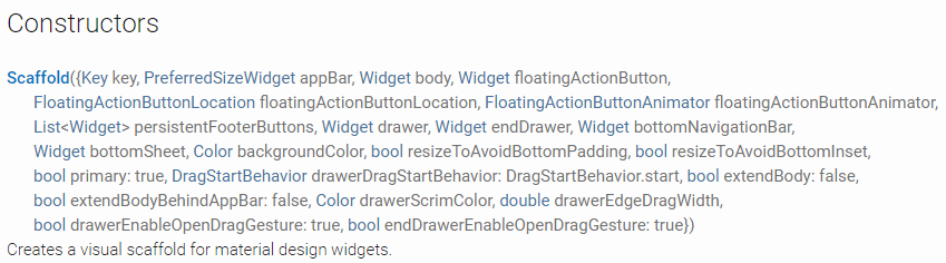
お互い比べてみる。
Scaffoldはこんな感じ。
- Jetpack Compose <--> Flutter
- topAppBar == appBar
- drawerContent == drawer
- bodyContent == body
- bottomAppBar == bottomNavigationBar
- floatingActionButtonPosition == floatingActionButtonLocation
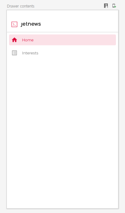
drawerContentのAppDrawer
AppDrawerはなに?
- AppDrawerはComposable関数です。
- ColumnはFlutterと同じ
- Modifierについては後でみなす。
- SpacerはFlutterのSpacerの同じな感じ
- DividerはFlutterのSpacerの同じな感じ
@Composable
fun AppDrawer(
    currentScreen: Screen,
    closeDrawer: () -> Unit
) {
    Column(modifier = Modifier.fillMaxSize()) {
        Spacer(Modifier.preferredHeight(24.dp))
        JetNewsLogo(Modifier.padding(16.dp))
        Divider(color = MaterialTheme.colors.onSurface.copy(alpha = .2f))
        DrawerButton(
            icon = Icons.Filled.Home,
            label = "Home",
            isSelected = currentScreen == Screen.Home,
            action = {
                navigateTo(Screen.Home)
                closeDrawer()
            }
        )

        DrawerButton(
            icon = Icons.Filled.ListAlt,
            label = "Interests",
            isSelected = currentScreen == Screen.Interests,
            action = {
                navigateTo(Screen.Interests)
                closeDrawer()
            }
        )
    }
}
ComposeのDivider
/**
 * A divider is a thin line that groups content in lists and layouts
 *
 * @param color color of the divider line
 * @param thickness thickness of the divider line, 1 dp is used by default
 * @param startIndent start offset of this line, no offset by default
 */
@Composable
fun Divider(
    modifier: Modifier = Modifier,
    color: Color = MaterialTheme.colors.onSurface.copy(alpha = DividerAlpha),
    thickness: Dp = 1.dp,
    startIndent: Dp = 0.dp
) {
    val indentMod = if (startIndent.value != 0f) {
        Modifier.padding(start = startIndent)
    } else {
        Modifier
    }
    Box(modifier.plus(indentMod).fillMaxWidth().preferredHeight(thickness).drawBackground(color))
}

private const val DividerAlpha = 0.12f
FlutterのDivider
//A thin horizontal line, with padding on either side.

//In the material design language, this represents a divider. Dividers can be used in lists, Drawers, and elsewhere to separate content.

//To create a divider between ListTile items, consider using ListTile.divideTiles, which is optimized for this case.

//The box's total height is controlled by height. The appropriate padding is automatically computed from the height.


const Divider({
  Key key,
  this.height,
  this.thickness,
  this.indent,
  this.endIndent,
  this.color,
}) : assert(height == null || height >= 0.0),
     assert(thickness == null || thickness >= 0.0),
     assert(indent == null || indent >= 0.0),
     assert(endIndent == null || endIndent >= 0.0),
     super(key: key);
終わりに
今回はここまでメモします。
次はDrawerButtonとtopAppBarについて、
つづく。