はじめに
Nuxt.jsを使用しChart.jsで棒グラフを作成する
プロジェクトがあったのでその備忘録
※API連携は次の記事で書きます
環境
macOS
Docker
ゴール
国語、算数、理科、英語、社会(5教科)の
テストの点数をグラフにして表示
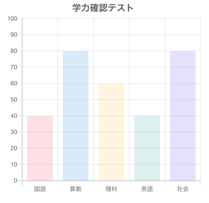
Chart.jsインストール
root $ docker-compose run front yarn add vue-chartjs chart.js
BarChart.vue作成
Nuxt.jsのcomponentsディレクトリへChart.vueを作成
front $ touch components/BarChart.vue
BarChart.vue
<script>
import { Bar, mixins } from 'vue-chartjs'
const { reactiveProp } = mixins

export default {
  extends: Bar,
  mixins: [reactiveProp],
  props: {
    chartdata: {
      type: Object,
      default: null
    },
    options: {
      type: Object,
      default: null
    }
  },
  mounted () {
    this.renderChart(this.chartData, this.options)
  }
}
</script>
Chart.vueの作成(親ページ)
front $ touch pages/Chart.vue
Chart.vue
<template>
  <v-main>
    <v-container>
      <v-row>
        <BarChart
          :chart-data="bar_data_collection"
          :options="bar_options"
        />
      </v-row>
    </v-container>
  </v-main>
</template>

<script>
import BarChart from '~/components/BarChart.vue'

export default {
  components: {
    BarChart
  },
  data () {
    return {
      bar_data_collection: { datasets: [], options: {} }
    }
  },
  mounted () {
    this.barFillData()
  },
  methods: {
    barFillData () {
      this.bar_data_collection = {
        labels: ['国語', '算数', '理科', '英語', '社会'],
        datasets: [
          {
            backgroundColor: [
              'rgba(255, 99, 132, 0.2)',
              'rgba(54, 162, 235, 0.2)',
              'rgba(255, 206, 86, 0.2)',
              'rgba(75, 192, 192, 0.2)',
              'rgba(153, 102, 255, 0.2)'
            ],
            data: [50, 60, 70, 80, 90, 70]
          }
        ]
      }
      this.bar_options = {
        title: {
          display: true,
          fontSize: 18,
          text: '学力確認テスト'
        },
        responsive: true,
        maintainAspectRatio: false,
        legend: {
          position: 'top',
          display: false
        },
        layout: {
          padding: 0
        },
        scales: {
          yAxes: [
            {
              ticks: {
                beginAtZero: true,
                min: 0,
                max: 100
              }
            }
          ]
        }
      }
    }
  }
}
</script>
備考
グラフのスタイルやオプションは数多くあるので
公式サイトを確認すると良いと思います→ Chart.js公式
以上、お疲れ様でした