行毎に欠損値の数がいくつあるか調べて、
それに応じて、目的変数がどのように異なっているか可視化する方法についてメモ。
参考:TPS September 2021 EDA(Kaggle)
使用コード
features = [feature for feature in train_df.columns if feature not in ['id', 'claim']]
train_df['no_missing'] = train_df[features].isna().sum(axis=1)
test_df['no_missing'] = test_df[features].isna().sum(axis=1)

missing_target = pd.DataFrame(train_df.groupby('no_missing')['claim'].agg('mean')).reset_index()
missing_target.columns = ['no', 'mean']

background_color = "#f6f5f5"

plt.rcParams['figure.dpi'] = 600
fig = plt.figure(figsize=(6, 2), facecolor='#f6f5f5')
gs = fig.add_gridspec(1, 1)
gs.update(wspace=0.3, hspace=0.3)

ax0 = fig.add_subplot(gs[0, 0])
ax0.set_facecolor(background_color)
for s in ["top","right"]:
    ax0.spines[s].set_visible(False)

sns.barplot(ax=ax0, x=missing_target['no'], y=missing_target['mean'], saturation=1, zorder=2, color='#ffd514')
ax0.grid(which='major', axis='x', zorder=0, color='#EEEEEE', linewidth=0.4)
ax0.grid(which='major', axis='y', zorder=0, color='#EEEEEE', linewidth=0.4)
ax0.set_ylabel('')
ax0.set_xlabel('train dataset', fontsize=4, fontweight='bold')
ax0.tick_params(labelsize=4, width=0.5)
ax0.xaxis.offsetText.set_fontsize(4)
ax0.yaxis.offsetText.set_fontsize(4)

ax0.text(-0.5, 0.95, 'Target & missing value', fontsize=6, ha='left', va='top', weight='bold')
ax0.text(-0.5, 0.9, 'Observations that has no missing value has the lowest probability to claim', fontsize=4, ha='left', va='top')

for p in ax0.patches:
    value = f'{p.get_height():.2f}'
    x = p.get_x() + p.get_width() - 0.4
    y = p.get_y() + p.get_height() + 0.02
    ax0.text(x, y, value, ha='center', va='center', fontsize=2.5,
            bbox=dict(facecolor='none', edgecolor='black', boxstyle='round', linewidth=0.2))

plt.show()
上記の流れ
1)欠損値を計算して、DataFrameに格納する。
features = [feature for feature in train_df.columns if feature not in ['id', 'claim']]
train_df['no_missing'] = train_df[features].isna().sum(axis=1)
test_df['no_missing'] = test_df[features].isna().sum(axis=1)
まずこの部分で、features変数に、train_dfのid(インデックス), claim(目的変数)以外のカラムを配列にして格納する。
※説明変数をfeatures変数に配列にして格納している。
そして、train_df, test_dfにno_missingカラムを作成し、行毎にカラムの値がいくつ欠損しているかを計算して格納する。
2)グラフに使用するデータフレームの準備
missing_target = pd.DataFrame(train_df.groupby('no_missing')['claim'].agg('mean')).reset_index()
missing_target.columns = ['no', 'mean']
データフレームを作成。no_missing(欠損値の数)カラム毎にclaimの平均値を出す。
このデータフレームを使用して、グラフを作成する。
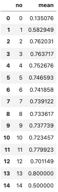
※データフレームのmeanの数値が、0.5以上であれば、claim(目的変数)が1の方が多い。1に近づくにつれて、claimが1の割合が増えていく。
つまり、claimが1の割合を意味している。
3)データフレームを使用して、グラフを作成していく。
# グラフの土台を作成するコード
plt.rcParams['figure.dpi'] = 600
fig = plt.figure(figsize=(6, 2), facecolor='#f6f5f5')
gs = fig.add_gridspec(1, 1)
gs.update(wspace=0.3, hspace=0.3)

# グラフの枠を除去するコード
ax0 = fig.add_subplot(gs[0, 0])
ax0.set_facecolor(background_color)
for s in ["top","right"]:
    ax0.spines[s].set_visible(False)

# グラフの土台に対してグラフを入れるコード
sns.barplot(ax=ax0, x=missing_target['no'], y=missing_target['mean'], saturation=1, zorder=2, color='#ffd514')
ax0.grid(which='major', axis='x', zorder=0, color='#EEEEEE', linewidth=0.4)
ax0.grid(which='major', axis='y', zorder=0, color='#EEEEEE', linewidth=0.4)
ax0.set_ylabel('')
ax0.set_xlabel('train dataset', fontsize=4, fontweight='bold')
ax0.tick_params(labelsize=4, width=0.5)
ax0.xaxis.offsetText.set_fontsize(4)
ax0.yaxis.offsetText.set_fontsize(4)

# グラフにタイトルを入れるコード
ax0.text(-0.5, 0.95, 'Target & missing value', fontsize=6, ha='left', va='top', weight='bold')
ax0.text(-0.5, 0.9, 'Observations that has no missing value has the lowest probability to claim', fontsize=4, ha='left', va='top')
4)棒グラフの上の数字(ラベル)を表示するためのコード
for p in ax0.patches:
    # 各ラベルの数値をvalue変数に格納
    value = f'{p.get_height():.2f}'
    # ラベルの横位置を調整する
    x = p.get_x() + p.get_width() - 0.4
    # ラベルの縦位置を調整する
    y = p.get_y() + p.get_height() + 0.02
    # ラベルの詳細設定&表示をするためのコード
    ax0.text(x, y, value, ha='center', va='center', fontsize=2.5,
            bbox=dict(facecolor='none', edgecolor='black', boxstyle='round', linewidth=0.2))
出力結果
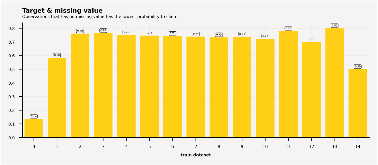
- 欠損値の無い観測値は、請求の確率が最も低く、14%しかない。
- 欠損値が1つある観測では、請求する確率が58%に増加した。
- 欠損値2~13では、請求の確率が70%以上となり、欠損値14では50%以下に低下する。