はじめに
こんにちは!@70days_jsです。
シンプルかつレスポンシブなナビバーを作りました。
ナビバーは色々作ってきましたが、今回は総まとめみたいな感じです。
今日は35日目。(2019/11/22)
よろしくお願いします。
サイトURL
やったこと
シンプルかつレスポンシブなナビバーを自作しました。
まずはgifで外観をどうぞ。↓
切り替えは750pxと751pxを境に行なっています。
751px以上ならナビバーにメニューをすべて表示し、
750px以下ならハンバーガーボタンを押すことでメニューを表示する。
まずはhtmlから説明します。
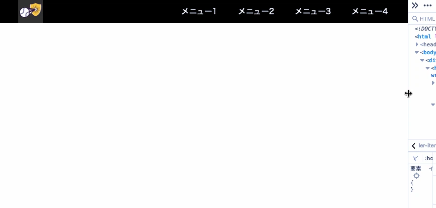
以下html全文。↓
<body>
    <div class="all-container">
        <header class="header-wrapper">
            <div class="header-more-than-751px header-items">
                <div class="header-menu"><a href="" class="header-logo"></a></div>
                <div class="header-menu"><a href="">メニュー1</a></div>
                <div class="header-menu"><a href="">メニュー2</a></div>
                <div class="header-menu"><a href="">メニュー3</a></div>
                <div class="header-menu"><a href="">メニュー4</a></div>
            </div>
            <div class="header-less-than-750px header-items">
                <div class="header-menu"><a href="" class="header-logo"></a></div>

                <label class="hamburgerButtonLabel" for="hamburgerButton">
                    <div class="icon-wrapper"><i class="fas fa-bars hamburger-icon"></i></div>
                </label>
            </div>

            <input type="checkbox" id="hamburgerButton">
            <div class="header-menu-hover">
                <div><a href="">メニュー1</a></div>
                <div><a href="">メニュー2</a></div>
                <div><a href="">メニュー3</a></div>
                <div><a href="">メニュー4</a></div>
            </div>

        </header>
    </div>

</body>
基本的にbodyの中身はheader, main, hooterで分けているんですが、今回は大枠にall-containerというものを用意しました。これで横幅が1200px以上は広がりません。
htmlを見ただけで、メニューが重複していることが分かると思いますが、ここはいい案が思いつきませんでした。今後の課題です。
次にcssのポイントですが、ここも今までやってきたことを足し合わせたようなことをしています。
以下、重要なところだけ抜き出して紹介します。↓
body {
    overflow-x: hidden;
}

.header-items {
    display: flex;
    justify-content: flex-end;
    width: 100vw;
    background-color: rgba(0, 0, 0, 1);
}

.header-menu:first-of-type {
    margin-right: auto;
}

@media screen and (max-width:750px) {
    .header-more-than-751px {
        display: none;
    }
    .header-menu-hover {
        position: absolute;
        top: 50px;
        right: 0;
        width: 100vw;
        transition: all .5s ease;
        transform: translateX(100%);
    }
      #hamburgerButton:checked+div{
        transform: translateX(0px);
    }
}

@media screen and (min-width:751px) {
    .header-less-than-750px {
        display: none;
    }
    .header-menu-hover {
        display: none;
    }
}
body {
overflow-x: hidden;
}
まず一番上のこのbodyですが、これは画面からはみ出た部分を隠すようにしています。
mediaクエリの中に書いてある.header-menu-hoverクラスを見てもらえばわかりますが、ハンバーガーボタンで出すメニューは消しているのではなく、画面外に置いているだけだからです。
.header-items {
display: flex;
justify-content: flex-end;
width: 100vw;
background-color: rgba(0, 0, 0, 1);
}
二番目に書いた.header-itemsクラスは、header内の要素をflex boxで描画する設定を書いています。flex-end;を指定しているので、要素はすべて右端に詰めて置かれるようになります。
.header-menu:first-of-type {
margin-right: auto;
}
三番目に書いた.header-menu:first-of-typeは、.header-menuクラスの中で一番最初に出てくる要素に対して、header内で唯一左端に置くための設定です。
ロゴを左端に置くためのクラスです。
これを書かなければ、ボックス内はflex-end;なので右端に寄ってしまいしまいます。
最後のmediaクエリでは、いらないdisplayを消したり、必要な要素のスタイルを表示したりしています。
感想
やっぱりメニューを二回書くところが引っかかっています。
javascript使うしかないのかな。
それともhtmlの書き方をもっと勉強して、もっと構成を考えたらなんとかなるのだろうか。
最後までお読みいただきありがとうございます。明日も投稿しますのでよろしくお願い致します。