今回は施設間の搬入搬出データを用いて、東京駅からの距離帯ごとに、搬入元と搬出先の組み合わせ分布を集計・可視化します。
「【R言語】④カーネル密度推定と緯度経度での距離計算」では、各施設の立地について分析を行いましたが、今回は施設間の搬出入の件数について分析します。
今回はバルーンプロットによって可視化を行います。
具体的には以下のことを行います。
・ 東京駅を基準点(緯度経度)として設定し、各レコードについて搬入元・搬出先それぞれの東京駅からの距離をハバーサイン公式で計算します。
・計算した距離をもとに、搬入元距離・搬出先距離を距離帯(0–15km / 15–30km / 30–45km / 45–100km)に分類します。
・搬入元の距離帯 × 搬出先の距離帯(4×4の16区分)でデータを集計し、各組み合わせごとの件数(必要に応じて数量や平均値も)を算出し、バルーンプロットで可視化して、どの距離帯の組み合わせで搬出入件数が多いかを確認します。
# データ読み込み(文字コードはCP932 = Windows日本語)
dt <- read.csv("D:/inout.csv", fileEncoding = "CP932")

# 東京駅(基準点)の緯度経度
tokyo_station_lon <- 139.7672   # 経度
tokyo_station_lat   <- 35.68112   # 緯度

# ハバーサイン公式の距離計算ライブラリ
# install.packages("geosphere") # 未インストールなら一度だけ実行
library(geosphere)


# 東京駅からの距離をハバーサイン公式で計算
# inbound_distance = 搬入元距離(km): dt[,59]=経度, dt[,60]=緯度
# outbound_distance = 搬出先距離(km): dt[,68]=経度, dt[,69]=緯度
inbound_distance <- geosphere::distHaversine(
  p1 = cbind(dt[, 59], dt[, 60]),
  p2 = c(tokyo_station_lon, tokyo_station_lat)
) / 1000

outbound_distance <- geosphere::distHaversine(
  p1 = cbind(dt[, 68], dt[, 69]),
  p2 = c(tokyo_station_lon, tokyo_station_lat)
) / 1000

# 元データに距離列を追加(末尾に inbound_distance, outbound_distance)
dt_inout_distance <- cbind(dt, inbound_distance, outbound_distance)

# 追加列の位置(元データ列数に依存しないようにする)
col_inbound_distance <- ncol(dt) + 1   # 搬入元距離 inbound_distance
col_outbound_distance <- ncol(dt) + 2   # 搬出先距離 outbound_distance


# 距離帯の設定(0-15, 15-30, 30-45, 45-100)
breaks_km <- c(0, 15, 30, 45, 100)
labels_inbound <- c("inbound-015km", "inbound-030km", "inbound-045km", "inbound-100km")
labels_outbound <- c("outbound-015km", "outbound-030km", "outbound-045km", "outbound-100km")


# 指定列の距離でデータを4区分する関数
split_by_distance_band <- function(dat, dist_col, breaks = c(0, 15, 30, 45, 100)) {
  out <- vector("list", length(breaks) - 1)
  for (i in seq_len(length(breaks) - 1)) {
    lower <- breaks[i]
    upper <- breaks[i + 1]
    out[[i]] <- dat[dat[, dist_col] > lower & dat[, dist_col] <= upper, , drop = FALSE]
  }
  out
}


# 1つの搬入元グループに対して、搬出先距離で再度4区分し、
# 75列目(/1000) と 81列目 を集計する関数
summarize_inner_bands <- function(dat, inner_dist_col, value_col = 75, count_col = 81,
                                  breaks = c(0, 15, 30, 45, 100)) {
  inner_groups <- split_by_distance_band(dat, inner_dist_col, breaks)

  t_vec <- sapply(inner_groups, function(x) sum(x[, value_col] / 1000, na.rm = TRUE))
  dai_vec <- sapply(inner_groups, function(x) sum(x[, count_col], na.rm = TRUE))

  list(t = t_vec, dai = dai_vec)
}

# 搬入元距離 col_inbound_distance で4区分
outer_groups <- split_by_distance_band(dt_inout_distance, col_inbound_distance, breaks_km)

# 各搬入元区分について、搬出先距離 col_outbound_distance で集計
results <- lapply(outer_groups, summarize_inner_bands, inner_dist_col = col_outbound_distance)


# 4×4 = 16セルの縦ベクトルにする(元コードと同じ並び)

inout_dai1 <- cbind(unlist(lapply(results, `[[`, "dai")))


# ラベル作成(元コードの並びに合わせる)
# 1つの搬入元区分ごとに、搬出先4区分が並ぶので each = 4
inbound_label  <- rep(labels_inbound, each = 4)   # 搬入元
outbound_label <- rep(labels_outbound, times = 4)  # 搬出先

inout_dai2   <- cbind(inbound_label, outbound_label, inout_dai1)


# 今回の可視化対象(81列目の合計)
plot_data <- inout_dai2

# バルーンプロット表示
par(ps = 15)
library(gplots)

balloonplot(
  plot_data[, 2], plot_data[, 1], as.numeric(plot_data[, 3]),
  ylab = "搬入元", xlab = "搬出先", main = "東京駅からの距離ごと"
)
以下のような図が出力されました。
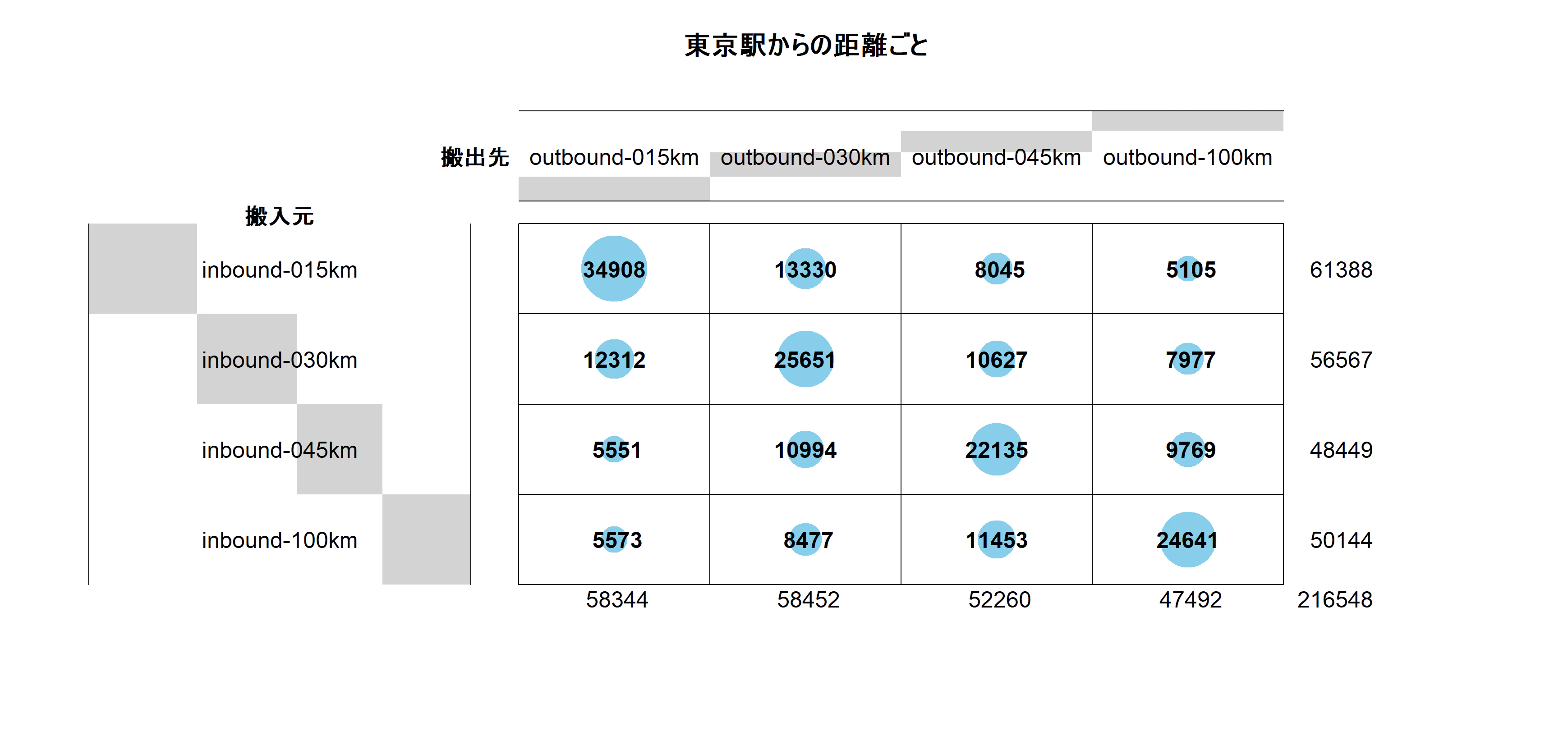
今回のバルーンプロットでは、16区分(搬入元距離帯 × 搬出先距離帯)ごとの 81列目の合計値(件数) を円の大きさで表現しています。
こちらの図を見ると、同じ距離圏内での搬出入が多いという傾向がわかります。
(補足)
こちらのバルーンプロットをggplot2にすると以下のようになります。
library(ggplot2)

plot_df <- data.frame(
  搬入元 = plot_data[, 1],
  搬出先 = plot_data[, 2],
  値     = as.numeric(plot_data[, 3]),
  stringsAsFactors = FALSE
)

# x軸(搬出先)は左が近距離
plot_df$搬出先 <- factor(plot_df$搬出先, levels = (unique(outbound_label)))

# y軸(搬入元)は上が近距離
plot_df$搬入元 <- factor(plot_df$搬入元, levels = rev(unique(inbound_label)))


ggplot(plot_df, aes(x = 搬出先, y = 搬入元, size = 値)) +
  geom_point(shape = 21, fill = "skyblue", color = "black", alpha = 0.8) +
  geom_text(aes(label = 値), size = 3, vjust = 0.5) +
  scale_size_area(max_size = 20) +
  labs(
    x = "搬出先", y = "搬入元",
    title = "東京駅からの距離帯ごとの搬出入件数",
    size = "件数"
  ) +
  theme_minimal(base_size = 14)
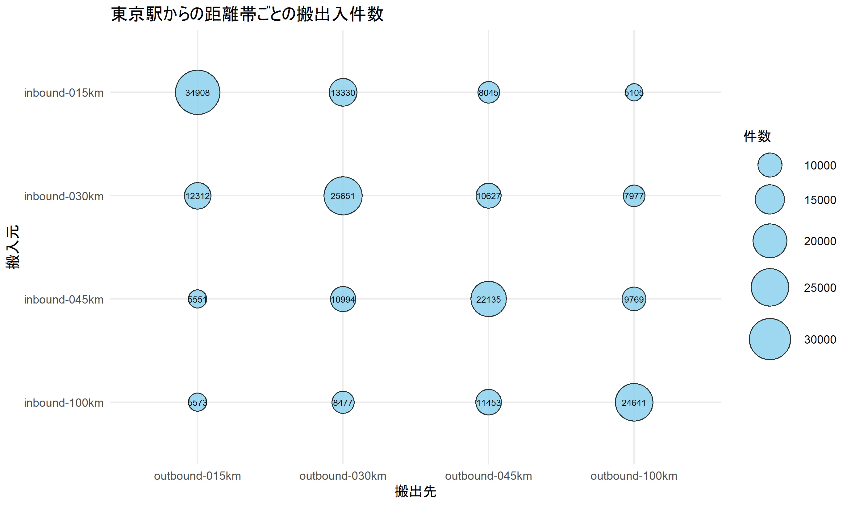
同じバルーンプロットでも、ライブラリによって異なる図ができて面白いです。