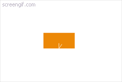
There have so many animation for icon scroll, but today we will do animation type arrow run down like animated last post.
Start with element html
You just simple put html will is:
<div class="icon-scroll"></div>
and if you use pug to code it will is:
.icon-scroll
Start with scss
*There're we will create square color orange has width 80px:
.icon-scroll{
  background: #ec8806;
  position: relative;
  z-index: 10;;
  cursor: pointer;
  width: 90px;
  left: 0;
  right: 0;
  top: 20px;
  padding-bottom: 45px;
  margin: auto;
  color: #fff;
  text-align: center;
  transition: 2s;
}
*Next, we will add two Pseudo-Elements is before and after like this:
before:
   &:before{
    content: "";
    display: block;
    position: absolute;
    bottom: 0;
    right: 0;
    left: 0;
    margin: auto;
    width: 1px;
    height: 18px;
    background-color: #FFF;
    transform-origin: left bottom;
    transform: scaleY(0) rotate(70deg);
    animation: arrowA 1.8s ease-in-out 0s infinite;
   }
after:
   &:after{
     content: "";
     position: absolute;
     width: 1px;
     height: 40px;
     margin: auto;
     bottom: 0;
     left: 0;
     right: 0;
     animation: arrowB 1.8s ease-in-out 0s infinite;
     background-color: #FFF;
   }
Start with keyframes
Keyframes arrowA for before:
@keyframes arrowA {
  0% {
    transform:rotate(35deg) scaleY(0) translate(0px, 0px);
    height: 15px;
  }
  40% {
    transform:rotate(35deg) scaleY(0) translate(0px, 0px);
    height: 15px;
  }
  55% {
    transform:rotate(35deg) scaleY(1) translate(0px, 0px);
    height: 15px;
  }
  80% {
    transform:rotate(35deg) scaleY(1) translate(0px, 0px);
    height: 15px;
  }
  100% {
    transform:rotate(35deg) scaleY(1) translate(0px, -15px);
    height: 0px;
  }
}
Keyframes arrowB for after:
@keyframes arrowB {
  0% {
    transform:scaleY(0);
    transform-origin:50% 0;
  }
  20% {
    transform:scaleY(0);
    transform-origin:50% 0;
  }
  45% {
    transform:scaleY(1);
    transform-origin:50% 0;
  }
  55% {
    transform:scaleY(1);
    transform-origin:50% 100%;
  }
  85% {
    transform:scaleY(0);
    transform-origin:50% 100%;
  }
  100% {
    transform:scaleY(0);
    transform-origin:50% 100%;
  }
}
Done! 
Ahhhhh... It's so simple... 