目次
1、はじめに
2、本題
3、分析の流れについて
4-1、データ内容の確認・前処理
4-2、データを可視化し、各カラムの相関関係について分析
4-3、モデルの作成・正確性の確認
5、まとめ
6、おわりに
1、はじめに
私は文系の大学を卒業後、人材業界で3年間営業を行なっています。
普段の業務に活かせるようなデータ分析力を身につけたいと考え、今回はAidemyさんのデータ分析コースを受講しました。
(※ 本ブログは、成果物の提出を目的とし作成しました。)
2、本題
普段の業務上、日々多くの求人票を見ることが多いこと、そして普段の業務にデータ分析を活かせるになることが目的であったため、今回はデータサイエンティスの求人票を分析してみることにしました。
今回の分析の目的は、データサイエンティストの年収と最も相関性の高いカラムを見つけようと思います。
・使用データ
「ds_salaries.csv」
(kaggleのnotebookを参照:”https://www.kaggle.com/code/harits/salary-analysis-data-science-jobs/notebook”)
・実行環境
Mac book M1
Google Colaboratory
3、分析の流れ
分析の流れは下記のとおりです。
① データ内容の確認・前処理
② データを可視化し、各カラムの相関関係について分析
③ モデルの作成・正確性の確認
4-1、データ内容の確認・前処理
まずはじめに、必要なデータのインポートを行います。
import pandas as pd
import numpy as np
import matplotlib.pyplot as plt
import seaborn as sns
import matplotlib.patches as mpatches
from google.colab import drive
drive.mount("/content/drive")
#使用するデータセットの読み込み
all_data = pd.read_csv("/content/drive/MyDrive/Aidemy_成果物/input:data-science-job-salaries:ds_salarie.csv")
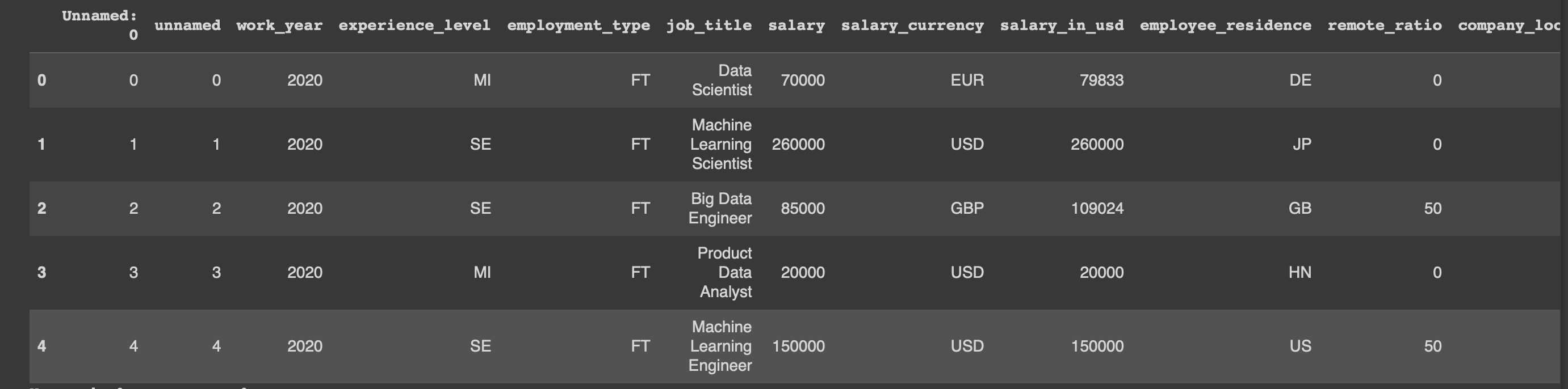
#データの表示(先頭5行)
display(all_data.head())
#欠損データの有無をチェック
all_data.isnull().sum()

#データの形を表示
all_data.info()

カラムの意味はそれぞれ下記の通りとなります。
work_year :いつ年収が支払われたのか。
experience_level:データサイエンティストとしての経験値(以下参照)
EN = Entry-level / Junior
MI = Mid-level / Intermediate
SE = Senior-level / Expert
EX = Executive-level / Director
employment_type:雇用体系
PT = Part-time
FT = Full-time
CT = Contract
FL = Freelance
job_title:ポジション名
salary:年収
salary_currency:年収が支払われた通過
salary_in_usd:年収をUSDに変換した金額
employee_residence:現住所(国単位:国名コード)
remote_ratio:リモート対応度(以下、参照)
0 = 全くない〜週に1、2日程度
50 = 週に3、4日程度
100 = ほぼリモート〜フルリモート
company_location :会社の所在国(国名コード)
company_size :社員数を基にした企業規模(以下参照)
S = less than 50 employees (small)
M = 50 to 250 employees (medium)
L = more than 250 employees (large)
#求人のポジション名を確認
all_data["job_title"].value_counts()

上記データの分析まとめ:
・データの欠如はなし
・今回は、データ量の最も多い”USD”を基準として相関関係を分析するため、
・ポジポジションタイトルでいくつか類似しているポジション名を統一する必要がありそう。
(例:Financial Data Analyst → Data Analyst)
・カテゴリーデータもあり(場合によっては変数へ変換の必要あり)
・以下の不要なカラムは削除する
"Unames: 0"
"salary","salary_currency" - "salary_in_usd"を使用するため
# 不要なカラムを削除
all_data = all_data.drop("Unnamed: 0", axis=1)
all_data = all_data.drop("salary", axis=1)
all_data = all_data.drop("salary_currency", axis=1)

# 類似しているポジション名をマージする。
all_data['job_title'] = all_data['job_title'].str.replace("Finance Data Analyst", "Data Analyst")
all_data['job_title'] = all_data['job_title'].str.replace("Marketing Data Analyst", "Data Analyst")
all_data['job_title'] = all_data['job_title'].str.replace("Financial Data Analyst", "Data Analyst")
all_data['job_title'] = all_data['job_title'].str.replace("Product Data Analyst", "Data Analyst")
all_data['job_title'] = all_data['job_title'].str.replace("Business Data Analyst", "Data Analyst")
all_data['job_title'] = all_data['job_title'].str.replace("ML Engineer", "Machine Learning Engineer")
all_data.head()

4-2、データを可視化し、各カラムの相関関係について分析
次に各カラムのデータを可視化していく。
#年収(USD)について
all_data[['salary_in_usd']].describe()

#「年収」分布を可視化
fig, ax = plt.subplots(figsize=(12,6))
plt.rcParams.update({'font.size': 13})

ax = sns.histplot(data = all_data, x="salary_in_usd", kde=True, color="grey", bins=30)
for i in range(2, 7):
    ax.patches[i].set_facecolor('crimson')
sns.despine(top=True, right=True)

ax.set_title('The Distribution of Salaries', pad=20, loc="left")
plt.show()
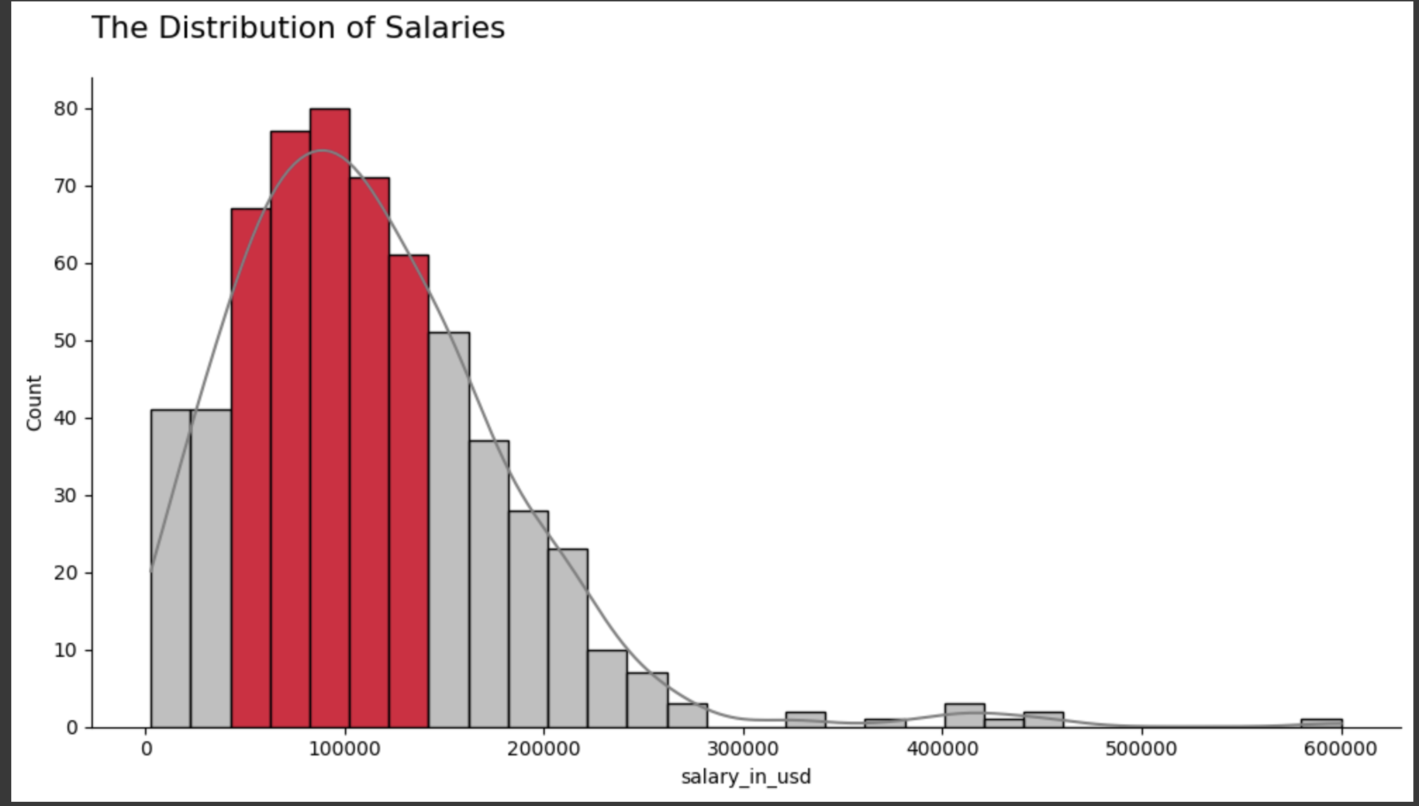
上記の可視化データについて:
・対象ポジションの年収: 2,859 USD 〜 600,000 USD
・平均年収:112,298 USD
#求人票で使用されているポジション名の割合を可視化
fig, ax = plt.subplots(figsize=(12,6))
plt.rcParams.update({'font.size': 13})

job_title = all_data["job_title"].value_counts()
job_title = job_title.sort_values(ascending=False)
job_title = (job_title / job_title.sum()) * 100
job_title = job_title.round(1)
job_title = job_title[job_title > 1.5]

colors = ['grey' if(x<10) else 'red' for x in job_title]
ax = sns.barplot(x=job_title.values, y=job_title.index, palette=colors, orient="h")

sns.despine(top=True, right=True, left=True, bottom=True)
ax.tick_params(axis='y', which='major', pad=20)
ax.tick_params(left=False, bottom=False)
ax.set(xticklabels=[])

for i, v in enumerate(job_title.values):
    if(i<3):
        plt.text(v + 0.5, i + 0.1, str(v)+"%", fontweight="bold")
    else:
        plt.text(v + 0.5, i + 0.1, str(v)+"%")

def change_height(ax, new_value):
    for patch in ax.patches:
        current_height = patch.get_height()
        diff = current_height-new_value

        patch.set_height(new_value)

        patch.set_y(patch.get_y()+diff * .5)

change_height(ax, 0.75)

plt.title("Top 7 Number of Employees by Job Title", y=1.05, loc="left")

plt.tight_layout()
plt.show()

del job_title

上記データについて:
・「Data scientist」「Data Engineer」「Data Analyst」の3つが、全体の10%以上の求人で表記されているポジション名であった。
・少数ではあるが、別のポジション名もあり
#ポジション名と年収(USD)の相関性を可視化する。


fig, ax = plt.subplots(figsize=(12,6))
plt.rcParams.update({'font.size': 13})

salaries_by_job_title = all_data.groupby("job_title")["salary_in_usd"].mean()
salaries_by_job_title = salaries_by_job_title.sort_values(ascending=False)[:10]
salaries_by_job_title = salaries_by_job_title.round(1)

colors = ['red' if i<1 else 'grey' for i in range(10)]

ax = sns.barplot(x=salaries_by_job_title.values, y=salaries_by_job_title.index, palette=colors, orient="h")

sns.despine(top=True, right=True, left=True, bottom=True)
ax.tick_params(axis='y', which='major', pad=20)
ax.tick_params(left=False, bottom=False)
ax.set(xticklabels=[])

for i, v in enumerate(salaries_by_job_title.values):
    plt.text(v - 55000, i + 0.1, "$"+str(v), color="white", fontweight="bold")

def change_height(ax, new_value):
    for patch in ax.patches:
        current_height = patch.get_height()
        diff = current_height-new_value

        patch.set_height(new_value)

        patch.set_y(patch.get_y()+diff * .5)

change_height(ax, 0.75)

plt.title("Top 10 Average Salaries by Job Title", y=1.05, loc="left")
ax.set(ylabel=None)

plt.tight_layout()
plt.show()

del salaries_by_job_title

上記データについて:
・「Data Analytics Lead」のポジションが最も年収の高いポジションであることがわかった。
・またTOP4はいずれも管理職であることから、役職の有無と年収の高さは相乗関係にありそう。
#勤続年数について可視化する。
fig, ax = plt.subplots(figsize=(8,6))
plt.rcParams.update({'font.size': 13})

work_year = all_data["work_year"].value_counts()
work_year = work_year.sort_values()
work_year = (work_year / work_year.sum()) * 100
work_year = work_year.round(1)

colors = ['grey', 'grey', 'red']
ax = sns.barplot(x = work_year.index, y = work_year.values, palette=colors)

sns.despine(top=True, right=True, left=True)
ax.tick_params(left=False, bottom=False)
ax.set(yticklabels=[])

for i, v in enumerate(work_year.values):
    if(i<2):
        plt.text(i-0.1, v+2, str(v)+"%")
    else:
        plt.text(i-0.11, v+2, str(v)+"%", fontweight="bold")
plt.tight_layout()
plt.title("The Number of Employees by Work Year", y=1.05, loc="left")
plt.show()

del work_year

上記データについて:
2022年の分析対象者が50%以上いることがわかる。
fig, ax = plt.subplots(figsize=(8,6))
plt.rcParams.update({'font.size': 13})

salaries_by_work_year = all_data.groupby("work_year")["salary_in_usd"].mean()
salaries_by_work_year = salaries_by_work_year.round(1)

colors = ['grey', 'grey', 'red']
ax = sns.barplot(x = salaries_by_work_year.index, y = salaries_by_work_year.values, palette=colors)

sns.despine(top=True, right=True)
ax.set(xlabel=None)

for i, v in enumerate(salaries_by_work_year.values):
    plt.text(i-0.23, v-8000, "$"+str(v), color="white", fontweight="bold")

plt.tight_layout()
plt.title("Average Salaries by Work Year", y=1.05, loc="left")
plt.show()

del salaries_by_work_year
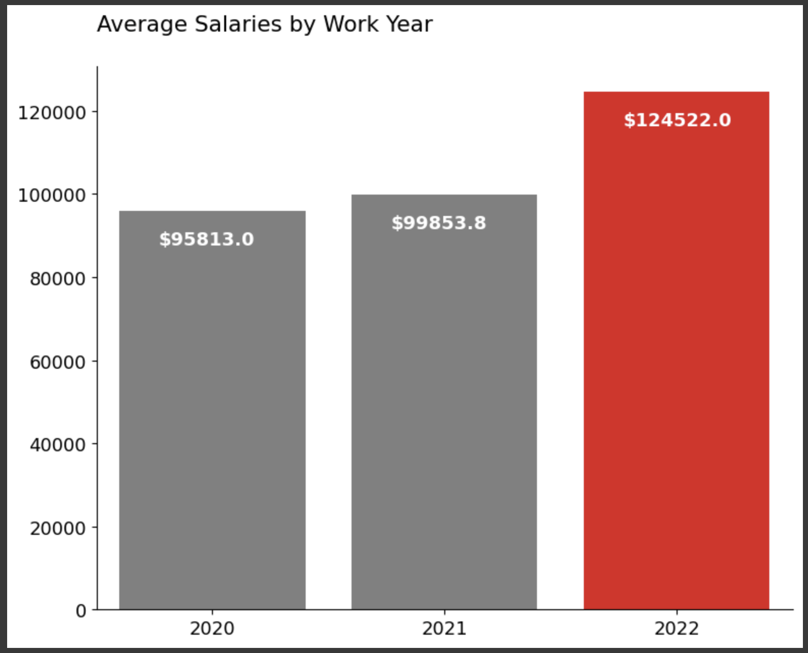
上記データについて:
2020年から2021年にかけての年収の上がり幅と比べ、2021年から2022年にかけての平均年収の上がり幅が大きいことがわかる。
fig, axs = plt.subplots(figsize=(15, 4))

top_4_job_title_list = ["Data Scientist", "Data Engineer", "Data Analyst", "Machine Learning Engineer"]
colors = ['red', 'grey', 'grey', 'grey']
sizes = [3.25, 1.25, 1.25, 1.25]

job_salaries_per_year = all_data[all_data["job_title"].isin(top_4_job_title_list)]
job_salaries_per_year = job_salaries_per_year.groupby(["work_year", "job_title"])["salary_in_usd"].mean()
job_salaries_per_year = job_salaries_per_year.round(1)
job_salaries_per_year = job_salaries_per_year.reset_index()

for i in range(4):
    p = 141+i
    ax = plt.subplot(p)

    ax = sns.lineplot(x="work_year", y="salary_in_usd", hue="job_title",
                 size="job_title", data=job_salaries_per_year, palette=colors, sizes=sizes)

    lines = ax.get_lines()
    line = lines[i]
    line.set_marker('o')
    line.set_markersize(10)
    line.set_markevery([0, 2])

    for j in range(4):
        if(colors[j]=="red"):
            colors[(j+1)%4] = "red"
            colors[j] = "grey"
            sizes[(j+1)%4] = 3.25
            sizes[j] = 1.25
            break

    if(i!=0):
        ax.spines['left'].set_visible(False)
        ax.set(ylabel=None)
        ax.set(yticklabels=[])
        ax.tick_params(left=False)
    ax.spines['top'].set_visible(False)
    ax.spines['right'].set_visible(False)
    ax.set(xlabel=None)
    ax.set_xticks([2020, 2021, 2022])
    ax.get_legend().remove()
    plt.title(job_salaries_per_year["job_title"].unique()[i], y=1.05, loc="center")

plt.suptitle("Salary by Work Year for Most Employees of Four Job Titles", y=1.05)
plt.tight_layout()
plt.show()
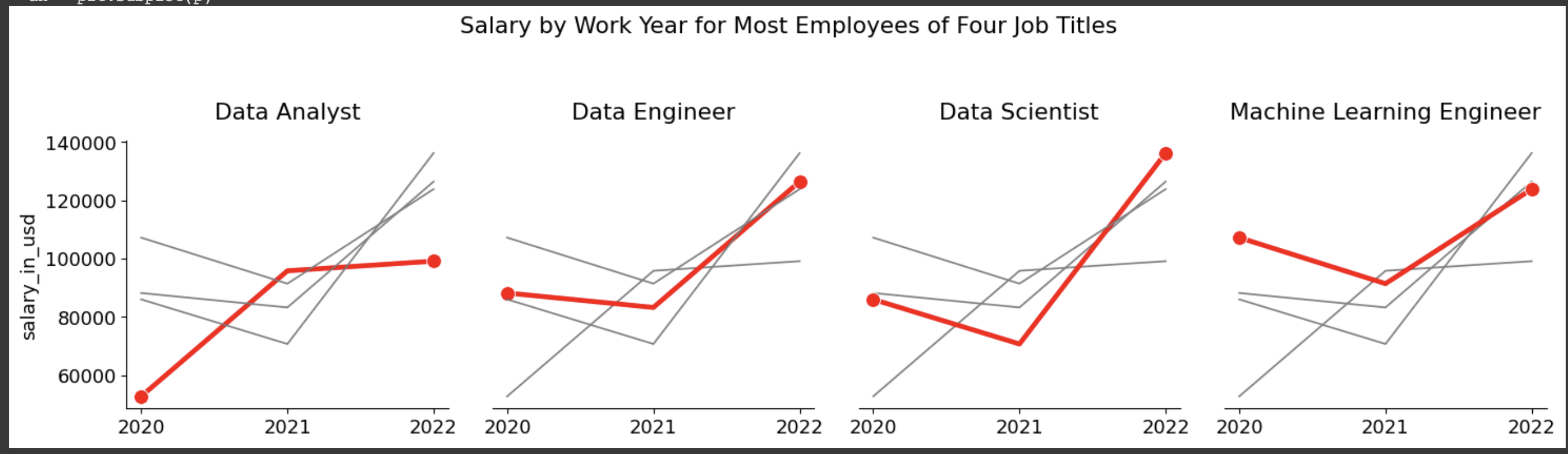
上記データについて:
2年間でいずれの職種も年収が上がっている。
fig, ax = plt.subplots(figsize=(12,6))
plt.rcParams.update({'font.size': 13})

experience_level = all_data["experience_level"].value_counts()
experience_level = experience_level.sort_values(ascending=False)
experience_level = (experience_level / experience_level.sum()) * 100
experience_level = experience_level.round(1)
experience_level.index = ["Senior-level / Expert", "Mid-level / Intermediate", "Entry-level / Junior", "Executive-level / Director"]

colors = ['red', 'grey', 'grey', 'grey']
ax = sns.barplot(x = experience_level.values, y = experience_level.index, palette=colors, orient="h")

sns.despine(top=True, right=True, left=True, bottom=True)
ax.tick_params(axis='y', which='major', pad=20)
ax.tick_params(left=False, bottom=False)
ax.set(xticklabels=[])

for i, v in enumerate(experience_level.values):
    if(i==0):
        plt.text(v + 1, i+0.05, str(v)+"%", fontweight="bold")
    elif(i<3):
        plt.text(v + 1, i+0.05, str(v)+"%")
    else:
        plt.text(v + 0.8, i+0.05, str(v)+"%")

def change_height(ax, new_value):
    for patch in ax.patches:
        current_height = patch.get_height()
        diff = current_height-new_value

        patch.set_height(new_value)

        patch.set_y(patch.get_y()+diff * .5)

change_height(ax, 0.75)

plt.title("The Number of Employees by Experience Level", y=1.05, loc="left")

plt.tight_layout()
plt.show()

del experience_level

上記データについて:
分析対象者の半分近くはシニアレベルであることがわかる。
fig, ax = plt.subplots(figsize=(12,6))
plt.rcParams.update({'font.size': 13})

salaries_by_ex_level = all_data.groupby("experience_level")["salary_in_usd"].mean()
salaries_by_ex_level = salaries_by_ex_level.sort_values(ascending=False)
salaries_by_ex_level = salaries_by_ex_level.round(1)
salaries_by_ex_level.index = ["Executive-level / Director", "Senior-level / Expert", "Mid-level / Intermediate", "Entry-level / Junior"]

ax = sns.barplot(x = salaries_by_ex_level.values, y = salaries_by_ex_level.index, palette=colors, orient="h")

sns.despine(top=True, right=True, left=True, bottom=True)
ax.tick_params(axis='y', which='major', pad=20)
ax.tick_params(left=False, bottom=False)
ax.set(xticklabels=[])

for i, v in enumerate(salaries_by_ex_level.values):
    if(i<2):
        plt.text(v - 30000, i + 0.05, "$"+str(v), color="white", fontweight="bold")
    else:
        plt.text(v - 27000, i + 0.05, "$"+str(v), color="white", fontweight="bold")


def change_height(ax, new_value):
    for patch in ax.patches:
        current_height = patch.get_height()
        diff = current_height-new_value

        patch.set_height(new_value)

        patch.set_y(patch.get_y()+diff * .5)

change_height(ax, 0.75)

plt.title("Average Salaries by Experience Level", y=1.05, loc="left")
ax.set(ylabel=None)

plt.tight_layout()
plt.show()

del salaries_by_ex_level

上記データについて:
予想通り、役職レベルと平均年収は比例することがわかる。
fig, ax = plt.subplots(figsize=(8,6))
plt.rcParams.update({'font.size': 13})

employment_type = all_data["employment_type"].value_counts()
employment_type = employment_type.sort_values()
employment_type = (employment_type / employment_type.sum()) * 100
employment_type = employment_type.round(1)
employment_type.index = ["Freelance", "Contract", "Part-time", "Full-time"]

colors = ['grey', 'grey', 'grey', 'red']
ax = sns.barplot(x = employment_type.index,y = employment_type.values, palette=colors)

sns.despine(top=True, right=True, left=True)
ax.tick_params(left=False, bottom=False)
ax.set(yticklabels=[])

for i, v in enumerate(employment_type.values):
    if(i<3):
        plt.text(i-0.1, v+3, str(v)+"%")
    else:
        plt.text(i-0.12, v+3, str(v)+"%", fontweight="bold")

plt.tight_layout()
plt.title("The Number of Employees by Employment Type", y=1.05, loc="left")
plt.show()

del employment_type

上記データについて:
分析対象の9割強の人が正規雇用である。
fig, ax = plt.subplots(figsize=(8,6))
plt.rcParams.update({'font.size': 13})

salaries_by_em_type = all_data.groupby("employment_type")["salary_in_usd"].mean()
salaries_by_em_type = salaries_by_em_type.sort_values()
salaries_by_em_type = salaries_by_em_type.round(1)
salaries_by_em_type.index = ["Part-time", "Freelance", "Full-time", "Contract"]

colors = ['grey', 'grey', 'grey', 'red']
ax = sns.barplot(x = salaries_by_em_type.index, y = salaries_by_em_type.values, palette=colors)

sns.despine(top=True, right=True)
ax.set(xlabel=None)

for i, v in enumerate(salaries_by_em_type.values):
    if(i<2):
        plt.text(i-0.28, v-12000, "$"+str(v), color="white", fontweight="bold")
    else:
        plt.text(i-0.31, v-12000, "$"+str(v), color="white", fontweight="bold")

plt.tight_layout()
plt.title("Average Salaries by Employment Type", y=1.05, loc="left")
plt.show()

del salaries_by_em_type

上記データについて:
契約社員の平均年収が圧倒的に高いことがわかるが、分析対象の9割強が正規雇用であることから、ここで表示されている契約社員の平均年収は必ずしも参考にするべきデータではないと言えそう。
fig, ax = plt.subplots(figsize=(8,6))
plt.rcParams.update({'font.size': 13})

company_size = all_data["company_size"].value_counts()
company_size = company_size.sort_values()
company_size = (company_size / company_size.sum()) * 100
company_size = company_size.round(1)
company_size.index = ["Small", "Large", "Medium"]

colors = ['grey', 'grey', 'red']
ax = sns.barplot(x = company_size.index, y = company_size.values, palette=colors)

sns.despine(top=True, right=True, left=True)
ax.tick_params(left=False, bottom=False)
ax.set(yticklabels=[])

for i, v in enumerate(company_size.values):
    if(i<2):
        plt.text(i-0.1, v+2.5, str(v)+"%")
    else:
        plt.text(i-0.11, v+2.5, str(v)+"%", fontweight="bold")

plt.tight_layout()
plt.title("The Number of Employees by Company Size", y=1.05, loc="left")
plt.show()

del company_size

上記データについて:
"Medium"規模の企業がデータ分析対象の半分弱を占めていることがわかる。
fig, ax = plt.subplots(figsize=(8,6))
plt.rcParams.update({'font.size': 13})

salaries_by_com_size = all_data.groupby("company_size")["salary_in_usd"].mean()
salaries_by_com_size = salaries_by_com_size.sort_values()
salaries_by_com_size = salaries_by_com_size.round(1)
salaries_by_com_size.index = ["Small", "Medium", "Large"]

colors = ['grey', 'grey', 'red']
ax = sns.barplot(x = salaries_by_com_size.index, y = salaries_by_com_size.values, palette=colors)

sns.despine(top=True, right=True)
ax.set(xlabel=None)

for i, v in enumerate(salaries_by_com_size.values):
    if(i<1):
        plt.text(i-0.22, v-8000, "$"+str(v), color="white", fontweight="bold")
    else:
        plt.text(i-0.24, v-8000, "$"+str(v), color="white", fontweight="bold")

plt.tight_layout()
plt.title("Average Salaries by Company Size", y=1.05, loc="left")
plt.show()

del salaries_by_com_size

上記データについて:
"Large"規模の企業の年収が一番高いことがわかるが、"Medium"との差は、"Small"規模の企業の年収と比較すると小さいことがわかる。
fig, ax = plt.subplots(figsize=(12,6))
plt.rcParams.update({'font.size': 13})

employee_residence = all_data["employee_residence"].value_counts()
employee_residence = employee_residence.sort_values(ascending=False)
employee_residence = (employee_residence / employee_residence.sum()) * 100
employee_residence = employee_residence.round(1)
employee_residence = employee_residence[employee_residence > 1.5]
employee_residence.index = ["United States", "Great Britain", "India", "Canada", "Denmark", "France", "Spain", "Greece"]

colors = ['grey' if(x<10) else 'red' for x in employee_residence]
ax = sns.barplot(x = employee_residence.values, y = employee_residence.index, palette=colors, orient="h")

sns.despine(top=True, right=True, left=True, bottom=True)
ax.tick_params(axis='y', which='major', pad=20)
ax.tick_params(left=False, bottom=False)
ax.set(xticklabels=[])

for i, v in enumerate(employee_residence.values):
    if(i==0):
        plt.text(v + 1, i + 0.1, str(v)+"%", fontweight="bold")
    else:
        plt.text(v + 0.7, i + 0.1, str(v)+"%")

def change_height(ax, new_value):
    for patch in ax.patches:
        current_height = patch.get_height()
        diff = current_height-new_value

        patch.set_height(new_value)

        patch.set_y(patch.get_y()+diff * .5)

change_height(ax, 0.75)

plt.title("Top 8 Number of Employees by Employee Residence", y=1.05, loc="left")

plt.tight_layout()
plt.show()

del employee_residence
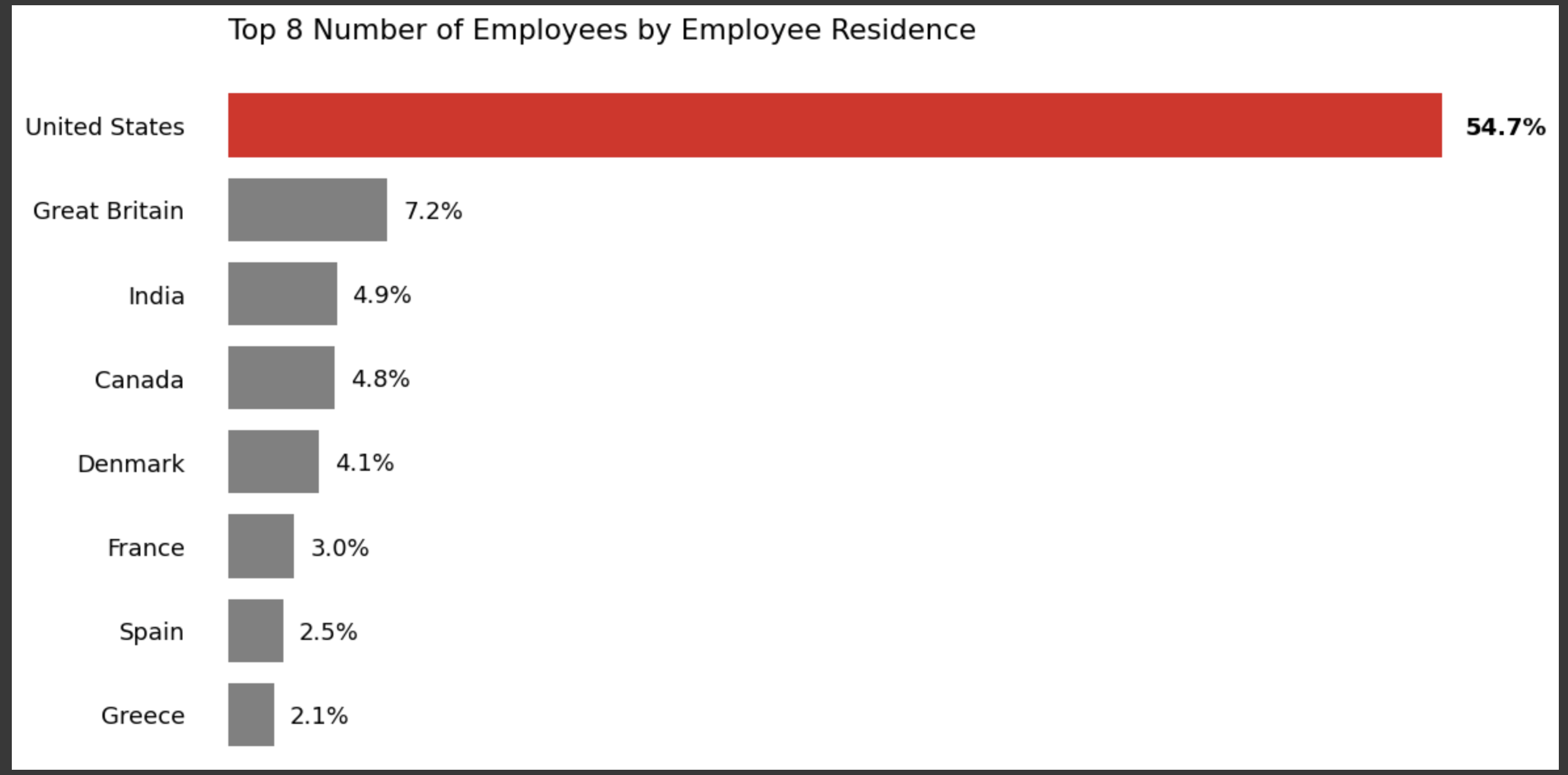
上記データについて:
分析対象者の5割弱がアメリカ在住であることがわかる。
fig, ax = plt.subplots(figsize=(12,6))
plt.rcParams.update({'font.size': 13})
top_8_country_list = ["US", "GB", "IN", "CA", "DE", "FR", "ES", "GR"]
salaries_by_em_res = all_data[all_data["employee_residence"].isin(top_8_country_list)]
salaries_by_em_res = salaries_by_em_res.groupby("employee_residence")["salary_in_usd"].mean()
salaries_by_em_res = salaries_by_em_res.sort_values(ascending=False)[:10]
salaries_by_em_res = salaries_by_em_res.round(1)
salaries_by_em_res.index = ["United States", "Canada", "Denmark", "Great Britain", "France", "Spain", "Greece", "India"]
colors = ['grey' if(x!=0) else 'red' for x in range(8)]
ax = sns.barplot(x=salaries_by_em_res.values, y=salaries_by_em_res.index, palette=colors, orient="h")
sns.despine(top=True, right=True, left=True, bottom=True)
ax.tick_params(axis='y', which='major', pad=20)
ax.tick_params(left=False, bottom=False)
ax.set(xticklabels=[])
for i, v in enumerate(salaries_by_em_res.values):
if(i!=0):
plt.text(v - 18000, i + 0.1, "$"+str(v), color="white", fontweight="bold")
else:
plt.text(v - 20000, i + 0.1, "$"+str(v), color="white", fontweight="bold")
def change_height(ax, new_value):
for patch in ax.patches:
current_height = patch.get_height()
diff = current_height-new_value
patch.set_height(new_value)
patch.set_y(patch.get_y()+diff * .5)
change_height(ax, 0.75)
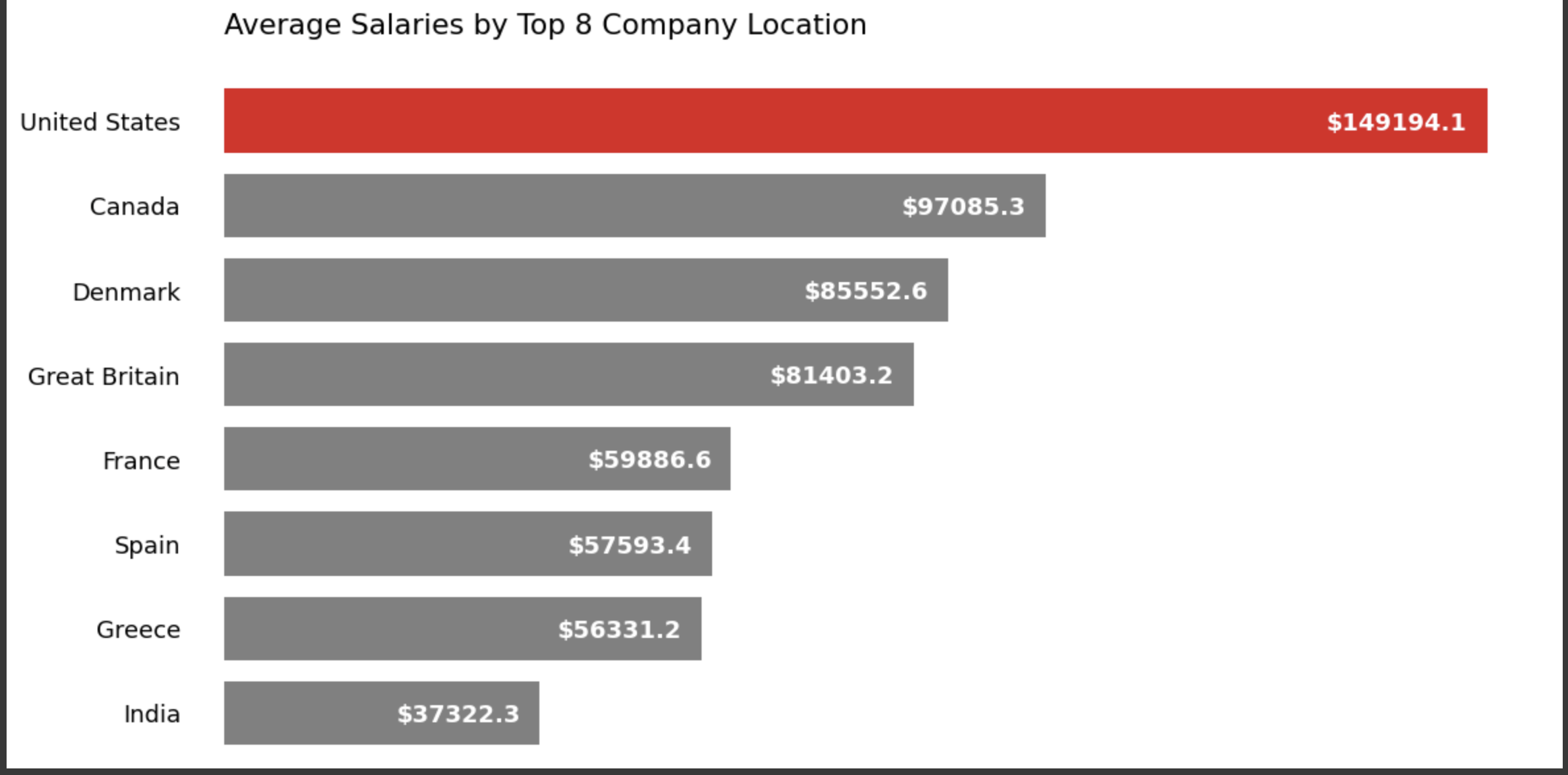
plt.title("Average Salaries by Top 8 Employee Residence", y=1.05, loc="left")
ax.set(ylabel=None)
plt.tight_layout()
plt.show()
del salaries_by_em_res

上記データについて:
アメリカ在住者の平均年収が一番高いことがわかる。
fig, ax = plt.subplots(figsize=(12,6))
plt.rcParams.update({'font.size': 13})

company_location = all_data["company_location"].value_counts()
company_location = company_location.sort_values(ascending=False)
company_location = (company_location / company_location.sum()) * 100
company_location = company_location.round(1)
company_location = company_location[company_location > 1.5]
company_location.index = ["United States", "Great Britain", "Canada", "Denmark", "India", "France", "Spain", "Greece"]

colors = ['grey' if(x<10) else 'red' for x in company_location]
ax = sns.barplot(x = company_location.values, y = company_location.index, palette=colors, orient="h")

sns.despine(top=True, right=True, left=True, bottom=True)
ax.tick_params(axis='y', which='major', pad=20)
ax.tick_params(left=False, bottom=False)
ax.set(xticklabels=[])

for i, v in enumerate(company_location.values):
    if(i==0):
        plt.text(v + 1, i + 0.1, str(v)+"%", fontweight="bold")
    else:
        plt.text(v + 1, i + 0.1, str(v)+"%", )

def change_height(ax, new_value):
    for patch in ax.patches:
        current_height = patch.get_height()
        diff = current_height-new_value

        patch.set_height(new_value)

        patch.set_y(patch.get_y()+diff * .5)

change_height(ax, 0.75)

plt.title("Top 8 Number of Employees by Company Location", y=1.05, loc="left")

plt.tight_layout()
plt.show()

del company_location

上記データについて:
対象データの6割近くが、アメリカを勤務地としたデータであることがわかる。
fig, ax = plt.subplots(figsize=(12,6))
plt.rcParams.update({'font.size': 13})

top_8_country_list = ["US", "GB", "IN", "CA", "DE", "FR", "ES", "GR"]
salaries_by_comp_loc = all_data[all_data["employee_residence"].isin(top_8_country_list)]
salaries_by_comp_loc = salaries_by_comp_loc.groupby("employee_residence")["salary_in_usd"].mean()
salaries_by_comp_loc = salaries_by_comp_loc.sort_values(ascending=False)[:10]
salaries_by_comp_loc = salaries_by_comp_loc.round(1)
salaries_by_comp_loc.index = ["United States", "Canada", "Denmark", "Great Britain", "France", "Spain", "Greece", "India"]

colors = ['grey' if(x!=0) else 'red' for x in range(8)]

ax = sns.barplot(x=salaries_by_comp_loc.values, y=salaries_by_comp_loc.index, palette=colors, orient="h")

sns.despine(top=True, right=True, left=True, bottom=True)
ax.tick_params(axis='y', which='major', pad=20)
ax.tick_params(left=False, bottom=False)
ax.set(xticklabels=[])

for i, v in enumerate(salaries_by_comp_loc.values):
    if(i!=0):
        plt.text(v - 17000, i + 0.1, "$"+str(v), color="white", fontweight="bold")
    else:
        plt.text(v - 19000, i + 0.1, "$"+str(v), color="white", fontweight="bold")

def change_height(ax, new_value):
    for patch in ax.patches:
        current_height = patch.get_height()
        diff = current_height-new_value

        patch.set_height(new_value)

        patch.set_y(patch.get_y()+diff * .5)

change_height(ax, 0.75)

plt.title("Average Salaries by Top 8 Company Location", y=1.05, loc="left")
ax.set(ylabel=None)

plt.tight_layout()
plt.show()

del salaries_by_comp_loc
上記データについて:
アメリカで勤務している方の平均年収が一番高いことがわかる。
fig, ax = plt.subplots(figsize=(8,6))
plt.rcParams.update({'font.size': 13})

remote_ratio = all_data["remote_ratio"].value_counts()
remote_ratio = remote_ratio.sort_values()
remote_ratio = (remote_ratio / remote_ratio.sum()) * 100
remote_ratio = remote_ratio.round(1)
remote_ratio.index = ["Hybrid", "In-Office", "Remote"]

colors = ['grey', 'grey', 'red']
ax = sns.barplot(x = remote_ratio.index, y = remote_ratio.values, palette=colors)

sns.despine(top=True, right=True, left=True)
ax.tick_params(left=False, bottom=False)
ax.set(yticklabels=[])

for i, v in enumerate(remote_ratio.values):
    if(i<2):
        plt.text(i-0.1, v+1.6, str(v)+"%")
    else:
        plt.text(i-0.1, v+1.6, str(v)+"%", fontweight="bold")

plt.tight_layout()
plt.title("The Number of Employees by Remote Ratio", y=1.05, loc="left")
plt.show()

del remote_ratio
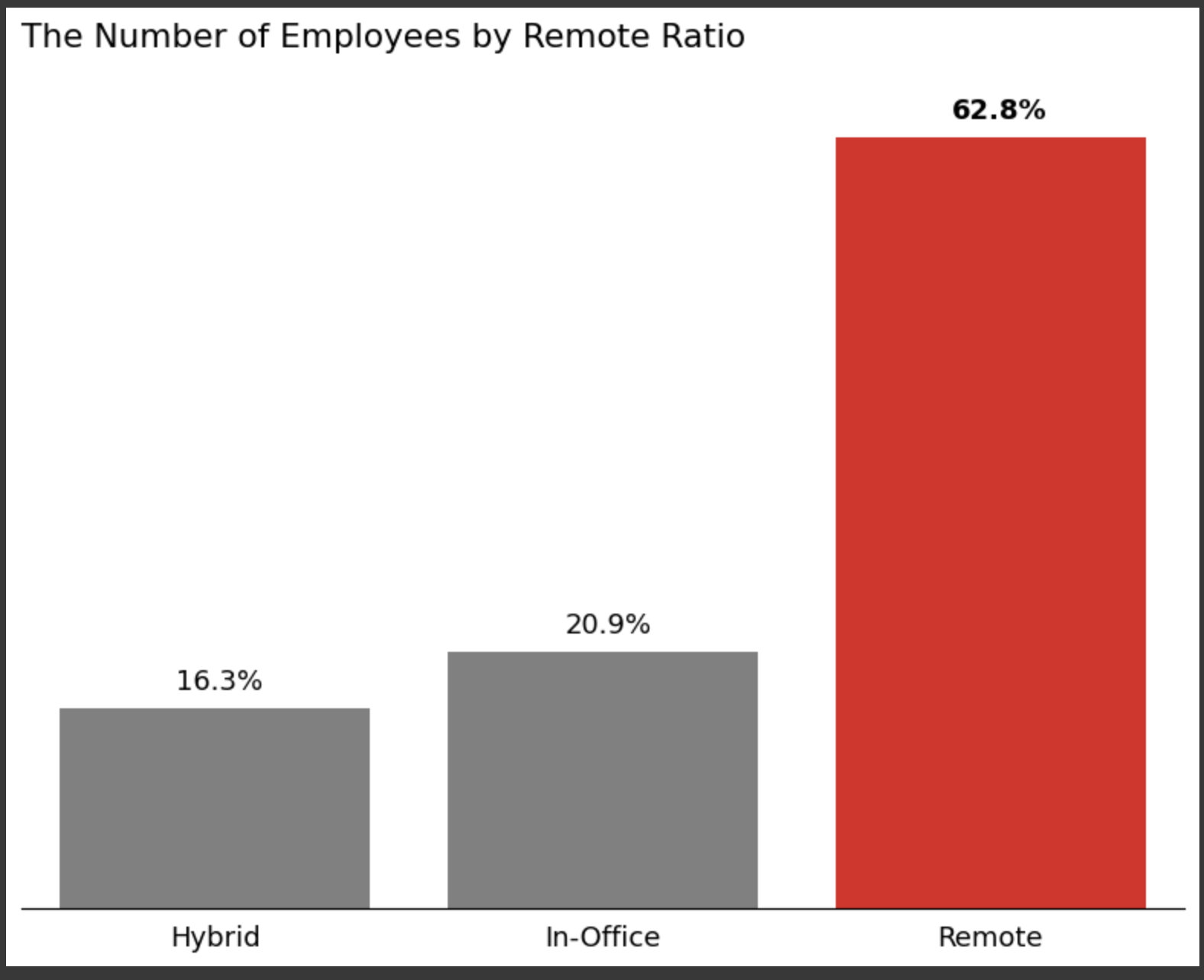
上記データについて:
分析対象者の6割弱がリモートで勤務していることがわかる
fig, ax = plt.subplots(figsize=(8,6))
plt.rcParams.update({'font.size': 13})

salaries_by_rem_ratio =all_data.groupby("remote_ratio")["salary_in_usd"].mean()
salaries_by_rem_ratio = salaries_by_rem_ratio.sort_values()
salaries_by_rem_ratio = salaries_by_rem_ratio.round(1)
salaries_by_rem_ratio.index = ["Hybrid", "In-Office", "Remote"]

colors = ['grey', 'grey', 'red']
ax = sns.barplot(x = salaries_by_rem_ratio.index, y = salaries_by_rem_ratio.values, palette=colors)

sns.despine(top=True, right=True)
ax.set(xlabel=None)

for i, v in enumerate(salaries_by_rem_ratio.values):
    plt.text(i-0.23, v-8000, "$"+str(v), color="white", fontweight="bold")

plt.tight_layout()
plt.title("Average Salaries by Remote Ratio", y=1.05, loc="left")
plt.show()

del salaries_by_rem_ratio

上記データについて:
"Remote"での平均年収が一番高いことがわかる。
fig, axs = plt.subplots(figsize=(12, 4))

colors = ['red', 'grey', 'grey']
sizes = [3.25, 1.25, 1.25]

remote_ratio_dict = {0  : "In-Office",
                     50 : "Hybrid",
                     100: "Remote"}
remote_salaries_per_year = all_data.groupby(["work_year", "remote_ratio"])["salary_in_usd"].mean()
remote_salaries_per_year = remote_salaries_per_year.round(1)
remote_salaries_per_year = remote_salaries_per_year.reset_index()
remote_salaries_per_year['remote_ratio'] = remote_salaries_per_year['remote_ratio'].replace(remote_ratio_dict, regex=True)

for i in range(3):
    p = 131+i
    ax = plt.subplot(p)

    ax = sns.lineplot(x="work_year", y="salary_in_usd", hue="remote_ratio",
                 size="remote_ratio", data=remote_salaries_per_year, palette=colors, sizes=sizes)

    lines = ax.get_lines()
    line = lines[i]
    line.set_marker('o')
    line.set_markersize(10)
    line.set_markevery([0, 2])

    for j in range(3):
        if(colors[j]=="red"):
            colors[(j+1)%3] = "red"
            colors[j] = "grey"
            sizes[(j+1)%3] = 3.25
            sizes[j] = 1.25
            break

    if(i!=0):
        ax.spines['left'].set_visible(False)
        ax.set(ylabel=None)
        ax.set(yticklabels=[])
        ax.tick_params(left=False)
    ax.spines['top'].set_visible(False)
    ax.spines['right'].set_visible(False)
    ax.set(xlabel=None)
    ax.set_xticks([2020, 2021, 2022])
    ax.get_legend().remove()

    plt.title(remote_salaries_per_year["remote_ratio"].unique()[i], y=1.05, loc="center")

plt.suptitle("Salary by Work Year for Remote Ratio", y=1.05)
plt.tight_layout()
plt.show()

del remote_salaries_per_year
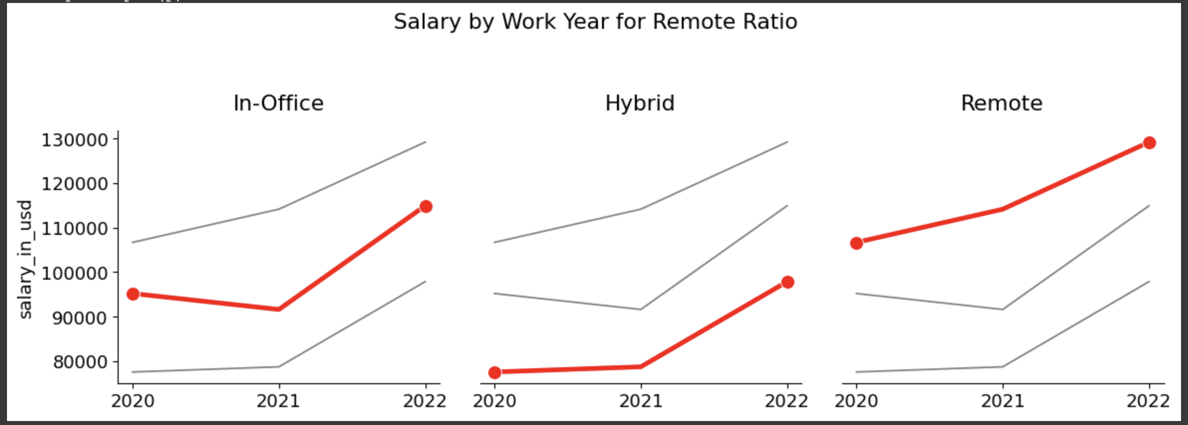
上記データについて:
2年間で上昇した年収幅についてはいずれも同程度ではあったものの、
"Remote">"In-Office">””Hyrid"の順番で最終的な年収の高いことがわかった。
(コロナによるオフィスへの出社制限等により、オフィスの電気代やその他の経費が削減され、それが結果として給与への反映につながったのだろうか。また、機械学習による単純労働の削減が期待されデータサイエンティストの採用ニーズ高が、年収アップを後押ししていると想像できそう。)
# Settings
fig, ax = plt.subplots(figsize=(10, 8))

all_data_heatmap = all_data[["work_year", "experience_level", "company_size", "remote_ratio", "salary_in_usd"]]

# experience_level
ex_level = ["EN", "MI", "SE", "EX"]
for i in range(len(ex_level)):
    all_data_heatmap["experience_level"] = all_data_heatmap["experience_level"].str.replace(ex_level[i], str(i))
all_data_heatmap["experience_level"] = all_data_heatmap["experience_level"].astype(int)

# company_size
com_size = ["S", "M", "L"]
for i in range(len(com_size)):
    all_data_heatmap["company_size"] =  all_data_heatmap["company_size"].str.replace(com_size[i], str(i))
all_data_heatmap["company_size"] =  all_data_heatmap["company_size"].astype(int)

# Heatmap
corr =  all_data_heatmap.corr()
corr = corr.drop('work_year').drop('salary_in_usd', axis=1)
matrix = np.zeros((4, 4))
matrix[3, :] = 1

ax = sns.heatmap(corr, annot=True, cmap="Reds", linewidths=5)
ax = sns.heatmap(corr, mask=matrix, annot=True, cmap="gray_r", linewidths=5, cbar=False, vmin=0, vmax=2)

ax.tick_params(axis='x', which='major', pad=10)
ax.tick_params(axis='y', which='major', pad=10)
ax.tick_params(left=False, bottom=False)

plt.tight_layout()
plt.title("Relationships among the Salary and Other Features", )
plt.show()

上記データについて:
年収との相関関係について、
"Experince_level">"work_year">"company_size">”remote_ratio”
の順で高いことがわかった。
4-3、モデルの作成・正確性の確認
以下の流れで実行します。
① objectデータを数値へ変換
② "salary_in_usd"を目的変数として、重回帰分析&ロッソ回帰で正確性をチェック
from sklearn.preprocessing import LabelEncoder

le = LabelEncoder()
all_data["experience_level"] = le.fit_transform(all_data["experience_level"])
all_data["employment_type"] = le.fit_transform(all_data["employment_type"])
all_data["job_title"] = le.fit_transform(all_data["job_title"])
all_data["salary_in_usd"] = le.fit_transform(all_data["salary_in_usd"])
all_data["employee_residence"] = le.fit_transform(all_data["employee_residence"])
all_data["company_location"] = le.fit_transform(all_data["company_location"])
all_data["company_size"] = le.fit_transform(all_data["company_size"])

display(all_data.head())


#”salary_in_usd”を目的変数におき、重回帰&ロッソ回帰で正確性を確認する。

from sklearn.linear_model import LinearRegression
from sklearn.model_selection import train_test_split

# データの生成
X = all_data[['work_year','experience_level','employment_type','job_title','employee_residence','company_location','company_size','remote_ratio']].values
y = all_data['salary_in_usd'].values
train_X, test_X, train_y, test_y = train_test_split(X, y, random_state=100)

# モデルの構築
model = LinearRegression()

# モデルの学習
model.fit(train_X, train_y)

# モデルの正確性確認
print(model.score(test_X, test_y))

# ロッソ回帰を実行
print("ロッソ回帰")
model_lasso = Lasso()
model_lasso.fit(train_X, train_y)

print(model_lasso.score(test_X, test_y))
分析結果:
結果とは重回帰分析が38%、ロッソ回帰が39%といずれも正確性の低い結果となった。
原因として、以下2点が考えられるため、実行していく。
1, 標準化を行なっていない。
2, 特微量の数が多い。

# 標準化を実施、重回帰とロッソ回帰でそれぞれ正確性を再度確認。

from sklearn.decomposition import PCA
from sklearn.preprocessing import StandardScaler

X = all_data[['work_year','experience_level','employment_type','job_title','employee_residence','company_location','company_size','remote_ratio']].values
y = all_data['salary_in_usd'].values
train_X, test_X, train_y, test_y = train_test_split(X, y, random_state=100)

# 標準化のためのインスタンスを生成
sc = StandardScaler()
# データの標準化
train_X_std = sc.fit_transform(train_X)
test_X_std = sc.transform(test_X)

# 主成分分析のインスタンスを生成
pca = PCA(n_components=2)

# トレーニングデータから変換モデルを学習し、テストデータに適用
train_X_pca = pca.fit_transform(train_X_std)
test_X_pca = pca.transform(test_X_std)

# モデルの構築
model = LinearRegression()

# モデルの学習
model.fit(train_X_pca, train_y)

# モデルの正確性確認
print("重回帰")
print(model.score(test_X_pca, test_y))
print("")

# ロッソ回帰を実行
print("ロッソ回帰")
model_lasso.fit(train_X_pca, train_y)
print(model_lasso.score(test_X_pca, test_y))
print("")

実行結果:
データの標準化後、正確性が更に下がりました。
最後に、特微量を減らしてもう一度正確性を確認してみます。
選ぶ特微量は、目的関数「salary_in_usd」との密度が高い順番に選択してみます。
# "salary_in_usd"との密度を調べる。
np.random.seed(0)
salary_in_usd = np.random.rand(100) # 目的関数のデータ
work_year = np.random.rand(100) # カラム1のデータ
experience_level = np.random.rand(100) # カラム2のデータ
employment_type = np.random.rand(100) # カラム3のデータ
job_title = np.random.rand(100) # カラム4のデータ
employee_residence = np.random.rand(100) # カラム5のデータ
remote_ratio = np.random.rand(100) # カラム6のデータ
company_location = np.random.rand(100) # カラム7のデータ
company_size = np.random.rand(100) # カラム8のデータ
# 目的関数とカラム1の密度を計算
density_work_year = np.sum(salary_in_usd * work_year) / np.sum(work_year)
density_experience_level = np.sum(salary_in_usd * experience_level) / np.sum(experience_level)
density_employment_type = np.sum(salary_in_usd * employment_type) / np.sum(employment_type)
density_job_title = np.sum(salary_in_usd * job_title) / np.sum(job_title)
density_employee_residence = np.sum(salary_in_usd * employee_residence) / np.sum(employee_residence)
density_remote_ratio = np.sum(salary_in_usd * remote_ratio) / np.sum(remote_ratio)
density_company_location = np.sum(salary_in_usd * company_location) / np.sum(company_location)
density_company_size = np.sum(salary_in_usd * company_size) / np.sum(company_size)
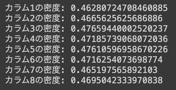
print("カラム1の密度:", density_work_year)
print("カラム2の密度:", density_experience_level)
print("カラム3の密度:", density_employment_type)
print("カラム4の密度:", density_job_title)
print("カラム5の密度:", density_employee_residence)
print("カラム6の密度:", density_remote_ratio)
print("カラム7の密度:", density_company_location)
print("カラム8の密度:", density_company_size)
実行結果

# 密度の高い順番に変数へ入れ、重回帰とロッソ回帰でそれぞれ正確性を再度確認。
# 順番に入れるだけでなく、他の組み合わせを試し最終的に正確性の高い組み合わせを調べる。

# job_title remote_ratio company_size experience_level company_location work_year
X = all_data[['employment_type', 'employee_residence','remote_ratio','experience_level','company_location','work_year']].values
y = all_data['salary_in_usd'].values
train_X, test_X, train_y, test_y = train_test_split(X, y, random_state=100)

# 標準化のためのインスタンスを生成
sc = StandardScaler()
# データの標準化
train_X_std = sc.fit_transform(train_X)
test_X_std = sc.transform(test_X)

# 主成分分析のインスタンスを生成
pca = PCA(n_components=2)

# トレーニングデータから変換モデルを学習し、テストデータに適用
train_X_pca = pca.fit_transform(train_X_std)
test_X_pca = pca.transform(test_X_std)

# モデルの構築
model = LinearRegression()

# モデルの学習
model.fit(train_X_pca, train_y)

# モデルの正確性確認
print(model.score(test_X_pca, test_y))
print("")

# ロッソ回帰を実行
print("ロッソ回帰")
model_lasso.fit(train_X_pca, train_y)
print(model_lasso.score(test_X_pca, test_y))
print("")

結果:
・特微量を調整したところ、正確性は少しだけ上がった。
・目的結果とその他のカラムとの密度を計算後、密度の高い順番にXへ貼り付け正確性を計算したが、密度の高さと正確性の高さは比例していなかった。結果として3番目、4番目、5番目に密度の高いカラムをXの値から削除した組み合わせの正確性が最も高い結果となった。
・しかしながら、標準化前の正確性より低いままであった。
分析:
・使用したデータの量がもう少し多ければディープラーニングを試すこともできたので、今度は更に情報量の多いデータセット使って試してみようと思います。
5, まとめ
今回使用したデータ並びに分析方法からは、以下の項目がデータサイエンティスの年収との相関性が見つかった。しかしながら依然正確性が低いため、他のデータセットを使った分析をしないことには、以下の項目と年収の相関性があるとは言えないと思います。
・employment_type
・employee_residence
・remote_ratio
・experience_level
・company_location
・work_year
6, おわりに
今回はデータ分析の3ヶ月コースを受講しました。
コースを受講するだけではあまり理解を深めることなく進めていましたが、
他の方が言う通り実際に手を動かし、わからないことはチューターさんに質問をし解決することで、
より理解が深まったと思います。
今回の学習を通して機械学習の基本を学びましたが、実際にコーディングをしたのは更に一部の知識を使っただけにすぎず、本当の意味ではまだまだ自分のスキルにできていないと思います。
今後も継続的にスキルを磨いていき、普段の実務にも活かしていきます。