概要
異なる次元のグラフを同時に書きたいことは多々あると思います。
matplotlibを使って共通のxに対しy軸が二つある2軸グラフを書いていこうと思います。
とりあえずかく
まず、最もシンプルなケースとしてある軸にsin(x), 別軸にcos(x)を描いてみます。
ax1に対して、twinx()でax2を設定し、それぞれのAxeに対し、plotすれば書くことができます。
import matplotlib.pyplot as plt
import math as ma
import numpy as np

plt.figure(figsize=(10,8))
fig, ax1 = plt.subplots()
ax2 = ax1.twinx() # 二つ目の軸を定義

x = np.arange(0,2*ma.pi, 0.1)
y = np.sin(x) # 一つ目の軸ではsin(x)
y2 = np.cos(x) #二つ目の軸ではcos(x)

ax1.plot(x, y, color='black')
ax1.set_ylabel('$\sin(x)$') # ラベルを設定
ax2.plot(x, y2, color='red')
ax2.set_ylabel('$\cos(x)$')
# plt.savefig('sin_cos.png', bbox_inches="tight") # bbox_inches="tight"でラベルの見切れを防ぐ
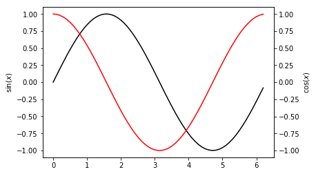
画像を出力した際にラベルが見切れてしまうのでこちらの記事を参考にして、pet.savefigにbbox_inches="tight"を追加します。
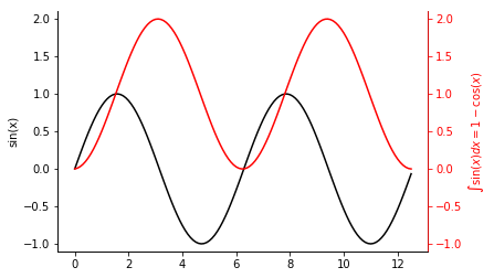
装飾を施す
次は少し装飾を施して凝ったグラフを作ってみましょう。
$$y = \sin(x)$$
$$y = \int_0^x \sin(x) dx = 1-\cos(x)$$
を書いていきます。
ax.set_ylimでy軸の範囲を変えられます。
また軸ごとに色を変えることもできます。
ax.spines['right'].set_color('red')で右の軸の色を赤に,
ax.tick_params(axis = 'y', colors ='red')でy軸の目盛りを赤にできます。
ただし、これらはそれぞれのAxeに対して定義されているので、後で定義する方で上書きすることとなります。
そのため上の枠線を消す際は両方のAxeのalphaを0にしないと消えてくれません。
plt.figure(figsize=(10,7))
fig, value = plt.subplots()
integral = value.twinx()

x = np.arange(0, 4*ma.pi, 0.1)
y = np.sin(x)
value.plot(x, y, color = 'black')
value.set_ylim(-1.1, 2.1) # value軸の範囲設定
value.set_ylabel('sin(x)')


Y = np.cumsum(y*0.1) # 配列の各要素を足し合わせる
integral.plot(x, Y, color = 'red')
integral.set_ylim(-1.1, 2.1)
integral.spines['right'].set_color('red') # integral軸の色を変える
integral.tick_params(axis = 'y', colors ='red')# integral軸の目盛りの色を変える
integral.set_ylabel(r'$\int \sin(x) = 1-\cos(x)$', color = 'red')


value.spines['top'].set_alpha(0) # valueに対する上の枠線を消す
integral.spines['top'].set_alpha(0) # integralに対する上の枠線を消す
# plt.savefig('sin_integral.png', bbox_inches="tight")
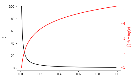
積分して遊んでみる
2軸用意することである関数とその積分値を表示することができます。
f(x) = 1/x
まず
$$y = \frac{1}{x}$$
$$y = \int_{0\leftarrow}^x \frac{1}{x} dx= \log(x)$$
を表示してみます。
plt.figure(figsize=(10,7))
fig, value = plt.subplots()
integral = value.twinx()

x = np.arange(0.01, 1, 0.01)
y = np.reciprocal(x)
value.plot(x, y, color='black')
value.set_ylabel(r'$\frac{1}{x}$')

Y = np.cumsum(y) # 配列の各要素を足し合わせる
integral.plot(x, Y, color='red')
integral.spines['right'].set_color('red')
integral.tick_params(axis = 'y', colors ='red')
integral.set_ylabel(r'$\int \frac{1}{x} = log(x)$', color = 'red')


value.spines['top'].set_alpha(0)
integral.spines['top'].set_alpha(0)
# plt.savefig('reciprocal.png', bbox_inches="tight")
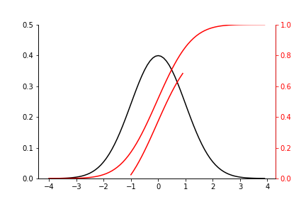
正規分布
次は正規分布とその積分について考えてみます。
積分範囲を変えて、複数の積分値について考えてみます。
もちろんy軸が一つの場合と同様、同じ軸に対して複数のグラフを重ねることもできます。
plt.figure(figsize=(10,7))
fig, value = plt.subplots()
integral = value.twinx()

def normal_dist(x, sigma, mu):
    return 1/ma.sqrt(2*ma.pi*sigma**2) * ma.exp(-(x-mu)**2/(2*sigma**2))

sigma = 1
mu = 0
x = np.arange(-4*sigma, 4*sigma, 0.1)
y = [normal_dist(i, sigma, mu) for i in x]
value.plot(x, y, color='black')
value.set_ylim(0,0.5)


x4 = np.arange(-1*sigma, 1*sigma, 0.1)
y4 = np.array([normal_dist(i, sigma, mu) for i in x4])
Y4 = np.cumsum(y4*0.1)
integral.plot(x4, Y4, color='red')


x2 = np.arange(-4*sigma, 4*sigma, 0.1)
y2 = np.array([normal_dist(i, sigma, mu) for i in x2])
Y2 = np.cumsum(y2*0.1)
integral.plot(x2, Y2, color='red')

integral.spines['right'].set_color('red')
integral.tick_params(axis = 'y', colors ='red')
integral.set_ylim(0,1)


value.spines['top'].set_alpha(0)
integral.spines['top'].set_alpha(0)
# plt.savefig('normal_dist.png')
参考
[Red Green Black and White
NOZAWA Kento Seaborn tips]
(https://nzw0301.github.io/2016/07/seaborn-tips)
リソース
こちらのリポジトリに実行コードがあります。
https://github.com/YutoOhno/MultipleAxes