この記事の目的
複数のクラスターの散布図を描いたときに, 点が重なって見づらいことありますよね.
そこで, Plotlyを使って1クラスターずつ確認できるようなプロットを作成しました.
背景
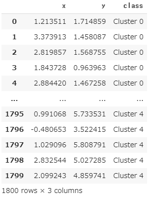
例えば, 5つのクラスターに分かれたxy座標を持つこんなデータがあったとき,
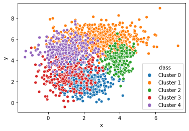
例えば, seabornなら1行で以下のプロットが描けます.
sns.scatterplot(x="x", y="y", hue="class", data=df)
ただ, 上のままだとちょっと見づらいので, 透明度alphaを指定しますが,
sns.scatterplot(x="x", y="y", hue="class", data=df, alpha=0.5)
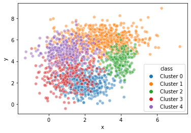
少し改善したものの, 今回のデータでは相変わらず見づらいです.
そこでクラスターを1つ1つ分けてプロットすることができれば...と考えPlotlyを使ってみました.
解説
まず, ライブラリの準備をして,
import numpy as np
import pandas as pd

import seaborn as sns
import matplotlib.pyplot as plt
import plotly.graph_objects as go
import plotly
ダミーデータを準備します.
x0 = np.random.normal(2, 0.8, 400)
y0 = np.random.normal(2, 0.8, 400)
x1 = np.random.normal(3, 1.2, 600)
y1 = np.random.normal(6, 0.8, 600)
x2 = np.random.normal(4, 0.4, 200)
y2 = np.random.normal(4, 0.8, 200)
x3 = np.random.normal(1, 0.8, 300)
y3 = np.random.normal(3, 1.2, 300)
x4 = np.random.normal(1, 0.8, 300)
y4 = np.random.normal(5, 0.8, 300)

df = pd.DataFrame()

df["x"] = np.concatenate([x0, x1, x2, x3, x4])
df["y"] = np.concatenate([y0, y1, y2, y3, y4])
df["class"] = ["Cluster 0"]*400 + ["Cluster 1"]*600 + ["Cluster 2"]*200+ ["Cluster 3"]*300+ ["Cluster 4"]*300
続いて, 本題のプロット部分ですが,
先にすべてのコードを一旦お見せします.
def plotly_scatterplot(x, y, hue, data, title=""):
    cluster = df[hue].unique()
    n_cluster = len(cluster)
    colors = plt.rcParams['axes.prop_cycle'].by_key()['color']

    fig = go.Figure()

    button = []
    tf = [True]*n_cluster
    tmp = dict(label="all",
               method="update",
               args=[{"visible": tf}]
               )
    button.append(tmp)

    for i,clu in enumerate(cluster):
        fig.add_trace(
            go.Scatter(
                x = df[df[hue]==clu][x],
                y = df[df[hue]==clu][y],
                mode="markers",
                name=clu,
                marker=dict(color=colors[i])
                )
            )

        tf = [False]*n_cluster
        tf[i] = True
        tmp = dict(label=clu,
                   method="update",
                   args=[{"visible": tf}]
                   )
        button.append(tmp)


    fig.update_layout(
        updatemenus=[
            dict(type="buttons",
                 x=1.15,
                 y=1,
                 buttons=button
                 )
            ])

    x_min = df[x].min()
    x_max = df[x].max()
    x_range = x_max - x_min
    y_min = df[y].min()
    y_max = df[y].max()
    y_range = y_max - y_min

    fig.update_xaxes(range=[x_min-x_range/10, x_max+x_range/10])
    fig.update_yaxes(range=[y_min-y_range/10, y_max+x_range/10])
    fig.update_layout(
    title_text=title,
    xaxis_title=x,
    yaxis_title=y,
    showlegend=False,
    )

    fig.show()
    #plotly.offline.plot(fig, filename='graph.html')
めちゃくちゃ長くてすみません...
ポイントは2か所あります.
ポイント1
fig.add_trace(
    go.Scatter(
        x = df[df[hue]==clu][x],
        y = df[df[hue]==clu][y],
        mode="markers",
        name=clu,
        marker=dict(color=colors[i])
        )
    )
この部分では, データフレームdfの中のクラスター1つ1つの散布図を作成しています. colorsにはpltで自動で選択される色列が入っているので, color=colors[i]で, それを順番に指定しています.
ポイント2
tf = [False]*n_cluster
tf[i] = True
tmp = dict(label=clu,
           method="update",
           args=[{"visible": tf}]
           )
button.append(tmp)
tf には[False, True, False, False, False]のように真偽値が入っていて, どのtraceを表示・非表示にするかを選択しています.
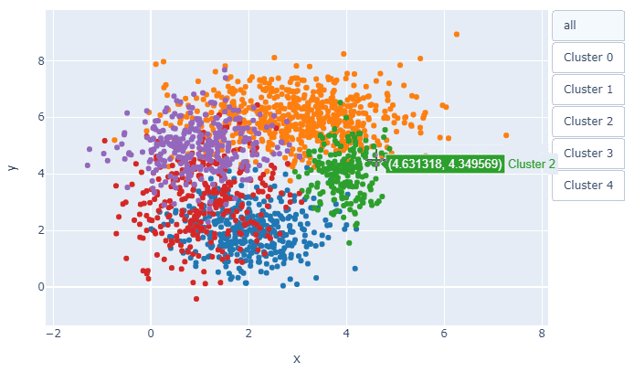
今回は, fig.add_traceで5枚の散布図が重なっていて, その何枚目を表示するかということです. tf=[True, True, True, True, True]とすべてTrueにすれば, 全データの散布図が表示されます.
あとは, 次の1行で,
plotly_scatterplot(x="x", y="y", hue="class", data=df, title="Scatter Plot")
冒頭のプロットが描けます.
以上!
参考
Plotly:Update Button
stack overflow:Get default line colour cycle