少し複雑な散布図を書いたときにその散布図のキャプションが見にくかったから、表形式で出力したいと思った。
やってる記事が見つからず、結構時間を溶かしたのでメモ代わり。
意外と需要あるんじゃないかと思ってる
後、コードは適当...
もっと簡単な方法があればコメント等くださるとありがたいです。
環境
- Python 3.6.2
- pyenv-virtualenv
- macOS 10.15
最終目的
こんな感じの表が作りたい。
(以下の表は特に意味のない、散布図です。)
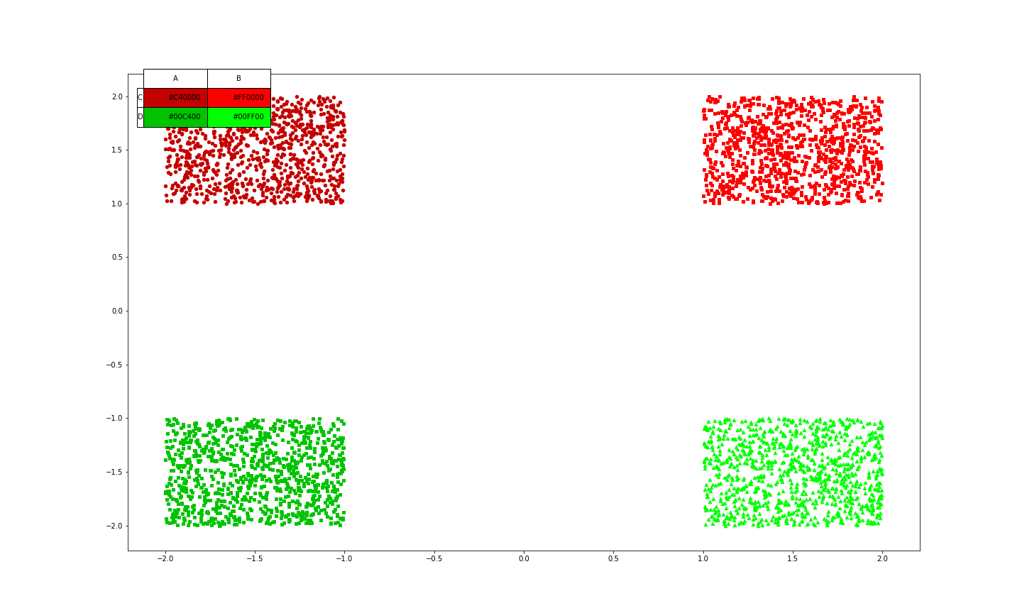
作り方は、表を散布図とテーブルの2つ作ってそれを重ねるという風にした。
そもそもPyPlotについて
PyPlotの仕様については以下の記事が非常にわかりやすい
matplotlib の figure(図) と axes(座標軸)-python
実装
とりあえず、適当に乱数で点を作る。
_x1 = np.random.rand(1000) + 1
_y1 = np.random.rand(1000) + 1
_x2 = np.random.rand(1000) - 2
_y2 = np.random.rand(1000) + 1
_x3 = np.random.rand(1000) + 1
_y3 = np.random.rand(1000) - 2
_x4 = np.random.rand(1000) - 2
_y4 = np.random.rand(1000) - 2
今後はこの乱数から、生成したものをを使用する。
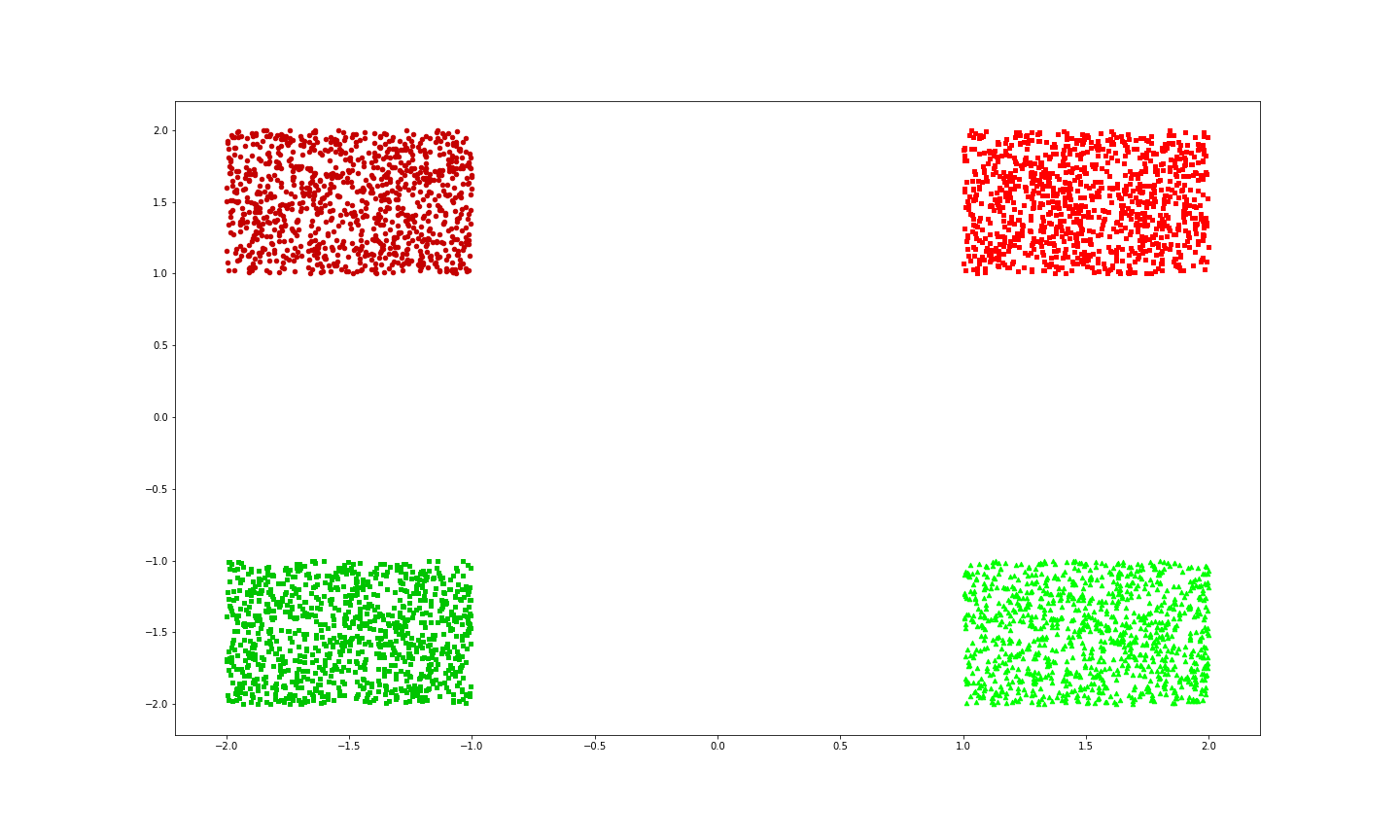
普通の散布図
まずは普通の散布図を作る。
plot.figure(figsize=(20, 12))
plot.scatter(_x1, _y1, s=20, c='#FF0000', marker='s')
plot.scatter(_x2, _y2, s=20, c='#C40000', marker='o')
plot.scatter(_x3, _y3, s=20, c='#00FF00', marker='^')
plot.scatter(_x4, _y4, s=20, c='#00C400', marker=',')
plot.show()
出力は以下のようになる。
表の下に新たにテーブルを持った表を作る
テーブルの作りかたは以下を参考にした。
python – Matplotlibテーブルのみ
plot.figure(figsize=(20, 12))
plot.subplot(2,1,1)
plot.scatter(_x1, _y1, s=20, c='#FF0000', marker='s')
plot.scatter(_x2, _y2, s=20, c='#C40000', marker='o')
plot.scatter(_x3, _y3, s=20, c='#00FF00', marker='^')
plot.scatter(_x4, _y4, s=20, c='#00C400', marker=',')
data = np.array([['#C40000', '#FF0000'],
                 ['#00C400', '#00FF00']])
columns = ['A', 'B']
rows = ['C', 'D']
df = pd.DataFrame(data, index=rows, columns=columns)
plot.subplot(2,1,2)
plot.table(cellText=df.values, rowLabels=df.index, colLabels=df.columns, loc='upper left', cellColours=df.values)
plot.show()
出力は以下のようになる。
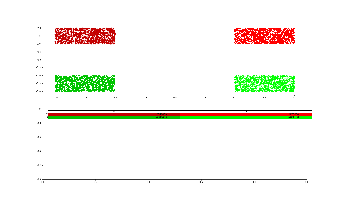
subplotで1つの図の中に2つの表を入れている状態にはなったが、下側の表が邪魔である。
下の表を消し、テーブルを上に持ってくる
下の表を消し、2つの表と表の間隔をいじることで、テーブルを上に持ってくる。
表と表の間隔のいじり方は以下を参考にした。
matplotlib subplot。グラフ間の間隔を調整-python
plot.figure(figsize=(20, 12))
plot.subplot(2,1,1)
plot.scatter(_x1, _y1, s=20, c='#FF0000', marker='s')
plot.scatter(_x2, _y2, s=20, c='#C40000', marker='o')
plot.scatter(_x3, _y3, s=20, c='#00FF00', marker='^')
plot.scatter(_x4, _y4, s=20, c='#00C400', marker=',')
data = np.array([['#C40000', '#FF0000'],
                 ['#00C400', '#00FF00']])
columns = ['A', 'B']
rows = ['C', 'D']
df = pd.DataFrame(data, index=rows, columns=columns)
plot.subplot(2,1,2)
# 表を消してる
plot.axis('tight')
plot.axis('off')
plot.table(cellText=df.values, rowLabels=df.index, colLabels=df.columns, loc='upper left', cellColours=df.values)
# 表の間隔を変えている(好みに合わせていじってください)
plot.subplots_adjust(hspace= - 1.03)
plot.show()
出力は以下のようになり、だいぶそれっぽくなった。
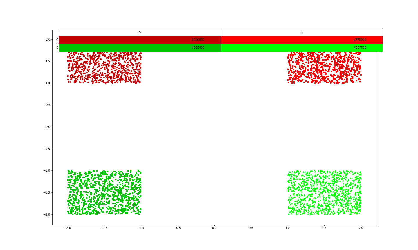
ただ、少し、テーブルが横に広いので、大きさを変えてあげる。
テーブルの大きさを変える
テーブルのセルの横幅を変えることでそれっぽくする(横幅しか変えられない)
plot.figure(figsize=(20, 12))
plot.subplot(2,1,1)
plot.scatter(_x1, _y1, s=20, c='#FF0000', marker='s')
plot.scatter(_x2, _y2, s=20, c='#C40000', marker='o')
plot.scatter(_x3, _y3, s=20, c='#00FF00', marker='^')
plot.scatter(_x4, _y4, s=20, c='#00C400', marker=',')
data = np.array([['#C40000', '#FF0000'],
                 ['#00C400', '#00FF00']])
columns = ['A', 'B']
rows = ['C', 'D']
df = pd.DataFrame(data, index=rows, columns=columns)
plot.subplot(2,1,2)
plot.axis('tight')
plot.axis('off')
# colWidthsでセルの横幅を変えている(好みでいじってください)
plot.table(cellText=df.values, rowLabels=df.index, colLabels=df.columns,
           colWidths=[0.08, 0.08, 0.08, 0.08], loc='upper left', cellColours=df.values)
plot.subplots_adjust(hspace= - 1.03)
出力は以下のようになり、完成である。

まとめ
最終的なコードは以下のようなものである。
# 乱数による点の作成
_x1 = np.random.rand(1000) + 1
_y1 = np.random.rand(1000) + 1
_x2 = np.random.rand(1000) - 2
_y2 = np.random.rand(1000) + 1
_x3 = np.random.rand(1000) + 1
_y3 = np.random.rand(1000) - 2
_x4 = np.random.rand(1000) - 2
_y4 = np.random.rand(1000) - 2

# 散布図の作成
plot.figure(figsize=(20, 12))
plot.subplot(2,1,1)
plot.scatter(_x1, _y1, s=20, c='#FF0000', marker='s')
plot.scatter(_x2, _y2, s=20, c='#C40000', marker='o')
plot.scatter(_x3, _y3, s=20, c='#00FF00', marker='^')
plot.scatter(_x4, _y4, s=20, c='#00C400', marker=',')
data = np.array([['#C40000', '#FF0000'],
                 ['#00C400', '#00FF00']])
columns = ['A', 'B']
rows = ['C', 'D']
df = pd.DataFrame(data, index=rows, columns=columns)
plot.subplot(2,1,2)
# 表を消してる
plot.axis('tight')
plot.axis('off')
# colWidthsでセルの横幅を変えている(好みでいじってください)
plot.table(cellText=df.values, rowLabels=df.index, colLabels=df.columns,
           colWidths=[0.08, 0.08, 0.08, 0.08], loc='upper left', cellColours=df.values)
# 表の間隔を変えている(好みに合わせていじってください)
plot.subplots_adjust(hspace= - 1.03)
この方法なら、カラーテーブルを載せた散布図をいい感じの位置に自分で持ってきて載せることができる。
試してはいないが、グラフの右下に小さいグラフを上から被せて載せたりもできるんじゃないかと思ってる。
参考記事
matplotlib の figure(図) と axes(座標軸)-python
python – Matplotlibテーブルのみ
matplotlib subplot。グラフ間の間隔を調整-python