bokehとは
Bokehは、Pythonでインタラクティブなグラフやビジュアライゼーションを作成するためのライブラリです。
インタラクティブ性や多様なプロットタイプ,カスタマイズ可能性に着目し勉強してみました。
折れ線グラフ
こんな感じのグラフが作成できます
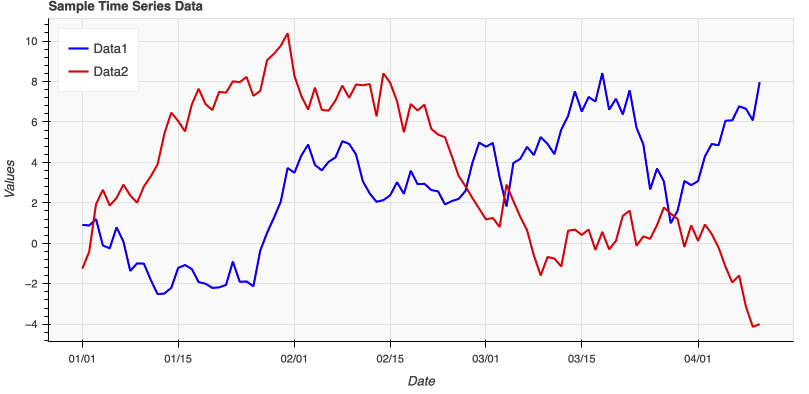
下記はコードです。
import pandas as pd
import numpy as np
from bokeh.plotting import figure, show, output_file
from bokeh.models import ColumnDataSource

# サンプル時系列データを生成
dates = pd.date_range(start="2022-01-01", periods=100, freq="D")
data1 = np.cumsum(np.random.randn(100))
data2 = np.cumsum(np.random.randn(100))

# データをDataFrameに変換
df = pd.DataFrame({'date': dates, 'data1': data1, 'data2': data2})

# BokehのColumnDataSourceを作成
source = ColumnDataSource(df)

# HTML出力ファイルを設定
output_file("time_series_plot.html")

# Figureを作成
p = figure(title="Sample Time Series Data", x_axis_label='Date', y_axis_label='Values', x_axis_type='datetime', width=800, height=400, toolbar_location=None, background_fill_color="#fafafa")

# データをプロット
p.line('date', 'data1', source=source, legend_label="Data1", line_width=2, color="blue")
p.line('date', 'data2', source=source, legend_label="Data2", line_width=2, color="red")

# レジェンドの位置を設定
p.legend.location = "top_left"

# グラフを表示(HTMLファイルに保存)
show(p)
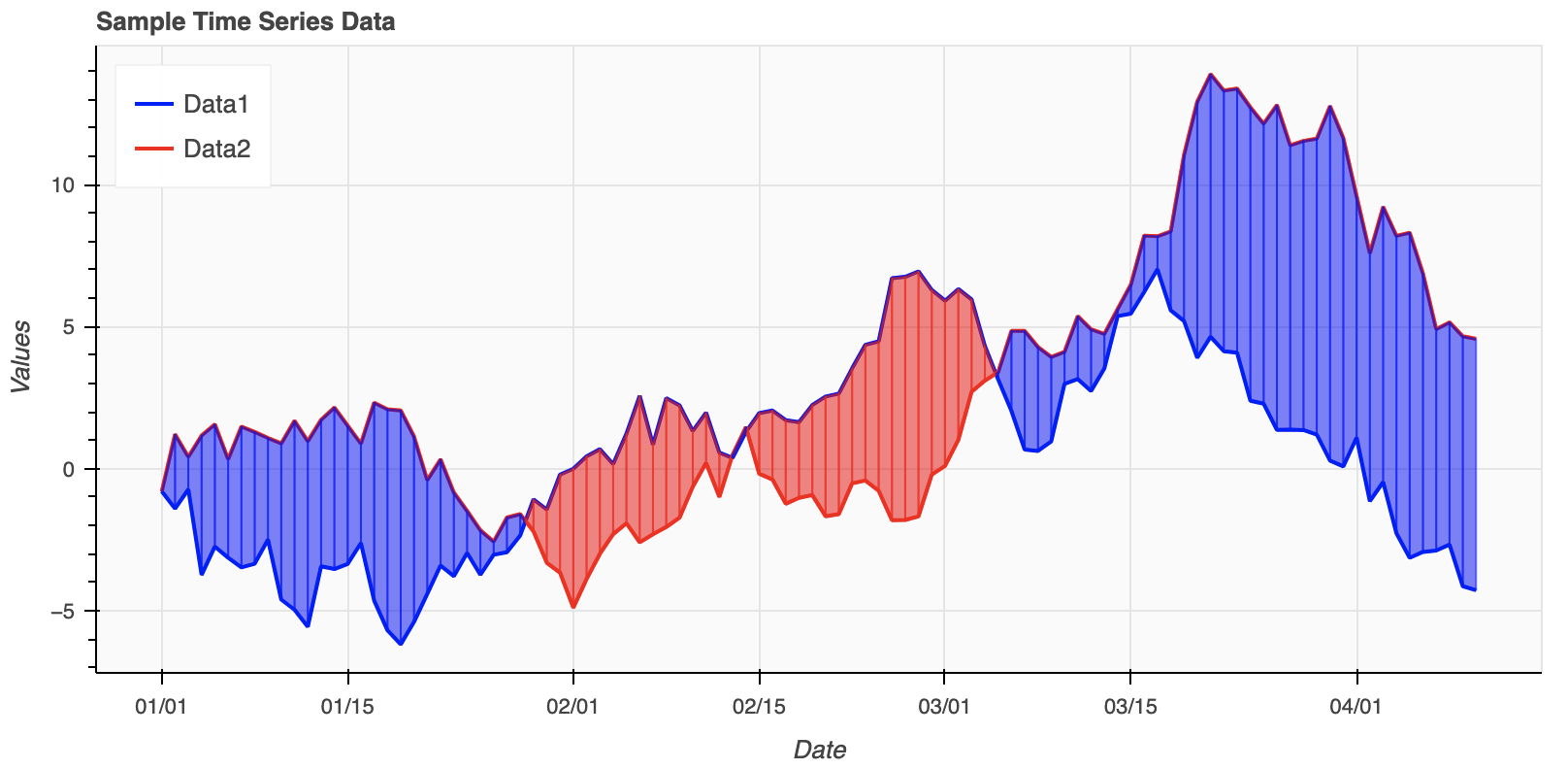
下記のように2つのグラフ間を塗りつぶしたりできます。
import pandas as pd
import numpy as np
from bokeh.plotting import figure, show, output_file
from bokeh.models import ColumnDataSource

# サンプル時系列データを生成
dates = pd.date_range(start="2022-01-01", periods=100, freq="D")
data1 = np.cumsum(np.random.randn(100))
data2 = np.cumsum(np.random.randn(100))

# データをDataFrameに変換
df = pd.DataFrame({'date': dates, 'data1': data1, 'data2': data2})

# BokehのColumnDataSourceを作成
source = ColumnDataSource(df)

# HTML出力ファイルを設定
output_file("time_series_plot.html")

# Figureを作成
p = figure(title="Sample Time Series Data", x_axis_label='Date', y_axis_label='Values', x_axis_type='datetime', width=800, height=400, toolbar_location=None, background_fill_color="#fafafa")

# データをプロット
p.line('date', 'data1', source=source, legend_label="Data1", line_width=2, color="blue")
p.line('date', 'data2', source=source, legend_label="Data2", line_width=2, color="red")

# 塗りつぶし領域のプロット
for i in range(len(df)-1):
    if df['data1'][i] > df['data2'][i] and df['data1'][i+1] > df['data2'][i+1]:
        # Both points have data1 > data2
        p.patch([df['date'][i], df['date'][i+1], df['date'][i+1], df['date'][i]],
                [df['data2'][i], df['data2'][i+1], df['data1'][i+1], df['data1'][i]],
                color="red", alpha=0.5)
    elif df['data1'][i] <= df['data2'][i] and df['data1'][i+1] <= df['data2'][i+1]:
        # Both points have data1 <= data2
        p.patch([df['date'][i], df['date'][i+1], df['date'][i+1], df['date'][i]],
                [df['data1'][i], df['data1'][i+1], df['data2'][i+1], df['data2'][i]],
                color="blue", alpha=0.5)
    else:
        # Intersection within this segment
        x0, x1 = df['date'][i], df['date'][i+1]
        y0_data1, y1_data1 = df['data1'][i], df['data1'][i+1]
        y0_data2, y1_data2 = df['data2'][i], df['data2'][i+1]

        # Compute intersection
        x_intersect = x0 + (x1 - x0) * (y0_data1 - y0_data2) / ((y0_data1 - y0_data2) - (y1_data1 - y1_data2))
        y_intersect = y0_data1 + (x_intersect - x0) * (y1_data1 - y0_data1) / (x1 - x0)

        if df['data1'][i] > df['data2'][i]:
            p.patch([x0, x_intersect, x_intersect, x0],
                    [y0_data2, y_intersect, y_intersect, y0_data1],
                    color="red", alpha=0.5)
            p.patch([x_intersect, x1, x1, x_intersect],
                    [y_intersect, y1_data2, y1_data1, y_intersect],
                    color="blue", alpha=0.5)
        else:
            p.patch([x0, x_intersect, x_intersect, x0],
                    [y0_data1, y_intersect, y_intersect, y0_data2],
                    color="blue", alpha=0.5)
            p.patch([x_intersect, x1, x1, x_intersect],
                    [y_intersect, y1_data1, y1_data2, y_intersect],
                    color="red", alpha=0.5)

# レジェンドの位置を設定
p.legend.location = "top_left"

# グラフを表示(HTMLファイルに保存)
show(p)
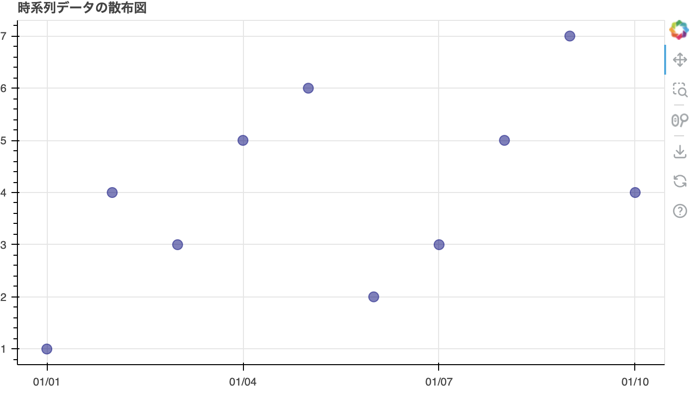
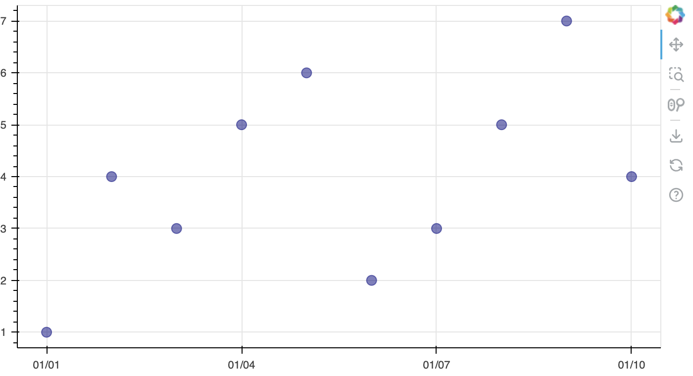
散布図
下記のように散布図を作成することもできます。
from bokeh.plotting import figure, show, output_file
from bokeh.models import ColumnDataSource
import pandas as pd
# サンプルデータを作成
data = {
'date': pd.date_range('2023-01-01', periods=10),
'value': [1, 4, 3, 5, 6, 2, 3, 5, 7, 4]
}
df = pd.DataFrame(data)
# ColumnDataSourceを作成
source = ColumnDataSource(df)
# figureを作成
p = figure(x_axis_type="datetime", title="時系列データの散布図", height=400, width=700)
# 散布図を描画
p.circle('date', 'value', size=10, color="navy", alpha=0.5, source=source)
# 出力ファイルを指定
output_file("scatter_plot.html")
# プロットを表示(HTMLファイルに保存)
show(p)
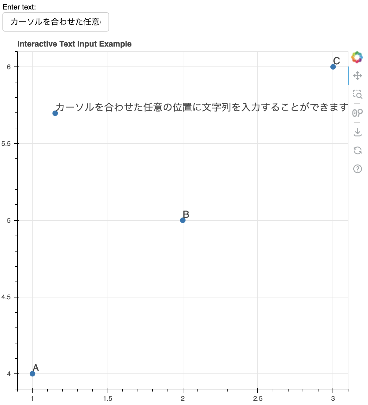
グラフの中にテキストを入力することができます。
Enter textの入力フォームに文字列を入力しグラフをクリックすると、入力されたテキストがその位置に追加されます。
from bokeh.plotting import figure, show, output_file
from bokeh.models import ColumnDataSource, CustomJS, LabelSet
from bokeh.layouts import column
from bokeh.models.widgets import TextInput

# HTMLファイルに出力する設定
output_file("interactive_text_input.html")

# 初期データ
initial_data = dict(x=[1, 2, 3], y=[4, 5, 6], text=['A', 'B', 'C'])
source = ColumnDataSource(data=initial_data)

# プロットの作成
p = figure(width=600, height=600, title="Interactive Text Input Example")

# 初期プロット
p.scatter(x='x', y='y', size=8, source=source)

# ラベルセットの作成
labels = LabelSet(x='x', y='y', text='text', level='glyph', source=source)
p.add_layout(labels)

# JavaScriptコールバック
callback = CustomJS(args=dict(source=source), code="""
    const data = source.data;
    const text = text_input.value;
    const x = cb_obj.x;
    const y = cb_obj.y;
    data['x'].push(x);
    data['y'].push(y);
    data['text'].push(text);
    source.change.emit();
""")

# プロットにタップツールの追加
p.js_on_event('tap', callback)

# テキスト入力ウィジェット
text_input = TextInput(value="Sample Text", title="Enter text:")

# テキスト入力ウィジェットをJavaScriptコールバックに渡す
callback.args['text_input'] = text_input

# レイアウト
layout = column(text_input, p)

# グラフの表示
show(layout)
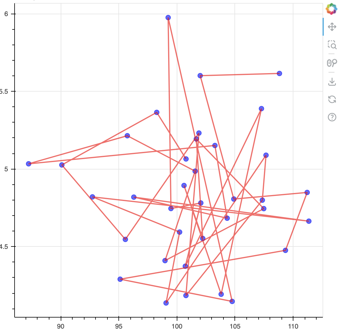
散布図を時系列順にラインで繋ぐことができます
from bokeh.plotting import figure, show
from bokeh.io import curdoc
from bokeh.models import ColumnDataSource
import numpy as np

# 仮データの生成
np.random.seed(0)
dates = np.arange('2020-01', '2023-01', dtype='datetime64[M]')
cpi = np.random.normal(loc=100, scale=5, size=len(dates))
unemployment_rate = np.random.normal(loc=5, scale=0.5, size=len(dates))

# データソースの作成
source = ColumnDataSource(data=dict(
    dates=dates,
    cpi=cpi,
    unemployment_rate=unemployment_rate
))

# プロットの準備
p = figure(title="Phillips Curve", x_axis_label='CPI', y_axis_label='Unemployment Rate')

# 散布図の描画
p.circle('cpi', 'unemployment_rate', size=8, source=source, color='blue', alpha=0.6)

# 線で繋げる
p.line('cpi', 'unemployment_rate', source=source, line_width=2, color='red', alpha=0.6)

# プロットの表示
curdoc().add_root(p)
show(p)
終わりに
今後もこんな感じでbokehでのグラフ作成やデータ分析の発信もしていきます