概要
matplotlibでグラフを作っていると、色を連続的に変えてプロットしてカラーバーも付けたい場合がある。そんなときに便利なのが、matplotlib.collections.LineCollectionである。このLineCollectionを使ったカラーバー付きグラフの作成方法について紹介する。
実装
Google Colabで作成した本記事のコードは、こちらにあります。
各種インポート
各種インポート
import numpy as np
import matplotlib.pyplot as plt
import matplotlib.cm as cm
from matplotlib.collections import LineCollection
実行時の各種バージョン
| Name | Version |
|---|---|
| numpy | 1.21.6 |
| matplotlib | 3.2.2 |
方法
-
np.column_stackで、xとyのプロット情報をまとめて、空配列linesにappendする。 -
LineCollection(lines, cmap=cm.jet, array=scales)のarrayには、カラーマップにしたい値の配列を入れる。(サンプルでは、scalesというパラメータを変えてプロット情報をまとめていたので、scalesを指定している。) -
ax.add_collection(lc)でaxオブジェクトに2の情報を追加する。 -
ax.autoscale()でグラフの表示範囲をオート(プロットエリア全体)にする。ここは重要で、LineCollection関数では仕様上、デフォルトではプロット情報に関わらずx軸y軸が0-1の範囲が表示される設定になっていると思われる。 -
fig.colorbarでカラーバーを表示する。
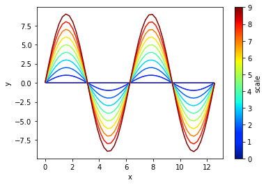
サンプル
x = np.linspace(0, 4*np.pi)
scales = np.arange(10)

lines = []
for scale in scales:
    y = scale * np.sin(x)
    lines.append(np.column_stack([x, y]))

fig, ax = plt.subplots()
lc = LineCollection(lines, cmap=cm.jet, array=scales)
line = ax.add_collection(lc)
# add_collection関数の後にautoscaleを指定しないとx,y軸が0-1の範囲のみが表示されるので注意
ax.autoscale()
ax.set_xlabel('x')
ax.set_ylabel('y')

fig.colorbar(line, label='scale')
plt.show()
出力結果
使用例(1つのグラフで連続的に色を変える例)
matplotlibでグラフを作っていると、1つのグラフ内で色を連続的に変えたい場合があるので、その一例を紹介する。
関数の準備
この関数は1つの配列を3点毎に区切ってnp.column_stackする。ただ、3点毎の両端の2点は被らすようにしたいため、range(1, len(x), 2)と3個飛ばしではなくあえて2個飛ばしにしている。配列は、numpy形式で使うようにしてください。
1つのグラフを連続的に色を変えるための関数
def single_line_stacks(x, y):
    """Parameters
    x: numpy 1D array
    y: numpy 1D array
    x and y should be the same size.
    """
    lines = []
    for coord in range(1, len(x), 2):
        # 1つのグラフを3点に分割して
        # その配列同士を被らせるようにstackする
        x_elems = x[coord-1:coord+2]
        y_elems = y[coord-1:coord+2]
        lines.append(np.column_stack([x_elems, y_elems]))
    return lines
グラフの傾き(微分)をカラーマップ表示
グラフの傾き(微分)をカラーマップ表示
x = np.linspace(0, 4*np.pi, 1000)
y = np.sin(x)
lines = single_line_stacks(x, y)
slope_cmap = np.cos(x[1::2])  # 傾き(微分)

fig, ax = plt.subplots()
lc = LineCollection(lines, cmap=cm.bwr, array=slope_cmap)
line = ax.add_collection(lc)
ax.autoscale()
ax.set_xlabel('x')
ax.set_ylabel('y')

fig.colorbar(line, label='slope')
plt.show()
出力結果
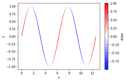
傾きが負のところを青、正のところを赤にすると分かりやすいですね。高校の数学の微分の授業はこのような図があると理解が進みそうな気がします。
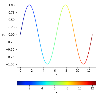
グラフのx軸をカラーマップ表示
グラフのx軸をカラーマップ表示
x = np.linspace(0, 4*np.pi, 1000)
y = np.sin(x)
lines = single_line_stacks(x, y)
x_cmap = x[1::2]

fig, ax = plt.subplots(figsize=(5, 6))
lc = LineCollection(lines, cmap=cm.jet, array=x_cmap)
line = ax.add_collection(lc)
ax.autoscale()
ax.set_xlabel('x')
ax.set_ylabel('y')

fig.colorbar(line, label='x', orientation='horizontal')
plt.show()
出力結果
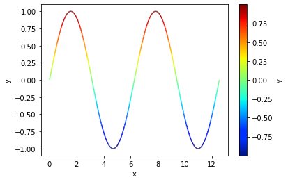
グラフのy軸をカラーマップ表示
グラフのy軸をカラーマップ表示
x = np.linspace(0, 4*np.pi, 1000)
y = np.sin(x)
lines = single_line_stacks(x, y)
y_cmap = y[1::2]

fig, ax = plt.subplots()
lc = LineCollection(lines, cmap=cm.jet, array=y_cmap)
line = ax.add_collection(lc)
ax.autoscale()
ax.set_xlabel('x')
ax.set_ylabel('y')

fig.colorbar(line, label='y')
plt.show()
出力結果
まとめ
matplotlibで連続的に色を変えてカラーバーを表示する方法を紹介しました。カラーマップ一つでグラフの見せ方が変わってくるところが楽しいです。誰かのお役に立てれば幸いです。
参考資料