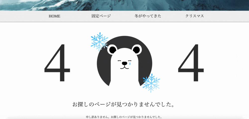
WordPressの自作テーマを作成中、404ページをちょっと変わったデザインにしてみようと思い、404の「0」の部分をしろくまに変えたデザインを作ってみました。
404ページに行くのが楽しくなる!...かも?
実際に作った、しろくまくん入りの404ページ
こちらが実際にWordPressテーマ作成中に作った、しろくまくん入りの404ページになります。
ページが見つからなかった。という悲しさを表現する為に泣かせています( ;∀;)
ちなみに雪の結晶以外は全て、HTMLとCSSのみで作りました!
書いたコード
※スマホで見るとぐしゃぐしゃになってしまいます(`;ω;´)
全体のコード
See the Pen 404Shirokuma by yuma11 (@yuma11) on CodePen.
しろくまの部分
See the Pen Shirokuma by yuma11 (@yuma11) on CodePen.
コードの解説
shirokuma.scss
.kuma { // しろくまの背景
  position: relative;
  margin: 0 auto;
  width: 320px;
  height: 320px;
  border-radius: 50%;
  background: #3c3c3b;
  &__ear { // 耳
    position: absolute;
    top: 50px;
    width: 60px;
    height: 60px;
    border-radius: 80px 100px 0 100px / 100px 130px 0 100px;
    background: #fff;
    &--left { // 左耳
      left: 60px;
      &:after { // 左耳の穴
        position: absolute;
        top: 12px;
        left: 12px;
        width: 40px;
        height: 40px;
        border-radius: 80px 100px 0 100px / 100px 130px 0 100px;
        background: #000;
        content: '';
      }
    }
    &--right { // 右耳
      right: 60px;
      transform: scale(-1, 1);
      &:after { // 右耳の穴
        position: absolute;
        top: 12px;
        right: 8px;
        width: 40px;
        height: 40px;
        border-radius: 80px 100px 0 100px / 100px 130px 0 100px;
        background: #000;
        content: '';
      }
    }
  }
  &__face { // 顔
    position: absolute;
    bottom: 0;
    left: 50%;
    width: 160px;
    height: 250px;
    border-radius: 80px 80px 0 0;
    background: #fff;
    transform: translateX(-50%);
    &:before { // 顔の左下部分(斜めになっている場所)
      position: absolute;
      bottom: 20px;
      left: -5px;
      width: 20px;
      height: 50px;
      background: white;
      content: '';
      transform: skewX(-20deg);
    }
    &:after { // 顔の右下部分(斜めになっている場所)
      position: absolute;
      right: -5px;
      bottom: 20px;
      width: 20px;
      height: 50px;
      background: white;
      content: '';
      transform: skewX(20deg);
    }
  }
  &__eye { // 目
    position: absolute;
    top: 130px;
    width: 20px;
    height: 20px;
    border-radius: 50%;
    background: #000;
    transform-origin: 100px 200px;
    animation: Cry 3s infinite;
    &--left { // 左目
      left: 120px;
      &:after { // 左目の中身(白い部分)
        position: absolute;
        top: 50%;
        left: 50%;
        width: 7px;
        height: 7px;
        border-radius: 50%;
        background: #fff;
        content: '';
        transform: translateX(-50%);
      }
    }
    &--right { // 右目
      right: 120px;
      &:after { // 右目の中身(白い部分)
        position: absolute;
        top: 50%;
        left: 50%;
        width: 7px;
        height: 7px;
        border-radius: 50%;
        background: #fff;
        content: '';
        transform: translateX(-50%);
      }
    }
  }
  &__tears { // 涙
    position: absolute;
    top: 145px;
    right: 125px;
    width: 8px;
    height: 15px;
    border-radius: 24px 24px 24px 24px / 63px 63px 24px 24px;
    background: skyblue;
    opacity: 0;
    animation: Tears 3s infinite;
  }
  &__nose { // 鼻
    position: absolute;
    top: 150px;
    left: 50%;
    width: 30px;
    height: 20px;
    border-radius: 40% 40% 55% 55%;
    background: #000;
    transform: translateX(-50%);
    &--bottom { // 鼻の下(縦に伸びている線)
      position: absolute;
      top: 150px;
      left: 50%;
      width: 3px;
      height: 30px;
      background: #000;
      transform: translateX(-50%);
    }
  }
  &__mouth { // 口
    position: absolute;
    top: 174px;
    width: 20px;
    height: 20px;
    border-width: 0 3px 3px 0;
    border-style: solid;
    border-color: #000;
    border-radius: 0 0 20px 0 / 0 0 20px 0;
    &--left { // 口の左側
      left: 135px;
      transform: rotate(25deg);
    }
    &--right { // 口の右側
      right: 135px;
      transform: rotate(65deg);
    }
  }
}

@keyframes Cry { // まばたきをするアニメーション
  0% {
    height: 20px;
    transform: translateY(0);
  }
  25% {
    height: 0;
    transform: translateY(15px);
  }
  50% {
    height: 20px;
    transform: translateY(0);
  }
  100% {
    height: 20px;
    transform: translateY(0);
  }
}

@keyframes Tears { // 涙が流れるアニメーション
  0% {
    opacity: 0;
    transform: translateY(0);
  }
  25% {
    opacity: 1;
  }
  50% {
    opacity: 0;
    transform: translateY(20px);
  }
  100% {
    opacity: 0;
    transform: translateY(0);
  }
}
作ってみて感じたこと
CSSで何か作るのって凄く楽しい...!!
書いたコードがすぐに反映されていくから楽しくて仕方なかったです(´∇`)
まだまだ技術的に足りない部分や、知らない部分が多いので今後もスキルを高めていきたいと思います。
ちなみにしろくまくんを作っている中で、border-radiusの値を8つ指定して使うことが多かったのですが、そんな時にかなり便利なサイトを見つけました↓
FANCY-BORDER-RADIUS
こちらのサイトは直感的に形を作るだけで、その形のborder-radiusの値を出してくれる便利なサイトです。
最後までご覧いただきありがとうございました!