はじめに
ここでは、Python初心者向けに、Matplotlibについて解説します。
Python3系の使用を想定しています。
ライブラリの読み込み
他のライブラリと同様に、importで読み込みます。
%matplotlib inllineは、Jupyter Notebookにおいて、ノートブック上でグラフを描画するための記述です。
matplotlib_1.py
%matplotlib inline
import matplotlib.pyplot as plt
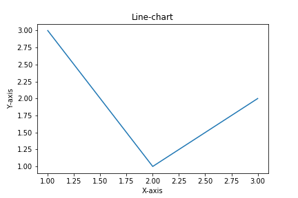
折れ線グラフ
折れ線グラフは、基本的には以下のように描画することができます。
matplotlib_2.py
%matplotlib inline
import matplotlib.pyplot as plt


x = [1, 2, 3]
y = [3, 1, 2]
plt.title('Line-chart') # グラフタイトル
plt.xlabel('X-axis') # x軸ラベル
plt.ylabel('Y-axis') # y軸ラベル

plt.plot(x, y) # グラフを作成
plt.savefig('matplotlib_2.png') # グラフを画像ファイルとして保存
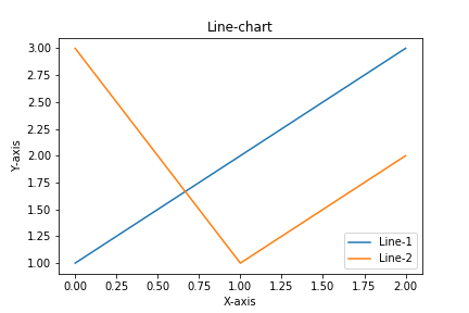
複数の折れ線グラフを描画する場合は以下のように書きます。
matplotlib_3.py
%matplotlib inline
import matplotlib.pyplot as plt


plt.plot([1, 2, 3])
plt.plot([3, 1, 2])
plt.title('Line-chart')
plt.xlabel('X-axis')
plt.ylabel('Y-axis')
plt.legend(['Line-1', 'Line-2']) # 凡例

plt.show() # グラフを表示
plt.savefig('matplotlib_3.png')
また、上のコードは以下のように書き換えることもできます。
matplotlib_4.py
%matplotlib inline
import matplotlib.pyplot as plt


fig, ax = plt.subplots()

ax.plot([1, 2, 3])
ax.plot([3, 1, 2])
ax.set_title('Line-chart')
ax.set_xlabel('X-axis')
ax.set_ylabel('Y-axis')
ax.legend(['Line-1', 'Line-2'])

plt.show()
plt.savefig('matplotlib_4.png')

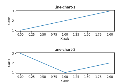
複数のグラフを縦に並べることもできます。
matplotlib_5.py
%matplotlib inline
import matplotlib.pyplot as plt


fig, ax = plt.subplots(2) # 2行に並べる
plt.subplots_adjust(wspace=1, hspace=1) # グラフ間のスペース

ax[0].plot([1, 2, 3])
ax[0].set_title('Line-chart-1')
ax[0].set_xlabel('X-axis')
ax[0].set_ylabel('Y-axis')
ax[1].plot([3, 1, 2])
ax[1].set_title('Line-chart-2')
ax[1].set_xlabel('X-axis')
ax[1].set_ylabel('Y-axis')

plt.show()
plt.savefig('matplotlib_5.png')
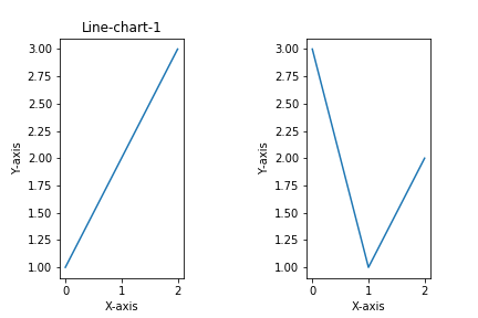
同様に、横に並べることもできます。
matplotlib_6.py
%matplotlib inline
import matplotlib.pyplot as plt


fig, ax = plt.subplots(1, 2) # 1行2列に並べる
plt.subplots_adjust(wspace=1, hspace=1)

ax[0].plot([1, 2, 3])
ax[0].set_title('Line-chart-1')
ax[0].set_xlabel('X-axis')
ax[0].set_ylabel('Y-axis')
ax[1].plot([3, 1, 2])
ax[0].set_title('Line-chart-1')
ax[1].set_xlabel('X-axis')
ax[1].set_ylabel('Y-axis')

plt.show()
plt.savefig('matplotlib_6.png')
棒グラフ
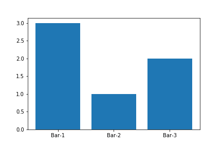
棒グラフは、以下のようにして描画することができます。
matplotlib_7.py
%matplotlib inline
import matplotlib.pyplot as plt


x = [1, 2, 3]
y = [3, 1, 2]

plt.bar(x, y, tick_label=['Bar-1', 'Bar-2', 'Bar-3']) # データ、ラベル名を指定して棒グラフを作成

plt.show()
plt.savefig('matplotlib_7.png')
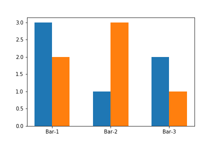
複数の棒グラフを横に並べる時は以下のように記述します。
matplotlib_8.py
%matplotlib inline
import matplotlib.pyplot as plt
import numpy as np


y1 = [3, 1, 2]
y2 = [2, 3, 1]
x = np.arange(len(y1))

bar_width = 0.3 # 棒グラフの幅を指定

plt.bar(x, y1, width=bar_width, align='center')
plt.bar(x+bar_width, y2, width=bar_width, align='center')
plt.xticks(x+bar_width/2, ['Bar-1', 'Bar-2', 'Bar-3'])

plt.show()
plt.savefig('matplotlib_8.png')
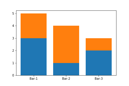
縦に重ねる時は、以下のように書きます。
matplotlib_9.py
%matplotlib inline
import matplotlib.pyplot as plt


x = [1, 2, 3]
y1 = [3, 1, 2]
y2 = [2, 3, 1]

plt.bar(x, y1, tick_label=['Bar-1', 'Bar-2', 'Bar-3'])
plt.bar(x, y2, bottom=y1) # y1の上にy2を乗せる

plt.show()
plt.savefig('matplotlib_9.png')
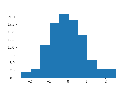
ヒストグラム
ヒストグラムを描画する時は以下のように記述します。
matplotlib_10.py
%matplotlib inline
import matplotlib.pyplot as plt
import numpy as np


num_random = np.random.randn(100)
plt.hist(num_random, bins=10) # ヒストグラムを作成

plt.show()
plt.savefig('matplotlib_10.png')
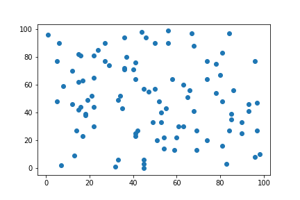
散布図
散布図の描画は以下の通りです。
matplotlib_11.py
%matplotlib inline
import matplotlib.pyplot as plt
import numpy as np


x = np.random.choice(np.arange(100), 100)
y = np.random.choice(np.arange(100), 100)

plt.scatter(x, y) # 散布図を作成

plt.show()
plt.savefig('matplotlib_11.png')
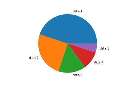
円グラフ
円グラフは、以下のようにして描画することができます。
matplotlib_12.py
%matplotlib inline
import matplotlib.pyplot as plt


percent_data = [45, 25, 15, 10, 5]

plt.pie(percent_data, labels=['data-1', 'data-2', 'data-3', 'data-4', 'data-5']) # 円グラフ(楕円)を作成
plt.axis('equal') # 円形にする

plt.show()
plt.savefig('matplotlib_12.png')
まとめ
ここでは、Matplotlibを用いて、折れ線グラフ、棒グラフ、ヒストグラム、散布図、円グラフを描画する方法について解説しました。
目的に応じて、適切なデータ可視化方法を選択できるようにしたいところです。