概要
最近WebアプリでかっこいいUIをさくっと作りたいときは、Carbon Design Systemをよく使っています。
この記事では、AngularでCarbon Design Systemを使って、テキストボックスに値を入力し、ボタンを押すとモーダルが表示されるだけのシンプルなUIの作り方をご紹介します。

Carbon Design Systemとは?
Carbon Design Systemは、IBMが提供しているオープンソースのデザインシステムです。
IBMの公式サイトやIBM Cloudのコンソールなどで利用されており、AngularやReact、Vue.jsなどのメジャーなフレームワークで利用できるようになっています。
青を差し色にした角張ったデザインがクールで個人的にお気に入りです。


前提
この記事は、以下のパッケージがインストールされていることを前提としています。
| パッケージ名 | バージョン |
|---|---|
| Node.js | 18.10.0 |
| npm | 8.19.2 |
| Angular CLI | 16.1.4 |
手順
Angularプロジェクトを作成する
以下のコマンドを実行し、Angularプロジェクトを作成します。
ng new my-carbon-tutorial
ルーティングは有効、スタイルのフォーマットはCSSで作成します。Carbon Design Systemの公式チュートリアルでは、SCSSを使っていますが、あえてCSSを選択しています(特に理由はないです)
? Would you like to add Angular routing? Yes
? Which stylesheet format would you like to use? CSS
Carbon Design Systemをインストールする
作成したAngularプロジェクトのディレクトリ配下に移動し、以下のコマンドを実行します。
npm i --save carbon-components-angular @carbon/styles
インストールが完了したら、styles.cssを開き、コードを以下の通り修正します。
margin-top-10とmargin-top-20は、Carbon Design Systemとは直接関係ありませんが、レイアウトの調整用に後で使いたいため、今のうちに追加しておきます。
@import '~@carbon/styles/css/styles.min.css';

.margin-top-10 {
  margin-top: 10px;
}
.margin-top-20 {
  margin-top: 20px;
}
styles.cssの修正が完了したら、app.module.tsを開き、コードを以下の通り修正します。
import { NgModule } from '@angular/core';
import { BrowserModule } from '@angular/platform-browser';
import { FormsModule }   from '@angular/forms';
import {
  ButtonModule,
  InputModule,
  ModalModule,
  ThemeModule,
  UIShellModule
} from 'carbon-components-angular';

import { AppRoutingModule } from './app-routing.module';
import { AppComponent } from './app.component';

@NgModule({
  declarations: [
    AppComponent
  ],
  imports: [
    BrowserModule,
    AppRoutingModule,
    FormsModule,
    ButtonModule,
    InputModule,
    ModalModule,
    ThemeModule,
    UIShellModule,
  ],
  providers: [],
  bootstrap: [AppComponent]
})
export class AppModule { }
ヘッダーを作成する
appディレクトリ配下で以下のコマンドを実行し、ヘッダーのコンポーネントを作成します。
ng g component components/header
header.component.tsを開き、コードを以下の通り修正します。
追加するのは、class内の@HostBindingの部分です。この記述がないと、ヘッダーがコンテンツの上に被さってしまうため、ヘッダーを表示する場合は忘れずに記述するようにしましょう。
import { Component, HostBinding } from '@angular/core';

@Component({
  selector: 'app-header',
  templateUrl: './header.component.html',
  styleUrls: ['./header.component.css']
})
export class HeaderComponent {
  @HostBinding('class.cds--header') headerClass = true;
}
header.component.htmlを開き、コードを以下の通り修正します。
cdsThemeの部分で、ヘッダーのテーマを指定しています。g100を指定した場合は、ヘッダーの背景色が黒、文字色が白で表示されます。ここはwhite g10 g90 g100のいずれかで指定する必要があります。ちなみに、gはgrayのgです。
cds-headerの部分がヘッダーの本体です。ロゴの部分に表示したい文字列をnameに指定しています。brandは指定しなくてもよいのですが、指定しない場合デフォルトでnameで指定している文字列の頭にIBMをつけてくる(今回の場合、brandを指定しないとIBM My Carbon Tutorialになる)ため、今回は空文字を指定しています。
<div cdsTheme="g100">
  <cds-header name="My Carbon Tutorial" brand="" />
</div>
header.component.tsとheader.component.htmlを修正したら、app.component.htmlを開き、コードを以下の通り修正します。
<app-header></app-header>
ここまでの修正が完了したら、ng serveでローカルサーバを起動させ、http://localhost:4200/ にアクセスしてみます。
以下の画像のように、画面上部にヘッダーが表示されればOKです。

メインページを作成する
appディレクトリ配下で以下のコマンドを実行し、メインページのコンポーネントを作成します。
ng g component components/main
main.component.tsを開き、コードを以下の通り修正します。
テキストボックスに入力された文字列を保持するフィールドとモーダルの開閉を制御するフィールドを定義しておきます。
import { Component } from '@angular/core';

@Component({
  selector: 'app-main',
  templateUrl: './main.component.html',
  styleUrls: ['./main.component.css']
})
export class MainComponent {
  public name = '';
  public isOpen = false;
}
main.component.htmlを開き、コードを以下の通り修正します。
inputタグにcdsText、buttonタグにcdsButtonをdirectiveとして指定することで、テキストボックスとボタンがCarbon Design Systemのスタイルになります。
cds-modalの部分は名前の通り、モーダルの表示に使用しています。
<h2>Welcome to Carbon Tutorial!</h2>

<div class="margin-top-20">
  <input cdsText placeholder="Your name please" [(ngModel)]="name"/>
</div>
<div class="margin-top-10">
  <button
    cdsButton="primary"
    [disabled]="!name.length"
    (click)="isOpen = !isOpen"
  >
    Hello!
  </button>
</div>

<cds-modal [open]="isOpen" (closeSelect)="isOpen = !isOpen">
  <cds-modal-header (closeSelect)="isOpen = !isOpen">
    <p class="cds--modal-header__heading">Success!!</p>
  </cds-modal-header>
  <div class="cds--modal-content">
    <p>Hello, {{name}}!!</p>
  </div>
  <cds-modal-footer>
    <ng-container>
      <button
        cdsButton="primary"
        (click)="isOpen = !isOpen"
      >
        Close
      </button>
    </ng-container>
  </cds-modal-footer>
</cds-modal>
main.component.tsとmain.component.htmlを修正したら、app-routing.module.tsを開き、コードを以下の通り修正します。
import { NgModule } from '@angular/core';
import { RouterModule, Routes } from '@angular/router';
import { MainComponent } from './components/main/main.component';

const routes: Routes = [
  {
    path: '',
    component: MainComponent
  }
];

@NgModule({
  imports: [RouterModule.forRoot(routes)],
  exports: [RouterModule]
})
export class AppRoutingModule { }
app-routing.module.tsを修正したら、app.component.htmlを開き、コードを以下の通り修正します。
コンテンツは、mainタグやdivタグで囲ったうえで、cds--contentをclassとして指定しておくと、paddingなどをよろしくやってくれます。逆に指定しないと、ヘッダーがコンテンツの上に被さってしまいます。
<app-header></app-header>
<main class="cds--content">
  <router-outlet></router-outlet>
</main>
ここまでの修正が完了したら、再度 http://localhost:4200/ にアクセスしてみます。
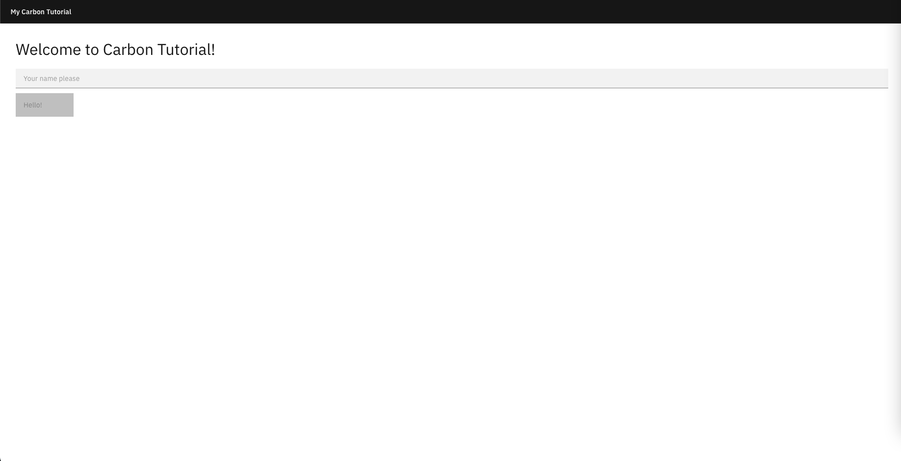
以下の画像のような画面が表示されたら、テキストボックスに適当な文字を入力し、「Hello!」ボタンをクリックしてください。
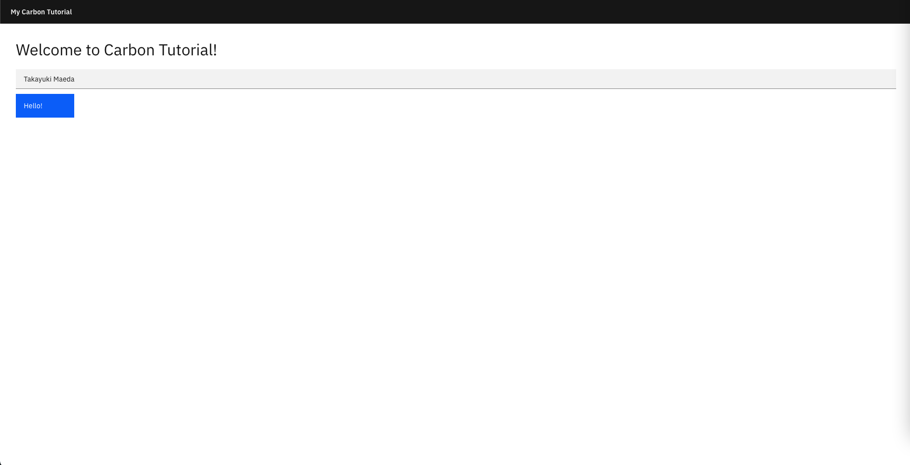
モーダルが表示され、「Hello, [テキストボックスに入力した文字]!!」と表示されればOKです。
参考文献