今更ですが、Storybookに手を出していこうと思い、環境構築から順にメモとして残していきます。
始めに
Storybookとは?

- 公式サイト:https://storybook.js.org/
- UIコンポーネントカタログが作成できるツール
- デザイナとプログラマの認識合わせに使える
- Docなども記載できるため、チーム開発での意思疎通にも使える
Storybookの環境構築
環境
Console
% node -v
v12.13.0
% npm -v
6.13.6
プロジェクトの作成
Vue CLIを使ってお好みの設定でプロジェクトを作成します。
Console
% npx @vue/cli create vue-storybook-demo

Vue CLI v4.2.2
? Please pick a preset: Manually select features
? Check the features needed for your project: TS, Linter
? Use class-style component syntax? Yes
? Use Babel alongside TypeScript (required for modern mode, auto-detected polyfills, transpiling JSX)? No
? Pick a linter / formatter config: Prettier
? Pick additional lint features: (Press <space> to select, <a> to toggle all, <i> to invert selection)Lint o
n save
? Where do you prefer placing config for Babel, ESLint, etc.? In dedicated config files
? Save this as a preset for future projects? No
開発サーバの起動
Console
% cd vue-storybook-demo
% npm run serve
ブラウザでhttp://localhost:8080/へアクセスし表示確認を行う。
Storybookプラグインの追加
Console
% npx @vue/cli add storybook

? What do you want to generate? Initial framework
? What storybook version do you want? (Please specify semver range) >=5.3.0
? Use Storybook CSF (component story format)? Yes
? Use Storybook Docs? Yes
自動生成されたサンプルの修正
今回のVueCLIの設定だと、自動生成されるサンプルでエラーが発生していたので、修正します。
src/components/MyButton.vue
 <script lang="ts">
- export default {
-   name: "my-button",
-
-   methods: {
-     onClick() {
-       this.$emit("click");
-     }
-   }
- };
+ import { Component, Vue } from "vue-property-decorator";
+
+ @Component
+ export default class MyButton extends Vue {
+   public onClick(){
+     this.$emit("click");
+   }
+ }
 </script>
Storybookサーバの起動
Console
% npm run storybook:serve
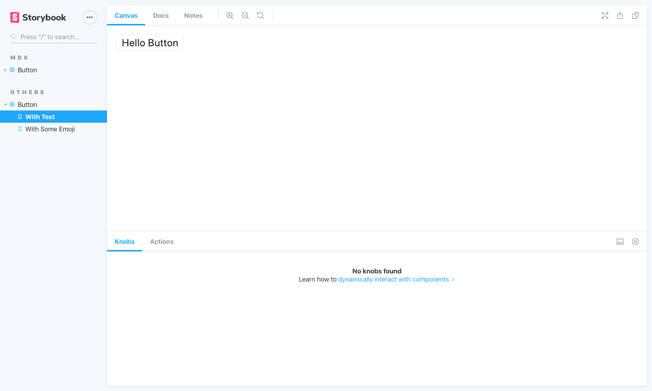
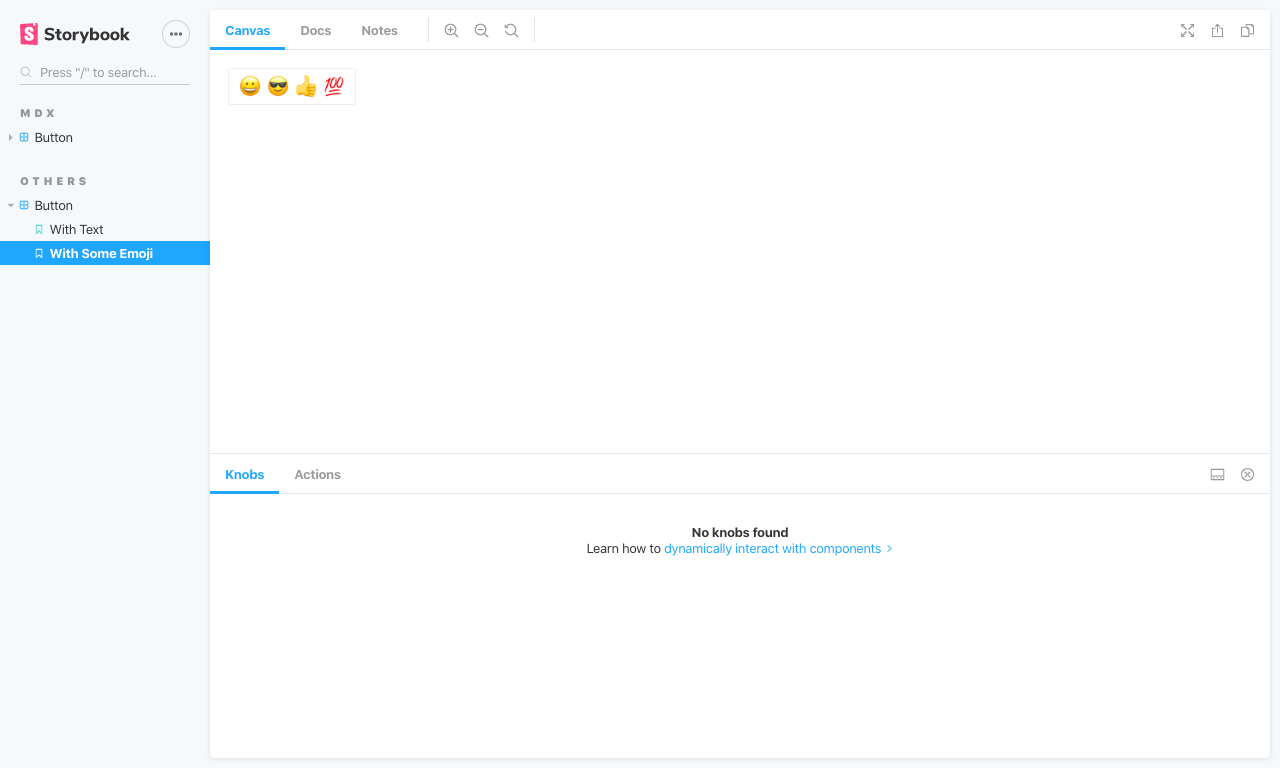
ブラウザでhttp://localhost:6006/?path=/story/button--with-textへアクセスし表示確認を行います。
(というか勝手にブラウザが開く。)
Storyの追加
オリジナルのコンポーネントの作成
以下のファイルを新規作成します。
src/components/MyHeading.vue
<template>
  <h1>
    <slot></slot>
  </h1>
</template>

<script lang="ts">
import { Component, Vue } from "vue-property-decorator";

@Component
export default class MyHeading extends Vue {}
</script>
Storyの追加
以下のファイルを新規作成します。
src/stories/MyHeading.stories.js
import MyHeading from "../components/MyHeading.vue";

export default {
  component: MyHeading,
  title: "Heading"
};

export const withText = () => ({
  components: { MyHeading },
  template: '<my-heading>Hello Title</my-heading>'
});
src/stories/MyHeadding.stories.mdx
import { Meta, Props, Story, Preview } from '@storybook/addon-docs/blocks';
import MyHeading from '../components/MyHeading.vue';

<Meta title="MDX|Heading" component={MyHeading} />

# MyHeading

<Props of={MyHeading} />

This is a simple button with some text in it.

<Preview>
  <Story name="With Text">
    {{
        components: { MyHeading },
        template: '<my-heading>Hello Title</my-heading>'
    }}
  </Story>
</Preview>
ブラウザで表示確認
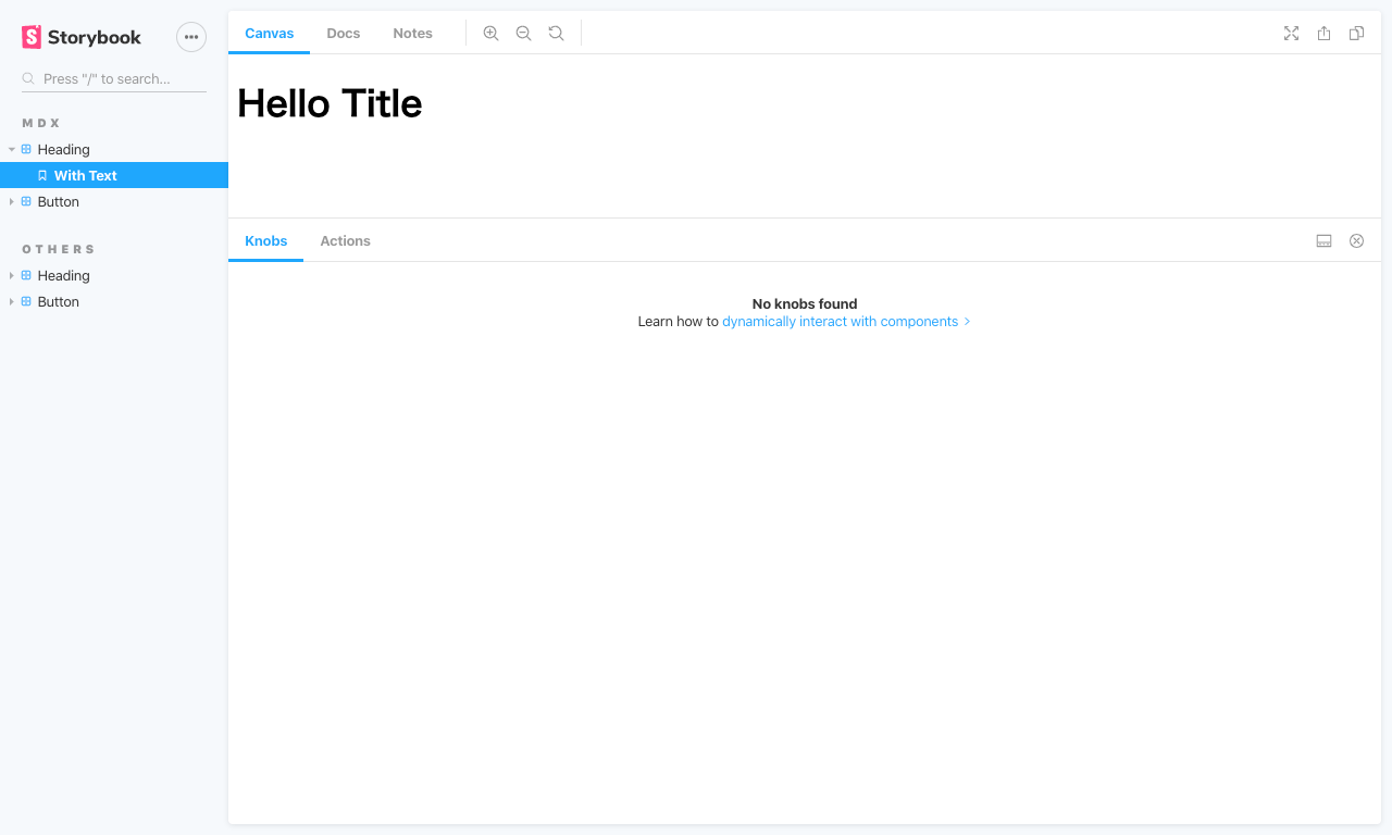
以上で環境構築は完了です。
ここから自作のコンポーネントを追加したり、お好みのStorybookプラグインを追加してプロジェクト毎のコンポーネントカタログを作成していきます。