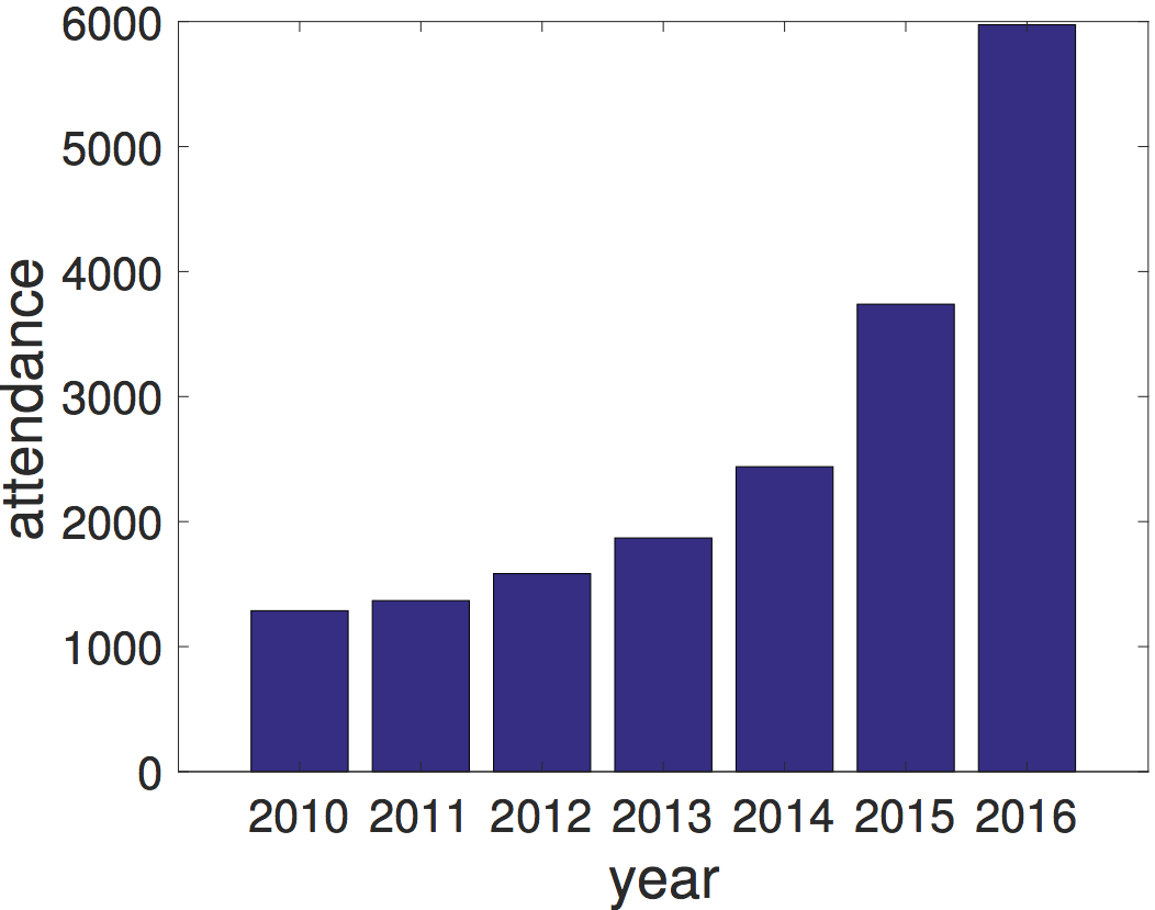
かなり前の話ですが、AI系トップカンファレンスNIPSの参加者が、昨今のAIブームの影響で指数的に増加しているようです。
 http://answeron.com/machine-learning-bubble/ より引用
このままの増加をたどると世界人口を超えるのではと危惧されています。そこでNIPS参加者数と世界人口の比較を行うグラフを書いてみます。数字は上記サイトのグラフから適当に設定しています。
import numpy as np
import matplotlib.pyplot as plt


x1 = np.arange(2000, 2019)
x2 = np.arange(2018, 2051)
y1 = np.exp((x1 - 2000) / 2) / 4.5
y2 = np.exp((x2 - 2000) / 2) / 4.5
y3 = (x1 - 2000) * 4e+9 / 50 + 6e+9
y4 = (x2 - 2000) * 4e+9 / 50 + 6e+9
plt.xkcd()
plt.plot(x1, y1, "b", label="NIPS Registrations")
plt.plot(x2, y2, "b--", label="NIPS Registrations (Projected)")
plt.plot(x1, y3, "r", label="World Population")
plt.plot(x2, y4, "r--", label="World Population (Projected)")
plt.xticks(np.arange(2000, 2051, 10))
plt.yticks(np.arange(0, 1.6, 0.5) * 1e+10)
plt.xlabel("Year")
plt.ylabel("# People")
plt.title("NIPS Registration Growth")
plt.legend()
plt.show()
結果

ラベルを変えることで、近年急速に増加している事象を世界人口と比較することができます。