はじめに
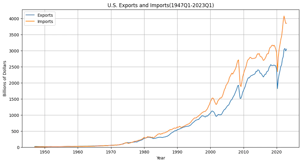
米国の輸出入額の推移をグラフ化する。
データは、BEA(U.S. Bureau of Economic Analysis、米国商務省経済分析局)の四半期データ(季節調整値)をFRED経由で取得。
コード
# ライブラリのインポート
import pandas as pd
import pandas_datareader as pdr
import matplotlib.pyplot as plt
import datetime

# FREDからデータの取得
start_date = '1947-01-01'  # 開始日
end_date = datetime.datetime.now().strftime('%Y-%m-%d')  # 今日の日付を終了日として設定
data = pdr.get_data_fred(['EXPGS', 'IMPGS'], start_date, end_date)  # 輸出'EXPGS'、輸入'IMPGS'のデータを取得

# データのプロット
plt.figure(figsize=(12,6))
plt.plot(data['EXPGS'], label='Exports')
plt.plot(data['IMPGS'], label='Imports')

# タイトル内の期間を動的に更新
start_quarter = pd.Timestamp(start_date).to_period("Q")
end_quarter = pd.Timestamp(data.index[-1]).to_period("Q")
plt.title(f'U.S. Exports and Imports({start_quarter}-{end_quarter})')

plt.xlabel('Year')
plt.ylabel('Billions of Dollars')
plt.legend()
plt.grid(True)
plt.ylim(bottom=0)  # 縦軸の範囲を0からに設定
plt.show()
出力
おわりに
次は、日本のデータで同じことをしたい。