概要
このサイトにあるFXのデータを、ローソク足表示させます。
環境
- Python 3.6 on Anaconda
- Jupiter notebook
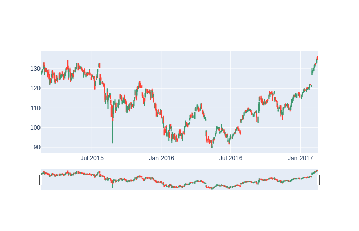
とりあえず株価データを表示するサンプルを動かす
表示に関してはこの投稿がより詳しく書いてあります。
ここのサイトのサンプルそのままに表示させます。
fig.py
import plotly.graph_objects as go

import pandas as pd
from datetime import datetime

df = pd.read_csv('https://raw.githubusercontent.com/plotly/datasets/master/finance-charts-apple.csv')

fig = go.Figure(data=[go.Candlestick(x=df['Date'],
                open=df['AAPL.Open'],
                high=df['AAPL.High'],
                low=df['AAPL.Low'],
                close=df['AAPL.Close'])])

fig.show()
以下のように表示されました。
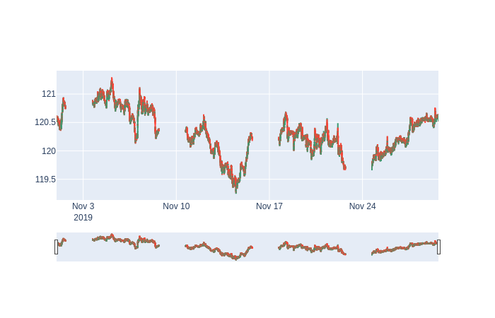
FXのデータを表示
このサイトのHISTDATA_COM_ASCII_EURJPY_M1_201911.zipを表示させてみたいと思います。
そのためにまず、zipファイルの中身をpd.DataFrameに変換します。
import pandas as pd
from zipfile import ZipFile
ascii_minute_names = ["datetime_str", "Open", "High", "Low", "Close", "Volume"]
ascii_minute_datetime_format = "%Y%m%d %H%M%S"

with ZipFile("HISTDATA_COM_ASCII_EURJPY_M1201911.zip", 'r') as z:
    with z.open("DAT_ASCII_EURJPY_M1_201911.csv") as f:
        df = pd.read_csv(f, names=ascii_minute_names, sep=";")
        df["datetime"] = pd.to_datetime(df.datetime_str, format=ascii_minute_datetime_format)
        df = df.set_index("datetime")
        del df["datetime_str"]

print(df.head())

"""
output:
                        Open     High      Low    Close  Volume
datetime
2019-11-01 00:00:00  120.599  120.601  120.595  120.598       0
2019-11-01 00:01:00  120.597  120.598  120.592  120.595       0
2019-11-01 00:02:00  120.597  120.603  120.597  120.601       0
2019-11-01 00:03:00  120.600  120.600  120.592  120.598       0
2019-11-01 00:04:00  120.597  120.603  120.593  120.597       0
"""
表示ぃ! ※データが大きいので実行時間かかります。
import plotly.graph_objects as go

import pandas as pd
from datetime import datetime

fig = go.Figure(data=[
    go.Candlestick(
        x=df.index,
        open=df.Open,
        high=df.High,
        low=df.Low,
        close=df.Close
    )
])

fig.show()
以下のように表示されました。
以上!