はじめに
SwiftUIでButtonの細かなカスタマイズをする方法について整理してみました。
環境
Xcode 14.1
内容
ButtonStyleでButtonのカスタマイズを定義
buttonStyle(_:)を使うことで定義したカスタマイズをButtonに適用する
実装
struct ButtonView: View {
    var body: some View {
        Button {
            // Action
        } label: {
            Text("ボタン")
                .font(.system(size: 18.0))
                .padding(12.0)
        }
        .buttonStyle(CustomButtonStyle())
    }
}

struct CustomButtonStyle: ButtonStyle {
    func makeBody(configuration: Configuration) -> some View {
        configuration.label
            .background(configuration.isPressed  ? Color.red : Color.blue)
            .foregroundColor(configuration.isPressed ? .black : .white )
            .clipShape(Capsule())
            .scaleEffect(configuration.isPressed ? 0.95 : 1)
            .animation(.easeOut(duration: 0.2), value: configuration.isPressed)
    }
}
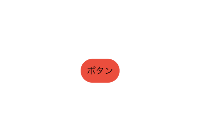
通常 -> タップ時

ボタンの非活性状態もカスタマイズする
ボタンのタップ時と非活性の状態のカスタマイズをするには、UIViewRepresentableを使うことで実装できました(他にもあるかもしれませんが)
実装
struct ButtonView: View {
    @State var isDisabled = false
    var body: some View {
        CustomButton(action: {
            isDisabled.toggle()
        })
        .frame(width: 50.0, height: 20.0)
        .disabled(isDisabled)
    }
}

struct CustomButton: UIViewRepresentable {
    var action: () -> Void

    func makeUIView(context: Context) -> UIButton {
        var configuration = UIButton.Configuration.plain()
        var container = AttributeContainer()
        container.font = UIFont.boldSystemFont(ofSize: 16.0)
        configuration.attributedTitle = AttributedString("ボタン", attributes: container)
        configuration.image = UIImage(systemName: "app")
        configuration.imagePadding = 10
        configuration.background.strokeWidth = 1.0
        let button = CustomButton(configuration: configuration)
        button.addAction(.init { _ in action() }, for: .touchUpInside)
        return button
    }

    func updateUIView(_: UIButton, context _: Context) {}
}

extension CustomButton {
    class CustomButton: UIButton {
        override func updateConfiguration() {
            guard let configuration = configuration else { return}

            var updatedConfiguration = configuration
            var background = UIButton.Configuration.plain().background
            background.cornerRadius = 15

            let strokeColor: UIColor
            let foregroundColor: UIColor
            let backgroundColor: UIColor
            let baseColor = updatedConfiguration.baseForegroundColor ?? UIColor.tintColor

            switch self.state {
            case .normal:
                strokeColor = .gray
                foregroundColor = baseColor
                backgroundColor = .blue
            case .highlighted:
                strokeColor = .gray
                foregroundColor = baseColor
                backgroundColor = baseColor.withAlphaComponent(0.3)
            case .selected:
                strokeColor = .clear
                foregroundColor = .white
                backgroundColor = baseColor
            case .disabled:
                strokeColor = .gray
                foregroundColor = baseColor.withAlphaComponent(0.3)
                backgroundColor = .clear
                var container = AttributeContainer()
                container.foregroundColor = baseColor.withAlphaComponent(0.3)
                let title = updatedConfiguration.title!
                updatedConfiguration.attributedTitle = AttributedString(title, attributes: container)
            default:
                strokeColor = .gray
                foregroundColor = baseColor
                backgroundColor = .clear
            }

            background.strokeColor = strokeColor
            background.backgroundColor = backgroundColor
            updatedConfiguration.baseForegroundColor = foregroundColor
            updatedConfiguration.background = background

            self.configuration = updatedConfiguration
        }
    }
}
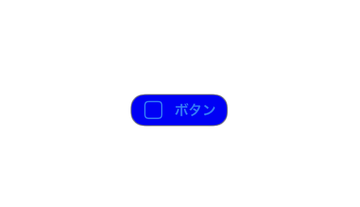
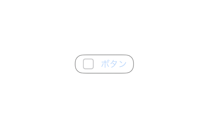
通常 -> タップ時 -> 非活性

おわりに
他にもButtonのカスタマイズ方法はありそうですが、ひとつの実装方法としてまとめました。
参考