はじめに
記事の概要
この記事では、Jリーグの2019年の順位表を使って、matplotlibの使い方を学びながら、サッカーにおいて順位と強く相関するものは何なのかを考察していきます。
自分の学習メモ代わりでもあるので、読みにくいかもしれませんがご容赦ください。
目的
・matplotlibの使い方に慣れる。
・DataFrameを扱えるようになる。
・サッカーの順位において、大事な要素を見つける。
コードと解説
前提
- 開発環境
- Anaconda
- Python3
- Juptyer-notebook
流れ
1. Jリーグのデータサイトの順位表をチェック
2. 2つの表を結合
3. とりあえず勝ち点をプロットしてみる
4. 総得点と総失点の関係をグラフに
5. 勝・分・敗の割合を見てみる
6. 各要素の相関を見てみる
コード
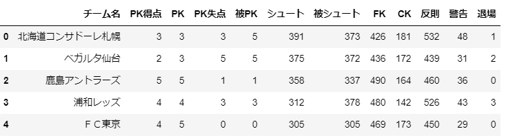
まずjリーグサイトから表を読み込み、整形。
import pandas as pd

url_ranking = 'https://data.j-league.or.jp/SFRT01/?search=search&yearId=2019&yearIdLabel=2019%E5%B9%B4&competitionId=460&competitionIdLabel=%E6%98%8E%E6%B2%BB%E5%AE%89%E7%94%B0%E7%94%9F%E5%91%BD%EF%BC%AA%EF%BC%91%E3%83%AA%E3%83%BC%E3%82%B0&competitionSectionId=0&competitionSectionIdLabel=%E6%9C%80%E6%96%B0%E7%AF%80&homeAwayFlg=3'
j_ranking = pd.read_html(url_ranking)
j_ranking = pd.DataFrame(j_ranking[0])
j_ranking = j_ranking.drop(['グラフ','試合','直近試合の勝敗','Unnamed: 12','Unnamed: 13'], axis=1) #不要なカラムの削除
j_ranking = j_ranking.rename(columns={"チーム":"チーム名"}) #もう一つの表と結合するためカラム名の変更
j_ranking.head()
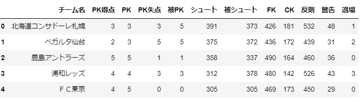
j_detail_ranking = 'https://data.j-league.or.jp/SFRT08/search?competitionYearEx=2019&competitionIdEx=1&selectedCompetitionName=%E6%98%8E%E6%B2%BB%E5%AE%89%E7%94%B0%E7%94%9F%E5%91%BD%EF%BC%AA%EF%BC%91%E3%83%AA%E3%83%BC%E3%82%B0&selectedCompetitionYear=2019%E5%B9%B4&competitionYear=2019&competitionId=1'
j_detail_ranking = pd.read_html(j_detail_ranking)
j_detail_ranking = pd.DataFrame(j_detail_ranking[0])
j_detail_ranking = j_detail_ranking.drop(18) #不要な行の削除
j_detail_ranking = j_detail_ranking.drop(['試合','試合時間','Unnamed: 19','退席','得点','失点','1試合平均得点','1試合平均失点'],axis=1) #不要なカラムの削除
j_detail_ranking.head()
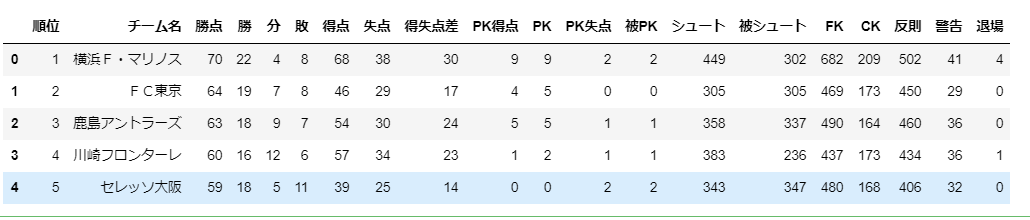
2種類の表を統合します。
j_all_ranking = j_ranking.merge(j_detail_ranking,on = 'チーム名')
j_all_ranking.head()
まずは順位と勝ち点でグラフ化しています。
import numpy as np
import matplotlib.pyplot as plt
%matplotlib inline

# 日本語フォントに対応
from matplotlib.font_manager import FontProperties
fp = FontProperties(fname=r'C:\WINDOWS\Fonts\meiryob.ttc', size=14)

x = j_all_ranking.loc[:,'順位'].values
y = j_all_ranking.loc[:,'勝点'].values
plt.plot(x,y, 'bo')
plt.xlabel('順位', fontproperties=fp)
plt.ylabel('勝ち点', fontproperties=fp);
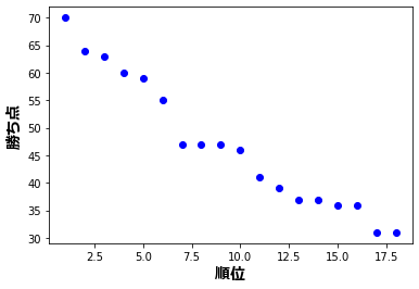
グラフを見ると何となく上位・中位・下位に分かれていますが、全体的に勝ち点の差は小さいです。
次に総失点と総得点で散布図を作ります。
from adjustText import adjust_text #文字の重なりを防ぐ
# 総得点VS総失点

plt.figure(figsize=(14, 8))

teams = j_all_ranking.loc[:, 'チーム名'].values
x = j_all_ranking.loc[:, '得点'].values
y = j_all_ranking.loc[:, '失点'].values

plt.scatter(x,y)
plt.title('総得点 VS 総失点',fontproperties=fp)
plt.xlabel('総得点',fontproperties=fp)
plt.ylabel('総失点',fontproperties=fp)
texts = [plt.text(x[i], y[i], team,fontproperties=fp) for i, team in enumerate(teams)]
adjust_text(texts);
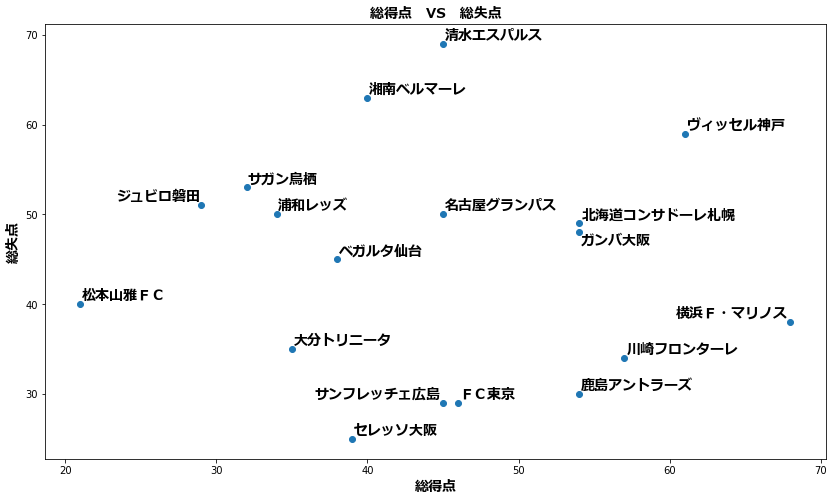
グラフの右下に行くほど順位が上がっていますね。
点の位置でそのチームの課題も何となく見えてきます。
例えば、ヴィッセル神戸は得点力がありますが、失点もかなり多いです。失点を減らせば、さらなる上位進出の可能性もあります。
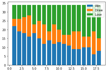
次に勝・分・敗の割合をグラフにします。
# 勝・引き・負の割合

x = j_all_ranking.loc[:,'順位'].values
y_1 = j_all_ranking.loc[:,'勝'].values
y_2 = j_all_ranking.loc[:,'分'].values
y_3 = j_all_ranking.loc[:,'敗'].values
p1 = plt.bar(x,y_1)
p2 = plt.bar(x,y_2,bottom=y_1)
p3 = plt.bar(x,y_3,bottom=y_1+y_2)
plt.legend((p1[0],p2[0],p3[0]),('Win','Draw','Lose'),);
次に各要素の相関係数を調べています。
# 相関
pd.options.display.float_format = '{:.2f}'.format #有効数字を指定
j_rank_corr = j_all_ranking.corr()
j_rank_corr
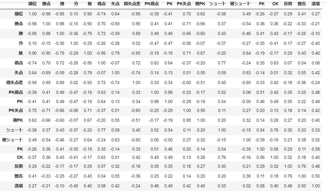
各値を見ると、「勝ち点・勝・得失点」は当然のことながら順位と強く相関していますね。
「得点・失点」では「得点」の方がわずかに相関係数が大きいですね。これが有意な差なのかどうか、仮説検定などをしないと何とも言えませんが、攻撃より守備が大事といえる可能性もりますね。
「シュート数・被シュート数」はあまり順位と相関しないようですね。
※今回は軽くデータに触れることが目的なので、仮説検定などは行っていません。
感想・反省
・基本的な使い方はマスターできたかな。
・使い方自体より、どの要素を抽出するかという方が悩む。
・実際のデータを使うとリアルで楽しい!
参考
・Pythonを使って2019年度J1チームデータを可視化してみた
・データサイエンスのためのPython入門講座全33回〜目次とまとめ〜