概要
matplotlibのGalleryをのんびり見よう。
私個人に分かりやすいようにまとめたりしながら。
環境
Python 3.7
matplotlib 3.4.1
内容
準備
import matplotlib
import matplotlib.pyplot as plt
import numpy as np
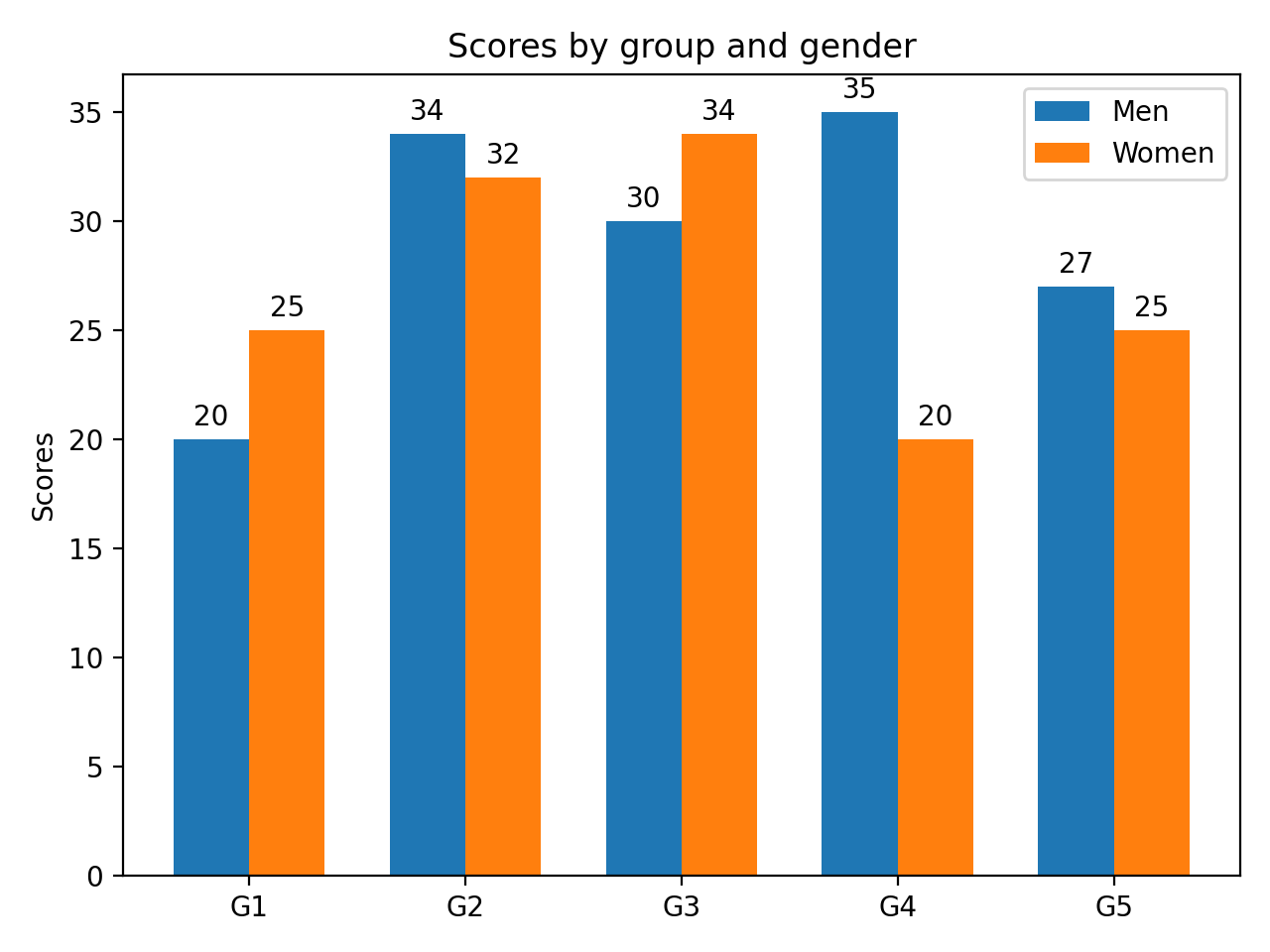
labels = ['G1', 'G2', 'G3', 'G4', 'G5']
men_means = [20, 34, 30, 35, 27]
women_means = [25, 32, 34, 20, 25]
x = np.arange(len(labels)) # the label locations
width = 0.35 # the width of the bars
plot
fig, ax = plt.subplots()
rects1 = ax.bar(x - width/2, men_means, width, label='Men')
rects2 = ax.bar(x + width/2, women_means, width, label='Women')

# Add some text for labels, title and custom x-axis tick labels, etc.
ax.set_ylabel('Scores')
ax.set_title('Scores by group and gender')
ax.set_xticks(x)
ax.set_xticklabels(labels)
ax.legend()

ax.bar_label(rects1, padding=3)
ax.bar_label(rects2, padding=3)

fig.tight_layout()

fig.show()
-
ax.bar(x - width/2,およびax.bar(x + width/2,で並べて表示できる -
rects1 = ax.bar(のように、ax.bar()はBarContainerを返す。 -
ax.bar_label(rects1, padding=3)でラベルを表示させられる。
参考にさせていただいた頁
感想
グラフを並べるのに悩んでいたので、助かる。
グラフの上方にラベルを置く際の使い方がわかったので、よかった。
今後
活用していきたい。