概要
matplotlibのGalleryをのんびり見よう。
私個人に分かりやすいようにまとめたりしながら。
環境
Python 3.7
matplotlib 3.4.1
内容
準備
import matplotlib
import matplotlib.pyplot as plt
import numpy as np
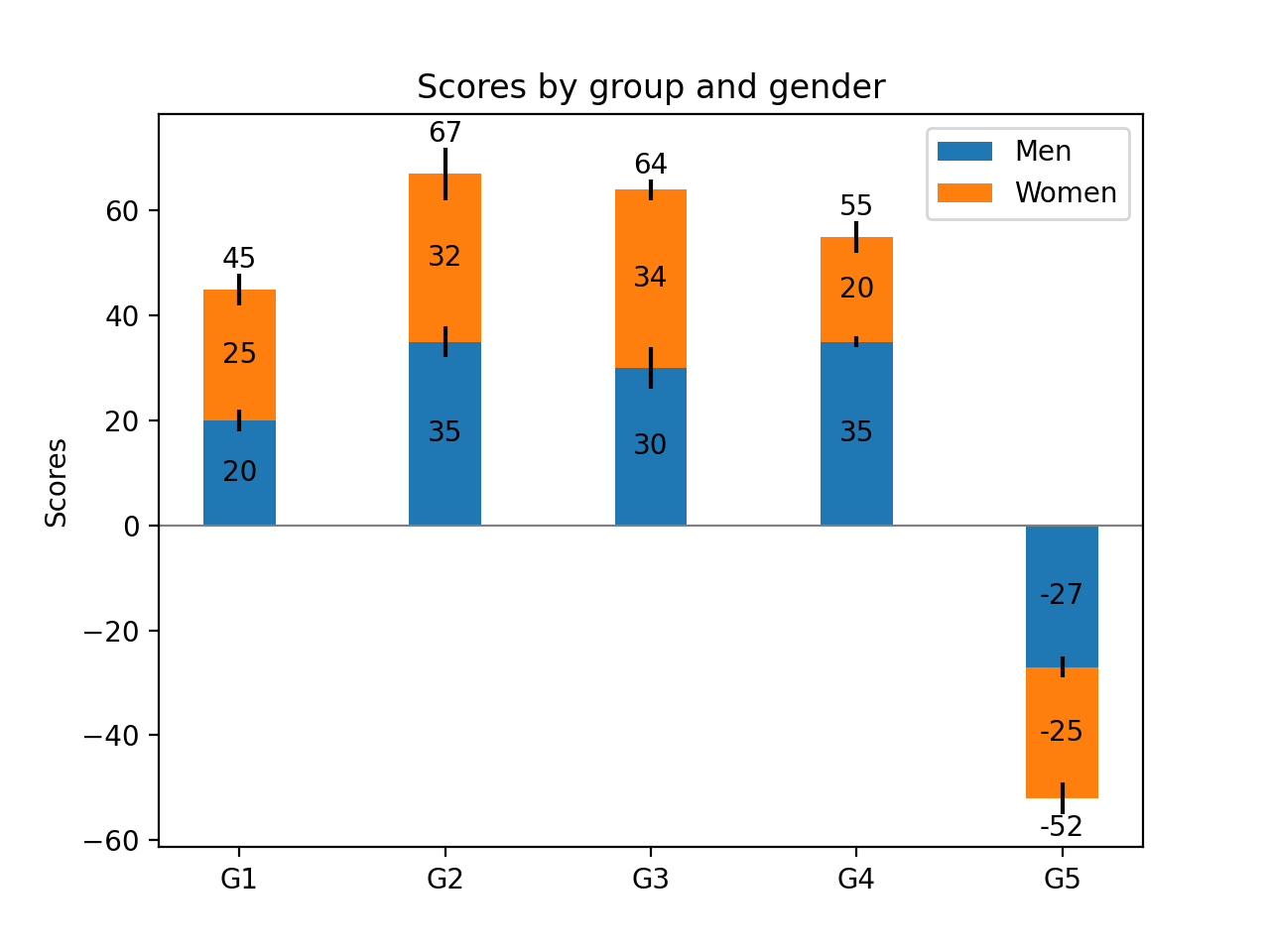
N = 5
menMeans = (20, 35, 30, 35, -27)
womenMeans = (25, 32, 34, 20, -25)
menStd = (2, 3, 4, 1, 2)
womenStd = (3, 5, 2, 3, 3)
ind = np.arange(N) # the x locations for the groups
width = 0.35 # the width of the bars: can also be len(x) sequence
plot
fig, ax = plt.subplots()

p1 = ax.bar(ind, menMeans, width, yerr=menStd, label='Men')
p2 = ax.bar(ind, womenMeans, width,
            bottom=menMeans, yerr=womenStd, label='Women')

ax.axhline(0, color='grey', linewidth=0.8)
ax.set_ylabel('Scores')
ax.set_title('Scores by group and gender')
ax.set_xticks(ind)
ax.set_xticklabels(('G1', 'G2', 'G3', 'G4', 'G5'))
ax.legend()

# Label with label_type 'center' instead of the default 'edge'
ax.bar_label(p1, label_type='center')
ax.bar_label(p2, label_type='center')
ax.bar_label(p2)

fig.show()
-
bar_labelでラベルを表示。label_type='center'で棒グラフの真ん中に表示。
参考にさせていただいた頁
感想
ax.bar_label(p2, label_type='center')と
ax.bar_label(p2)とで表示されるラベルも変わっているのはすごいなあと思った。
今後
活用していきたい。