昨日は地理情報まわりの基本的な知識を紹介しました。
シェープファイルの入手
さて GIS を利用するにあたりシェープファイルを自作するのは現実的ではありませんから、どこからか入手することが必要です。
主なシェープファイルの入手先
国土交通省 GIS データのダウンロード
http://nrb-www.mlit.go.jp/kokjo/inspect/landclassification/download/index.html
ESRI ジャパン 全国市区町村界データ
http://www.esrij.com/products/data/japan-shp/
Global Administrative Areas
http://www.gadm.org/country
いずれにせよ使用許諾などに目を通し、お使いの用途で利用可能であることを確認してください。今回の例では一番下の Global Administrative Areas を利用します。
シェープファイルを R で表示してみる
シェープファイルの Viewer はそれほどありません。 GIS の利用がなかなか進まないのはマトモな Viewer が無いからだとも言われているほどです。データ分析者は R を日常的に使っていますから、いっそのこと R そのものを Viewer として使っても良いでしょう。まずはシンプルにシェープファイルを閲覧してみます。
library(gpclib) # maptools の前提パッケージ gpclib を R で使うのに必要
library(maptools)
library(RColorBrewer) # 統計グラフで使える便利なカラーパレット

# 経度と緯度を設定する
xlim <- c(128, 146)
ylim <- c(30, 46)

# まずはシンプルに JPN_adm1.shp を表示してみる
png("image.png", width = 480, height = 480, pointsize = 12, bg = "white", res = NA)
jpn <- readShapePoly("JPN_adm1.shp")
plot(jpn, xlim=xlim, ylim=ylim)
dev.off()
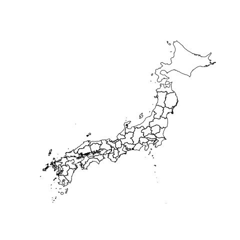
これが素のシェープファイルです。
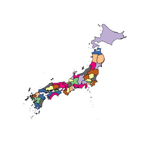
次に、県の境界ごとにカラーパレットを割り当ててみます。
col <- sample(1:8,size=47,replace=TRUE)
png("image2.png", width = 480, height = 480, pointsize = 12, bg = "white", res = NA)
plot(jpn, xlim=xlim, ylim=ylim, col=brewer.pal(8,"Accent")[col])
dev.off()
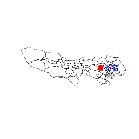
今度はシェープファイルの都心付近を拡大して、都市をポイントしてみます。
jpn <- readShapePoly("JPN_adm2.shp")
png("image3.png", width = 480, height = 480, pointsize = 12, bg = "white", res = NA)
plot(jpn[jpn$NAME_1=="Tokyo",])
points(139.7036, 35.69389, lwd=20, col="red")
text(139.7036, 35.69389, "新宿", col="blue", adj = c(-0.3,0.5), cex=2)
dev.off()
R のインタプリタで表示を確認しながら、描画したいデータを絞り込んでいくと良いでしょう。
オレゴン気候局のデータを使う
次に昨日も紹介した、オレゴン気候局のデータを利用してシェープファイル描画の流れを追ってみます。
Maps in R -- Examples
http://geog.uoregon.edu/geogr/topics/maps.htm
# まずは依存するライブラリをロードする
library(gpclib)
library(maptools)
library(RColorBrewer)
library(classInt)

# シェープファイルを読み込む
# オレゴン州のアウトライン
orotl.shp <- readShapeLines('orotl.shp',
    proj4string=CRS("+proj=longlat"))
# オレゴン州の気候局データ
orstations.shp <- readShapePoints('orstations.shp',
    proj4string=CRS("+proj=longlat"))
# オレゴン州郡の国勢調査データ(ポリゴン)
orcounty.shp <- readShapePoly('orcounty.shp',
    proj4string=CRS("+proj=longlat"))
これら地理情報に対し、国勢調査データなどをマッピングしていきます。
# 緯度経度を含む CSV ファイル
orstationc <- read.csv("orstationc.csv")
# オレゴン州郡国勢調査データ
orcountyp <- read.csv("orcountyp.csv")
# 国名を持つデータ·セット
cities <- read.csv("cities2.csv")

# まずはデータの中身を表示してみる
summary(orcounty.shp)
attributes(orcounty.shp)
attributes(orcounty.shp@data)
attr(orcounty.shp,"polygons")
元のシェープファイルの中身を覗いてみる
png("image0-1.png", width = 480, height = 480, pointsize = 12, bg = "white", res = NA)
plot(orotl.shp, xlim=c(-124.5, -115), ylim=c(42,47))
dev.off()

png("image0-2.png", width = 480, height = 480, pointsize = 12, bg = "white", res = NA)
plot(orcounty.shp, xlim=c(-124.5, -115), ylim=c(42,47))
dev.off()
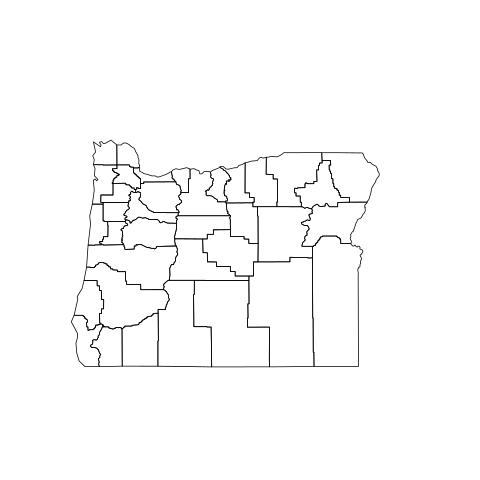
png("image0-3.png", width = 480, height = 480, pointsize = 12, bg = "white", res = NA)
plot(orstations.shp, xlim=c(-124.5, -115), ylim=c(42,47))
dev.off()
シンプルなマッピング
ここからマッピングしていきます。
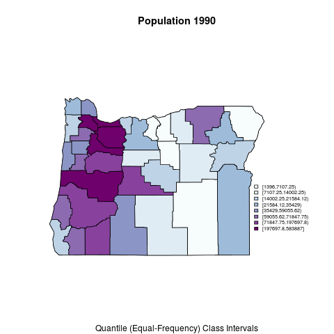
オレゴン州郡の国勢調査データ - orcounty.shpシェイプファイル内の属性データ
png("image1-1.png", width = 480, height = 480, pointsize = 12, bg = "white", res = NA)
plotvar <- orcounty.shp@data$POP1990
nclr <- 8
plotclr <- brewer.pal(nclr,"BuPu")
class <- classIntervals(plotvar, nclr, style="quantile")
colcode <- findColours(class, plotclr)
plot(orcounty.shp, xlim=c(-124.5, -115), ylim=c(42,47))
plot(orcounty.shp, col=colcode, add=T)
title(main="Population 1990",
    sub="Quantile (Equal-Frequency) Class Intervals")
legend(-117, 44, legend=names(attr(colcode, "table")),
    fill=attr(colcode, "palette"), cex=0.6, bty="n")
dev.off()
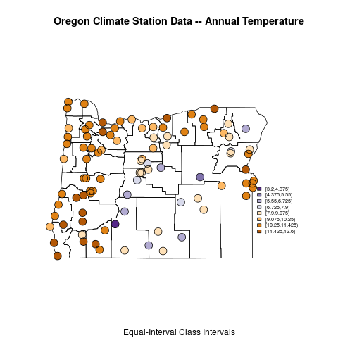
オレゴン州の気候局データ - orstationc.csvファイルのデータ、orotl.shpにおけるベースマップ
png("image1-2.png", width = 480, height = 480, pointsize = 12, bg = "white", res = NA)
plotvar <- orstationc$tann
nclr <- 8
plotclr <- brewer.pal(nclr,"PuOr")
plotclr <- plotclr[nclr:1] # reorder colors
class <- classIntervals(plotvar, nclr, style="equal")
colcode <- findColours(class, plotclr)
plot(orotl.shp, xlim=c(-124.5, -115), ylim=c(42,47))
points(orstationc$lon, orstationc$lat, pch=16, col=colcode, cex=2)
points(orstationc$lon, orstationc$lat, cex=2)
title("Oregon Climate Station Data -- Annual Temperature",
    sub="Equal-Interval Class Intervals")
legend(-117, 44, legend=names(attr(colcode, "table")),
    fill=attr(colcode, "palette"), cex=0.6, bty="n")
dev.off()
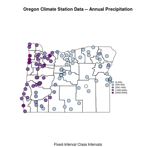
オレゴン州の気候局データ - 形状ファイル内の場所とデータ
png("image1-3.png", width = 480, height = 480, pointsize = 12, bg = "white", res = NA)
plotvar <- orstations.shp@data$pann
nclr <- 5
plotclr <- brewer.pal(nclr,"BuPu")
class <- classIntervals(plotvar, nclr, style="fixed",
fixedBreaks=c(0,200,500,1000,2000,5000))
colcode <- findColours(class, plotclr)
orstations.pts <- orstations.shp@coords # get point data
plot(orotl.shp, xlim=c(-124.5, -115), ylim=c(42,47))
points(orstations.pts, pch=16, col=colcode, cex=2)
points(orstations.pts, cex=2)
title("Oregon Climate Station Data -- Annual Precipitation",
    sub="Fixed-Interval Class Intervals")
legend(-117, 44, legend=names(attr(colcode, "table")),
fill=attr(colcode, "palette"), cex=0.6, bty="n")
dev.off()
カラースケールと表現のバリエーション
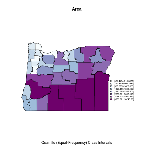
オレゴン州郡の国勢調査データ - 等しい周波数のクラス間隔
png("image2-1.png", width = 480, height = 480, pointsize = 12, bg = "white", res = NA)
plotvar <- orcounty.shp@data$AREA
nclr <- 8
plotclr <- brewer.pal(nclr,"BuPu")
# plotclr <- plotclr[nclr:1] # reorder colors if appropriate
class <- classIntervals(plotvar, nclr, style="quantile")
colcode <- findColours(class, plotclr)
plot(orcounty.shp, xlim=c(-124.5, -115), ylim=c(42,47))
plot(orcounty.shp, col=colcode, add=T)
title(main="Area",
sub="Quantile (Equal-Frequency) Class Intervals")
legend(-117, 44, legend=names(attr(colcode, "table")),
    fill=attr(colcode, "palette"), cex=0.6, bty="n")
dev.off()
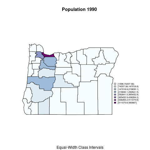
オレゴン州郡の国勢調査データ - 等幅クラス毎
png("image2-2.png", width = 480, height = 480, pointsize = 12, bg = "white", res = NA)
plotvar <- orcounty.shp@data$AREA
nclr <- 8
plotclr <- brewer.pal(nclr,"BuPu")
# plotclr <- plotclr[nclr:1] # reorder colors if appropriate
class <- classIntervals(plotvar, nclr, style="equal")
colcode <- findColours(class, plotclr)
plot(orcounty.shp, xlim=c(-124.5, -115), ylim=c(42,47))
plot(orcounty.shp, col=colcode, add=T)
title(main="Area",
    sub=" Equal-Width Class Intervals")
legend(-117, 44, legend=names(attr(colcode, "table")),
    fill=attr(colcode, "palette"), cex=0.6, bty="n")
# equal-width class intervals of 1990 population
plotvar <- orcounty.shp@data$POP1990
nclr <- 8
plotclr <- brewer.pal(nclr,"BuPu")
# plotclr <- plotclr[nclr:1] # reorder colors if appropriate
class <- classIntervals(plotvar, nclr, style="equal")
colcode <- findColours(class, plotclr)
plot(orcounty.shp, xlim=c(-124.5, -115), ylim=c(42,47))
plot(orcounty.shp, col=colcode, add=T)
title(main="Population 1990",
    sub=" Equal-Width Class Intervals")
legend(-117, 44, legend=names(attr(colcode, "table")),
    fill=attr(colcode, "palette"), cex=0.6, bty="n")
dev.off()
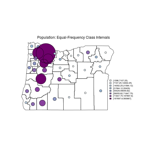
オレゴン州郡の国勢調査データ - バブルプロット
png("image2-3.png", width = 480, height = 480, pointsize = 12, bg = "white", res = NA)
# bubble plot equal-frequency class intervals
plotvar <- orcounty.shp@data$AREA
nclr <- 8
plotclr <- brewer.pal(nclr,"BuPu")
# plotclr <- plotclr[nclr:1] # reorder colors if appropriate
max.symbol.size=12
min.symbol.size=1
class <- classIntervals(plotvar, nclr, style="quantile")
colcode <- findColours(class, plotclr)
symbol.size <- ((plotvar-min(plotvar))/
    (max(plotvar)-min(plotvar))*(max.symbol.size-min.symbol.size)
    +min.symbol.size)
plot(orcounty.shp, xlim=c(-124.5, -115), ylim=c(42,47))
orcounty.cntr <- coordinates(orcounty.shp)
points(orcounty.cntr, pch=16, col=colcode, cex=symbol.size)
points(orcounty.cntr, cex=symbol.size)
    text(-120, 46.5, "Area: Equal-Frequency Class Intervals")
legend(-117, 44, legend=names(attr(colcode, "table")),
    fill=attr(colcode, "palette"), cex=0.6, bty="n")
# bubble plot equal-frequency class intervals
plotvar <- orcounty.shp@data$POP1990
nclr <- 8
plotclr <- brewer.pal(nclr,"BuPu")
# plotclr <- plotclr[nclr:1] # reorder colors if appropriate
max.symbol.size=12
min.symbol.size=1
class <- classIntervals(plotvar, nclr, style="quantile")
colcode <- findColours(class, plotclr)
symbol.size <- ((plotvar-min(plotvar))/
(max(plotvar)-min(plotvar))*(max.symbol.size-min.symbol.size)
+min.symbol.size)
plot(orcounty.shp, xlim=c(-124.5, -115), ylim=c(42,47))
orcounty.cntr <- coordinates(orcounty.shp)
points(orcounty.cntr, pch=16, col=colcode, cex=symbol.size)
points(orcounty.cntr, cex=symbol.size)
text(-120, 46.5, "Population: Equal-Frequency Class Intervals")
legend(-117, 44, legend=names(attr(colcode, "table")),
    fill=attr(colcode, "palette"), cex=0.6, bty="n")
dev.off()
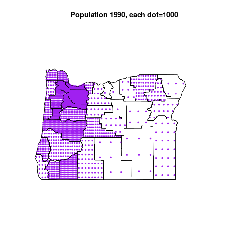
オレゴン州郡の国勢調査データ - (擬似)ドット密度マップ
png("image2-4.png", width = 480, height = 480, pointsize = 12, bg = "white", res = NA)
# maptools dot-density maps
# warning: this can take a little while
plottitle <- "Population 1990, each dot=1000"
orpolys <- SpatialPolygonsDataFrame(orcounty.shp, data=as(orcounty.shp, "data.frame"))
plotvar <- orpolys@data$POP1990/1000.0
dots.rand <- dotsInPolys(orpolys, as.integer(plotvar), f="random")
plot(orpolys, xlim=c(-124.5, -115), ylim=c(42,47))
plot(dots.rand, add=T, pch=19, cex=0.5, col="magenta")
plot(orpolys, add=T)
title(plottitle)
dots.reg <- dotsInPolys(orpolys, as.integer(plotvar), f="regular")
plot(orpolys, xlim=c(-124.5, -115), ylim=c(42,47))
plot(dots.reg, add=T, pch=19, cex=0.5, col="purple")
plot(orpolys, add=T)
title(plottitle)
dev.off()
まとめ
シェープファイルで地理情報を描画し、その上にデータを散りばめることができることがわかりました。
参考
Rの基本グラフィックス機能またはggplot2を使って地図を描くには
http://sudillap.hatenablog.com/entry/2013/03/26/210202
Maps in R -- Examples
http://geog.uoregon.edu/geogr/topics/maps.htm